BrandDESIGNSocial Media AdvertisingWebsite
Neo minimalist brand identity design including web and social advertising assets is the sharp evolution brands need in 2026. It strips away noise but adds just enough soul—warm neutrals, subtle textures, and purposeful negative space—to feel human in a sea of AI-generated sameness.
Neo minimalist brand identity design including web and social advertising assets delivers instant clarity while building quiet trust. Think clean logos that scale perfectly from favicon to billboard, websites that breathe, and social ads that stop scrolls without screaming.
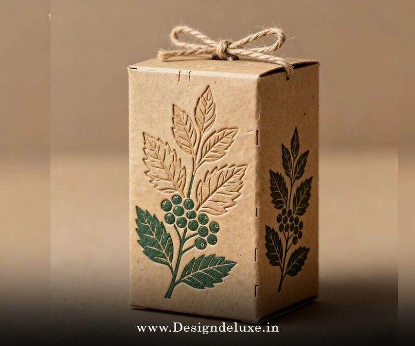
- Core elements: Simple forms, generous white space, limited earthy palettes (sage, terracotta, warm grays), and one or two accent colors.
- Why it wins now: Users crave calm amid digital overload. It adapts across devices and feels premium yet approachable.
- Web payoff: Faster load times, better UX, higher conversions.
- Social edge: Assets that perform in feeds—bold yet restrained carousels, stories, and Reels that reinforce recognition.
- Long-term ROI: Timeless enough to evolve without full rebrands every few years.
The kicker? Done right, it doesn’t just look good. It communicates competence and intention before a single word lands.
What Neo-Minimalist Brand Identity Actually Looks Like in 2026
Forget sterile white voids. Neo-minimalism breathes. It pairs surgical precision with soft details—gentle curves, micro-textures hinting at paper or linen, and humanist serifs that warm up sans-serif dominance.
Logos stay simple but gain character through subtle imperfections. A perfectly straight line feels robotic now; a faint hand-drawn flourish signals humanity. Color palettes lean earthy: deep charcoals, muted ochres, soft sages. Typography mixes clean grotesks with occasional expressive serifs for hierarchy.
Web design follows suit. Generous padding, single-column focus on mobile, and imagery used sparingly as heroes rather than fillers. Social assets mirror this: high-contrast thumbnails, template systems for consistency, and motion that’s elegant—not flashy.
Brands like Nothing.tech nail it with monochrome restraint and sharp product focus. Others layer in one bold accent for personality without clutter.
Here’s the thing: In an AI era, this style proves your brand has taste and restraint. It stands out by not trying too hard.
Why It Matters for Beginners and Intermediate Brands
Attention spans? Shot. Trust signals? Essential. Neo-minimalist work cuts through because it respects the viewer’s time.
Scalability rules. Your logo must crush as a 16×16 favicon and on packaging. Web pages load lightning-fast with fewer heavy elements. Social ads convert better when the visual hierarchy guides eyes straight to the CTA.
It also future-proofs you. Trends come and go, but refined simplicity compounds. You tweak palettes or add micro-animations without starting over.
Rhetorical question: Would you rather refresh your entire identity every 18 months or build something that ages like good leather?
Core Elements of Neo Minimalist Brand Identity Design Including Web and Social Advertising Assets
Nail these foundations:
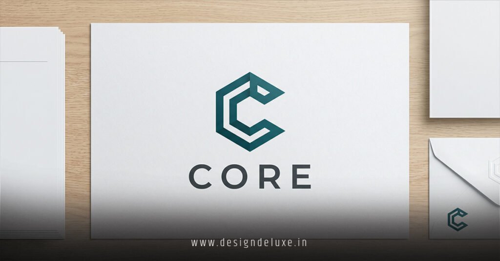
- Logo System: Primary mark, wordmark, icon, lockups. All vector, fully responsive.
- Color Palette: 2-3 primaries + neutrals. Test for accessibility (WCAG contrast).
- Typography: 1-2 families max. Variable fonts for flexibility.
- Imagery Style: High-quality, sparse. Negative space is your friend.
- Web Foundations: Clean grids, subtle animations, fast performance.
- Social Kit: Templates for posts, stories, covers, carousels. Consistent filters or overlays.
Consistency across every touchpoint turns good design into brand equity.
Step-by-Step Action Plan for Beginners
Start simple. Scale smart.
- Define Your Core: One sentence on what you stand for. This anchors every decision.
- Mood Board: Collect references. Focus on 2026 warmth—textures, earthy tones. Tools like Pinterest or Figma work fine.
- Logo Sketches: Pen and paper first. Aim for versatility. Simplify ruthlessly.
- Build the System: Choose colors, fonts, spacing rules. Create basic guidelines.
- Web Wireframes: Sketch homepage, about, product/service pages. Prioritize mobile.
- Social Assets: Design 5-10 templates. Prepare for Instagram, LinkedIn, TikTok, X.
- Test Relentlessly: Show to real people. Check on different screens and in bright sunlight.
- Launch & Iterate: Go live. Monitor analytics. Refine based on performance.
What I’d do if starting fresh: Spend 60% of time on strategy and testing, 40% on pixels. Most beginners do the reverse and regret it.
Comparison Table: Neo-Minimalist vs. Traditional Minimalist vs. Maximalist
| Aspect | Neo-Minimalist | Classic Minimalist | Maximalist |
|---|---|---|---|
| Color Palette | Warm neutrals + 1-2 accents | Stark black/white/grays | Bold, multi-color explosions |
| Textures | Subtle grain, linen hints | Flat, digital | Layered, ornate |
| White Space | Generous & purposeful | Extreme, sometimes cold | Minimal, dense content |
| Web Performance | Excellent (light assets) | Good | Often heavy |
| Social Ad Impact | High recognition, calm scroll-stopper | Clean but forgettable | Eye-catching but overwhelming |
| Cost to Maintain | Low | Low | High |
| Best For | Modern service/tech/wellness | Pure tech startups | Fashion, creative agencies |
This breakdown shows exactly where neo-minimalism splits the difference.
Common Mistakes & How to Fix Them
Mistake 1: Going too generic. Everything looks the same—thin lines, same sans fonts.
Fix: Inject one brand-specific quirk. A unique curve, custom ligature, or signature color ratio.
Mistake 2: Ignoring scalability. Beautiful desktop logo fails on mobile or dark mode.
Fix: Design variants early. Test in real contexts.
Mistake 3: Overusing negative space to the point of emptiness.
Fix: Use it to direct attention. Every empty area should earn its keep.
Mistake 4: Inconsistent social assets. One post screams, the next whispers.
Fix: Build a strict template library. Document rules.
Mistake 5: Treating it as “set it and forget it.”
Fix: Plan for evolution. Create flexible guidelines that allow controlled updates.
In my experience, the biggest killer is fear of commitment. Brands hedge and dilute. Pick your direction and own it.
Tools and Resources Worth Your Time
- Figma or Adobe Suite for full systems.
- Check AWWWARDS for fresh neo-minimal web inspiration.
- Study Nothing.tech for product-focused restraint.
- Read branding case studies on DesignMantic’s trend reports.
Key Takeaways
- Neo minimalist brand identity design including web and social advertising assets balances clarity with warmth for 2026 audiences.
- Prioritize scalability and consistency above all.
- Use earthy tones and subtle textures to avoid coldness.
- Build reusable asset systems for web and social from day one.
- Test with real users early and often.
- Focus on purposeful restraint—every element must serve the brand.
- Invest time in guidelines to protect your investment.
- Evolve thoughtfully rather than chasing every micro-trend.
Bottom line: This approach doesn’t just make your brand look professional. It makes it feel intentional and trustworthy in a noisy world. Start with your core message, build the system around it, and watch recognition compound.
Ready to build yours? Audit your current assets against these principles today. Pick one weak area—logo versatility or social templates—and strengthen it this week. Small, consistent moves create unstoppable brands.
FAQs
How much should I budget for neo minimalist brand identity design including web and social advertising assets in 2026?
Freelancers handle solid starter systems for $1,500–$8,000. Studios run $5,000–$25,000 for comprehensive packages with full guidelines and assets. Factor in your needs—basic logo vs. complete web + social kit.
Can beginners create effective neo minimalist brand identity design including web and social advertising assets themselves?
Yes, with discipline. Master core principles, use templates wisely, and test everything. Hire a pro for the logo and guidelines if budget allows—then extend the system yourself for web and social.
How do I keep neo minimalist brand identity design including web and social advertising assets consistent across platforms?
Create a brand style guide covering logo usage, colors, spacing, and social templates. Use cloud libraries in Figma or dedicated asset managers. Review assets quarterly.