
WebsiteAD Video / Motion GraphicsBanner DesigningDESIGNSocial Media Advertising
Neo minimalist web design social media ads banner motion graphics dominate feeds in 2026. Clean lines meet subtle motion. Brands cut noise and grab attention without screaming.
- Neo-minimalist style strips visuals to essentials while adding warm textures, purposeful animations, and strategic white space.
- It boosts scroll-stopping power for social ads and banners by focusing viewer eyes exactly where you want.
- Perfect for beginners and intermediates: fast to produce, loads lightning-quick, and converts better on mobile.
- Motion graphics add life without clutter—think micro-animations that guide rather than distract.
This approach works because attention spans keep shrinking. Users swipe past chaos. They pause for breathing room with intent.
What Neo Minimalist Web Design Social Media Ads Banner Motion Graphics Really Means
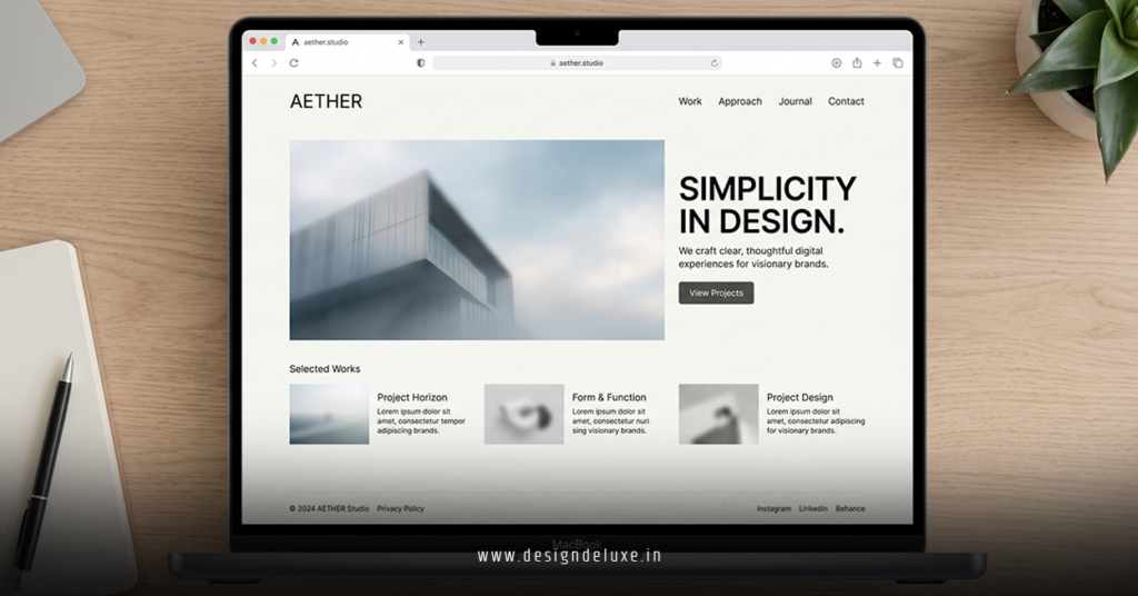
Neo-minimalism evolves classic minimalism. It keeps ruthless simplicity but warms it up. Think off-white backgrounds instead of stark #FFFFFF, humanist serifs paired with clean sans, and micro-details that feel human.
For social media ads and banners, this translates to layouts that breathe. One bold headline. A single focal image or product shot. Subtle motion that loops seamlessly. The result? Designs that feel premium yet approachable, loading instantly even on slower connections.
Here’s the thing: In 2026, platforms reward clarity. Algorithms push content that holds attention. Neo-minimalist banner motion graphics deliver exactly that—elegant restraint with just enough movement to stand out.
Why It Crushes for Social Media and Banners
Social feeds move fast. Your ad has seconds. Neo-minimalist designs cut through by doing less better. High contrast elements pop against generous negative space. Motion draws the eye without overwhelming.
Motion graphics shine here. A gentle fade on key text. An icon that pulses once. Product elements that slide into place. These aren’t fireworks. They’re signals that say “look here” without yelling.
Brands using this see stronger engagement. Nothing flashy, just effective. Users trust clean presentation. It signals confidence and quality.
Key Elements That Make Neo Minimalist Designs Tick
- White space as hero: Not empty. Intentional breathing room that frames your message.
- Warm neutrals and accents: Creams, soft sages, earthy tones over cold grays. One punchy accent color for focus.
- Typography hierarchy: Bold, legible fonts. Mix serif for warmth in headlines with crisp sans for body.
- Subtle motion: Micro-interactions, smooth transitions, looping animations under 3 seconds.
- Mobile-first grids: Simple, responsive layouts that adapt perfectly across platforms.
These choices keep file sizes small and performance high—critical for ad platforms.
Step-by-Step Action Plan for Beginners
Ready to create your first neo minimalist web design social media ads banner motion graphics? Follow this.
- Define the message: Boil it down to one core idea. What single thing should the viewer remember?
- Choose canvas and palette: Use tools like Figma or Canva. Pick warm neutrals. Limit to 2-3 colors total.
- Build the static frame: Big headline. One impactful visual. Tons of space. Align everything to a clean grid.
- Add motion thoughtfully: In After Effects or similar, animate only what matters—text reveal, element slide, subtle scale. Keep it under 5 seconds.
- Optimize and test: Export for each platform (Instagram, TikTok, LinkedIn). Check on mobile. A/B test variations.
- Iterate: Track engagement. Double down on what stops scrolls.
Start simple. One static banner first, then layer motion. You’ll improve fast.
What I’d do if starting fresh: Mock up three variations in an afternoon. Pick the one that feels calmest yet most magnetic.
Tools of the Trade in 2026
Figma for layouts. Adobe After Effects or CapCut for motion. Canva for quick starts with animated templates. LottieFiles for lightweight web animations. These keep workflows fast and outputs optimized.
Comparison Table: Neo-Minimalist vs Traditional Designs
| Aspect | Neo-Minimalist Approach | Traditional/Heavy Design | Winner for Social Ads |
|---|---|---|---|
| Load Time | Lightning fast (<2s) | Often slower due to assets | Neo-Minimalist |
| Attention Retention | High—focuses eye immediately | Scattered, users bounce | Neo-Minimalist |
| Production Time | 1-3 hours per asset | 6+ hours | Neo-Minimalist |
| Mobile Performance | Excellent | Variable, often needs fixes | Neo-Minimalist |
| Brand Perception | Premium, trustworthy, modern | Busy, dated, overwhelming | Neo-Minimalist |
| Cost Efficiency | Low (fewer elements) | Higher (complex assets) | Neo-Minimalist |
This table shows why the style wins for most campaigns.
Common Mistakes & How to Fix Them
Beginners often overdo “minimal.” They strip too much and end up boring. Or they sneak in extra icons “just in case.”
Mistake 1: Zero personality. Fix: Add one warm texture or subtle serif. Test warmth without clutter.
Mistake 2: Motion overload. Fix: Limit to 1-2 animated elements. Ask: Does this serve the message? If not, kill it.
Mistake 3: Ignoring platform specs. Fix: Design native sizes. Instagram Stories need vertical. Banners must read in 1 second.
Mistake 4: Pure cold white. Fix: Switch to soft cream or off-white. It feels more inviting instantly.
Catch these early. Review on actual devices, not just desktop.
Advanced Tips for Intermediate Creators
Push further with micro-interactions that respond to hover or tap. Experiment with variable fonts for dynamic weight shifts in motion. Layer subtle grain or paper textures for tactile feel in digital.
Study brands like Nothing.tech for product-focused minimal banners. They master negative space.
For motion, focus on easing curves—smooth starts and stops feel premium.
Key Takeaways
- Neo minimalist web design social media ads banner motion graphics deliver clarity with quiet power.
- Prioritize white space, warm tones, and purposeful motion over flashy effects.
- Keep designs mobile-optimized and platform-specific.
- One strong message beats five weak ones every time.
- Test relentlessly—data reveals what actually works.
- Warmth + simplicity builds trust faster than perfection.
- Start small, iterate fast, scale what converts.
- This style future-proofs your content in an AI-saturated world.
Neo-minimalist work feels like a deep breath in a noisy room. It stands out by refusing to compete on volume.
Ready to level up? Grab your next project brief, sketch one core frame, and animate the essential part. Your feeds will thank you. Scroll-stopping designs await.
FAQs
How does neo minimalist web design social media ads banner motion graphics differ from basic minimalism?
It adds warmth, subtle textures, and targeted motion while keeping the core simplicity. Basic minimalism can feel cold; neo-version feels intentional and human.
What tools work best for creating motion graphics in this style?
Figma for statics, After Effects for detailed motion, or CapCut for quicker social assets. Focus on lightweight exports that maintain quality across platforms.
Can beginners produce effective neo minimalist banner motion graphics without pro software?
Absolutely. Start with Canva’s animated templates, then refine in free tools. Master the principles first—restraint and focus matter more than fancy plugins.

