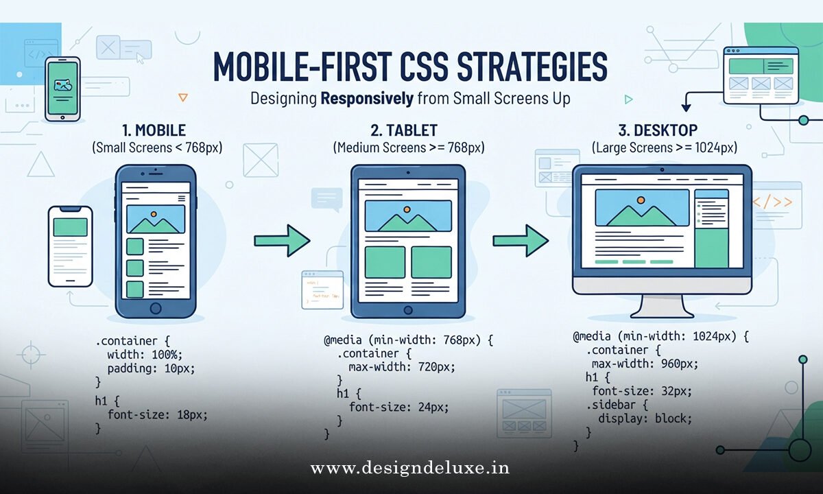
Mobile-first CSS Strategies
Mobile-first CSS strategies flip the old desktop-first habit on its head. You write the base styles for the smallest screens first, then layer enhancements with min-width media queries as space increases. The result is leaner code, clearer content priority, and layouts that hold up when real phones and tablets enter the picture.
Here’s the short version:
Base styles target...