Brand PackagingDESIGN
Custom coffee packaging design for small roaster brands is the intersection of branding, product protection, and buying psychology. Done right, it makes a tiny roaster look established, keeps coffee fresh, and helps the bag do quiet selling before you ever say a word.
- It’s not just “nice design.” It’s your first salesman on the shelf.
- Freshness wins when barrier materials, valve choice, and seal quality are handled properly.
- Small roasters need packaging that fits their budget, MOQ realities, and production workflow.
- The best designs make the origin story, roast style, and tasting notes easy to scan fast.
- In the USA, packaging also has to stay aligned with FDA labeling rules and food-contact expectations.searchenginejournal
Why packaging matters fast
Custom coffee packaging design for small roaster brands lives or dies on three things: visibility, freshness, and trust. If the bag looks amateur, buyers assume the coffee is too. If the bag leaks aroma, the product loses its edge before it reaches the cup.
Here’s the thing. A coffee bag is not a poster. It’s a sales tool, a freshness system, and a logistics object all at once. That’s why the smartest small roasters treat packaging like part of the roast profile, not an afterthought.
What makes it work
For beginner and intermediate roasters, the winning formula is simple: make the bag easy to understand in three seconds, easy to open, and hard to forget. That means clear hierarchy, a solid material choice, and a visual identity that looks intentional, not crowded.
The modern packaging playbook also rewards clarity over clutter. Clean layouts, distinctive color blocking, and sharp typography tend to outperform “trying to say everything” designs because shoppers scan, they don’t study. Strong content structure matters too, especially for search and AI summaries that favor quick-answer formatting.linkedin+1
Custom coffee packaging design for small roaster brands: the real job
The real job is to help a stranger decide, quickly, whether your coffee is worth trying. That decision happens with the eyes first, then the hands, then the palate.
If your bag feels premium but hides the roast level, origin, or grind type, you create friction. If it looks generic but your coffee is excellent, you waste an advantage you only get once. Packaging should reduce doubt, not add it.
Design elements that matter
A good coffee bag is like a good front porch. It tells people what’s inside, gives them a reason to come in, and keeps the weather out.
For custom coffee packaging design for small roaster brands, focus on these essentials:
- Brand mark and product name.
- Roast level or flavor family.
- Origin, process, or blend story.
- Net weight and grind type.
- Best-before or roast date.
- Storage and brew guidance if space allows.
- Bar code, regulatory copy, and recycling info.
Typography matters more than rookies think. A beautiful logo won’t rescue weak text hierarchy. If shoppers can’t spot the roast level in a glance, the design is failing at its first job.
Material and format choices
Packaging format should follow your sales channel. What works for a farmers market table may be wrong for wholesale shelves, online fulfillment, or grocery placement.
| Packaging option | Best for | Strengths | Watch-outs |
|---|---|---|---|
| Stand-up pouch | Most small roasters, retail, e-commerce | Strong shelf presence, efficient, flexible branding space | Can look generic if artwork is weak |
| Flat bottom bag | Premium positioning, specialty retail | Stable, high-end look, good panel space | Usually higher cost than basic pouches |
| Side-gusset bag | Volume sales, traditional coffee presentation | Efficient for shipping and stacking | Less display-friendly than newer formats |
| Compostable bag | Eco-led brand story | Strong marketing angle, aligns with sustainability claims | Barrier performance and local disposal rules need checking |
If you want the practical answer, most small roasters should start with a high-barrier stand-up pouch or flat-bottom bag. Those formats strike the best balance between cost, shelf presence, and protection.
Freshness and compliance
Freshness is not a branding detail. It’s the product. Coffee loses aroma fast when packaging or seals underperform, so the bag has to do real work, not cosmetic work.
For U.S. packaging, roasters also need to keep labeling clean and truthful. FDA guidance on food labeling and claims is a useful baseline for how packaging information should be handled, especially if you’re making origin, ingredient, or process claims. Food-contact materials also matter, because package components that touch food should be selected with safety in mind.linkedin+1
Custom coffee packaging design for small roaster brands and labeling
The label isn’t where creativity gets to ignore structure. It’s where you prove discipline.
That means your front panel should prioritize brand, roast, and product identity, while the back panel handles details like tasting notes, brew suggestions, net weight, and traceability. Make sure claims are specific and defensible. “Organic” is not a vibe. It’s a regulated term. Same energy for any sustainability statement.
Step-by-step action plan
If you’re starting from scratch, don’t overcomplicate this. Follow a clean sequence and you’ll save money, time, and revisions.
1. Define the buyer
Pick the actual person you want. Home brewer? Gift shopper? Specialty café buyer? Wholesale account? Each one responds to a different visual language.
2. Map the shelf
Look at nearby competitors in your price tier. Don’t copy them. Spot the patterns, then decide where you want to blend in and where you want to break out.
3. Choose the format
Match the bag to your channel and batch size. If you’re shipping direct-to-consumer, prioritize durability and ship-safe seals. If you’re retail-first, prioritize shelf visibility.
4. Lock the message
Write the bag copy before design begins. The packaging should support the message, not invent it.
5. Build the visual system
Choose type, color, photo style, icon set, and layout rules. Keep them consistent across SKUs so the brand feels like a family, not random one-offs.
6. Check production realities
Talk to your printer or packaging supplier early. Ask about minimum order quantities, lead times, finishing options, and artwork specs before finalizing the design.
7. Test in the wild
Print mockups. Put them on a shelf. Hold them at arm’s length. If the product name disappears or the hierarchy feels muddy, fix it.
8. Review for compliance
Verify weight statements, contact details, barcode placement, and any regulated claims before you go live. That last review saves expensive reprints.
Cost and timeline
Small roasters usually need a clear sense of what the tradeoffs look like before they commit. The cheapest option is not always the cheapest once rework, low shelf impact, and weak barrier performance are factored in.
| Stage | Typical focus | What it affects |
|---|---|---|
| Strategy | audience, SKU architecture, positioning | Prevents a mismatched design direction |
| Design | layout, typography, visual system | Shelf appeal, brand recognition |
| Prepress | dielines, print setup, color checks | Print accuracy, fewer production issues |
| Production | material, sealing, finishing | Freshness, cost, lead time |
| Launch | retailer feedback, customer response | Future redesign decisions |
What usually happens is this: roasters spend too much on visual polish and too little on structural clarity. Then the bag looks nice but underperforms in real use. Flip that around and the whole thing gets stronger.
Common mistakes and fixes
Bad packaging usually fails for boring reasons. Not dramatic reasons. Boring ones.
- Too many words. Fix it by cutting copy to the essentials and giving each panel one job.
- Weak hierarchy. Fix it by making brand, product name, and roast level impossible to miss.
- Trend-chasing without strategy. Fix it by designing for your buyer, not for a Dribbble screenshot.
- Ignoring production specs. Fix it by designing around the actual dieline and printer requirements.
- Overclaiming sustainability. Fix it by using precise, supportable language and real material details.
- Forgetting e-commerce. Fix it by making the bag readable in thumbnails and unboxing photos.
The kicker is that most of these errors are preventable in the first round. You do not need a giant budget to avoid them. You need discipline.
What good brands do
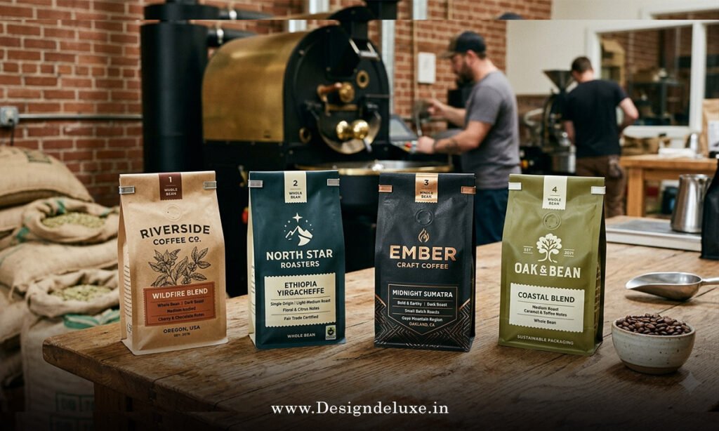
The strongest small roasters usually follow the same pattern: one clear visual idea, repeated well, across the whole line. They use packaging to separate SKUs without making each one feel like a different company.
They also think in systems. A seasonal coffee, a flagship blend, and a reserve single origin should look related, but not identical. That’s how you build recognition without killing variety.
Custom coffee packaging design for small roaster brands in practice
If I were launching a new micro-roaster tomorrow, I’d start with one bag format, two typefaces max, a tight color family, and brutally clear front-panel messaging. Then I’d test the bag on a shelf, in a web store thumbnail, and in a customer’s hand. If it works in all three places, it’s ready.
Key Takeaways
- Custom coffee packaging design for small roaster brands should sell, protect, and clarify in one shot.
- Strong hierarchy beats busy artwork almost every time.
- The bag format should match your sales channel and shipping reality.
- Freshness depends on material selection, seal quality, and valve choice.
- Compliance matters, especially for U.S. labeling and food-contact expectations.linkedin+1
- Clean, scannable layouts help both shoppers and search systems understand the product quickly.backlinko
- Start with one clear packaging system, then scale from there.
- Test mockups before committing to a full print run.
Custom coffee packaging design for small roaster brands works best when it looks sharp, reads fast, and behaves like a real packaging system instead of a pretty wrapper. Nail that, and your bag stops being overhead and starts acting like a sales asset.
FAQs
What is the best packaging format for custom coffee packaging design for small roaster brands?
For most small roasters, a stand-up pouch or flat-bottom bag is the safest starting point because it balances shelf appeal, freshness, and manageable production cost.
How important is sustainability in custom coffee packaging design for small roaster brands?
It matters, but only when it’s real. Choose recyclable or compostable options only if the material, barrier performance, and disposal path actually fit your product and audience.
How do I make custom coffee packaging design for small roaster brands stand out without looking gimmicky?
Use a strong color system, crisp typography, and a clear front-panel hierarchy. One memorable idea executed cleanly beats five ideas fighting each other.