Brand
Brand Identity Basics form the foundation every growing business needs when customers start recognising you by look and feel rather than just by name. Without clear identity, your marketing pieces drift in different directions. One post looks polished, the next feels random, and prospects quietly lose confidence. A solid brand identity stops that drift and makes every visual, message, and interaction feel like it belongs to the same company.
In this article, we’re going to be taking a look at Brand Identity Basics, and how you can define the core elements that make your business memorable and consistent. If you would like to find out more, feel free to read on.
Pic – CC0 License
Why Brand Identity Basics Matter for Everyday Sales
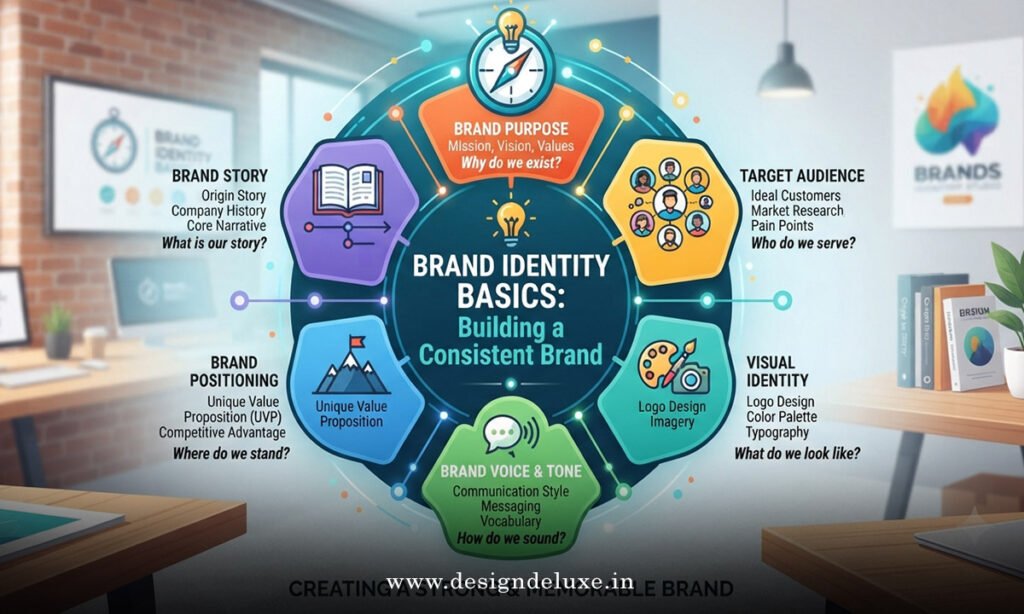
Your brand identity is the collection of visual and verbal signals people use to recognise and trust you. It includes your logo, colours, fonts, imagery style, tone of voice, and the overall personality you project. When these pieces stay aligned, customers form a clear mental picture of who you are. That picture reduces decision friction and supports higher conversion across your website, social channels, and sales materials.
Many entrepreneurs treat identity as a one-time logo project. In reality it works best as a living reference that guides every new piece of content. Once you lock the basics, creating marketing materials becomes faster and more reliable. This approach pairs especially well with the practical steps outlined in our Marketing Design Guide, where visual consistency turns identity into sales support.
Core Elements of Brand Identity Basics
Start with purpose. Write one clear sentence that explains why your business exists beyond making money. This purpose shapes the personality your visuals and words should express. Next choose your primary colours. Limit yourself to two or three main colours plus a couple of supporting neutrals. Record the exact codes so every designer or team member uses the same ones.
Typography comes next. Select one font for headlines and one for body text. Make sure both remain readable on mobile screens and across different platforms. Your logo should work in full colour, single colour, and simplified icon form. Test it small, large, light, and dark so it never disappears or becomes illegible.
Imagery style completes the set. Decide whether your photos feel bright and energetic, calm and minimal, or something else that matches your offer. Write a short note describing the mood, lighting, and subject matter you prefer. These decisions form the practical heart of Brand Identity Basics and keep future work on track.
Creating a Simple Brand Reference Document
You do not need a 40-page brand book. A single page or short PDF works for most small and mid-sized businesses. Include your logo versions, colour palette with codes, font names, a short personality description, and three or four example layouts. Store it where anyone creating content can find it quickly.
Update the document only when a real business change demands it. Frequent tweaks create confusion. Consistency over time builds recognition far more effectively than constant refresh cycles. Share the reference with freelancers, staff, and any agency you work with so every output stays aligned.
For guidance on how people form impressions from visual cues, the research published by the Nielsen Norman Group remains a reliable resource: the impact of visual design on credibility.
Applying Brand Identity Across Channels
Once the basics exist, apply them everywhere customers meet you. Update your website header, social profile images, email signature, and proposal templates first. These high-visibility spots deliver the quickest return. Then move to product packaging, presentation decks, and paid ads.
Keep the same logo treatment, colour ratios, and font pairings across all of them. When a prospect sees your LinkedIn post and later lands on your site, the visual connection should feel instant. That recognition supports trust and shortens the path to purchase. The same principle applies whether you operate in the USA, UK, Australia, Singapore, or Dubai.
Tone of voice belongs here too. Decide whether you sound straightforward and practical, warm and encouraging, or quietly authoritative. Write three short sample sentences that capture the voice and keep them in your brand reference. Visual identity and verbal identity reinforce each other when they stay in step.
Common Mistakes That Weaken Brand Identity
The most frequent error is collecting too many options. Extra colours, extra fonts, and multiple logo variations create inconsistency rather than flexibility. Choose fewer elements and use them well. Another pitfall is ignoring mobile. Most customers first meet your brand on a phone screen, so every element must remain clear at small sizes.
Low contrast between text and background quietly damages readability and trust. Check contrast early and keep it high. Finally, avoid treating identity as finished once the logo is done. Brand identity needs light ongoing attention so new team members and new channels do not drift away from the original plan.
Practical colour and accessibility standards appear in the Web Content Accessibility Guidelines: understanding contrast requirements.
For additional examples of how clear visual systems support marketing performance, HubSpot’s resources on brand consistency offer useful context: building a consistent brand.
Practical Next Steps You Can Take This Week
Audit your current materials. Place your website, recent social posts, and any sales documents side by side. Note every place colours, fonts, or logo treatments differ. Fix the highest-traffic items first. Create or update your one-page brand reference next. Then apply the standards to your social profiles and email templates.
Set a simple rule: nothing new goes live until it matches the reference. This habit prevents slow drift and keeps your presence looking intentional even during busy periods. Over time the consistency compounds, making your business easier to recognise and easier to choose.
We hope that you have found this article enlightening in some way and that these Brand Identity Basics give you a clear, usable foundation for stronger recognition and smoother marketing. Start with the essentials, keep them simple, and let consistency do the quiet work of building trust.