BrandBusiness & Finance
Restaurant Branding & Menu Design: Increase Orders works when your visual identity and menu layout stop acting like a passive list and start guiding guests toward higher-margin choices. Most operators treat the menu as an afterthought. That’s expensive. A tight brand story plus deliberate menu engineering routinely lifts average checks 10-15% on the same traffic and same prices.
Here’s the short version of what matters:
- Branding sets the emotional frame before the first bite.
- Menu design uses placement, language, and pricing psychology to steer orders.
- High-margin items get prime real estate; weak ones get demoted or cut.
- Consistent look and feel across print, digital, and packaging compounds the effect.
- Small, testable changes beat big redesigns that never ship.
The rest of this guide shows exactly how to do it in a U.S. independent or small multi-unit operation in 2026.
Why Restaurant Branding & Menu Design: Increase Orders Still Moves the Needle
Your logo, color system, type, and tone of voice tell guests what kind of place this is before they open the menu. That first impression changes how they read prices and descriptions. A coherent brand makes a $28 entrée feel intentional. A mismatched brand makes the same dish feel expensive.
Menu design then does the quiet sales work. Diners do not read every line. Eyes follow predictable paths—often called the golden triangle—starting upper right, moving across, then down. Put your strongest contribution-margin dishes in those zones. Use short sensory language. Drop the dollar signs. Highlight a couple of “most popular” or “chef’s pick” items. These moves are not tricks. They reduce decision fatigue and surface the dishes that actually pay the rent.
In my experience working with neighborhood spots and small groups, the biggest gains come from combining the two: a clear brand story that makes the menu feel inevitable, plus layout and copy that quietly favor the profitable mix.
The Menu Engineering Matrix That Actually Works
Before you redesign anything, rank every dish by two numbers only: contribution margin in dollars and units sold. Plot them. You get four buckets:
| Category | Margin | Popularity | What to Do |
|---|---|---|---|
| Stars | High | High | Protect placement, keep descriptions sharp, never bury them |
| Plowhorses | Low | High | Raise price carefully, reduce portion cost, or add a premium upgrade path |
| Puzzles | High | Low | Improve name, photo, or description; move to better real estate |
| Dogs | Low | Low | Cut or reinvent completely |
This matrix, refined over decades in hospitality programs, keeps the conversation honest. You stop arguing about “favorite dishes” and start arguing about cash contribution.
Restaurant Branding & Menu Design: Increase Orders — Step-by-Step Action Plan
What I’d do if I walked into your place tomorrow:
- Audit the brand basics in one afternoon.
Pull your logo, website, Instagram, takeout bags, and current menu side by side. Do the colors, type, and tone match? If the menu looks like it belongs to a different restaurant, fix that first. Guests notice inconsistency faster than you think. - Run the matrix on last 90 days of sales.
Export item-level sales and food cost. Calculate true contribution margin (price minus recipe cost). Sort. Identify your real stars and the quiet money-losers. - Rewrite every description.
Lead with the most appealing element. Add one sensory detail and one origin or method cue when it is true. “Grilled salmon” becomes “Cedar-plank wild salmon, lemon-thyme butter, seasonal asparagus.” Keep it under 25 words. Sensory language has been shown in controlled tests to lift orders for the featured item. - Rebuild the layout with intentional hierarchy.
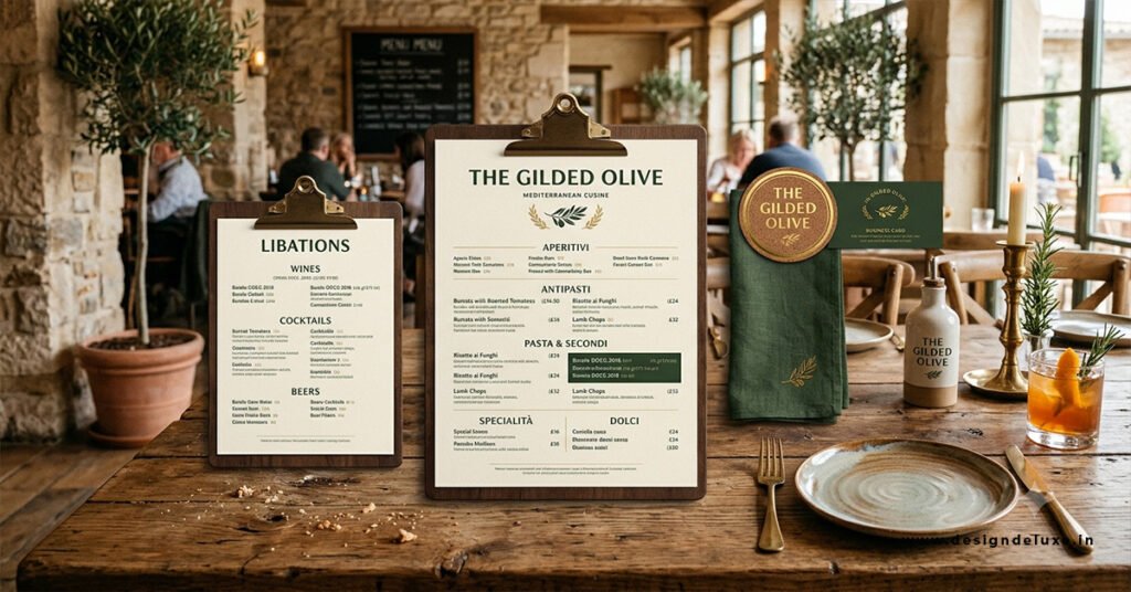
Place 3-5 stars in the upper-right and center zones. Limit categories to a scannable length. Align prices close to the item names instead of in a far-right column that invites pure price shopping. Remove dollar signs—research from Cornell University’s School of Hotel Administration found this alone can raise spending roughly 8 percent in certain settings. - Add visual restraint.
One or two high-quality photos of signature dishes. Simple icons for dietary needs with a clear key. White space is not wasted space; it is breathing room that keeps the eye moving to the items you want sold. - Test one digital version.
QR or tablet menus let you change order, highlight, and track clicks in days instead of weeks. Start with the same hierarchy as the print version so the experience feels consistent. - Measure for 30 days and adjust.
Track average check, mix of stars vs. dogs, and table time. Small tweaks compound.
Common Mistakes & How to Fix Them
Too many items. Decision fatigue is real. Guests slow down and default to safe, lower-margin choices. Cut anything selling fewer than a handful of units a week unless it serves a clear brand or dietary purpose. A tighter menu usually raises both speed and check average.
Everything screams for attention. Boxes, bold type, photos, and “special” callouts on half the page cancel each other out. Pick two or three items to feature. Let the rest stay quiet.
Prices in a neat right-hand column. Eyes drop straight down the numbers. Pull prices next to the dish names so guests read the story first.
Decorative fonts that fail in low light. Script and ultra-thin type look elegant in a mock-up and disappear under restaurant lighting. Stick to highly legible faces at 11-12 pt for body text.
Brand and menu that feel like strangers. If the menu could belong to any restaurant, the branding work is unfinished. Carry the same color, type hierarchy, and voice from the front door to the last page.
Pricing Psychology That Supports the Brand
Price anchors work. Put one genuinely high-ticket item near the dishes you want to move. The mid-range options suddenly feel reasonable. Charm pricing ($19 instead of $20) still helps in casual concepts; whole-dollar pricing often feels cleaner in upscale rooms. Bundles and set menus reduce the “pain of paying” by collapsing multiple decisions into one.
None of this replaces solid food cost control. It multiplies the effect of the control you already have.
Digital and Physical Consistency in 2026
Guests bounce between Google, delivery apps, your website, and the table. The brand must travel. High-quality photos of the same hero dishes across platforms reinforce recognition. QR menus should feel like a natural extension of the printed piece, not a different restaurant. When the visual language stays consistent, trust rises and decision speed improves.
For deeper reading on the research side of pricing presentation, the Cornell University School of Hotel Administration studies on menu psychology remain foundational. Industry operators also track broader trends through the National Restaurant Association resources on consumer behavior. Practical layout guidance that stays current appears in many hospitality design references, including work summarized by Restaurant Business Online.
Key Takeaways
- Rank dishes by contribution margin and popularity before you redesign anything.
- Put stars in the natural eye-path zones and give them the strongest language.
- Remove dollar signs and avoid pure price-column layouts.
- Keep the brand voice, colors, and type consistent from logo to menu to packaging.
- Cut low-performing items ruthlessly; decision fatigue kills average checks.
- Test one change at a time and measure for 30 days.
- Treat the menu as the most important piece of real estate on the table.
Restaurant Branding & Menu Design: Increase Orders is not about making the menu prettier. It is about making the profitable path the easiest path for the guest. Start with the matrix this week. Rewrite three star descriptions. Move those items into better positions. Track the next thirty days of average check. The numbers will tell you whether to push further or adjust. Most operators who run this process cleanly see the lift inside the first month.
FAQs
How does Restaurant Branding & Menu Design: Increase Orders actually work in a busy service?
It works by reducing decision fatigue and guiding eyes toward high-margin dishes through placement, sensory language, and consistent branding. Guests order faster and choose items that protect your food cost instead of defaulting to the cheapest or safest option.
Can small independent restaurants see real results from Restaurant Branding & Menu Design: Increase Orders without a big budget?
Yes. Most gains come from ranking dishes by contribution margin, rewriting three or four descriptions, moving stars into better positions, and removing dollar signs. These changes cost almost nothing and usually show up in average check within 30 days.
What’s the fastest way to test Restaurant Branding & Menu Design: Increase Orders on a digital menu?
Start with the same hierarchy as your print menu, add clear “Most Popular” or “Chef’s Pick” labels on two stars, and track which items get tapped most over two weeks. Adjust placement based on the data before reprinting physical menus.