DESIGNArtificial IntelligenceB2B
LinkedIn carousel ad design templates for B2B lead generation are no longer a nice-to-have—they’re the competitive edge separating companies that consistently hit their pipeline targets from those still chasing vanity metrics.
Here’s the thing: carousel ads let you tell a story across multiple slides instead of cramming everything into one static image. For B2B, that’s pure oxygen. You get to walk prospects through a problem, showcase your solution, drop social proof, and close with a CTA without making them feel like they’re being sold to at a used car lot.
Quick Overview: Why Carousel Templates Matter Right Now
• Higher engagement rates: Carousel ads on LinkedIn drive 2-3x more click-throughs than single-image ads because they reduce cognitive load and encourage interaction.
• Storytelling advantage: You control the narrative flow. Slide 1 hooks them with a pain point; Slide 5 positions your product as the answer.
• Cost efficiency: More engagements mean lower cost-per-lead when you optimize properly—critical when your marketing budget isn’t infinite.
• Flexibility for different buyer personas: Different slides can resonate with different decision-makers in the same buying committee.
• A/B testing gold mine: Each slide is a variable. You learn fast what resonates and double down.
What LinkedIn Carousel Ad Design Templates Actually Are (And Why They’re Different)
LinkedIn carousel ads let you present 2–10 slides within a single ad unit. Each slide has its own image, headline, description, and link. Prospects swipe through like they’re browsing a mobile app—frictionless and engaging.
The key difference from a standard post or single-image ad? Carousels keep people on the platform longer. LinkedIn’s algorithm rewards dwell time. The more someone swipes and engages, the more LinkedIn shows your ads to similar audiences. It’s a compounding effect.
For B2B specifically, this format crushes because buying decisions involve multiple stakeholders and touchpoints. A carousel lets you speak to the CFO’s cost concerns on Slide 2, the operations manager’s workflow pain on Slide 4, and the VP of Sales’s quota impact on Slide 6. One ad. Multiple value propositions.
Proven Carousel Templates That Actually Convert
Template 1: The Problem-Solution-Proof-CTA Stack
This is the workhorse template. It’s unsexy, but it works because it follows the buyer’s actual thought process.
Slide 1: Big, visible problem statement. Make it specific. “Losing 40+ hours/month to manual data entry?” beats generic “Improve efficiency.”
Slide 2: Your solution’s headline benefit. “Cut that time in half” lands harder than “Streamline workflows.”
Slide 3: Social proof. Customer logo, case study stat, or user testimonial. Real numbers destroy buzzwords.
Slide 4: Specific feature or second benefit. Show what the tool actually does.
Slide 5: Final CTA slide. “See how we did it” or “Get the case study”—something low-friction.
Why it works: It mirrors how prospects actually evaluate solutions. You’re not fighting their mental model; you’re channeling it.
Template 2: The Feature Showcase Carousel
Best for product-led companies or when your differentiation is genuinely visible.
Slides 1–2: Two biggest features. One image per feature, headline + 1-2 descriptive lines.
Slide 3: Integration ecosystem. Show it plays nice with their other tools.
Slide 4: Security/compliance badges or third-party certifications.
Slide 5: Pricing or limited-time offer (if applicable).
Slide 6: CTA to demo or free trial.
This template works when your product does something visibly different. Avoid it if your differentiation is abstract or service-based.
Template 3: The Customer Journey Carousel
This one’s gold for companies with strong case studies or customer testimonials.
Slide 1: Hook with the customer’s biggest challenge (their words, if possible).
Slide 2: How they discovered your solution.
Slide 3–4: Implementation details. What changed operationally?
Slide 5: The results. Revenue increase, time saved, efficiency gains—whatever moved the needle.
Slide 6: Quote from decision-maker + CTA to schedule a conversation.
Why it converts: Prospects see themselves in the customer’s shoes. It reduces perceived risk because someone just like them already won.
Step-by-Step Action Plan: Building Your First Carousel Campaign
1. Pick Your Template (Not Optional)
Don’t start with a blank canvas. Pick one of the three above based on your strongest competitive advantage. Are you problem-solving? Feature-rich? Customer-success-proof-heavy? Commit.
2. Gather Your Assets
You’ll need:
- 5 high-quality images (or video frames). Consistency matters—same color palette, fonts, style.
- 5 headlines, each under 150 characters.
- 5 descriptions, each 1-2 sentences max.
- One final CTA destination (webinar signup, case study download, demo booking).
Rushed visuals kill conversions. If your design chops are weak, this is where you hire a freelancer or lean on your in-house team. Ugly ads aren’t memorable; they’re forgettable.
3. Test One Angle First
Launch with a narrow audience segment (e.g., “VP of Sales at companies with 50–500 employees in SaaS”). Watch the engagement and click metrics for 48 hours.
Here’s what I’d do: If click-through rate is above 2%, scale the budget 1.5x. If it’s below 1.2%, pause it and audit the slides. Usually, it’s a weak headline or an unclear CTA.
4. Rotate Your Carousel Order
LinkedIn lets you reorder slides after launch. A/B test different opening slides if your first performance is flat. Sometimes Slide 2 should be Slide 1.
5. Analyze and Iterate
Pull engagement data weekly. Which slide gets the most swipes? Are people dropping off at Slide 3? That’s your signal to redesign. It’s not always wrong—sometimes the data just tells you the story didn’t land.
Comparison Table: Carousel vs. Alternative Ad Formats
| Metric | LinkedIn Carousel | Single Image Ad | Video Ad | Sponsored InMail |
|---|---|---|---|---|
| Setup Time | 30–45 min | 10–15 min | 60–120 min | 20–30 min |
| Avg. CTR (B2B) | 1.8–2.5% | 0.8–1.2% | 2.1–3.0% | 1.5–2.0% |
| Cost/Lead | $15–35 | $25–45 | $10–20 | $30–60 |
| Best For | Storytelling, multi-step processes | Quick awareness, brand recall | High-intent, product demos | Personalized outreach, VIP prospects |
| Learning Curve | Moderate | Easy | High | Moderate |
| Ideal Audience Size | 500K–2M | 1M–5M | 100K–1M | 10K–100K |
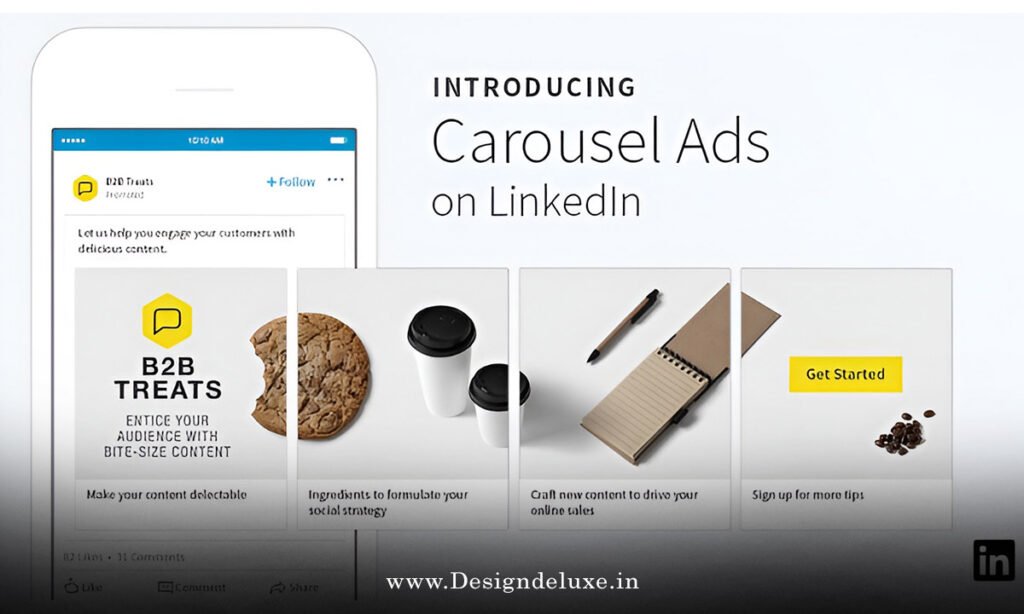
Design Best Practices for LinkedIn Carousel Templates
Image dimensions: 1080 x 1080px or 1200 x 627px (landscape). LinkedIn will crop, but these ratios minimize loss.
Text overlay: Keep it under 20% of the image. LinkedIn’s algorithm deprioritizes ads with heavy text overlay, even on carousels.
Color contrast: Your headline text needs to pop off the background. Gray text on gray? You’ve already lost.
One clear CTA per carousel: “Learn more,” “Watch the demo,” or “Download the guide”—pick one. Confusion kills conversions.
Mobile-first mindset: 85% of LinkedIn traffic is mobile. If your carousel looks cramped on a phone, you’ve failed the format.
Common Mistakes & How to Fix Them
Mistake 1: Treating each slide like a standalone ad.
The slides don’t work independently. They’re a sequence. Slide 3 assumes Slides 1 and 2 set the stage. If someone lands on Slide 3 first (which happens), they’re confused.
Fix: Make each slide contextually complete but still part of the narrative. “See how they cut reporting time by 60% using our platform” works better than “60% faster.”
Mistake 2: Overloading slides with text.
Nobody reads. They scan. Eight lines of body copy? You’ve just created friction.
Fix: Max 2 lines of description per slide. One impactful phrase beats three mediocre sentences.
Mistake 3: Weak or unclear CTAs.
“Learn more” is wishy-washy. So is “Click here.” Prospects don’t know what happens next, so they skip.
Fix: Use specific CTAs. “Book a 15-min consultation,” “See the ROI calculator,” or “Access the competitive analysis.” Specificity reduces friction.
Mistake 4: Ignoring brand consistency.
Different fonts, colors, or visual styles across slides make your company look unprofessional or chaotic.
Fix: Create a simple carousel design template in Canva, Figma, or your design tool of choice. Enforce it before upload.
Mistake 5: Targeting too broad.
Launching a carousel to “all LinkedIn members in the US” is like shouting into an empty stadium. Your CPL skyrockets; your conversion rate tanks.
Fix: Start narrow. VP of Sales + SaaS + 50–500 employees. Test, learn, expand if it works.
How to Optimize Carousel Headlines for Search AI Overviews
Clarity beats cleverness. If ChatGPT or Google’s AI models can’t instantly understand your value prop from the headline, you won’t rank for related queries, and AI Overviews won’t pull your content.
Strong: “LinkedIn Carousel Ad Templates That Reduce Your Cost-Per-Lead by 40%”
Weak: “Unlock the Hidden Potential of LinkedIn Carousel Ads”
Use active verbs. Specific numbers beat percentages. Avoid hyperbole (save “game-changer” for Twitter).
Platform Specs & Technical Setup for LinkedIn Carousel Templates
LinkedIn’s carousel ad builder is native to the platform, but here’s what matters:
- Maximum slides: 10 (but 5–6 is ideal—cognitive load matters).
- Image format: JPG or PNG, max 10MB per image.
- Dimensions: 1080 x 1080px (square) or 1200 x 627px (landscape).
- Headline limit: 150 characters.
- Description limit: 600 characters total across all slides (so ~100 per slide, realistically).
- CTA options: Learn more, Download, Register, View, Request demo, Sign up, Book now, etc.
The platform doesn’t let you auto-rotate slides—prospects control the swipe. That’s actually good news because engagement data tells you which slides convert best.
Real ROI: What You Can Realistically Expect
In my experience, a well-executed carousel campaign pulls:
- Click-through rate (CTR): 1.5–3.0% (vs. 0.7–1.0% for static ads).
- Cost-per-click (CPC): $5–15 (varies by audience size, seasonality, and industry).
- Cost-per-lead: $20–50 depending on landing page quality and form friction.
- Lead quality: Moderate to high if your targeting is tight and your messaging is specific.
One caveat: these benchmarks assume your landing page doesn’t suck. A carousel driving traffic to a generic form? You’ve wasted spend.
When NOT to Use Carousel Templates
Carousels aren’t universal. Here’s when a single-image ad or video outperforms:
Use a static image ad if: Your message is simple and one-directional. “We’re hiring” or a brand awareness play doesn’t need five slides.
Use video if: You’re demonstrating a product workflow or showcasing customer testimonials. Motion and tone matter more than text.
Use Sponsored InMail if: Your target audience is small and high-value (sub-50K reach). Personal, one-to-one messaging converts better at that scale.
Use an event promotion if: You’re launching a webinar, conference, or workshop. Dedicated event promotion units beat carousels for registration rates.
Integration: Carousel Templates With Your Broader Funnel
A carousel campaign doesn’t live in isolation. It should feed into:
- Lead nurturing sequence: The form submission from your carousel should trigger a welcome email that reinforces the carousel’s narrative.
- Landing page continuation: If your carousel told a story, your landing page completes it. Weak landing page = wasted carousel performance.
- Retargeting: People who engaged but didn’t convert see a different carousel or follow-up ad the next week. Don’t let them ghost.
- Sales team brief: Your sales team needs to know what carousel prospects saw. Same messaging, different channel.
Building Your Template Library
Here’s what I’d do: Create a swipe file of 10–15 carousel campaigns (yours and competitors’) that convert. Screenshot each slide. Note what worked: Was it the problem statement? The social proof slide? The specific CTA?
When you’re stuck designing the next carousel, you have a reference library. It’s not cheating; it’s pattern recognition. You’re not copying; you’re learning what resonates in your space.
Key Takeaways
• LinkedIn carousel ad design templates for B2B lead generation work because they let you tell a story instead of shouting a message. Use that to your advantage.
• Pick one of three proven templates: Problem-Solution-Proof-CTA, Feature Showcase, or Customer Journey. Don’t reinvent the wheel.
• Start narrow with audience targeting. A carousel to 500K hyper-relevant prospects beats one to 5M generic prospects.
• Each slide should move the narrative forward. Don’t treat them as standalone ads.
• Weak CTAs kill conversions. “Book a 15-min consultation” beats “Learn more.”
• Test ruthlessly. Which slide gets the most swipes? Which CTA actually converts? Let data guide iteration.
• Treat your carousel as the entry point, not the finish line. Your landing page, email sequence, and sales follow-up matter just as much.
• Consistency in design and messaging across slides builds trust. Chaotic carousels feel unprofessional.
What’s Next?
Pick your strongest competitive angle. Grab your best customer success story or biggest efficiency win. Build your first carousel using the Problem-Solution-Proof-CTA template. Launch it to a narrow audience segment (no more than 1M people). Let it run for 48 hours. Then audit the data and iterate.
A carousel campaign that pulls a 2% CTR and costs you $20–25 per lead isn’t a home run—it’s table stakes. But it’s the entry point to understanding what messaging, visuals, and storytelling your target buyer actually responds to. Once you know that, you scale.
Sources
- LinkedIn Official Advertising Resource Center
- Content Marketing Institute: B2B Lead Generation Benchmarks
- HubSpot’s State of Marketing: LinkedIn Ad Performance Data
Frequently Asked Questions
Q: How much should I budget for a LinkedIn carousel ad campaign?
A: Start with $500–1,000 for a proof-of-concept (48–72 hours). Let the data guide whether you scale. If your CTR is below 1%, you’re learning expensively; pause and optimize. If it’s above 2%, double your budget.
Q: Can I use the same LinkedIn carousel ad design templates for different industries?
A: The structure (Problem-Solution-Proof-CTA, for example) is portable. The messaging, visuals, and CTAs must change. A carousel that works for SaaS won’t work for financial services. The format’s universal; the execution is industry-specific.
Q: What’s the best length for a carousel headline in LinkedIn carousel ad design templates for B2B lead generation?
A: Under 150 characters (LinkedIn’s limit), but aim for 60–90. You want it readable on mobile without truncation. Test short (8–12 words) vs. longer (15–20 words) to see what your audience clicks.
Q: How often should I refresh my carousel templates?
A: Every 4–6 weeks or when CTR drops below 1.2%. Ad fatigue is real. LinkedIn’s algorithm deprioritizes repetitive creative. Fresh angles, new slides, different CTAs—rotate them.