Brand PackagingDESIGN
Packaging design for retail success is not about making a product look pretty on Instagram. It is about winning the three-second battle on a crowded shelf, surviving retailer scrutiny, and turning browsers into buyers without a salesperson in sight.
In physical retail the package is the salesperson, the billboard, and the first product experience all at once. Get the size, shape, hierarchy, and materials wrong and even a great product stays invisible. Get them right and velocity climbs fast.
One of the clearest proofs sits in the Case Study: How Design Rebranding Increased Sales 300%. A frozen-food brand swapped an awkward bucket for a standard rectangular box. Same recipe. Same price. Sales jumped threefold because retailers could finally stock it efficiently and shoppers could finally find it.
That is packaging design for retail success in action: solving real distribution and decision friction instead of chasing awards.
Why Packaging Still Decides Winners in 2026
Retail space is finite. Buyers allocate it based on what moves and what fits. A package that does not stack, faces poorly, or fails to communicate the core benefit in under three seconds gets limited placement or none at all.
Digital has not replaced this pressure. Omnichannel shoppers still discover products in stores, then complete the purchase online—or vice versa. The physical package has to work in both worlds. It has to look sharp in a photo and function in a freezer case or end-cap.
McKinsey’s long-running design research continues to show that companies treating design as a business system (not decoration) outperform peers on revenue growth. Packaging is the most immediate expression of that system at the point of sale.
The Non-Negotiables of Packaging Design for Retail Success
1. Format first, graphics second
Retailers care about cube efficiency. Square and rectangular formats win over irregular shapes in almost every category that uses standard gondolas or freezers. If your package wastes space or requires special handling, expect resistance. The 300% sales jump referenced earlier started with this exact change.
2. Instant hierarchy
Shoppers do not read. They scan. Put the product name, key benefit, and category cue in the primary visual zone. Secondary claims and brand story can live lower. Test this by squinting at a mockup from six feet away. If the main message disappears, redesign.
3. Material and structural honesty
Premium perception comes from feel and function, not just ink. A flimsy box that collapses on the shelf kills trust. A heavy glass jar that costs too much to ship kills margin. Match material to category expectations and logistics reality.
4. Consistency across the line
When a brand has multiple SKUs, the system must feel related without looking identical. Color coding, consistent logo placement, and shared structural language help shoppers find their variant quickly and help retailers plan planograms.
5. Regulatory and practical compliance
Nutrition panels, warnings, barcodes, and recycling symbols are not afterthoughts. Design them in from the start so they do not wreck the visual hierarchy later.
Practical Process for Brands That Want Results
Start with the constraint that is already costing you sales. Walk the store. Photograph the competitive set. Talk to the category manager if you can. Ask what makes a package easy or hard to stock and merchandise.
Then brief the designer with those constraints, not mood boards alone. Require physical prototypes that fit real shelf dimensions and shipping cases. Run a simple shelf test: place your mockup among competitors and ask people to find the product that matches a specific claim. Time them.
Launch the new packaging with matching updates to the website, sales sheets, and social assets. Inconsistent signals dilute the lift.
Track the metrics that matter to retailers: unit velocity, distribution points gained, and out-of-stocks reduced. Brand-awareness scores can wait.
Common Packaging Mistakes That Kill Retail Performance
- Designing only for the primary face and ignoring side and back panels that shoppers actually see when the product is rotated or stacked.
- Overloading claims so nothing stands out.
- Choosing a unique shape that looks distinctive in a design review but cannot be efficiently palletized or fitted into existing fixtures.
- Ignoring the “shopper from the aisle” view. What looks good on a conference table often fails under fluorescent lights from three feet away.
- Updating the package without updating the rest of the brand system, so the new look feels orphaned.
Table: Quick Diagnostic for Packaging Effectiveness
| Factor | Weak Signal | Strong Signal | Retail Impact |
|---|---|---|---|
| Shape & size | Irregular, hard to stack | Standard footprint, efficient cube | Better placement, lower resistance |
| Visual hierarchy | Busy, competing elements | Clear primary benefit in 1–2 seconds | Higher findability |
| Material & structure | Feels cheap or over-engineered | Matches category + logistics reality | Trust + margin protection |
| Line consistency | Each SKU looks unrelated | Cohesive system with clear differentiation | Faster shopper navigation |
| Compliance integration | Labels fight the design | Required info designed in cleanly | Avoids last-minute compromises |
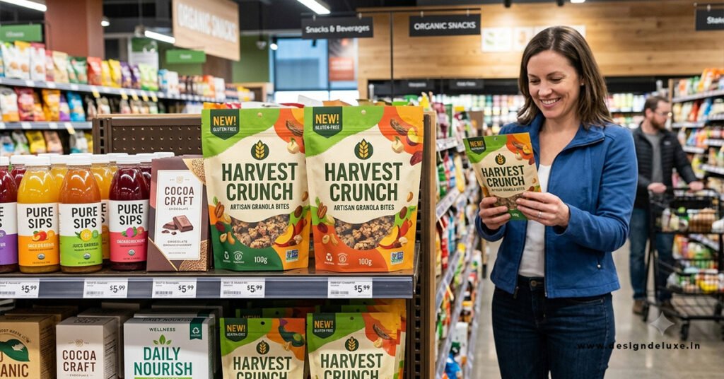
Real-World Signal, Not Theory
The packaging redesign that produced the documented 300% sales increase did not invent a new product. It removed the reason retailers limited distribution. Once the product could sit where shoppers expected it, the existing demand finally showed up in the numbers.
That pattern repeats across categories. When packaging aligns with how retail actually works—stocking, facing, scanning, and deciding—sales respond. When it fights those realities, even strong brands underperform.
Key Takeaways for Packaging Design for Retail Success
- Solve the physical and decision friction first. Graphics come second.
- Standard formats usually outperform unique shapes on velocity and distribution.
- Hierarchy that works from six feet away beats clever but quiet design.
- Consistency across SKUs and channels multiplies any single improvement.
- Measure placement and unit movement, not just aesthetic approval.
- Prototypes that fit real shelves and cases prevent expensive surprises.
- The biggest documented lifts often come from operational packaging changes rather than pure visual refreshes.
Packaging design for retail success is a commercial discipline. Treat it that way and the shelf starts working for you instead of against you. Start with the constraint that is already limiting sales, fix it cleanly, and the numbers follow.
Conclusion
Successful retail packaging is both a silent salesperson and a functional tool. By combining strong shelf visibility, consistent branding, practical structure, clear communication, and retailer-ready compliance, brands can turn packaging into a powerful driver of sales, loyalty, and long-term shelf presence. Design with the real store environment in mind, test thoroughly, and balance creativity with operational realities for the best results.
FAQs
1. What makes packaging stand out on a crowded retail shelf?
Bold, distinctive color ownership, high contrast, a unique shape or silhouette, clear large typography for key messages, and designs tested in realistic competitive shelf settings so the product is recognizable from several feet away.
2. How important is sustainability in modern retail packaging?
Very important. Many retailers and consumers prefer recycled content, monomaterials, plastic-free options, or FSC-certified materials. Sustainable choices can strengthen brand perception and help meet retailer requirements, but they must still deliver protection and shelf performance.
3. Should packaging be designed differently for retail vs. direct-to-consumer?
Yes. DTC packaging often prioritizes unboxing experience and shipping durability. Retail packaging must excel at shelf visibility, fit retailer planograms, include proper barcodes and compliance features, and convert browsers into buyers in seconds under store lighting and competition.