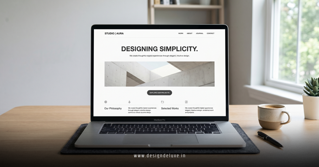
Minimalist Web Design Trends 2026 continue to reshape digital experiences. Clean interfaces cut through the noise. They deliver speed, clarity, and quiet confidence that users crave.
- Neo-minimalism adds warmth and subtle humanity to classic restraint.
- Generous white space, bold typography, and purposeful micro-animations dominate.
- Designs prioritize performance, mobile perfection, and emotional connection.
- Expect warmer neutrals, organic touches, and motion that guides rather than distracts.
This evolution feels refreshing in an overloaded web. Brands choose less to say more. Results? Lower bounce rates, stronger trust, and better conversions.
Why Minimalist Web Design Trends 2026 Matter Right Now
Attention is fractured. Users decide in under three seconds. Minimalist approaches win by removing friction. They let content and products shine without visual competition.
Here’s the thing: Pure cold minimalism from the 2010s feels dated. 2026 favors neo-minimalist web design social media ads banner motion graphics — a warmer, more intentional evolution that feels premium yet approachable.
It balances ruthless simplicity with human touches like soft textures, earthy tones, and kinetic details.
Core Minimalist Web Design Trends 2026
Several directions define the year. Each builds on core principles of restraint while adapting to AI tools, performance demands, and user expectations.
Expansive White Space and Breathing Room
Space isn’t wasted—it’s strategic. Generous negative space directs eyes, reduces cognitive load, and creates luxury feel. Layouts feel open even on small screens.
Warm Neutrals and Tonal Harmony
Goodbye sterile whites and grays. Hello creams, soft sages, warm beiges, and limited accent pops. These palettes feel inviting without sacrificing clarity.
Bold, Hierarchical Typography
Fewer fonts. Bigger impact. Mix crisp sans with humanist serifs for headlines. Variable fonts allow dynamic scaling in motion. Text becomes interface.
Purposeful Micro-Interactions and Motion
Subtle animations guide users. Hover states, scroll reveals, and looping elements add life. Keep them under 300ms and performance-friendly. Motion enhances without overwhelming.
Adaptive Dark Modes and Performance Focus
Seamless light/dark switching. Ultra-light code. Fast loads remain non-negotiable. Minimal designs naturally excel here.
Step-by-Step Action Plan to Implement These Trends
Beginners and intermediates can adopt these trends fast.
- Audit your current site: Strip one section to essentials. Note what feels lighter.
- Pick a warm palette: Limit to 2-3 tones. Test on actual devices.
- Redesign with grids: Use generous padding and alignment. One focal element per viewport.
- Add purposeful motion: Prototype micro-animations in Figma. Export lightweight Lottie files.
- Optimize relentlessly: Compress assets. Test Core Web Vitals. Mobile first, always.
- Gather feedback: Run quick user tests. Iterate based on real behavior.
What I’d do if refreshing a site today: Start with the homepage hero. Nail space, typography, and one signature animation. Scale from there.
Comparison Table: Minimalist vs Other 2026 Approaches
| Aspect | Minimalist (Neo) Trends 2026 | Maximalist / Bold Trends | Best For |
|---|---|---|---|
| Load Speed | Excellent, lightweight | Heavier due to layers | Performance-focused sites |
| User Focus | Laser-sharp on content | Immersive storytelling | SaaS, e-commerce |
| Emotional Feel | Calm confidence, trust | Energy, excitement | Brands seeking authority |
| Maintenance | Simple, scalable | Complex updates | Long-term projects |
| Conversion Impact | High clarity drives action | High engagement but potential distraction | Most business goals |
Neo-minimalist approaches often win for sustained results.
Common Mistakes & How to Fix Them
Many jump in and create “minimal” that’s actually empty or bland.
Mistake 1: Too much subtraction. Fix: Add one warm texture or subtle serif. Test for personality.
Mistake 2: Ignoring motion entirely. Fix: Introduce 1-2 micro-interactions. They boost engagement significantly.
Mistake 3: Desktop-only thinking. Fix: Design mobile-first. Ensure white space works at every breakpoint.
Mistake 4: Cold color schemes. Fix: Shift to off-whites and earth tones for instant approachability.
Review on real devices. Ask: Does this feel calm or barren?
Advanced Tips for 2026
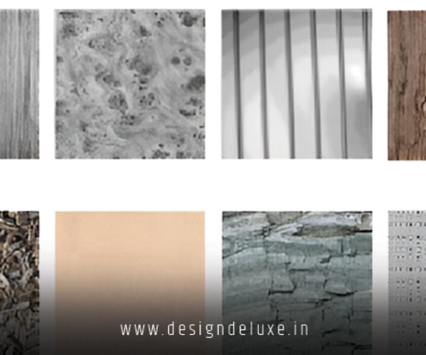
Layer subtle grain or paper-like textures for tactility. Experiment with organic shapes breaking strict grids. Use AI tools for rapid prototyping while keeping human oversight on final polish.
For social extensions, explore Neo minimalist web design social media ads banner motion graphics — they translate beautifully from full sites to quick-scrolling formats.
Key Takeaways
- Minimalist web design trends 2026 emphasize warmth over cold sterility.
- White space and typography carry more weight than ever.
- Motion adds soul when used with restraint.
- Performance and accessibility are table stakes.
- Neo-minimalism bridges simplicity and humanity perfectly.
- Test early, iterate often, measure real user behavior.
- Less truly delivers more in engagement and trust.
- Start small on one page or campaign element.
Minimalist designs in 2026 feel like a quiet conversation in a loud party. They draw people in and keep them there.
Ready to apply these? Pick one trend above. Sketch a new hero section this week. Your users — and search rankings — will notice the difference immediately.
FAQs
What makes neo-minimalism different in minimalist web design trends 2026?
It adds warmth, textures, and subtle motion to classic clean lines, creating designs that feel premium and human rather than stark.
How do these trends impact social media and ads?
They translate directly into high-performing neo minimalist web design social media ads banner motion graphics — clean, fast-loading assets that stop scrolls effectively.
Can small businesses adopt minimalist web design trends 2026 easily?
Yes. Start with free tools like Figma, focus on space and typography first, then layer motion. Results compound quickly with minimal ongoing effort.