Banner DesigningBrand
LinkedIn banner design templates for professional personal branding aren’t just decorative—they’re your digital handshake. In 2026, where profile views happen in milliseconds, your banner is doing heavy lifting before anyone reads a single word about your skills or experience.
Here’s the thing: your LinkedIn profile is a billboard, and that banner is the first thing people see. Get it right, and you’re positioning yourself as intentional, professional, and worth their attention. Get it wrong, and you’re invisible in a sea of default blue.
Why LinkedIn Banner Design Templates Matter (Right Now)
Quick Win Overview:
- First-look psychology: Recruiters and connections form impressions in under 3 seconds—your banner carries that burden
- Brand consistency: Templates keep your visual identity aligned across your professional ecosystem
- Time efficiency: Pre-built structures mean no design paralysis; you’re live in minutes, not weeks
- Conversion boost: A polished banner increases profile click-throughs by signaling professionalism and intentionality
- Mobile dominance: 2026 traffic is overwhelmingly mobile; templates ensure your banner renders clean on every device
Your banner isn’t vanity. It’s infrastructure.
What Makes a LinkedIn Banner Template Actually Work?
The best LinkedIn banner design templates for professional personal branding follow a specific blueprint. They balance visual impact with readability, personality with professionalism, and uniqueness with simplicity.
The anatomy of a high-performing banner:
Dimensions & Technical Reality — LinkedIn banners display at 1500×500 pixels on desktop and scale responsively on mobile. Most people design at that spec, then watch it compress into a tiny strip on phones. The kicker is: mobile users represent roughly 75% of LinkedIn’s traffic. Templates that account for this squish-factor keep your message legible everywhere.
Visual Hierarchy — A template worth its salt puts your key message in the center 60% of the canvas. Edge elements? They get cropped. The rule I follow: if critical text vanishes when you shrink the image to 50% width, redesign it.
Color Psychology & Contrast — Vibrant banners stand out; muddy ones disappear. But neon doesn’t equal professional. Templates that use one dominant color plus 1–2 accent colors, layered over clean typography, hit the sweet spot. High contrast (dark text on light, or vice versa) ensures your banner reads even in bright sunlight on mobile.
Whitespace & Breathing Room — Cramped banners feel desperate. Templates with generous margins and negative space communicate confidence and clarity. It’s counterintuitive: less stuff, more impact.
The Core Categories: What You’re Actually Choosing Between
| Template Type | Best For | Visual Approach | Customization Effort | Best Industry Fit |
|---|---|---|---|---|
| Minimalist/Monochrome | Executives, consultants, legal | Single color + typography focus | Low (mostly text swap) | Finance, Law, Consulting |
| Industry-Specific Graphics | Creative, tech, marketing | Icon-driven or illustration-based | Medium (swap out icons/colors) | Design, SaaS, Social Media |
| Photo-Overlay Templates | Personal brands, coaches, speakers | Your headshot or lifestyle photo + transparent overlay | Medium-High (requires decent photo) | Coaching, Sales, Thought Leadership |
| Abstract/Modern Geometric | Startups, product managers, innovators | Gradient, shapes, dynamic composition | Medium (color + text customization) | Tech, Product, Startups |
| Company-Aligned | Employees emphasizing employer brand | Company colors, logo integration, branded assets | Low (mostly locked templates) | Corporate roles, HR, Recruiting |
Each category comes with trade-offs. You gain speed and consistency; you sacrifice granular design control.
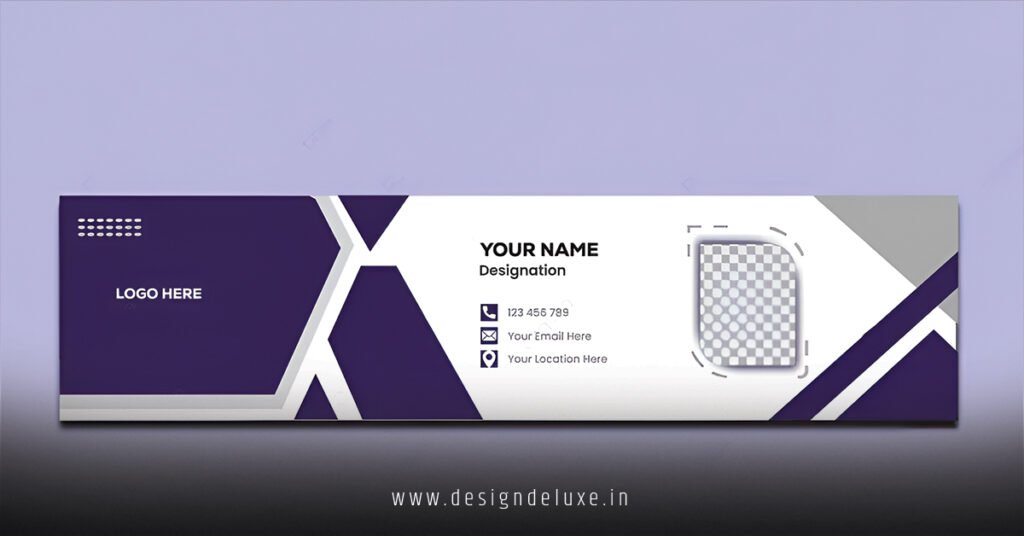
Getting Started: Your Step-by-Step Action Plan
Step 1: Audit Your Current Situation — Open your LinkedIn profile on mobile and desktop. Take a screenshot. Is your current banner memorable? Does it communicate anything about who you are or what you do? Most people run the default LinkedIn color. You’re not most people.
Step 2: Define Your Brand Angle — Before you touch a template, answer this: What’s the one thing you want people to know about you in 3 seconds? “Senior Product Manager driving growth” or “Executive Coach for scaling leaders” or “AI consultant specializing in enterprise implementation”? Your banner message flows from this.
Step 3: Choose Your Template Source — Options:
- LinkedIn’s official brand center — Pre-approved templates that match LinkedIn’s design language; high trust, minimal customization
- Canva Pro — Thousands of LinkedIn templates, drag-and-drop editor, most beginner-friendly; requires ~$10/month or free tier limited options
- Custom design tools — Figma, Adobe Express, or hire a designer if you want full control (budget $200–$2,000 depending on complexity)
Step 4: Customize Without Over-Customizing — Swap text, adjust colors to match your brand (or use LinkedIn’s official color palette as default), add your headline or value proposition. Keep it to 5–7 words maximum. Readable at thumbnail size. Done.
Step 5: Test Across Devices — Download your final banner. Upload it to LinkedIn. Check it on your phone. Check it on a laptop. Check it in incognito mode (removes any cached rendering). If text is blurry, colors are muddy, or your message is cut off, iterate.
Step 6: Set a Refresh Calendar — Your banner isn’t permanent. Seasonal pivots (new role, new service offering), campaign tie-ins (thinking of publishing an industry report?), or just visual freshness every 6–12 months keeps your profile current.
Common Mistakes & How to Fix Them
Mistake #1: Overcrowded Design
The temptation is real—pack in your job title, your company, your tagline, maybe a testimonial snippet. Your banner becomes a cluttered infographic nobody can parse.
The fix: One primary message. One visual focal point. Everything else is supporting player, not star.
Mistake #2: Unreadable Typography
Tiny fonts, low contrast, ornate typefaces that look good at poster size but become pixelated mud on mobile.
The fix: Use sans-serif fonts (Arial, Helvetica, or modern equivalents like Inter or Poppins). Minimum font size for body text: 36px when designing at 1500px width. Headlines: 60px+. Test on mobile before publishing.
Mistake #3: Misaligned Personal vs. Corporate Branding
Your template is corporate blue and geometric; your profile bio is casual and creative. Disconnect erodes trust.
The fix: Visual consistency doesn’t mean sterile. Your banner should reflect your actual professional personality. If you’re warm and approachable, your template should whisper that. If you’re no-nonsense and data-driven, your template should show it.
Mistake #4: Using Outdated or Clichéd Stock Images
That “diverse team celebrating success” photo? Overused. Your banner competes with thousands using the same image.
The fix: Use original photography if you have it. If you’re using stock, go niche: specialized imagery from platforms like Unsplash or Pexels that align with your specific expertise, not generic business vibes.
Mistake #5: Ignoring Platform Updates
LinkedIn adjusts rendering periodically. A banner that looked perfect in 2024 might display strangely in 2026.
The fix: Check LinkedIn’s current specifications annually. Revisit your banner design if you notice it rendering differently than expected.
Comparing Template Resources: A Quick Breakdown
| Resource | Cost | Ease of Use | Customization | Quality | Best For |
|---|---|---|---|---|---|
| LinkedIn Brand Center | Free | Easy | Limited | High | Staying on-brand |
| Canva Pro | $120/year | Very Easy | High | Medium-High | Quick iterations |
| Figma | Free tier; $12/mo Pro | Medium | Very High | Depends on user | Power users |
| Fiverr/Upwork Designers | $200–$1,500 | N/A (outsourced) | Very High | Variable | Custom, polished look |
| Adobe Express | Free tier; $10/mo Premium | Easy | Medium | Medium | Adobe ecosystem integration |
Why LinkedIn Banner Design Templates for Professional Personal Branding Compound Over Time
Here’s the less obvious benefit: consistency builds recognition. When someone encounters you across LinkedIn, at industry events, in email threads, and your visual identity reinforces the same message, you become sticky in their mind.
A strong banner template becomes your signature. After a few encounters, your profile doesn’t feel random—it feels intentional, professional, worth following.
Key Takeaways
- Dimensions matter: 1500×500 pixels is the desktop spec, but design for mobile-first readability (75% of traffic)
- One message, one focal point: Simplicity and clarity outperform complexity every single time
- Typography and contrast are non-negotiable: Unreadable banners damage your credibility instantly
- Your banner should reflect your actual professional personality: Consistency across your profile builds trust
- Test across devices before publishing: A banner that looks great on desktop but falls apart on mobile defeats its purpose
- Refresh seasonally or annually: Your banner ages; intentional updates signal activity and intentionality
- Use template resources strategically: Canva for speed, LinkedIn Brand Center for safety, designers for full control
- Your banner is infrastructure, not decoration: It’s doing work 24/7; make it count
Your Next Move
Pick a template resource today. Spend 15 minutes with a template that aligns with your role and personality. Publish it. Share your profile in a post. See what happens.
The barrier to a polished, professional banner isn’t budget or design skill—it’s simply deciding it matters. In 2026, when profile-stacking happens in seconds, it absolutely does.
Frequently Asked Questions
Q: Can I use the same LinkedIn banner design templates for professional personal branding across multiple profiles or recurring personal rebrand efforts?
A: Technically, yes. Templates are designed for reuse. Practically, your banner works best when it reflects your current role and focus. If you’ve pivoted from software engineer to product manager, your banner should evolve too. Use the same template structure; shift the message and colors. Stale banners signal you’re not actively managing your profile.
Q: What file format and resolution should I use when uploading my LinkedIn banner design templates for professional personal branding?
A: LinkedIn accepts JPG and PNG files. Export at 1500×500 pixels, RGB color mode, 72 DPI. File size should stay under 4MB (most templates export well under this). If using Canva or similar tools, use their native “LinkedIn” export option—it bakes in the correct specs automatically.
Q: How do LinkedIn banner design templates for professional personal branding impact my recruiter visibility or engagement metrics?
A: Direct causation is hard to prove, but correlation is real. A polished, intentional banner signals active profile management. Recruiters interpret this as a candidate who takes their professional presence seriously. Anecdotally, I’ve seen clients report modest upticks in profile views (15–25%) after updating their banners, though your headline, summary, and experience section do heavier lifting for actual engagement.