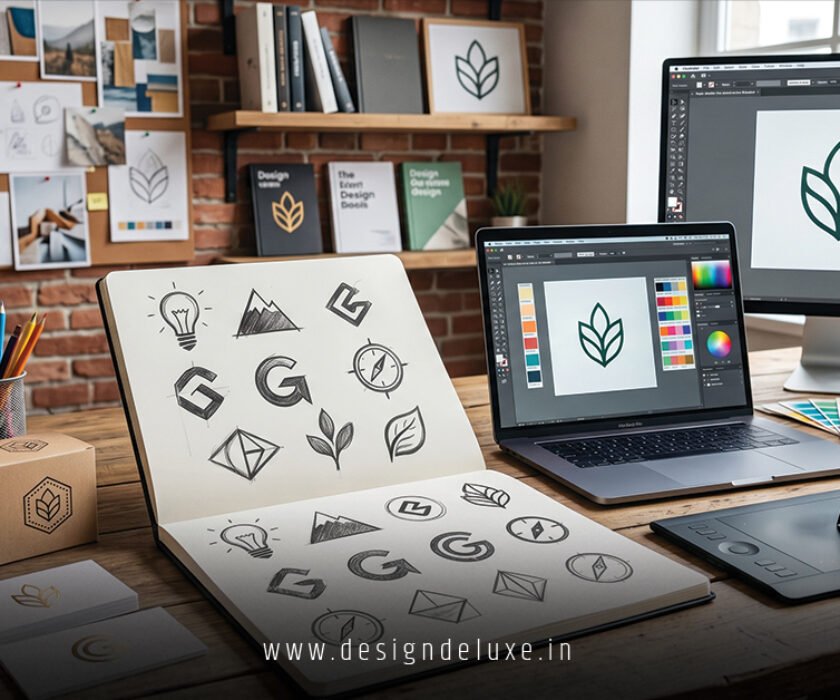
Brand
Minimalist Brand Identity for SaaS Startups delivers the clarity, trust, and speed that early-stage companies need to cut through noise and win users fast. In 2026, it’s no longer optional. It’s table stakes.
Clean lines. Smart negative space. Restrained color palettes. Typography that works at every size. This approach turns complex software into something that feels simple, premium, and instantly credible. Founders who nail it see better conversion, easier investor conversations, and lower churn from day one.
- What it includes: Logo system, color palette with dark mode, typography scale, iconography, basic usage rules, and consistent application across website, product UI, and marketing.
- Why SaaS loves it: Users drown in features. Minimalist identity reduces cognitive load and signals efficiency.
- 2026 reality: Neo-minimalism wins—clean foundations with subtle warmth, adaptability, and micro-personality that feels human, not robotic.
- The payoff: Faster onboarding, stronger retention, and a brand that scales from pre-seed to Series B without a full redesign.
Here’s the thing. Most SaaS startups slap on a generic logo and call it branding. Then they wonder why nothing sticks. A true minimalist brand identity works as a system, not a one-off asset.
Why Minimalist Brand Identity Wins for SaaS in 2026
SaaS buyers expect interfaces that disappear so they can focus on work. Your brand visuals must do the same. Minimalism cuts visual clutter, improves perceived performance, and builds instant trust.
Neo-minimalism dominates now. Pure sterile flat design feels dated. The best versions add gentle asymmetry, subtle texture, or thoughtful micro-interactions while keeping the core razor-sharp. Think Linear’s hyper-clean efficiency or Notion’s calm whitespace mastery.
Investors scan dozens of decks weekly. A polished minimalist identity signals you understand product thinking. Users remember you because nothing fights for attention.
Core Elements of a Strong Minimalist Brand Identity for SaaS Startups
Logo System: One primary mark that scales perfectly. Include wordmark, icon-only, and monochrome versions. Prioritize geometric sans-serifs with excellent kerning.
Color Palette: 2-3 core colors max. One primary, one neutral, one accent. Build in light and dark modes from day one. Calm blues, deep greens, and warm grays perform best.
Typography: Two families maximum. A clean sans for UI and headings. Maybe a subtle display variant for marketing. Generous line height and plenty of breathing room.
Iconography & Illustrations: Simple line icons or custom geometric shapes. Consistent stroke weight. Avoid busy illustrations in-product—save personality for marketing.
Voice & Application: Guidelines that cover website, in-app UI, emails, pitch decks, and social. Consistency beats creativity here.
Step-by-Step Action Plan for Building Yours
- Define your foundation
Write your positioning in one sentence. List three adjectives your brand should feel like. Identify competitors and deliberately stand apart. - Start with the logo
Use AI generated minimalist logo design for tech startups 2026 as your fast starting point. Generate variations, then refine for perfect scalability. - Build the full system
Lock colors, fonts, and spacing rules. Create a simple one-page brand guide—even in Figma or Google Docs. - Apply to product and website
Design key screens and landing pages using the system. Test with real users for clarity. - Document and enforce
Make guidelines accessible to the whole team. Review every new asset against them. - Test and evolve
Launch version 1.0. Gather feedback after 30-60 days and iterate. Minimalist systems shine through refinement.
What usually happens is teams over-design early. Keep it tight. You can always add later.
Common Mistakes & How to Fix Them
- Treating logo as the entire identity: Fix by building the full system early.
- Too many colors or fonts: Fix by ruthless editing—cut anything that doesn’t earn its place.
- Inconsistent application: Especially between marketing site and product UI. Fix with a living style guide.
- Chasing every trend: Heavy glassmorphism or wild gradients kill minimalism. Fix by anchoring in strategic simplicity.
- Ignoring dark mode: Non-negotiable for SaaS in 2026. Build it in from the start.
The kicker? Inconsistency destroys the trust minimalist design is supposed to build.

Pros and Cons of Minimalist Brand Identity for SaaS
| Aspect | Pros | Cons |
|---|---|---|
| Development Speed | Fast to implement and scale | Requires discipline to stay minimal |
| User Experience | Low cognitive load, high clarity | Can feel cold without warmth |
| Cost | Cheaper long-term | Initial strategy still needs thought |
| Memorability | Strong when done right | Risk of blending in |
| Adaptability | Works across all touchpoints | Harder to stand out in crowded categories |
For most SaaS startups, the advantages dominate heavily.
When and How to Level Up
Start minimalist. Once you hit product-market fit and meaningful revenue, layer in more personality—custom illustrations, motion assets, or flexible brand expressions that adapt by context.
Explore SaaS visual branding checklists for practical 2026 implementation tips. Study real systems at companies like Stripe and Linear for inspiration.
Key Takeaways
- Minimalist brand identity for SaaS startups prioritizes clarity over decoration.
- Neo-minimalism adds human warmth without sacrificing simplicity.
- Start with a strong logo and expand into a full scalable system.
- Consistency across product and marketing is non-negotiable.
- Test everything at small sizes and in real user flows.
- Dark mode support is mandatory in 2026.
- Use AI tools for speed, then refine with purpose.
- A tight identity accelerates everything from acquisition to retention.
Stop waiting for the perfect brief. Ship a clean, focused identity now and evolve it as you learn from real customers.
Your SaaS product already solves a hard problem. Make the brand experience match that intelligence—clear, confident, and effortless.
FAQs
How does minimalist brand identity for SaaS startups differ from general startup branding?
SaaS demands tighter integration between visual identity and product UI. Every screen must feel like the same brand, with extra focus on scalability, dark mode, and reducing user friction.
Should I use AI for minimalist brand identity for SaaS startups?
Absolutely for the logo and initial concepts. Combine [AI generated minimalist logo design for tech startups 2026] with human oversight for typography, spacing, and full system cohesion.
How much should a minimalist brand identity cost for an early SaaS startup?
You can build a solid v1 for under $2,000 using AI tools plus light designer polish. Budget $8k–20k+ for a more comprehensive system once you’ve validated the business.