Social Media AdvertisingBrandDESIGNE-Commerce
Instagram story ad design templates for ecommerce brands are the fastest way to turn a good product into a thumb-stopping ad. They matter because Stories are built for speed, and if your creative doesn’t land in the first second, it gets skipped, not saved.
- What it is: A repeatable design framework for vertical Story ads that fits ecommerce offers, product launches, promos, and retargeting.
- Why it matters: It saves time, keeps branding tight, and gives your team a cleaner path from concept to conversion.
- What good templates do: They spotlight one message, one product, one action, without visual clutter.
- Who needs them: Beginner and intermediate ecommerce brands that want ads that look polished without hiring a design department.
- The payoff: Faster production, more consistency, and a better shot at making people stop, read, and tap.
Why these templates work
Instagram Story ads are full-screen, vertical, and fast. That’s the whole game. Your creative has to read like a billboard, not a brochure.
The best Instagram story ad design templates for ecommerce brands remove friction. They give you a structure that already understands the format: bold headline, product visual, simple proof, and a clear CTA. Think of it like a racing line on a track — the template keeps your ad from drifting wide when the pressure is on.
For ecommerce, that matters even more. You’re not just making something pretty. You’re trying to move a shopper from “scrolling” to “curious” to “clicking” without losing them in the middle.
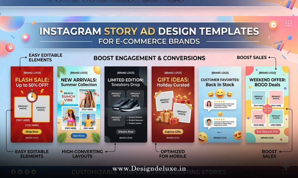
Instagram story ad design templates for ecommerce brands: what to include
A strong template usually includes five things:
- A hook that makes the offer obvious fast.
- A product image or short motion clip.
- A benefit-driven line, not a generic slogan.
- Social proof, urgency, or a value cue.
- A clean CTA that tells people exactly what to do next.
The layout should breathe. Leave space. Let the message hit. When every pixel is fighting for attention, nothing wins.
For Instagram’s own ad specs and format guidance, use Meta’s business resources as your baseline for placements, dimensions, and creative setup Meta Business Help Center. For mobile creative best practices, Google’s Think with Google library is useful because it keeps the focus on fast, vertical, mobile-first design Think with Google. If you want the platform-side ad policies and requirements, the official Instagram Ads page is the safest reference point Instagram Ads.
Answer-ready template table
| Template type | Best use case | Core elements | Pros | Watch out for |
|---|---|---|---|---|
| Product spotlight | Single hero item, best-seller, new drop | Big product image, 1 benefit, CTA | Clean, fast, easy to scale | Too little proof if the product is unknown |
| Promo stack | Sales, limited-time offers, holidays | Offer badge, urgency cue, CTA | Strong click potential | Can look spammy if overdone |
| UGC-style frame | Retargeting, trust building | Creator-style visual, testimonial, CTA | Feels native and credible | Needs real-looking execution |
| Problem-solution layout | Pain-point products, skincare, home, fitness | Problem headline, product fix, proof | Great for cold traffic | Can get wordy if you stack too many claims |
| Carousel-to-Story adaptation | Brands repurposing existing assets | Three fast frames, one message thread | Efficient and brand-safe | Needs tighter pacing than feed creative |
Step-by-step action plan
1. Pick one job for the ad
Don’t try to sell the whole brand in one Story. Choose one job: introduce, persuade, or convert. That’s it.
If you’re launching a new product, the job is awareness plus interest. If you’re running a sale, the job is direct response. If you’re retargeting, the job is to remove hesitation. One ad, one mission.
2. Start with the hook
The first frame has to earn the next second. Use a blunt benefit, a sharp pain point, or a strong offer. Skip the poetry.
A few examples:
- “Your skincare routine, simplified.”
- “The jeans that actually fit.”
- “48-hour sale on best sellers.”
Short works. Fast works.
3. Build the template around the product
Now place the visual where it can do real work. Show the product in use when possible. If it’s apparel, show fit and movement. If it’s beauty, show texture, application, or before-and-after context. If it’s home goods, show the item in a room, not floating alone like a museum object.
4. Add proof without clutter
Proof can be a review, a rating, a short testimonial, or a trust signal like “best seller” or “over 10,000 orders.” Keep it lean. One proof point is usually enough.
That’s the kicker: proof should support the sale, not interrupt it.
5. Finish with one CTA
Use one clear action. “Shop now” works. “Tap to save 20%” works. “View collection” works.
Do not stack three CTAs like a desperate middleman. Confused users do nothing.
Instagram story ad design templates for ecommerce brands: beginner setup
If I were building this from scratch for a small ecommerce brand, I’d keep it dead simple.
Template structure to copy
- Frame 1: Hook.
- Frame 2: Product visual.
- Frame 3: Benefit or proof.
- Frame 4: CTA.
That structure is enough to launch, test, and learn. You can always layer in motion, stickers, or creator footage later. At the start, clarity beats cleverness every time.
What I’d do first
- Use one brand font pair.
- Limit the palette to 2–3 colors.
- Keep text large enough to read on a phone.
- Design for safe zones so nothing gets buried by the interface.
- Make the CTA impossible to miss, but not obnoxious.
A template is supposed to save time, not create new decision fatigue. Build once, reuse often.
Design principles that convert
Good Story ads feel native to the app but sharp enough to stand apart. That means the design should look intentional, not overworked.
Use strong contrast. Use generous spacing. Use one focal point per frame. If a person can’t tell what the ad is about in a blink, it’s too busy.
Motion helps too, but don’t confuse motion with strategy. A slow zoom on a messy layout is still a messy layout. A clean frame with one moving element can outperform a crowded mini-movie.
Common mistakes and fixes
- Too much copy. Fix it by cutting every sentence that does not move the sale forward.
- Weak product visuals. Fix it by upgrading lighting, cropping, and context.
- No clear hierarchy. Fix it by deciding what the eye should see first, second, and third.
- Generic CTA. Fix it by matching the action to the offer.
- Branding that overwhelms the ad. Fix it by using branding as a frame, not the whole story.
- Template reuse without testing. Fix it by rotating hooks, visuals, and proof points one variable at a time.
Here’s the truth: bad Story ads usually fail because they ask too much of the viewer. The fix is almost always subtraction.
Template ideas by ecommerce use case
For fashion, use full-body product shots, fit notes, and motion. For beauty, use texture close-ups, application clips, and results. For food or supplements, show the item in a real routine, not on a sterile background. For home and decor, use in-room context and a quick benefit line.
Different products need different emphasis, but the template logic stays the same. Show the thing. Explain the win. Ask for the click.
Key Takeaways
- Instagram story ad design templates for ecommerce brands work because they make fast, vertical ads easier to build and easier to understand.
- The best templates focus on one job, one product, and one CTA.
- Strong Story ads use large text, clean hierarchy, and clear visuals.
- Proof matters, but only when it stays out of the way.
- Beginner brands should start with a simple four-frame structure.
- Product context beats decorative design almost every time.
- Testing one variable at a time gives cleaner results than redesigning everything at once.
- Less clutter usually means more clicks.
Instagram story ad design templates for ecommerce brands are not about making ads look fancy. They’re about making the sale easier to see, easier to trust, and easier to act on. Start with one clean template, test it against one offer, and let the data tell you where to sharpen the edge.
FAQs
What makes Instagram story ad design templates for ecommerce brands different from feed ad templates?
Story templates are built for full-screen, vertical viewing and need to communicate faster. Feed templates can afford more detail; Story templates cannot.
How many frames should Instagram story ad design templates for ecommerce brands use?
Three to four frames is the sweet spot for most ecommerce campaigns. That gives you enough room for a hook, product, proof, and CTA without dragging.
Can small brands use the same Instagram story ad design templates for ecommerce brands across different products?
Yes, as long as the core structure stays the same and the product-specific visuals, offer, and proof points change. Reuse the skeleton, not the exact message.