Logo DesignBrand
How to Design a Logo That Scales Across All Platforms is one of those branding jobs that looks simple until you try to make the same mark work on a website header, an Instagram profile, a product label, a podcast cover, and a storefront sign. If your logo is too detailed, too thin, or too clever in the wrong way, it can fall apart fast when the size changes.
How to Design a Logo That Scales Across All Platforms starts with one basic idea: your logo has to stay clear, recognizable, and readable everywhere your business shows up. In this article, we’re going to be taking a look at How to Design a Logo That Scales Across All Platforms, and how you can build a brand mark that looks sharp on every screen and surface. If you would like to find out more, feel free to read on.
Pic – CC0 License
Start with a logo that can breathe
The best scalable logos usually begin with simplicity. That does not mean boring, and it does not mean plain for the sake of it. It means the shape, spacing, and lettering are clean enough to survive when the logo is shrunk down or enlarged.
If your logo depends on tiny lines, crowded symbols, or too many words, it will struggle in smaller formats. Think about how your logo looks at favicon size, social avatar size, and on mobile screens. A strong logo should still make sense when someone sees it for one second on a busy feed.
For many entrepreneurs, the easiest path is a wordmark, a monogram, or a simple icon-plus-name combination. Adobe’s logo design guidance stresses clarity, simplicity and versatility as key traits for a logo that works across uses.[1]
How to Design a Logo That Scales Across All Platforms without losing identity
How to Design a Logo That Scales Across All Platforms really comes down to consistency. You want one brand look that can flex, not a dozen different versions that confuse people.
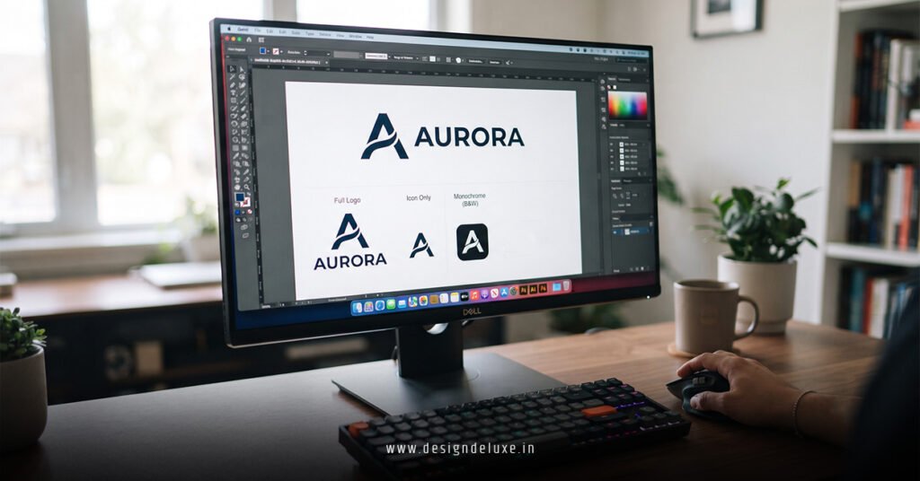
That is where a logo system helps. Instead of forcing one full logo into every space, build a small family of logo versions. You might use a full lockup for your website homepage, a compact icon for social media, and a single-color version for packaging or merchandise.
This approach is especially useful for businesses operating across the USA, UK, Australia, Singapore, and Dubai, where your logo may appear on different devices, materials, and signage styles. The more places your brand appears, the more important it is that the design works in both digital and print settings.
Choose shapes that stay readable at every size
Simple shapes usually scale better than intricate illustrations. Rounded forms, bold initials, and balanced spacing often hold up more reliably than delicate details.
When you are reviewing a draft, shrink it down until it is tiny. Then ask yourself whether you can still tell what it is. If the answer is no, the design needs less detail and stronger structure.
This is also where vector files matter. A logo built in vector format can scale cleanly without getting blurry, which is why designers and printers rely on it for professional use.[2] If your logo is still only living in a JPEG or PNG, it is time to fix that before you launch.
Build for dark, light, and messy backgrounds
Your logo will not always sit on a perfect white page. It may land on a dark website banner, a photo background, a product box, or a presentation slide.
That is why you need a version that works in multiple color treatments. At minimum, you should have a full-color version, an all-black version, and an all-white version. Each one should feel like the same brand.
You should also test how the logo behaves on real-world backgrounds. A logo that looks polished on a design canvas can disappear the moment it is placed over an image or textured surface. The goal is not just beauty. The goal is visibility.
Keep typography honest and simple
If your logo includes text, the font choice matters just as much as the symbol. Thin, trendy, or decorative type can look elegant in a mockup and fall apart in practice.
Choose lettering that remains readable at smaller sizes and in low-resolution settings. Avoid stretching the font, stacking it awkwardly, or adding effects that make it harder to read. Your name should be the easiest part of the logo to understand.
Google Fonts is a useful place to explore typefaces that are widely accessible and easy to test across screens.[3] A clean, well-chosen font often does more for your brand than a complicated visual trick.
Test the logo where your customers will actually see it
How to Design a Logo That Scales Across All Platforms is not just a design question. It is a testing question.
Put your logo into real mockups before you approve it. Try it on a phone screen, a website header, a business card, a social avatar, a slide deck, and a shipping box. If it feels too small, too cluttered, or too faint in any of those places, it is not ready yet.
This is also where honest feedback helps. Show the logo to people who do not work in design. If they can describe it quickly and remember it later, you are on the right track. If they ask what it is supposed to be, simplify it.
Protect the logo with clear brand rules
Once your logo is ready, keep it from being damaged by inconsistent use. Create a simple brand sheet that explains logo spacing, approved colors, minimum size, and when to use each version.
This does not need to be fancy. It just needs to stop random edits, awkward resizing, and color changes that weaken your brand. The clearer your rules, the easier it is for your team, freelancers, and partners to use the logo correctly.
If you are working with a designer, ask for final files in vector format plus web-ready exports for everyday use. That way, your logo stays sharp whether it appears on a billboard or a phone screen.
We hope that you have found this article enlightening in some way, because the real lesson is simple: How to Design a Logo That Scales Across All Platforms is about clarity first and style second. If you keep the design clean, test it in real places, and build flexible versions from the start, your logo will support your business as it grows instead of holding it back.