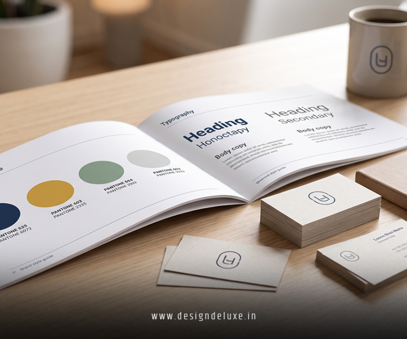
BrandColor Palette
How to Choose Brand Colors for a Stronger Brand Identity :
How to Choose Brand Colors is one of the first decisions that can make your business look clear, trustworthy, and memorable. If you get this right, your colors help people understand your brand before they read a single line of copy. That matters whether you are building a startup, a service business, or a product brand.
In this article, we’re going to be taking a look at How to Choose Brand Colors, and how you can build a palette that fits your audience and supports your brand goals. If you would like to find out more, feel free to read on.
Pic – CC0 License
Why brand colors matter
Your brand colors do more than make things look nice. They shape first impressions, influence mood, and help customers remember you later. Brand color guidance from Canva, DesignRush, and Wix all points to the same core idea: start with your brand identity, then choose colors that match it.[1][2][3]
If your business feels calm and dependable, your colors should support that. If your brand is bold and energetic, your palette should reflect that too. The point is not to follow trends blindly. The point is to make your business look and feel like itself.
How to Choose Brand Colors that fit your brand personality
The best place to start is your brand personality. Ask yourself what your business stands for, how you want people to feel, and what kind of customer you want to attract. That is the foundation of a useful palette.[2][3][8]
A simple way to think about it:
- Blue often signals trust, stability, and professionalism.
- Green often suggests growth, health, and balance.
- Red can feel bold, urgent, and energetic.
- Yellow can feel optimistic and friendly.
- Black often suggests luxury, authority, or sophistication.
- Orange often feels warm, active, and approachable.
These are not hard rules, but they are useful starting points. If you want to go deeper, it helps to link your color choices to the ideas in Logo Psychology: Colors & Shapes That Sell, because color and shape work together to shape perception.
Study your competitors before you decide
You do not want to copy your competitors, but you do want to understand the visual space you are entering. Canva, DesignRush, Shopify, and other branding guides all recommend checking competitor palettes before finalizing your own.[1][2][8][11]
This step helps you spot two things. First, what your industry expects. Second, where you can stand out without looking out of place. For example, if every law firm in your market uses dark blue, you may still use blue, but in a fresher or more modern way.
Look for patterns in your niche. Then decide whether you want to fit in, stand apart, or do a bit of both.
Pick a color system, not just one color
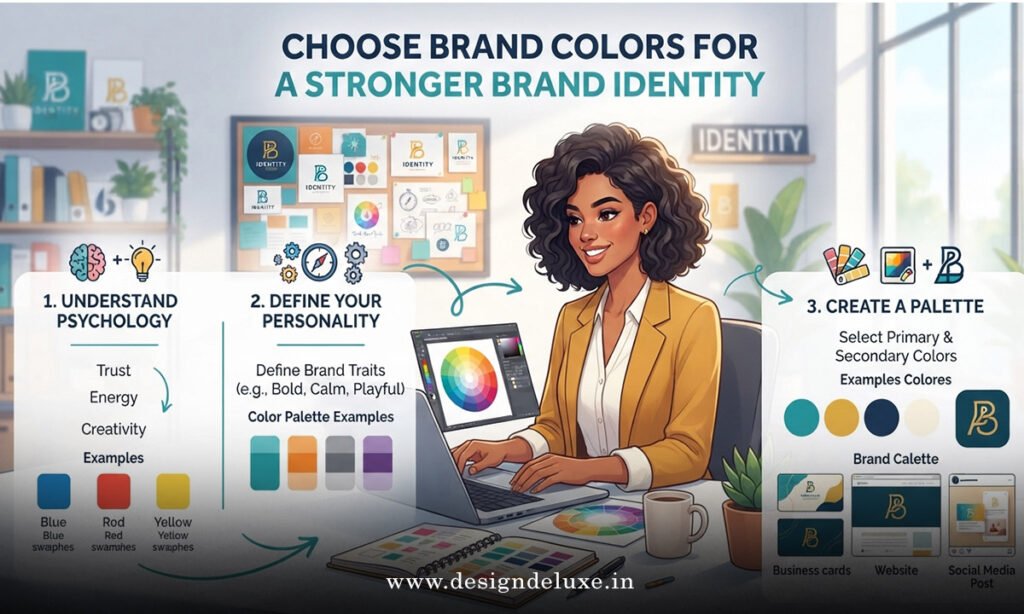
A strong brand usually needs more than one color. Most practical guides recommend a palette with a primary color, a secondary color, and neutral colors for balance.[7][12][14][19]
A simple setup looks like this:
- Primary color: your main brand color
- Secondary color: support color for variety
- Neutral color: background or base color
- Accent color: small pops of attention
This gives you flexibility across your website, social media, packaging, and printed materials. It also keeps your brand from looking messy or random. VistaPrint and Brafton both stress the importance of consistency across every touchpoint.[7][14]
If you are unsure where to begin, choose one main color that fits your brand personality, then build around it.
Use color psychology, but keep it practical
Color psychology is useful, but it should not run your whole branding decision. The goal is not to force a color to mean one thing for everyone. The goal is to choose a color that supports the experience you want your customers to have.[1][2][6][8]
For example, if you sell wellness services, soft greens and calm neutrals may feel right. If you sell premium consulting, a deep navy with clean white space may do the job better. If you sell kids’ products, brighter and more playful colors may be appropriate.
The key is consistency. When your color choices match your message, your brand feels more believable.
Test your palette in real use
A palette can look great in a mood board and fall apart in real life. That is why testing matters. Brand guides from Wix, Venngage, Adobe Express, and others recommend trying your colors in actual layouts before you commit.[3][6][9][11]
Test your colors on:
- Your logo
- Your website header
- Social media posts
- Product packaging
- Presentations or pitch decks
- Printed materials
You want to check contrast, readability, and balance. A good palette should work on screen and in print. It should also stay clear when used in small sizes.
If your brand colors only look good in one setting, they are not ready yet.
Keep your colors consistent across every touchpoint
Once you choose your colors, use them everywhere. That includes your logo, website, ads, packaging, invoices, and email templates. Consistency is what turns colors into recognition.[7][14][16]
This is also where a keyword like Logo Psychology: Colors & Shapes That Sell can support your wider brand strategy. If you keep your color choices aligned with your logo shape, typography, and overall tone, your brand will feel more polished and easier to remember.
The best brands do not keep reinventing their look. They repeat the same visual cues until customers know them instantly.
Build brand guidelines early
You do not need a huge brand book on day one. But you do need simple guidelines. At minimum, write down your color names and exact codes so your team uses the same shades every time.[14][16]
Include:
- Primary color
- Secondary color
- Accent color
- Neutral colors
- HEX, RGB, and CMYK codes
- Rules for background and text contrast
That saves time, avoids confusion, and keeps your brand looking professional as you grow.
We hope that you have found this article enlightening in some way, and we hope it gives you a clearer way to think about How to Choose Brand Colors for your business. If you want your brand to feel more trustworthy, more memorable, and easier to recognize, start with a simple palette and stay consistent. When you connect your colors back to Logo Psychology: Colors & Shapes That Sell, you give your visual identity a stronger reason to work.