Logo DesignBusiness & FinanceColor Palette
Logo Psychology: Colors & Shapes That Sell is one of those topics that can quietly shape how customers feel about your business before they read a single word. If you have ever wondered why one logo feels trustworthy, another feels energetic and another feels premium, the answer usually starts with color and shape. For entrepreneurs, that matters because your logo is often the first signal of what kind of business you run and who it is for. In this article, we’re going to be taking a look at Logo Psychology: Colors & Shapes That Sell, and how you can use it to make your brand feel clearer, stronger and more memorable. If you would like to find out more, feel free to read on.
Pic – CC0 License
Why logo psychology matters
A logo is not just decoration. It is a fast visual cue that helps people decide whether your business feels safe, modern, playful, serious or premium. In crowded markets, that split-second reaction can influence whether someone keeps looking or moves on.
That is why Logo Psychology: Colors & Shapes That Sell is useful for beginners and experienced owners alike. You do not need a huge budget to make smarter design choices. You need a clear idea of the feeling you want your brand to create.
The best logos do two things at once. They look good, and they support the promise your business is making. That is why simple design choices often work better than clever but confusing ones.
Logo Psychology: Colors & Shapes That Sell starts with color
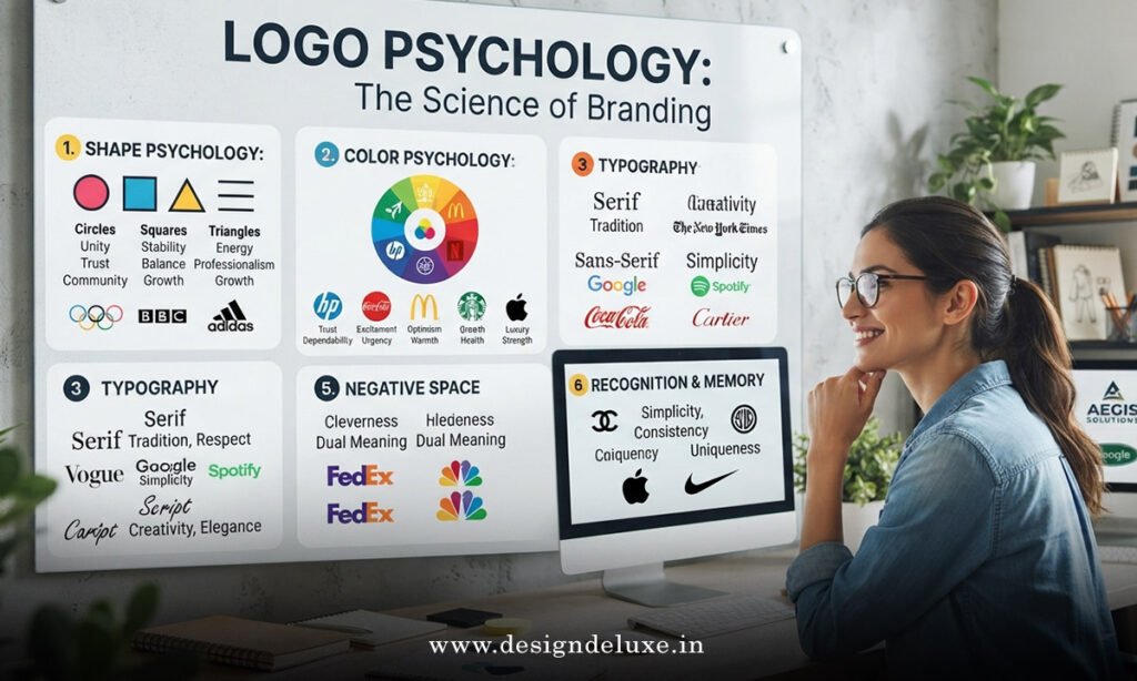
Color is usually the first thing people notice. It can shape emotion, set expectations and make your brand easier to remember. Research from Adobe’s color guidance shows that color can affect how people perceive a brand, which is one reason consistent color use matters so much in identity design. [1]
Here is the practical version for business owners:
- Blue often suggests trust, stability and professionalism. It is common in finance, tech and service businesses.
- Red can feel bold, urgent and energetic. It can work well when you want attention or appetite appeal.
- Green often signals growth, health, balance or sustainability.
- Yellow can feel optimistic, friendly and youthful, but too much can become tiring.
- Black usually suggests luxury, authority or sophistication.
- Orange can feel confident, warm and active.
- Purple is often linked with creativity, imagination and premium positioning.
The important point is not to pick a color because of a trend. Pick it because it matches the feeling you want your customer to have. If you run a legal firm in Singapore or Dubai, a calm blue or deep navy may make more sense than a bright neon palette. If you sell fitness coaching in the USA or the UK, stronger energy colors may fit better.
Logo Psychology: Colors & Shapes That Sell depends on shape too
Shape affects perception just as much as color. We read shapes quickly, even if we do not realize it. Rounded forms tend to feel softer and more friendly, while sharp angles can feel stronger, more disciplined or more technical.
Think of shape as the tone of voice in visual form.
- Circles and ovals often feel inclusive, smooth and community-focused.
- Squares and rectangles often suggest structure, reliability and order.
- Triangles can feel dynamic, directional and ambitious.
- Curves usually feel human, approachable and warm.
- Sharp angles can feel precise, modern and bold.
If you are a founder trying to build trust, softer shapes can help your brand feel less intimidating. If you want to signal innovation or speed, cleaner angular forms may work better. The shape should support the story, not fight it.
A useful rule: if your business is about care, support or service, choose shapes that feel open and easy. If your business is about performance, speed or expertise, choose shapes that feel sharper and more decisive.
Match the logo to the business promise
The strongest logos feel believable. That means the color and shape should match what you actually sell. If your logo promises premium quality, but your website and packaging feel cheap, customers notice the gap fast.
This is where Logo Psychology: Colors & Shapes That Sell becomes a business decision, not just a design one. A children’s brand may benefit from brighter colors and rounded shapes. A consulting firm may need calmer tones and a more structured mark. A wellness brand may want softer hues, open space and gentle curves.
To test fit, ask three simple questions:
- Does this logo match my pricing?
- Does it match my audience’s expectations?
- Does it match the experience I want people to have?
If the answer is no to any of these, your logo may be sending the wrong signal.
Keep it simple enough to remember
A logo does not need to explain everything about your business. It needs to be easy to recognize and hard to forget. That is one reason simple logos often outperform crowded ones.
The BBC’s brand guidelines are a good reminder of how disciplined visual identity can support recognition across platforms and sizes. [2] And when you are thinking about practical design choices, the principles used in accessible visual design from the Nielsen Norman Group are useful because clear contrast and legible forms improve usability. [3]
In practice, that means you should avoid:
- Too many colors
- Too many fonts
- Tiny details that disappear at small sizes
- Shapes that become unclear on mobile screens
- Trends that date quickly
If your logo works in black and white, on a phone screen and on a storefront sign, you are in a strong position.
Test your logo with real people
Designers can give you theory, but customers give you reality. Before you commit, show your logo to a few people who match your target market. Ask what the logo feels like, not just whether they like it.
Try questions like these:
- What kind of business do you think this is?
- What words come to mind when you see it?
- Does it feel trustworthy, premium, friendly or bold?
- Would you expect this brand to be affordable or high-end?
You are looking for patterns. If people consistently describe your logo in a way that matches your goals, you are on the right track. If they describe it in a way that clashes with your offer, adjust the color, shape or balance.
This is especially useful if you are launching in markets like the USA, UK, Australia, Singapore or Dubai, where audience expectations can vary by industry and price point. A logo that feels playful in one category may feel too casual in another.
Build a logo that supports growth
A good logo should still make sense as your business grows. That means thinking beyond the launch. Will it still work if you add new products, enter a new country or move upmarket?
Logo Psychology: Colors & Shapes That Sell works best when it is tied to a bigger brand system. Your logo should fit your website, social media, packaging and presentation deck. It should also leave room for change without needing a full redesign every year.
That is why many smart businesses choose a simple core mark and build the personality around it with color, typography and layout. This gives you flexibility while keeping the brand recognizable.
We hope that you have found this article enlightening in some way, and we hope it gives you a clearer way to think about logo choices for your business. If you remember one thing, make it this: color and shape are not just design details, they are business signals. When you use Logo Psychology: Colors & Shapes That Sell with intention, you give customers a clearer reason to trust you, remember you and choose you.