Brand
Brand identity guidelines template.
Let’s start there, because if you don’t lock your brand down on paper, it will drift—fast.
Think of a solid brand identity guidelines template as the rulebook that keeps your logo, colors, fonts, and voice from getting “freestyled” by every freelancer, agency, or team member who touches your brand. You’re not just making things pretty; you’re protecting recognition, trust, and conversion.
And here’s the smart move most teams miss: connect your brand identity guidelines template directly to your visual systems and workflows, including modern approaches like AI powered logo design with motion graphics and brand packaging 2026 so everything stays coherent as you scale
What is a brand identity guidelines template (and why should you care)
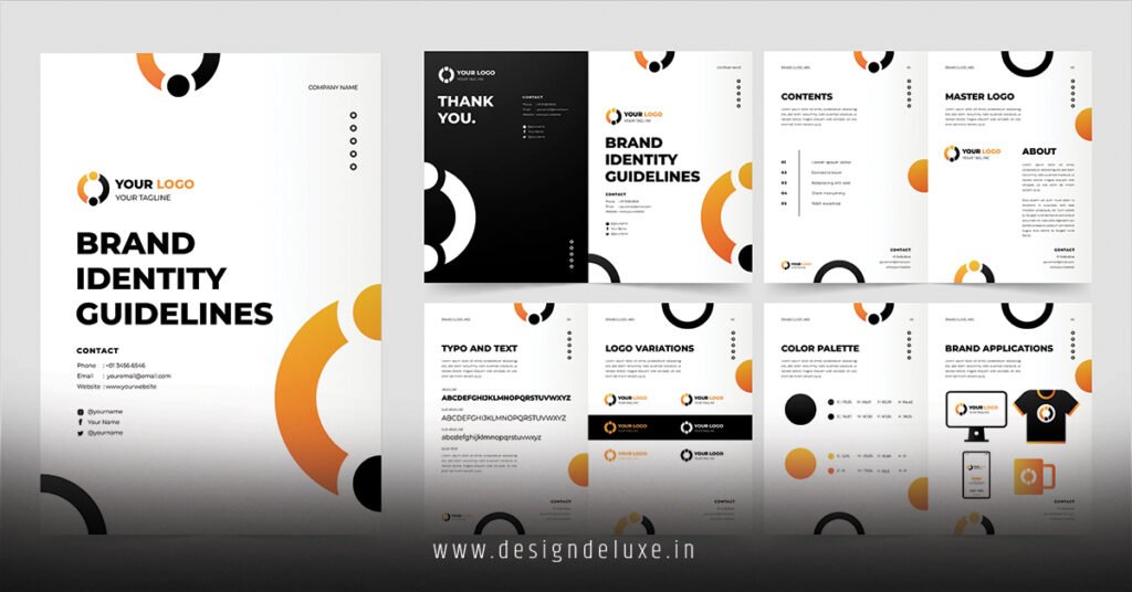
A brand identity guidelines template is a structured document that defines how your brand looks, sounds, and behaves across every touchpoint.
At minimum, it covers:
- Logo usage
- Color palette
- Typography
- Imagery and icon style
- Voice and tone basics
In my experience, brands with even a simple 5–10 page guidelines doc stay sharper across social, packaging, ads, and websites than brands that rely on “we’ll just remember it.” Spoiler: nobody remembers it.
Why you need a brand identity guidelines template before scaling creative
Here’s what usually happens without brand guidelines:
- Your logo is stretched, recolored, or slapped on any background.
- New ads “kind of” match… until they don’t.
- Packaging looks like it belongs to a different company than your Instagram feed.
- AI tools generate visuals that are technically good, but off-brand.
With a clear brand identity guidelines template, you:
- Protect brand recognition – same look, every time, everywhere.
- Move faster – designers and marketers don’t have to guess.
- Use AI and automation safely – tools know what “on brand” actually means.
- Avoid expensive rework – fewer redesigns, fewer “we need to fix everything” moments.
Core sections of a strong brand identity guidelines template
Use this as your blueprint. Whether you’re putting it in Google Docs, Notion, or a polished PDF, the structure matters more than the format.
1. Brand foundations
Anchor everything here.
Include:
- Brand purpose – why you exist beyond profit.
- Mission – what you’re trying to achieve.
- Vision – where you’re trying to go long term.
- Values – what you stand for and how you behave.
- Positioning – who you’re for and what makes you different.
This section guides decisions when design choices aren’t obvious. When in doubt, you come back here.
2. Logo and lockups
This is where most guidelines start—and where many stop too early.
Document:
- Primary logo
- Secondary logo (horizontal/stacked)
- Icon-only mark
- Clear-space rules
- Minimum size rules
- Approved color versions (full color, one-color, reversed)
Also add do’s and don’ts:
- Don’t stretch or distort
- Don’t change colors
- Don’t add drop shadows or random effects
- Don’t place on low-contrast backgrounds
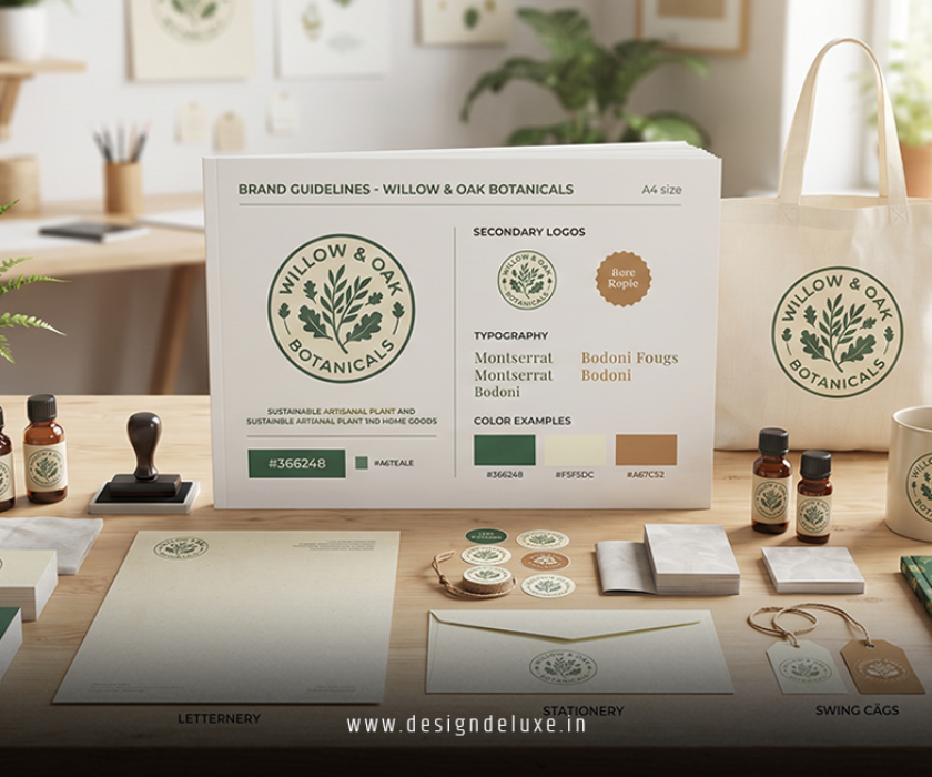
If your logo is part of an AI powered logo design with motion graphics and brand packaging 2026 system, reference the animated versions too: how long they run, how they appear, and where they should be used (intros, outros, story posts, etc.).
3. Color palette
Color is one of the fastest recognition tools you have.
Define:
- Primary colors – your core brand colors
- Secondary colors – supporting shades for backgrounds, accents, and charts
- Neutrals – whites, grays, blacks
For each color, include:
- HEX
- RGB
- CMYK
- (Optionally) Pantone for print-heavy brands
Make sure your palette clears accessibility basics—especially for text on backgrounds. The Web Content Accessibility Guidelines from the W3C offer clear criteria for contrast and legibility so your palette works for more people, not fewer.
4. Typography system
Fonts are your brand’s body language.
Document:
- Primary typeface (for headings)
- Secondary typeface (for body text)
- Web-safe fallback fonts
- Sizes, line spacing, and use cases (H1, H2, paragraph, captions, buttons)
Clarify rules like:
- All caps vs sentence case for headlines
- When to use bold, italics, or highlight colors
- How type should behave in motion (if you’re using animated titles and lower thirds)
If you’re building templates in tools that leverage AI powered logo design with motion graphics and brand packaging 2026, consistent type rules help AI generate layouts that feel like one cohesive system.
5. Imagery, iconography, and illustration
This is where a lot of brands drift into “random stock photo land.”
Define:
- Photography style – candid vs staged, bright vs moody, people vs product focus
- Icon style – line vs filled, rounded vs sharp, flat vs gradient
- Illustration style – flat, 3D, minimal, detailed, etc.
Show side-by-side examples of:
- On-brand visuals
- Off-brand visuals
AI tools can generate imagery on demand now, but they need guardrails. Your brand identity guidelines template should explicitly define what “on-style” looks like so you can prompt faithfully and reject off-brand results quickly.
6. Voice and tone
Visuals get people in the door; voice keeps them.
Include:
- 3–5 adjectives that describe your brand voice (e.g., confident, friendly, practical, witty)
- A short “we say this / we don’t say this” section
- Examples:
- Social posts
- Website headlines
- Email intros
Voice and tone guidelines help you keep copy consistent even when different writers or AI assistants are helping you draft text.
7. Motion and digital behavior (increasingly essential)
If your brand lives on video, social, or in interactive interfaces, document:
- Logo animation rules – duration, easing style, entrance/exit style
- Transition style – cuts, fades, slides, wipes, etc.
- Micro-interactions – how buttons, hovers, and notifications behave
This is where AI powered logo design with motion graphics and brand packaging 2026 ties directly into your template. AI might help you generate the motion concepts, but your guidelines define the patterns:
- “Logo reveals in under 2 seconds using a clean draw-on and fade.”
- “Text motion is minimal—no bouncing, spinning, or heavy distortion.”
When motion is standardized, your brand feels intentional, not chaotic.
8. Packaging and physical applications
If you sell a physical product, your brand identity guidelines template needs a packaging section.
Cover:
- Primary packaging layout (front, back, sides)
- Logo placement rules and minimum sizing
- Required info (ingredients, legal, warnings, country-of-origin, etc.)
- Example mockups (flat + 3D renders)
Regulatory content should always align with official guidance. For U.S. products, brands often refer to Food and Drug Administration resources to ensure labeling meets category requirements (especially for food, supplements, and cosmetics).
When you’re leveraging AI powered logo design with motion graphics and brand packaging 2026, your packaging guidelines should clarify:
- Which elements AI can explore (patterns, backgrounds, colorways)
- Which elements are fixed (logo, core info, approved claims, typography)
How to build your brand identity guidelines template from scratch (step-by-step)
Here’s a simple, actionable path if you’re starting from zero.
- Gather what you already have
- Logos, brand colors (even if informal), existing decks, your best-performing content.
- Highlight what feels “most like you” visually and verbally.
- Define the foundations
- Write 1–2 tight sentences each for purpose, mission, vision, and positioning.
- Choose 4–6 values you actually use when making decisions.
- Lock in your logo and core visuals
- Finalize your logo system and core color palette.
- Pick 1–2 typefaces you can use consistently across web, print, and video.
- If you’ve used AI powered logo design with motion graphics and brand packaging 2026, freeze your best outputs and build rules around them.
- Document with simple, visual examples
- For each section (logo, color, type, imagery, voice), show:
- Approved examples
- Common mistakes
- Keep text concise. Designers love clarity, not novels.
- For each section (logo, color, type, imagery, voice), show:
- Turn the guidelines into templates
- Social post templates
- Presentation templates
- Ad templates
- Basic packaging layout templates
- Share, train, and enforce
- Store your brand identity guidelines template somewhere easy to access.
- Walk your team and partners through it.
- Make it the default reference for every new project.
How AI fits into your brand identity guidelines template
AI design and content tools are powerful… and dangerous… without guardrails.
Use your template as the control system:
- Prompt AI with your defined colors, typography styles, and visual tone.
- Reject outputs that violate logo rules, color contrast, or voice guidelines.
- Feed your best on-brand assets back into AI tools so future generations stay aligned.
If you’re already using AI powered logo design with motion graphics and brand packaging 2026, your brand identity guidelines template becomes the master reference that keeps static, motion, and packaging coherent as you spin up more campaigns and products.
Common mistakes in brand identity guidelines templates (and how to avoid them)
1. Making the document too theoretical
Lots of lofty brand language, no practical examples.
- Fix: Show real, concrete “do this, not that” visuals for every major section.
2. Overcomplicating rules
20+ pages of micro-rules that nobody can remember.
- Fix: Start with a lean version. Cover essentials first (logo, color, type, imagery, voice) in a concise, usable format.
3. Ignoring motion and digital use
Guidelines that only cover print and static layouts feel outdated immediately.
- Fix: Add a section for motion, digital behavior, and how your brand behaves on screens, especially if you’re using AI assisted motion and packaging tools.
4. Writing it once and never updating
Brands evolve. Your guidelines should too.
- Fix: Revisit your brand identity guidelines template at least annually or after key shifts—new product lines, brand refresh, major channel changes.
5. Not connecting guidelines to AI workflows
You define rules, but your AI tools aren’t aligned.
- Fix: Turn your guidelines into prompt snippets, tokens, or presets so AI outputs start closer to “on-brand” instead of “randomly stylish.”
Key takeaways
- A brand identity guidelines template is the operating manual that keeps your brand consistent across every channel and format.
- Strong guidelines cover foundations, logo usage, color, typography, imagery, voice, motion, and packaging.
- The best templates are visual, practical, and easy for real humans to follow—not just designers.
- When paired with AI powered logo design with motion graphics and brand packaging 2026, guidelines prevent AI from producing off-brand visuals.
- Accessibility, regulatory requirements, and real-world use must be baked into your rules, especially for packaging and digital experiences.
- Start lean, iterate, and make your guidelines the single source of truth for anyone touching your brand.
FAQ :
FAQ 1: What should a basic brand identity guidelines template include?
A basic brand identity guidelines template should cover your logo usage rules, color palette, typography system, imagery style, and core voice and tone principles. These sections give designers, marketers, and partners enough structure to keep everything visually and verbally consistent across channels.
FAQ 2: How often should I update my brand identity guidelines template?
Update your brand identity guidelines template whenever you change your logo, expand your product lines, refresh your visual style, or add new primary channels (like a big push into video or e‑commerce). For most brands, a light review every 12 months keeps the document relevant and aligned with reality.
FAQ 3: Do I really need a brand identity guidelines template if I use AI design tools?
Yes—arguably even more. AI tools can generate huge amounts of content quickly, so without a brand identity guidelines template you’ll get a lot of inconsistent, off-brand visuals. Clear guidelines help you prompt AI correctly and tie outputs back into a cohesive system, especially when you’re using advanced workflows like AI powered logo design with motion graphics and brand packaging 2026.