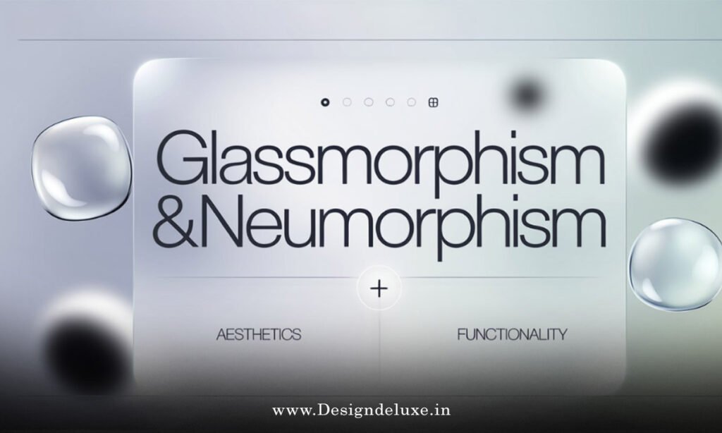
Neumorphism vs glassmorphism in UI design boils down to extruded pillows versus frosted windows. Both rule 2026 interfaces. One hugs shadows. The other blurs boundaries.
Quick verdict:
- Neumorphism: Soft, embossed buttons. Feels tactile, like pressed clay.
- Glassmorphism: Translucent layers. Ethereal, floating panes.
- Pick? Neumorphism for grounded apps. Glass for sci-fi flair.
- 2026 edge: Hybrids win. Layer both for depth.
We’ll pit ’em head-to-head. Pros, cons, code. Your UI levels up.
The rise of neumorphism vs glassmorphism in UI design
Back in 2020, neumorphism whispered from Dribbble. Flat design’s rebellion.
Glassmorphism? iOS blur’s lovechild. Exploded post-2021.
Now, 2026. Apps blend ’em. Fintech? Neumorphic cards for touch. Gaming? Glassy HUDs.
India’s edtech apps: Neumorphism’s warmth builds trust. USA SaaS: Glass screams innovation.
Question: Why duel now? Users crave tactility amid AI overload.
Core traits: Neumorphism unpacked
Neumorphism mimics real-world extrusion.
Key bits:
- Base color match. Background and element same hue.
- Dual shadows: Light (top-left), dark (bottom-right).
- Subtle highlights: Inner glows for concave/convex.
Example CSS:
.neumo-btn {
  background: #e0e5ec;
  box-shadow:
    6px 6px 12px #d1d9e6,
    -6px -6px 12px #ffffff;
  border-radius: 20px;
}
Tactile. Press it? Shadows invert.
Core traits: Glassmorphism unpacked
Glassmorphism? See-through magic. Dive deeper into glassmorphism logo effects for futuristic app interfaces here.
Essentials:
- Opacity: rgba(255,255,255,0.1).
- Backdrop blur:
backdrop-filter: blur(10px). - Borders: Frosted edges.
- Vibrancy: Optional hue shift.
Feels premium. Like wet glass.
Head-to-head comparison table
Scan this. Truth in rows.
| Feature | Neumorphism | Glassmorphism |
|---|---|---|
| Visual Style | Soft, embedded, skeuomorphic | Translucent, layered, futuristic |
| Depth Method | Shadows/highlights | Blur + transparency |
| Performance | Pure CSS, buttery smooth | Blur taxes GPU on mobiles |
| Accessibility | High contrast easy | Risky with low opacity |
| Best For | Buttons, cards (tactile UIs) | Overlays, logos (immersive apps) |
| Dark Mode Fit | Seamless color shifts | Glows shine brighter |
| Browser Support | 99% (2026) | 95% backdrop-filter |
Apple’s Human Interface Guidelines nod to layered depth. Google’s Material 3 elevates surfaces—neumorphism kin. W3C’s CSS Compositing backs blurs.
Pros and cons showdown
Neumorphism pros:
- Intuitive. Users “feel” presses.
- Lightweight. No renders.
- Versatile themes.
Cons:
- Can muddle on complex layouts.
- Faux depth fools no one long-term.
Glassmorphism pros:
- Modern wow-factor.
- Layers content smartly.
- Pairs with animations.
Cons:
- Perf hit on budget phones (India alert).
- Readability roulette.
In trenches? Neumorphism for forms. Glass for dashboards.
Step-by-step: Implement both in your UI
Hybrid action plan. Beginners first.
1. Base setup (Figma/Sketch)
- Canvas: Dark gradient (#0a0a0a to #1a1a2e).
- Card: 300x200px.
2. Neumorphic card
- Fill: #f0f0f0.
- Shadows: 8px inset light/dark.
- Radius: 24px.
3. Glass overlay
- New rect atop.
- rgba(255,255,255,0.15).
- Blur: 12px.
- Border: 1px rgba(255,255,255,0.25).
4. Code it (Tailwind/CSS)
.neumo-card {
  background: #e5e5e5;
  box-shadow:
    inset 4px 4px 8px #d1d1d1,
    inset -4px -4px 8px #f9f9f9;
}

.glass-overlay {
  background: rgba(255,255,255,0.12);
  backdrop-filter: blur(12px);
  border: 1px solid rgba(255,255,255,0.18);
}
5. Animate duel
Neumorph: Shadow flip on click.
Glass: Scale + blur pulse.
sequenceDiagram
    participant U as User
    participant N as Neumorph
    participant G as Glass
    U->>N: Click
    N->>N: Invert shadows
    U->>G: Hover
    G->>G: Blur + scale
6. Test & tweak
- Lighthouse score >90.
- Devices: iPhone 12, Moto G-series.
Performance pitfalls: 2026 realities
Neumorphism: Zero worry. CSS shadows compose fast.
Glass: Backdrop-filter? Skips frames on Android WebView.
Fix: Progressive enhancement. Fallback to opacity-only.
India devs: Optimize. 70% users on mid-range.
Accessibility face-off
Neumorphism: Shadows boost perceived pressability. WCAG loves contrast.
Glass: Opacity kills ratios. Fix: Bold text, min 60% opacity.
Tool: WAVE or Lighthouse audits.
Real-world case studies
Notion 2026: Neumorphic blocks. Feels notebook-like.
Figma plugins: Glassy panels over canvases.
Paytm: Neumorphic wallets. Tactile transfers.
Robinhood: Glass charts. Volatile markets, glassy calm.
What I’d do: User tests. Heatmaps reveal taps.
Common mistakes to dodge
- Neumorph overload. Flat again. Fix: Mix with flats.
- Glass no-blur fallback. Opaque mess. Fix:
supportsqueries. - Theme ignore. Breaks dark mode. Fix: HSL vars.
- No motion. Static snooze. Fix: Reduced motion media query.
- Mobile blind. Crashes perf. Fix: Clamp blur via JS.
Seen it kill launches.
Key Takeaways
- Neumorphism: Shadows for touch. Grounded UIs.
- Glassmorphism: Blur for float. Futuristic wins.
- Hybrid: Stack ’em for 2026 depth.
- Perf first: Test mobiles.
- Access always: Contrast check.
- Animate smart: Hover, not loops.
- Tools: Tailwind + Figma rule.
Conclusion
Neumorphism vs glassmorphism in UI design? No victor. Tools in your kit. Neumorph grounds. Glass elevates. Blend for apps that stick.
Grab Figma. Duel ’em now. Your users notice.
Depth duels. You win.
FAQ
What’s the main difference in neumorphism vs glassmorphism in UI design?
Neumorphism uses shadows for embossed feel. Glassmorphism blurs with transparency for floating layers.
Which performs better on mobile: neumorphism or glassmorphism?
Neumorphism. No GPU blur tax. Ideal for India’s diverse devices.
Can I combine neumorphism and glassmorphism?
Absolutely. Neumorphic base + glass overlay. Ultimate depth.
How to make glassmorphism accessible?
Boost opacity, ensure 4.5:1 contrast. Test with screen readers.
Best tools for neumorphism vs glassmorphism in UI design?
Figma for mockups, Tailwind CSS for code. Plugins speed it.