Brand
Minimalist Brand Identity Systems build quiet power that scales across every touchpoint without screaming for attention.
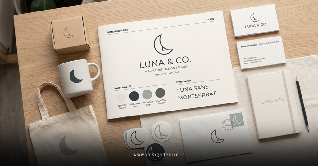
Minimalist brand identity systems strip away noise to create flexible, memorable frameworks centered on clean typography, generous white space, and purposeful elements. These systems shine especially when anchored by a pixel sharp minimalist logo design for social media advertising campaigns that stays crisp at every size.
- Core idea: A cohesive set of rules covering logo, colors, fonts, imagery, and layout that adapts while staying instantly recognizable.
- Why 2026 demands it: Feeds move fast. Cluttered identities get scrolled past. Clean systems build trust and recall faster.
- Biggest win: One strong foundation powers websites, ads, packaging, and social without constant redesigns.
- Who needs this: DTC brands, SaaS, coaches, and service businesses tired of visual chaos.
The kicker is this—minimalism isn’t boring when done right. It feels confident. Calm. Expensive.
Why Minimalist Brand Identity Systems Dominate in 2026
Brands face more screens and faster decisions than ever. A rigid, detailed identity cracks under pressure. Adaptive minimalist systems bend instead.
Neo-minimalism leads the pack now. It keeps the sharp clarity everyone loved but adds subtle warmth—soft edges, earthy neutrals, or tiny human touches. Cold perfection feels dated. Approachable strength wins.
The payoff shows up in metrics. Consistent visual systems improve recognition and make paid campaigns more efficient. Your pixel sharp minimalist logo design for social media advertising campaigns becomes the reliable hero across every ad format.
Flexibility rules. Your system must morph from a tiny profile icon to a billboard without losing its soul.
Key Building Blocks of Strong Minimalist Systems
Focus on these pillars:
- Core Logo Mark: Simple, scalable, pixel-perfect.
- Color Strategy: One hero color plus supporting neutrals that work in light and dark modes.
- Typography Hierarchy: Two or three fonts max with clear usage rules.
- Imagery Guidelines: Consistent photo style, icon treatment, and spacing.
- Adaptive Rules: How elements shift across mobile, desktop, print, and motion.
This isn’t less creativity. It’s focused creativity.
Step-by-Step: Building Your Minimalist Brand Identity System
Don’t guess. Follow this flow.
- Clarify your essence. Boil your brand down to three words. Honest. Sharp. Approachable.
- Audit competitors. Spot gaps where clean simplicity could stand out.
- Design the hero logo first. Nail that pixel sharp minimalist logo design for social media advertising campaigns early—it anchors everything else.
- Lock color and type. Test combinations across real applications.
- Create usage rules. Document what’s allowed and what’s forbidden.
- Build templates. Social posts, ad creatives, pitch decks, email signatures.
- Test ruthlessly. Show variations to real users. Measure recall after five seconds.
- Document everything. A simple brand guide beats chaos.
What I’d do differently today: Spend more time on adaptability. Create rules for how the system lives in Reels, Stories, and static ads.
Common Mistakes & How to Fix Them
Mistake 1: Treating it as just a logo.
Fix: Build the full system. Logo alone won’t carry campaigns.
Mistake 2: Overly strict rules.
Fix: Build in flexibility. Define variations for different contexts.
Mistake 3: Ignoring platform realities.
Fix: Design with compression and small sizes in mind from day one.
Mistake 4: Static thinking.
Fix: Plan for motion and responsive layouts. 2026 favors adaptive systems.
Mistake 5: No enforcement.
Fix: Create shareable templates and quick-reference guides for your team.
Tools and Resources for 2026
- Figma for collaborative system building.
- Adobe Creative Cloud for polished assets.
- Canva Pro for fast team execution.
- Free brand guideline templates from high-authority sources like Canva’s brand identity resources.
Minimalist vs Other Identity Approaches
| Approach | Flexibility | Recognition | Maintenance Cost | Social Ad Performance |
|---|---|---|---|---|
| Pure Minimalist | High | Very Fast | Low | Excellent |
| Maximalist | Low | Slower | High | Variable |
| Neo-Minimalist | Highest | Fast | Medium | Best in 2026 |
| Illustration-Heavy | Medium | Context-dependent | Higher | Good for niche |
Key Takeaways
- Minimalist brand identity systems deliver clarity that cuts through noise.
- Anchor everything in a strong pixel sharp minimalist logo design for social media advertising campaigns for maximum versatility.
- Neo-minimalism with warmth beats cold flat design in today’s market.
- Document rules clearly and create templates for consistency.
- Test across real devices and platforms constantly.
- Adaptability separates good systems from great ones.
- Simplicity builds premium perception when executed with intention.
- Consistency compounds—small repeated impressions create big equity.
Your brand doesn’t need to yell to be remembered. It needs to whisper clearly and consistently.
Next step: Audit your current assets this week. Strip one unnecessary element and see how much stronger the system feels. Then expand from your core logo outward.
FAQs
How does a minimalist brand identity system improve social media advertising?
It creates instant recognition even in fast-scrolling feeds. When paired with a pixel sharp minimalist logo design for social media advertising campaigns, your ads feel professional and trustworthy from the first frame.
What’s the difference between minimalist branding and neo-minimalism in 2026?
Classic minimalism stays ultra-clean and cold. Neo-minimalism adds subtle warmth, texture, or imperfection while keeping the power of simplicity.
Can small businesses build effective minimalist brand identity systems without big budgets?
Absolutely. Start with your logo, define three colors and two fonts, then create reusable templates. Focus on consistency over perfection.