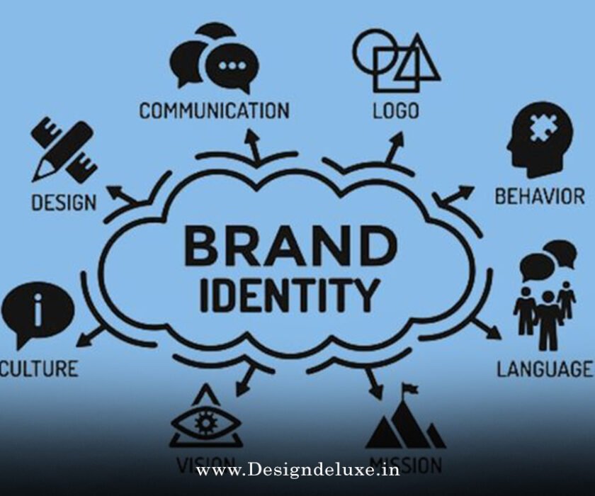
BrandBusiness & FinanceColor Palette
How to choose brand colors for small business logos 2026 starts with one truth: your colors do more than look pretty. They shape first impressions, build trust, and help your mark stand out even at thumbnail size.
Especially when paired with micro first logo design with motion for small business branding 2026, the right palette makes your tiny icon pop on phones while the motion version feels alive on social feeds.
For small businesses in India or the USA, smart color choices level the playing field without big budgets. Here’s the no-fluff guide that actually works.
- Align with personality first — Pick hues that match what your brand stands for, not just what’s trending.
- Prioritize contrast and accessibility — Your logo must read clearly at 32 pixels and in both light/dark modes.
- Keep the palette tight — Usually 3–5 colors max: one primary, one secondary, neutrals, and a strategic accent.
- Test for real use — Check how colors perform on favicons, packaging, websites, and Reels.
- Build flexibility — Ensure versions work in monochrome, dark mode, and with subtle motion effects.
Why Color Choice Matters More Than Ever in 2026
Colors hit fast. Studies show up to 90% of quick product judgments tie to color alone. For small businesses, that snap decision happens on crowded Instagram or a tiny app icon.
In 2026, with motion-first branding rising, your static colors become the foundation. The right ones make animations feel purposeful instead of random. Wrong ones? They clash, wash out, or confuse.
Indian markets often blend vibrant tradition with modern minimalism—think saffron accents on clean bases or deep teals for calm tech services. USA brands lean into bold contrasts or earthy warms. Either way, the rules stay similar: clarity wins.
Here’s the thing—trends shift, but fundamentals don’t. High contrast for micro sizes. Emotional fit. Technical performance across devices.
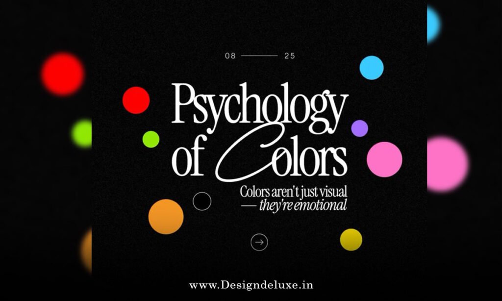
Color Psychology Basics That Still Hold Up
Colors carry meaning. Blue often signals trust and calm—popular for finance, consulting, or wellness in both countries. Green screams growth, health, or eco-friendliness. Red brings energy and urgency but can feel aggressive if overdone.
Yellow feels optimistic and approachable for food or kids’ brands. Deep burgundies and rich browns add sophistication in 2026 palettes. Teals and jade tones balance nature with tech-forward vibes.
The kicker? Context beats blanket rules. A fiery red works great for a street-food brand in Mumbai but might overwhelm a quiet yoga studio in California. Always tie color to your core message and audience.
Psychology guides, not dictates. Test with real people from your target group when possible.
2026 Color Trends Worth Considering (Without Chasing Every One)
This year leans into intentional contrast. Earthy neutrals pair with deep teals and smoky blues. Warm organic palettes feel approachable. Some brands mix retro-futurist touches—soft ’90s hues with sharp accents.
Pantone’s influence shows in calm, serene tones like soft whites or transformative teals that suggest clean slates and sustainability. Bold saturated pops appear sparingly as accents.
High-contrast black-and-white bases remain strong for versatility. Gradients return but controlled—soft blends that support motion without overwhelming.
For small businesses: Don’t overhaul everything. Pull one or two trending elements that fit your story. A subtle teal accent in a micro logo can feel fresh without dating quickly.
Step-by-Step: How to Choose Brand Colors for Your Logo
Follow this practical flow. Beginners can finish in a weekend. Intermediates refine faster.
- Define your brand personality — List 3–5 words that describe you: trustworthy, energetic, premium, playful. Write one sentence about your ideal customer.
- Research competitors and gaps — Look at similar businesses. Note what colors dominate. Then deliberately differentiate if it makes sense.
- Pick your primary color — Choose one that carries the emotional weight. Test it in your rough logo sketch at small size.
- Build supporting colors — Add a secondary for balance, neutrals (grays, off-whites, deep blacks) for backgrounds, and one accent for highlights or calls-to-action.
- Check accessibility and contrast — Use free tools like WebAIM Contrast Checker. Aim for at least 4.5:1 for text. Ensure it works in grayscale too.
- Create variations — Design light mode, dark mode, and monochrome versions. Test how the primary color behaves with motion—does it glow nicely or fight the animation?
- Test in real contexts — Export your logo tiny. View on mobile in sunlight. Print a sample. Show to 5–10 potential customers and ask what they feel.
- Document everything — Note exact hex codes, usage rules, and when to use each shade. This saves chaos later.
What I usually see: Businesses that skip step 5 regret it when their site fails accessibility checks or their favicon turns muddy.
Comparison Table: Common Color Choices by Industry
| Industry | Primary Color Ideas | Why It Works | Accent Suggestion | Watch Out For |
|---|---|---|---|---|
| Wellness / Yoga | Deep teal, soft green, warm beige | Calm, nature, trust | Gentle coral or gold | Overly bright greens |
| Food / Cafe | Warm terracotta, rich brown, yellow | Appetite, approachability, energy | Fresh mint | Too much red (aggression) |
| Tech / Services | Strong blue, charcoal, clean white | Professionalism, reliability | Vibrant teal or electric | Muddy dark blues |
| Fashion / Handmade | Earthy burgundy, soft blush, black | Sophistication with warmth | Metallic gold accent | Clashing brights |
| Eco / Sustainability | Forest green, jade, warm neutrals | Growth, trustworthiness | Sunny yellow | Washed-out pastels |
Use this as a starting point. Adapt ruthlessly to your unique angle.
Tools to Help You Choose and Test Colors in 2026
Start free: Coolors.co or Adobe Color for generating harmonious palettes. Canva’s color wheel simplifies combinations.
For accessibility: WebAIM Contrast Checker or Stark plugin in Figma. Test dark mode directly in your design tool.
Intermediates: Figma or Adobe Express let you mock the full micro logo with motion previews. Export and check file performance.
Pro move: Create a simple brand board with your colors applied to logo variations, website mock, and social post. See the system together.
Common Mistakes When Choosing Logo Colors (and Quick Fixes)
- Picking favorites instead of strategy — Your personal love for purple might not fit a B2B service. Fix: Tie every choice back to brand words and audience.
- Too many colors — Logos with 6+ hues look messy at small sizes. Fix: Stick to 3 core + 1–2 accents.
- Ignoring dark mode — Colors that pop on white fail on black. Fix: Build and test dual versions early.
- Low contrast in micro sizes — Beautiful mid-tones disappear as favicons. Fix: Prioritize bold differentiation from the start.
- Following trends blindly — Neon everything looks dated fast. Fix: Use trends as inspiration, not rules. Ground them in timeless neutrals.
Fix these and your colors support the logo instead of fighting it.
How Colors Enhance Micro First Logo Design with Motion
When your foundation follows micro first logo design with motion for small business branding 2026, colors become the multiplier. A clean, high-contrast primary lets the shape shine tiny. The accent color can pulse or reveal in the animation for extra personality without chaos.
Subtle gradients or teal-to-blue shifts work beautifully in short loops. Just keep motion lightweight—colors shouldn’t compete with movement.
Result? Your brand feels cohesive: solid at rest, engaging when animated. Small businesses win big here because one strong palette stretches across every touchpoint.
Key Takeaways
- Start with brand personality and audience, not trends.
- Limit your palette for clarity and versatility.
- Test contrast, dark mode, and tiny sizes relentlessly.
- Ensure colors support both static micro logos and subtle motion.
- Document hex codes and rules early to stay consistent.
- Differentiate thoughtfully from competitors.
- Prioritize accessibility—it’s non-negotiable in 2026.
- Treat color as a strategic system, not decoration.
Conclusion
How to choose brand colors for small business logos 2026 boils down to intention over inspiration. Nail the emotional fit, technical performance, and real-world flexibility, and your logo becomes a quiet powerhouse.
Pair it wisely with micro-first thinking and purposeful motion, and you create recognition that sticks even in fast scrolls.
Next step: Grab your three brand words today. Open a free color tool. Sketch one primary option and test it small. Small decisions now build brands that last.
Your colors can quietly do heavy lifting—if you choose them with eyes wide open.
External Links :
- FreeLogoServices: Color Trends 2026 – 10 Logo Palettes for Branding — Practical palettes and application tips for 2026.
- Brandcloud: Brand Colors in 2026 – How to Choose Them and Keep Consistent — Strategic process with testing advice.
- Kirnani Technologies: The Ultimate Guide to Choosing the Right Colors for Your Brand — Step-by-step with psychology and 60-30-10 rule.
- Canva: How to Choose Your Brand Colors — Beginner-friendly guide with color psychology focus.
- InfluenceFlow: Brand Colors and Logo Settings Guide 2026 — Personality-based selection and technical specs.
FAQ :
1. Why is choosing the right brand colors important for small business logos?
Brand colors significantly impact recognition (up to 80% increase with consistent use), evoke emotions, and communicate personality instantly. For small businesses with limited marketing budgets, strong colors help build trust, stand out from competitors, and create a professional, memorable identity across digital platforms, packaging, and social media. In 2026, colors also influence accessibility and performance in micro-first designs and motion logos.
2. How do I start choosing colors based on my small business brand personality?
Begin by defining 3–5 adjectives that describe your brand (e.g., trustworthy, energetic, eco-friendly, premium). Match these to color psychology: blue for trust and stability (common in finance/services), green for growth/sustainability, warm earth tones (terracottas, muted greens, browns) for authenticity and approachability. Avoid choosing based solely on personal preference — align with your target audience, industry, and desired emotional response.
3. What color trends should small businesses consider for logos in 2026?
2026 trends lean toward earthy and warm palettes (rich browns, terracottas, mossy greens, sun-washed neutrals) for grounded, sustainable vibes, alongside deep teals/jade for calm technology feel, smoky jewel tones, and controlled gradients. Many brands use fewer colors (2–4 max) with high contrast for micro-visibility. Retro-futurist mixes and organic warm tones replace overly bright or flat designs, helping small businesses appear modern yet approachable.
4. How many colors should I use in my small business logo and branding?
Limit to 2–4 colors maximum: one primary (dominant in the logo), one secondary for support/contrast, neutrals for backgrounds/text, and optionally one accent for highlights (e.g., CTAs). Follow the 60-30-10 rule (60% primary, 30% secondary, 10% accent) for balance. This keeps logos simple, scalable (especially for micro-first designs), accessible, and consistent across light/dark modes and platforms.
5. What practical steps and tools help small businesses choose and test brand colors?
Define personality and research competitors.
Study color psychology and generate palettes using tools like Adobe Color, Canva, or Coolors.
Test for contrast, accessibility (WCAG standards), and real-world use (websites, favicons, packaging).
Ensure versatility for digital/print and micro sizes.
Create brand guidelines for consistency. Free/affordable tools like Canva or free logo makers work well for small businesses.