Logo DesignAd'sBrandE-CommerceSocial Media Advertising
Warm organic logo and brand identity design for e-commerce social media ads is all about creating visuals that feel like a genuine invitation rather than a hard sell. Think soft curves, earthy tones, and approachable elements that stop the scroll and build instant trust in a feed full of polished perfection.
Here’s the quick overview:
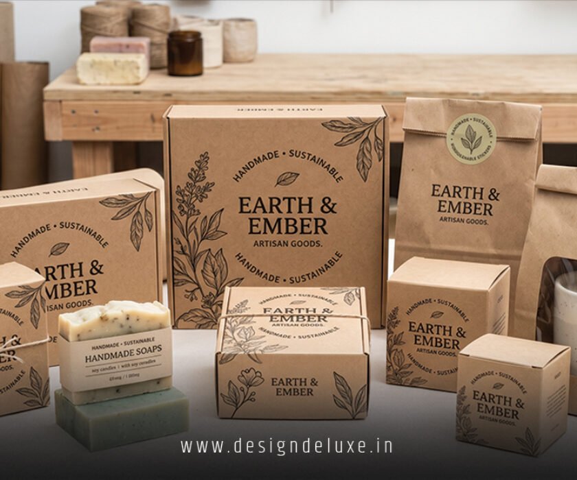
- It blends warm colors (terracotta, oat, amber) with organic shapes and subtle textures to evoke comfort and authenticity.
- Perfect for e-commerce because it humanizes your products on tiny mobile screens where ads live and die in seconds.
- Boosts engagement: people pause for brands that feel real, not robotic.
- Scales across Instagram Stories, Facebook carousels, TikTok, and Pinterest without losing personality.
- Helps beginners stand out without big budgets by focusing on emotional connection over flashy effects.
No kidding — in 2026, sterile minimalism is out. Feeds crave warmth.
Why Warm Organic Design Wins on Social Media Ads
Your e-commerce ad has about 1.5 seconds before someone swipes. Cold blues and sharp edges scream “corporate.” Warm organic elements whisper “this feels good.”
Soft, rounded letterforms and hand-drawn touches make your logo pop even at small sizes. Earthy palettes — caramel, sage, warm terracotta — trigger feelings of comfort and quality. Shoppers associate them with natural, thoughtful products.
The kicker? These designs adapt. Your primary logo works as a clean icon for profile pics. Subtle textures add depth in carousels without killing load times.
I’ve seen e-commerce brands double their ad click-through rates simply by swapping icy graphics for something that feels handmade and inviting. It’s not magic. It’s understanding that people buy from brands they like.
Core Elements of Warm Organic Logo and Brand Identity Design
Logo basics that actually work:
- Shapes: Gentle curves, irregular but balanced forms. Avoid perfect circles or harsh angles.
- Colors: Primary warm neutrals (oat beige, soft brown) plus 1-2 accents (amber, muted terracotta). Keep it to 4-5 colors max.
- Typography: Rounded sans-serifs or soft serifs with organic flow. Pair a friendly display font with a highly readable body font.
- Textures: Subtle grain, paper-like finishes, or faint hand-drawn lines — but use sparingly so they don’t muddy on mobile.
Your full brand identity goes further: consistent photography style (warm lighting, natural props), icon sets with rounded edges, and even motion principles for ads (gentle fades, not aggressive zooms).
Warm Organic Logo and Brand Identity Design for E-Commerce: Key Differences from Generic Design
| Aspect | Generic/Corporate Design | Warm Organic Design | Why It Matters for Social Ads |
|---|---|---|---|
| Color Palette | Cool blues, stark blacks | Earthy warms: terracotta, oat, amber | Builds trust and stops the scroll |
| Shapes | Sharp, geometric | Soft curves, natural irregularities | Feels approachable, human |
| Texture | Flat, glossy | Subtle grain or hand-drawn elements | Adds depth without slowing load |
| Typography | Ultra-clean sans | Rounded or slightly imperfect serifs | Conveys warmth and personality |
| Scalability | Works big, breaks small | Optimized for tiny icons and Stories | Performs everywhere on social |
| Emotional Vibe | Professional, distant | Welcoming, authentic | Drives saves, shares, purchases |
This isn’t just pretty. It directly impacts conversion when your product image sits next to the logo in an ad.
Step-by-Step Action Plan: Build Your Warm Organic Brand Identity
Beginners, breathe. You don’t need a fancy agency. Follow this and you’ll have something solid.
- Define your brand soul
Write one sentence: What feeling do you want customers to have when they see your ad? (Cozy, fresh, trustworthy?) List 3 core values. Know your audience — busy parents? Eco-conscious millennials? - Research without copying
Look at competitors. Note what feels cold. Then sketch 10 rough logo ideas on paper. Focus on simple shapes first. - Choose your color story
Pick a warm base (like soft beige #F5EDE4). Add depth with terracotta (#C46A4F) and a pop of sage or amber. Test on black and white backgrounds. - Design the logo
Start with the wordmark or simple icon. Ensure it works in one color. Test at 50×50 pixels — that’s your social avatar size. - Build supporting assets
Create 2-3 logo variations (horizontal, stacked, icon-only). Define typography rules. Set photo guidelines: natural light, minimal props, warm filters. - Create ad templates
Make 3 ready-to-use Canva or Figma templates for Instagram ads. Lock in logo placement, color usage, and font sizes. - Test ruthlessly
Run a small ad set with your new assets. Check engagement, click rate, and how it looks on different devices.
What I’d do if starting fresh today: Spend 70% of time on strategy and testing, 30% on actual pixels. Most new brands rush the pretty part and regret it.
Tools and Practical Tips for 2026
Free or low-cost options work fine for intermediates:
- Figma or Canva for quick mocks and templates.
- Adobe Express for mobile-first tweaks.
- Coolors or Adobe Color for palette generation (search “warm earthy”).
- Remove.bg for clean product cutouts.
Pro tip: Always export PNG with transparent background and SVG for scalability. Compress images aggressively for ads — speed wins.
For e-commerce, ensure your identity works on product pages too. The same warm logo that shines in ads should feel at home on your Shopify or WooCommerce store.
Common Mistakes (and How to Fix Them)
- Overloading with elements
Fix: Ruthlessly simplify. If you can’t sketch it from memory, it’s too busy for social. - Ignoring mobile
Fix: Zoom out to 20% in your design tool. If it blurs or feels cluttered, redesign. - Inconsistent application
Fix: Create a one-page brand cheat sheet. Logo size minimum, color hex codes, do’s and don’ts. - Chasing every trend
Fix: Pick one warm organic direction and own it for at least 12 months. Trends fade; consistency builds recognition. - Using cold stock photos
Fix: Shoot your own or choose images with natural lighting and real textures.
I’ve watched brands lose months fixing these. Catch them early.
Key Takeaways
- Warm organic logo and brand identity design for e-commerce social media ads turns cold scrolls into warm connections.
- Focus on soft shapes, earthy colors, and subtle humanity — it outperforms glossy perfection.
- Simplicity + consistency beats complexity every time.
- Test everything at actual ad sizes and on real devices.
- Strategy first, design second. Always.
- Your brand should feel like a trusted friend, not a salesman.
- Small details (like rounded corners or warm neutrals) make a massive difference in engagement.
- Start imperfect today rather than perfect never.
Conclusion
Warm organic logo and brand identity design for e-commerce social media ads isn’t a passing trend — it’s how smart brands cut through noise in 2026. It makes your products feel approachable, your ads more clickable, and your business more memorable.
Pick one small action right now: Open a blank canvas and sketch three soft logo shapes using warm colors. See how it feels.
Your audience is waiting for something real. Give it to them.
FAQ
What exactly makes a logo “warm organic” for e-commerce ads?
It uses soft, curved shapes, earthy color palettes like terracotta and oat, and subtle natural textures instead of sharp lines or cool tones. The result feels approachable and human on fast-scrolling social feeds.
How much should a beginner budget for warm organic logo and brand identity design?
You can start under $200 using tools like Canva or Figma yourself. Hiring a freelancer for a solid logo + basic guidelines usually runs $500–$1500 depending on complexity. Focus spend on strategy over fancy effects.
Does warm organic design work for every e-commerce niche?
It shines for wellness, fashion, home goods, food, and beauty. For highly technical or luxury minimalist brands, blend in cleaner elements — but keep the underlying warmth to stay relatable on social.
How do I make sure my warm organic brand identity performs well in ads?
Test logo visibility at small sizes, use high-contrast text overlays, and maintain consistent colors across the ad creative and landing page. Track metrics like click-through rate and time on site.
Can I update an existing logo to feel more warm and organic?
Yes. Soften edges, warm up the color palette, and add subtle rounded elements or textures. Keep the core mark recognizable so you don’t confuse loyal customers. Test the new version in a small ad campaign first.