Social Media AdvertisingDESIGN
Gaming YouTube thumbnail design is the difference between “nice video, shame no one saw it” and “why did this suddenly blow up?”. Thumbnails are billboards in the feed. If they don’t grab attention in half a second, the algorithm doesn’t get a chance to help you.
- Thumbnails are the #1 visual click trigger on YouTube.
- Strong design can lift click-through rate (CTR) and watch time, which YouTube tracks as engagement.
- Gaming audiences scroll fast; your thumbnail must read clearly at small sizes.
- Consistent thumbnails create a familiar “brand row” in suggested videos.
- Smart Gaming YouTube thumbnail design works together with your YouTube channel logo and banner design for gaming creators for a complete visual identity.
Most creators overthink concepts and underthink clarity. The goal isn’t “pretty.” It’s “instantly obvious and hard to ignore.”
Why Gaming YouTube thumbnail design matters so much
Here’s what usually happens. You put serious effort into recording, editing, and maybe even scripting. Then you slap together a thumbnail in five minutes. That imbalance kills discoverability.
Gaming content lives or dies on:
- recognizability (fans spot your videos)
- clarity (viewers understand what they’ll get)
- emotion (they feel something strong enough to click)
YouTube’s own documentation on thumbnails emphasizes contrast, readability, and limited text for better performance. When thumbnails are messy or vague, viewers skip past them. That lowers CTR, which lowers how often your videos get recommended.
No CTR, no growth. Simple as that.
The core anatomy of a high-performing gaming thumbnail
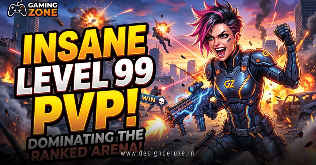
A strong Gaming YouTube thumbnail design typically uses a few consistent ingredients, not 15 random ideas.
Key elements:
- Clear focal subject
- Your face, a character, or a key in-game moment.
- Readable text (optional but powerful)
- Short, bold words that add context, not a full sentence.
- Strong contrast and color
- The thumbnail must pop against YouTube’s white or dark UI.
- Emotional hook
- Surprise, shock, hype, mystery, satisfaction—pick one primary emotion.
- Clean composition
- Enough empty space so the eye isn’t overwhelmed.
Gaming YouTube thumbnail design is not about stuffing everything from the video into a single frame. It’s about choosing one moment that sells the click.
How thumbnails and channel branding work together
If your thumbnails are doing one thing and your channel art is doing another, you’re leaving recognition on the table.
When your Gaming YouTube thumbnail design shares colors, fonts, and style with your YouTube channel logo and banner design for gaming creators, a few things happen:
- viewers start recognizing your content in suggested feeds
- your channel page looks cohesive and professional
- your brand feels deliberate, not random
Think of your logo and banner as home base, and your thumbnails as your frontline. The frontline must still look like it belongs to the same team.
Thumbnail design fundamentals for gaming creators
1. Design for small screens first
Most viewers are on mobile. If your thumbnail only looks good at full size during design, you’re not testing reality.
Rules of thumb:
- zoom out to ~10–15% while designing; if you can’t read it, it’s too busy
- avoid small UI details as the main subject
- make faces or characters large and clear
2. Use text sparingly and with purpose
Text should support the visual story, not replace it.
Good examples:
- “NO HUD”
- “ONE SHOT ONLY”
- “LAST CIRCLE”
- “PERMA-DEATH”
Bad habits:
- writing your full video title in the thumbnail
- thin fonts that vanish on mobile
- text sitting on top of a busy background with no outline
3. Emphasize emotion
Gaming content is emotional by nature. Use that.
Emotions that work well:
- shock (“did that really happen?”)
- tension (“can they clutch this?”)
- triumph (“insane win”)
- fear (“terrifying boss fight”)
- curiosity (“what build is that?”)
Faces sell emotion extremely well—either your own or a stylized character.
4. Control color like a weapon, not decoration
Color drives attention and recognizability.
Smart choices:
- 2–3 primary colors that match your channel brand
- high contrast between foreground and background
- one color reserved for “danger / surprise” (often red or yellow)
What usually hurts:
- rainbow thumbnails with no hierarchy
- backgrounds and text that share similar brightness
- random saturation boosts “because it looks cool”
Quick comparison: effective vs ineffective gaming thumbnails
| Aspect | Effective Gaming Thumbnail | Ineffective Gaming Thumbnail |
|---|---|---|
| Focus | One clear subject (face, character, or moment) | Multiple tiny elements competing for attention |
| Text | 3–5 bold words max, high contrast | Full sentences, hard-to-read fonts |
| Color | Deliberate palette, strong contrast | Oversaturated, chaotic colors |
| Emotion | Strong facial expression or clear emotional cue | Neutral expressions, no emotional pull |
| Branding | Consistent style with logo and banner | Every video looks like a different channel |
Step-by-step action plan for Gaming YouTube thumbnail design
Step 1: Decide the thumbnail’s story before you design
Ask one simple question:
If viewers saw only the thumbnail with no title, what would they think the video is about?
Decide whether your thumbnail is selling:
- a crazy moment (clutch, glitch, speedrun, fail)
- a promise (guide, tips, build, settings)
- a reaction (review, opinion, hot take)
- a journey (series, challenge, playthrough)
Your design should serve that story.
Step 2: Capture or collect strong source images
Don’t rely on random paused frames; they usually blur and lack focus.
Better options:
- take deliberate in-game screenshots during key moments
- capture your reaction face on camera with good lighting
- export frames from your edit when the action is clear
Save a small library of your facial expressions and game scenes you can reuse.
Step 3: Block out a simple composition
Before obsessing over polish:
- Place the background (game image or gradient).
- Place the main subject (your face or key game element).
- Place the text area.
- Leave space for the YouTube time stamp in the bottom right.
If this blocked-out layout doesn’t read clearly, no level of detail will fix it.
Step 4: Add text that supports, not repeats, the title
Your title and thumbnail should work as a tag team, not twins.
Bad:
- Title: “I survived 100 days in hardcore Minecraft”
- Text: “100 days in hardcore Minecraft”
Better:
- Title: “I survived 100 days in hardcore Minecraft”
- Thumbnail text: “NO STRUCTURES” or “PERMA-DEATH ONLY”
Let the text highlight what’s extreme, unusual, or risky.
Step 5: Apply consistent branding elements
Tie your Gaming YouTube thumbnail design back to your overall brand:
- use the same primary colors from your YouTube channel logo and banner design for gaming creators
- stick with one or two headline fonts across thumbnails
- keep recurring elements (outlines, drop shadows, glow style) consistent
The result: your videos start forming a recognizable “row” in recommended feeds.
Step 6: Test at small sizes and iterate
Zoom out. Shrink it. View it on your phone.
Check:
- Can you tell what’s happening in under a second?
- Is the text readable?
- Does your face or character pop from the background?
- Does it stand out from other thumbnails in your niche?
Make small tweaks:
- brighten the subject
- darken or blur the background slightly
- adjust text size / placement
- simplify anything that’s competing for attention
Common mistakes in Gaming YouTube thumbnail design (and how to fix them)
Mistake 1: Trying to show the entire story in one image
Creators often throw in:
- the map
- the weapon
- three enemies
- multiple UI elements
- plus big text
Result: a noisy mess.
Fix it:
- pick one iconic moment or element
- crop in aggressively
- use text or title to imply the rest of the story
Mistake 2: Tiny, thin fonts
Stylish fonts that disappear on mobile are a silent CTR killer.
Fix it:
- use bold, sans-serif or chunky display fonts
- outline text with a contrasting stroke
- minimize word count instead of shrinking text
Mistake 3: Blended backgrounds with no separation
When your subject and background have similar brightness and color, nothing stands out.
Fix it:
- darken or blur the background slightly
- add a subtle outline or glow around the subject
- push your subject toward the viewer with brightness and contrast
Mistake 4: Inconsistent style between videos
New fonts every video, random colors, new layout each time—you see this a lot. It kills brand memory.
Fix it:
- settle on a few “templates” you can evolve
- keep core structure similar while changing content
- refresh style once you clearly outgrow it, not every week
Mistake 5: Overusing generic “shocked face + red circle + arrow” with no logic
These tropes still work in some cases, but if they’re not connected to the content, viewers feel tricked.
Fix it:
- only use arrows, circles, and big reactions when they highlight a real moment
- make sure the core idea of the video matches the emotion shown
- avoid bait that the video doesn’t deliver on
How to align thumbnails with content type
Different gaming formats benefit from slightly different thumbnail styles.
For guides and tutorials
Focus on:
- clear text that states the benefit (“AIM BETTER”, “EASY FARM”)
- recognizable game element (weapon, menu, map)
- maybe your face for authority
You’re selling usefulness.
For challenge runs and series
Focus on:
- progression indicators (“Ep. 3”, “Day 50”, “Attempt #7”)
- consistent layout across the series
- strong emotion on success / failure faces
You’re selling story and continuity.
For highlights and funny moments
Focus on:
- biggest reaction or weirdest moment
- exaggerated emotion
- minimal text like “WHY?” or “WHAT JUST HAPPENED”
You’re selling reaction and entertainment.
Matching thumbnails to your audience and niche
A sweaty ranked Apex channel should not look like a cozy Stardew Valley channel. Same platform, totally different expectations.
Ask:
- Is my audience here for high-skill play, chill vibes, or personality chaos?
- Does my current thumbnail style communicate that immediately?
- If someone saw three of my thumbnails side by side, would they know they’re related?
What I’d do if I were targeting:
- Competitive players: sharper edges, strong contrast, focus on guns, maps, ranks, stats.
- Story/RPG fans: cinematic frames, character close-ups, moody color grading.
- Casual/cozy gamers: softer tones, cleaner layout, less aggressive text.
Your Gaming YouTube thumbnail design should feel like it belongs in your niche but still has its own twist—like a recognizable jersey in a league, not a random T-shirt.
Key takeaways
- Gaming YouTube thumbnail design is a primary driver of CTR, which directly influences growth.
- Design for mobile and small sizes first; if it doesn’t read small, it doesn’t work.
- Focus on one clear subject, strong emotion, and minimal, high-contrast text.
- Use consistent colors, fonts, and layout patterns for a recognizable brand line.
- Align thumbnails with your YouTube channel logo and banner design for gaming creators so the entire channel feels cohesive.
- Avoid overcrowding, tiny fonts, and generic tropes that don’t match the actual content.
- Your thumbnail and title should work together—one sells the story, the other clarifies it.
- Iterate often by testing small-size readability and comparing against top thumbnails in your niche.
Strong thumbnails won’t fix weak videos, but they will finally give good videos a fair shot. Clean up your Gaming YouTube thumbnail design, and you make it easier for every single upload to win that split-second “click or skip” decision.
FAQs
How much time should I spend on Gaming YouTube thumbnail design per video?
For most gaming creators, 15–45 minutes per thumbnail is a solid target, especially when you’re building templates you can reuse. Early on, that might feel like a lot, but consistent, high-quality thumbnails tend to pay off in higher CTR and better long-term growth.
Do I need my face in every Gaming YouTube thumbnail design?
Not always, but faces are powerful click drivers because humans are wired to notice expressions. If your content is personality-driven, your face can be a strong anchor; if it’s gameplay-first, you can lean harder on in-game visuals and still keep a consistent style.
How does Gaming YouTube thumbnail design connect with my channel logo and banner?
Your Gaming YouTube thumbnail design should carry over the same core colors, fonts, and general style from your YouTube channel logo and banner design for gaming creators. That visual continuity helps viewers recognize your videos quickly in search, suggested feeds, and subscriptions.