Brand
Fitness brand color psychology shapes how people feel the moment they see your logo, website, apparel, or gym space. The right palette can spark energy, build trust, or signal recovery—often before a single word is read.
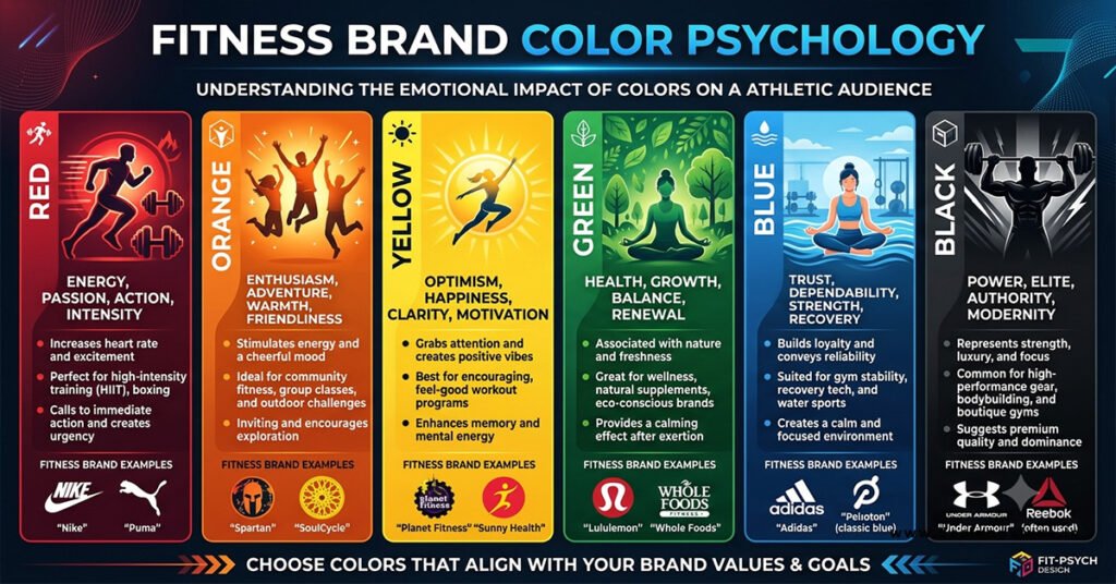
- Red and orange create urgency, power, and high energy for performance-focused brands.
- Blue builds trust, focus, and long-term commitment.
- Green signals health, balance, and sustainable progress.
- Black communicates strength, premium quality, and seriousness.
- Color choice should match your specific niche and audience emotions.
This is one piece of a larger visual system. When you combine smart color decisions with overall Fitness Brand Design: Motivation Through Visuals, the entire brand experience starts working harder for you.
Why Color Matters More in Fitness Than Most Industries
People make split-second emotional judgments. In fitness, those judgments influence whether someone feels motivated to train, trusts your expertise, or believes the brand can help them change. Research consistently links certain colors to measurable shifts in energy, perceived exertion, and competitive drive. Brands that ignore this leave motivation on the table.
Core Colors and Their Fitness Meanings
Red
Signals energy, power, intensity, and action. It raises heart rate and competitive focus. Perfect for high-performance gyms, strength training, HIIT, combat sports, and brands that sell “push harder.” Overuse can feel aggressive—balance it with neutrals.
Orange
Delivers enthusiasm, optimism, and social energy. Orangetheory built an entire identity around it because the color maps cleanly to elevated effort. Great for group fitness, bootcamps, and community-driven brands.
Blue
Evokes trust, stability, calm focus, and professionalism. Ideal for coaching brands, longevity programs, rehab-focused training, and tech-driven fitness apps. Darker blues feel authoritative; lighter blues feel supportive.
Green
Represents growth, health, balance, and nature. Strong choice for wellness studios, outdoor training, nutrition-integrated brands, and recovery-focused programs. It lowers perceived effort and supports a more holistic message.
Black
Communicates strength, premium positioning, focus, and seriousness. Pair it with bold accents for high-end or hardcore brands. Black keeps designs clean and modern while reinforcing power.
Yellow and Neon Accents
Use sparingly for optimism, attention, and energy highlights. Too much can feel cheap or distracting.
Color Strategy by Fitness Niche
| Niche / Focus | Primary Colors | Supporting Colors | Emotional Goal |
|---|---|---|---|
| Strength / Powerlifting | Red + Black | Charcoal, white | Intensity, dominance, results |
| HIIT / Group Fitness | Orange + Red | Black, white | Energy, community, urgency |
| Coaching / Longevity | Navy / Blue | Teal, soft gray | Trust, consistency, science |
| Yoga / Wellness | Green + Soft neutrals | Beige, lavender | Calm, balance, recovery |
| Premium / Lifestyle | Black + Gold or Navy | White, muted accents | Exclusivity, quality |
| Outdoor / Functional | Earth greens + Orange | Brown, sand | Vitality, adventure |
How to Apply Color Psychology to Your Brand
- Define the dominant emotion you want clients to feel (energy, trust, calm, power).
- Choose one primary brand color that owns that emotion.
- Select one or two accent colors for CTAs, highlights, and secondary messaging.
- Lock in neutrals (black, white, gray, or warm earth tones) for readability and balance.
- Test the palette across logo, website, apparel, social posts, and physical space.
- Check contrast for accessibility—text must remain readable.
- Stay consistent. Random color shifts dilute the psychological effect.
Common Mistakes to Avoid
Copying Nike or Orangetheory without matching your actual positioning. A yoga studio in pure red will feel off-brand.
Using too many bright colors at once. The result looks chaotic instead of intentional.
Ignoring context. Wall colors in a gym, button colors on a website, and logo colors all need to work together.
Forgetting cultural and demographic differences. Color meanings are not universal.
Treating color as decoration instead of a strategic tool that influences behavior.
Key Takeaways
- Color triggers emotional and physiological responses that affect motivation and perception.
- Red and orange drive energy and intensity; blue builds trust; green supports balance and health.
- Match your primary color to the core promise of your fitness brand.
- Use accents strategically and neutrals for balance and professionalism.
- Consistency across every touchpoint multiplies the psychological impact.
- Test real-world applications (logo, site, apparel, space) before finalizing.
- Pair strong color choices with broader Fitness Brand Design: Motivation Through Visuals for maximum effect.
Color is one of the fastest ways to communicate what your fitness brand stands for. Choose deliberately, apply consistently, and let the palette do part of the motivational work for you. Review your current colors against the emotions you want clients to feel—then refine. The brands that get this right look more intentional and feel more powerful the moment someone encounters them.
FAQs
What is the best color for a fitness brand logo?
There is no single best color. Match it to your positioning: red or orange for high-energy performance, blue for trusted coaching, green for wellness and balance, black for premium strength.
Can I use more than one strong color?
Yes—most effective fitness brands use one dominant color plus one accent. Too many competing hues dilute the message and reduce impact.
Does color psychology actually affect workouts?
Evidence shows certain colors influence perceived exertion, energy levels, and competitive drive. While individual responses vary, strategic use still shapes how people experience your brand and environment.