DESIGN
Book Cover Design: Make Your Title Stand Out starts with one non-negotiable truth: if readers can’t read your title at thumbnail size, the rest of your design is noise.
Here’s the quick breakdown of what works in 2026:
- Title legibility at 160–200 pixels wide is the #1 conversion filter on Amazon and most online retailers.
- Clear visual hierarchy (title first, everything else second) beats pretty but confusing layouts every time.
- High contrast plus genre-appropriate type keeps the title readable without fighting the artwork.
- Two fonts maximum and deliberate negative space stop the cover from looking amateur.
- Testing the finished cover at actual thumbnail size before upload is the cheapest quality-control step you can take.
Most online discovery still happens on phones. Your cover shows up tiny in search results, category lists, and ads. That means the title has to punch through instantly. In my experience, authors who treat the title as the primary design element—not an afterthought—see the difference in click-through rates. The ones who fall in love with a busy illustration and then squeeze the title into leftover space usually don’t.
Why Thumbnail Reality Rules Book Cover Design: Make Your Title Stand Out
Think of the thumbnail test as the ultimate stress test. Shrink your cover to about one inch wide on screen. Can you still make out every word of the title? If the answer is no, fix it.
Amazon’s search and “Customers Also Bought” carousels display covers at roughly 160–200 pixels across. That’s not much real estate. Thin fonts, low-contrast colors, and decorative scripts that look elegant at full size simply disappear. What usually happens is the eye skips your book entirely.
Genre conventions still matter. Romance readers expect certain script or elegant serif treatments. Thriller buyers respond to bold, condensed sans-serifs. Nonfiction often leans on clean, authoritative type that signals expertise. Ignoring those signals confuses the very people most likely to buy.
The goal isn’t to reinvent the wheel. It’s to make your title the clearest, strongest signal in a crowded digital shelf.
Step-by-Step Action Plan for Book Cover Design: Make Your Title Stand Out
- Start with the title itself. Write it out and decide the natural line breaks. Short titles (one to three words) can go big and bold. Longer ones need tighter tracking or condensed faces so they don’t force the type smaller.
- Choose type with purpose. Limit yourself to two font families max. One strong display face for the title, one cleaner supporting face for author name and any subtitle. Avoid system defaults like Arial or Times. Test a few options from reputable sources such as Google Fonts or Adobe Fonts that match your genre.
- Build hierarchy with size and weight. Make the title at least twice the visual weight of the author name for most debut or midlist books. Position the title where the eye lands first—often the upper third or center, depending on the image.
- Force contrast. Dark text on light or light text on dark. If the background is busy, place a subtle solid or gradient bar behind the type, or darken/lighten the area under the title. Drop shadows and outlines can help, but keep them restrained. Convert the design to grayscale; if the title still pops, you’re in good shape.
- Design for the thumbnail first. Create the cover at full print or ebook resolution, then immediately shrink a copy to 200 × 300 pixels. Read the title. If it fails, enlarge the type, simplify the background, or adjust placement. Repeat until it passes.
- Check print and digital versions. Ebook covers need to look sharp at screen resolution. Print covers (KDP or IngramSpark) require 300 DPI, proper bleed, and safe margins so the title doesn’t get clipped. Use the official templates from each platform.
- Get outside eyes. Show the thumbnail version to a few people who read in your genre. Ask only one question: “What does the title say?” If they hesitate, keep refining.
What I’d do if I were starting a new project tomorrow: open the top 20 bestsellers in my exact subcategory, note the common title treatments, then design something that feels at home in that group while still reading clearly at small size. Fitting in first, then standing out second, still works.
Comparison of Title Treatments That Work in 2026
| Approach | Best For | Strengths | Weaknesses | Thumbnail Survival |
|---|---|---|---|---|
| Bold condensed sans-serif | Thrillers, action, business | High impact, easy to scale | Can feel cold if overused | Excellent |
| Elegant serif or script | Romance, literary fiction | Emotional tone, genre signal | Thin weights vanish at small size | Fair to good |
| Large single-word type | Short titles, minimalist | Instant recognition, modern | Limits longer titles | Excellent |
| Layered or textured type | Fantasy, horror | Atmosphere and personality | Risk of illegibility | Variable |
| Clean geometric sans | Nonfiction, self-help | Authority and clarity | Can look generic without care | Excellent |
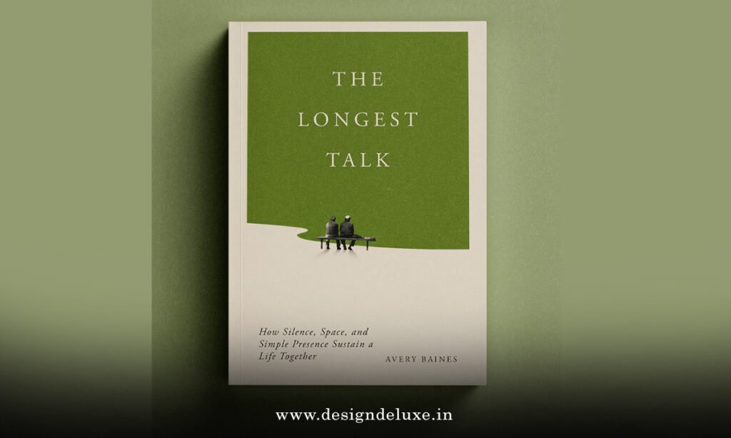
Common Mistakes & How to Fix Them
Putting a beautiful but busy image first and then forcing the title into whatever space remains. Fix: reverse the process. Lock the title treatment first, then build the image around it or choose an image that leaves clear space for type.
Using more than two fonts or mixing weights randomly. Fix: pick one strong title face and one supporting face. Stick to them.
Low contrast—gray text on a muted background, or light text over a light sky. Fix: check the design in grayscale. Increase the difference in value until the title is unmistakable.
Decorative fonts that look special at full size but turn into squiggles when reduced. Fix: test every font choice at thumbnail size before committing. If the letters merge or disappear, swap it.
Ignoring safe margins and bleed on print covers. Titles that sit too close to the edge get trimmed or look cramped. Fix: download the current KDP or IngramSpark template and keep critical text inside the safe zone.
Trying to make the title “unique” at the expense of readability. In a crowded market, clarity sells faster than cleverness that no one can read.
For official technical specs on file preparation and dimensions, see Amazon’s KDP cover requirements. For broader design principles that still hold up, the Reedsy guide onbook cover design remains a solid reference. And for a practical look at what converts in competitive categories, the analysis at Kindlepreneur on cover lessons from thousands of self-published books is worth studying.
Key Takeaways
- Thumbnail legibility is non-negotiable in 2026 online retail.
- Title size and contrast should dominate the visual hierarchy for most books.
- Two fonts maximum keeps the design clean and professional.
- Genre-appropriate type signals the right readers instantly.
- Test the cover at actual search-result size before you publish.
- Print and ebook versions need separate technical checks for resolution, bleed, and color.
- Clarity beats complexity when the first impression lasts half a second.
Nail the title treatment and the rest of the cover has a fighting chance. Get the title wrong and even a strong story starts at a disadvantage.
Open your current cover file, shrink it to one inch wide, and read the title out loud. If you can’t, you know exactly what to fix next. Then re-upload and watch how the improved clarity changes the way readers respond.
FAQs
How important is contrast when doing Book Cover Design: Make Your Title Stand Out?
Contrast is everything. Without strong value difference between the title and the background, the type disappears at small sizes no matter how large you make it. Check every design in grayscale before finalizing.
Can I use the same title treatment for both ebook and print versions?
You can keep the same design concept, but the technical files differ. Ebooks need RGB and screen-friendly resolution. Print requires 300 DPI, CMYK or the platform’s preferred color space, proper bleed, and safe margins so the title never gets cut.
What’s the fastest way to test whether my Book Cover Design: Make Your Title Stand Out will work on Amazon?
Export a version at roughly 200 × 300 pixels and view it on your phone at arm’s length. If the title is clear and the genre is still obvious, you’re close. If not, enlarge the type or simplify the area behind it until it passes.