Typography / PhotographyAD Video / Motion GraphicsAd'sBanner DesigningDESIGNE-CommerceWebsite
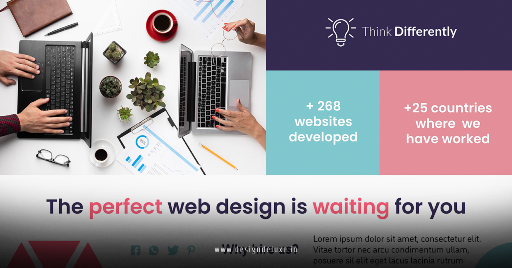
Bold typography web design banner ads and retro futurism motion graphics for e-commerce stands out in a sea of forgettable online stores. It grabs attention instantly, tells a story, and drives sales without screaming for clicks.
- Bold typography creates instant hierarchy and personality through oversized, expressive fonts that pop on banners and product pages.
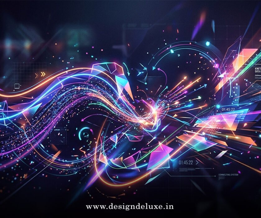
- Retro futurism motion graphics blend nostalgic 80s sci-fi vibes with sleek modern animations—think neon grids, chrome text, and floating holographic elements.
- This combo works especially well for e-commerce because it boosts engagement and perceived value in competitive categories like fashion, tech gadgets, and lifestyle products.
- The result? Higher click-through rates on ads and longer time on site for visitors who feel they’re discovering something cool, not just shopping.
Here’s the thing. In 2026, shoppers scroll past bland designs in seconds. This style cuts through the noise.
Bold typography web design banner ads and retro futurism motion graphics for e-commerce fuses visual punch with emotional pull. It turns static banners into dynamic experiences that feel premium yet approachable. Beginners can start simple. Intermediates can layer in complex animations. Either way, it delivers results.
Why Bold Typography Rules Banner Ads in 2026
Typography isn’t decoration anymore. It’s the hero. Oversized headlines with heavy weights and unexpected pairings command attention on mobile-first banners. Variable fonts let text shift dynamically—thicker on hover, lighter in motion.
What usually happens is this: a clean sans-serif body pairs with a chunky display font for headlines. Add subtle tracking adjustments and you get rhythm without chaos.
In banner ads, limit to two typefaces max. One bold for the offer. One supporting for the call-to-action. This keeps load times snappy and focus laser-sharp.
Bold typography web design banner ads and retro futurism motion graphics for e-commerce shines when the type itself animates. Letters slide in with a metallic sheen or glitch briefly before settling. It feels alive.
Retro Futurism Motion Graphics: The Secret Sauce for E-commerce
Retro futurism pulls from mid-century visions of tomorrow—think chrome rockets, atomic patterns, and vaporwave palettes updated for today. In motion graphics, these elements pulse, scan, and hover. Perfect for product reveals or promotional banners.
A floating product orb with neon scan lines? Instant intrigue. Text that types itself in a retro terminal style? Nostalgia meets tech.
Motion isn’t just pretty. It guides the eye. Subtle loops keep banners from feeling static while staying lightweight for fast loading.
Comparison: Static vs. Bold Retro-Futurist Banners
| Aspect | Static Banners | Bold Typography + Retro Futurism Motion |
|---|---|---|
| Attention Span | 2-3 seconds typical | 8+ seconds with animation |
| Perceived Brand Value | Standard retail feel | Premium, innovative, memorable |
| Conversion Impact | Baseline | Up to 25-80% lift with video/motion |
| Production Time | Quick (hours) | 1-3 days for intermediates |
| File Size/Performance | Light | Optimized HTML5 or Lottie keeps it fast |
| Best For | Awareness | Direct response + storytelling |
Data points draw from industry reports on video and motion effects.
Step-by-Step: Build Your First Bold Retro Banner Campaign
Start here if you’re new. No fancy agency needed.
- Define your vibe. Pick a retro era—1950s atomic or 1980s cyber—and tie it to your product. Tech gear loves chrome grids. Apparel pops with pastel neons.
- Choose tools. Figma for static mocks. Adobe After Effects or free alternatives like Blender for motion. Export as Lottie for web efficiency.
- Craft the typography. Grab a bold display font (think variable weights). Test oversized headlines at 100px+. Ensure readability on mobile.
- Design the banner. 300×250 or 728×90 common sizes. Place product centrally. Layer retro elements sparingly—scan lines, subtle grid, glowing accents.
- Add motion. Animate entrance: text wipes in with a futuristic whoosh. Product rotates gently. Keep total loop under 10 seconds.
- Test and launch. Use Google Ads or Meta for placement. A/B test variations. Track clicks, not just impressions.
What I’d do if starting fresh: Mock three versions in one afternoon. Pick the one that makes you stop scrolling.
Common Mistakes & How to Fix Them
Overdoing the retro can look dated fast. Fix: Balance with clean negative space. One strong retro motif beats a cluttered mess.
Ignoring mobile? Kiss half your traffic goodbye. Fix: Design mobile-first. Scale typography down gracefully. Test on actual devices.
Heavy animations tanking load speed. Fix: Use CSS animations or lightweight JSON exports. Compress assets ruthlessly.
Forgetting the offer. Pretty graphics alone don’t sell. Fix: Bold CTA text always visible. Tie motion to the benefit—”Shop the Future Now.”
Bold typography web design banner ads and retro futurism motion graphics for e-commerce fails when creators chase trends instead of solving user problems. Keep the customer first.
Advanced Tips for Intermediate Designers
Layer interactions. Hover effects that trigger deeper animations. Scroll-triggered reveals on landing pages.
Incorporate 3D elements sparingly. A subtle parallax on retro chrome text adds depth without overwhelming.
Track performance obsessively. Heatmaps show where eyes linger on your animated elements. Adjust accordingly.
Check out Figma’s web design trends guide for fresh inspiration on kinetic typography. Or explore Adobe Stock’s retro collections for authentic assets. For deeper history on the aesthetic, Wikipedia’s Retrofuturism entry offers solid context.
Key Takeaways
- Bold typography delivers instant hierarchy and brand voice in banner ads.
- Retro futurism motion graphics create emotional connection through nostalgic yet forward-looking visuals.
- Always optimize for speed—motion must enhance, not hinder, user experience.
- Test relentlessly. What looks cool in design software might flop in live ads.
- Combine with strong offers for maximum conversion power.
- Start simple, then layer complexity as skills grow.
- Focus on storytelling: make shoppers feel they’re part of something exciting.
- In 2026, this style stands out precisely because it feels human in a polished AI world.
Bold typography web design banner ads and retro futurism motion graphics for e-commerce gives your store a distinct edge. It transforms passive browsers into active buyers.
Grab a free tool today, sketch one banner this afternoon, and launch a small test campaign. You’ll see the difference immediately. The future of your e-commerce visuals? It’s bold, nostalgic, and moving—right now.
FAQs
How do I create bold typography web design banner ads and retro futurism motion graphics for e-commerce on a budget?
Free tools like Canva Pro for basics, Figma for designs, and open-source Lottie animations get you far. Focus on one hero banner first. Scale up once it performs.
What fonts work best for retro futurism in e-commerce motion graphics?
Chunky sans-serifs with geometric edges or revived serifs with metallic effects. Variable fonts from Google Fonts let you animate weight and width smoothly. Test for legibility first.
Can small e-commerce brands compete using bold typography web design banner ads and retro futurism motion graphics?
Absolutely. The style levels the playing field because creativity trumps big budgets. Consistent application across product pages and ads builds recognition fast.