Social Media AdvertisingBrandDESIGN
Social Media Design Secrets can be the difference between posts that get ignored and posts that actually drive sales for your business. You’re not struggling because your product isn’t good enough; you’re struggling because people scroll right past your content without even noticing it. Your logo is fine, your offer is fine, but your visuals aren’t stopping thumbs or telling a clear story about who you are. That’s where smart, simple design choices make all the difference. In this article, we’re going to be taking a look at Social Media Design Secrets, and how you can turn casual scrollers into loyal followers and paying customers. If you would like to find out more, feel free to read on.
Pic – CC0 License
Pick A Clear Visual Identity And Stick To It
If your posts look different every week, people won’t recognise your brand in their feed. We want your audience to be able to spot your content instantly, even without seeing your logo. To get there, choose a simple set of brand elements: two or three colours, one or two fonts, and a basic layout style you repeat often. Think about how brands like Canva and Mailchimp feel familiar every time you see them; that’s the power of consistency. Once you lock this in, use it across Instagram, TikTok, LinkedIn, Facebook, and even your email headers.
Social Media Design Secrets: Make Every Post About One Main Idea
One of the biggest design mistakes we see is trying to cram too much into a single post. When a graphic has three headlines, five icons, and a wall of text, people give up quickly. A simple secret is this: each post should have one clear message and one primary visual focus. That might be a headline, a product shot, a testimonial, or a bold call-to-action. If you’re not sure what to remove, ask yourself, “If someone only sees this for two seconds, what’s the one thing I want them to remember?” Then design around that.
Use Hierarchy So Your Message Is Instantly Clear
Good social media design isn’t just about colours; it’s about how the eye moves across the content. We want the most important part of your message to be the first thing people see. Use size, weight, and contrast to create visual hierarchy. Make your main headline the largest, supporting text smaller, and keep details like dates or disclaimers subtle. You can study how top media brands like BBC structure their news graphics: big headline, small subtext, simple layout. Apply the same thinking to your promotions, announcements, and carousels.
Social Media Design Secrets: Design For The Feed, Not The Portfolio
A common trap is designing like you’re building a perfect portfolio, instead of designing for how people actually scroll. In the feed, your post is competing with memes, friends’ photos, and breaking news. That means you need designs that are bold at a small size. Test your graphics by zooming out or viewing them as tiny thumbnails. If you can’t read the main message or recognise the subject, it’s not ready. We should also design with mobile screens in mind first, since most of your audience is holding a phone, not sitting at a big monitor.
Use Simple, Repeatable Templates To Save Time
You don’t need a full-time designer to have good-looking content. What you need are 5–7 reusable templates that fit your brand. For example, you might have a template for quotes, one for tips, one for product highlights, one for testimonials, and one for announcements. Once these are set up in a tool like Canva or Adobe Express, you can plug in new text and images each week without redesigning from scratch. This keeps your feed cohesive and saves your team hours, so you can spend more time engaging with customers instead of pushing pixels.
Choose Photos And Video That Feel Real, Not Stocky
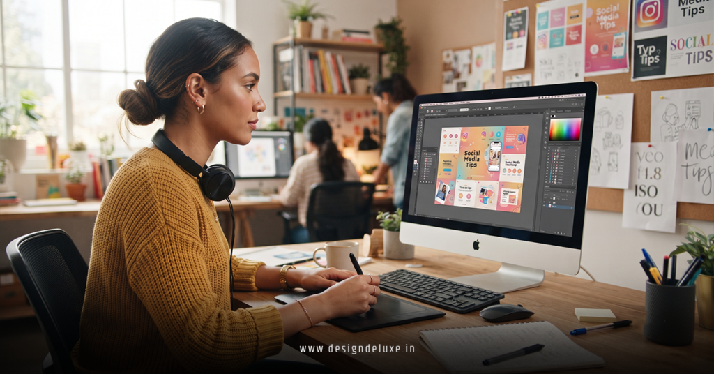
Design isn’t just about graphics; it’s also about the photos and clips you use. Audiences across the USA, UK, Australia, Singapore, and Dubai respond more strongly to content that feels real and relatable. Use images of actual customers, real workplaces, and genuine behind-the-scenes moments whenever you can. If you do rely on stock, avoid overly staged poses and fake smiles. Pair your images with clean overlays and short captions, rather than covering the entire photo with blocks of text that make it hard to connect with the people in the picture.
Nail Your Brand Story With Colour And Typography
We should treat colour and typography as part of your brand story, not just decoration. Bright, playful colours and rounded fonts send a very different message than muted tones and sharp, minimal typography. Ask: what do we want people to feel about our business—friendly, bold, premium, innovative, calm? Then pick colours and fonts that match that feeling and use them consistently. This helps you show up in feeds in a way that aligns with your positioning, whether you’re a startup in Singapore or an established service business in Dubai.
Design For Engagement, Not Just Aesthetics
Pretty posts that don’t drive any action won’t grow your business. We need to design with engagement in mind. That means using layouts that highlight questions, polls, and calls-to-action clearly. For example, if you want comments, make the question the hero of the graphic. If you want saves, present tips in a simple carousel format with big, readable text. Make buttons, arrows, and “Swipe” prompts obvious, and avoid overcrowding your posts with multiple competing actions. The cleaner and clearer the ask, the more likely people are to respond.
Keep Text Short, Sharp, And Easy To Read
Most social media platforms are not the place for long paragraphs on the image itself. Your design should give just enough information to spark interest, then let the caption do the heavier lifting. Aim for short headlines, supporting lines with 5–10 words, and generous spacing. Make sure your text contrasts well with the background; if you’re placing text over a photo, use a subtle overlay or a solid shape behind the words. This is especially important for older audiences or users checking their feeds outdoors in bright light.
Test, Learn, And Refine What Works
The smartest entrepreneurs treat social media design like an ongoing experiment, not a one-time project. We can look at your analytics and see which posts got more reach, saves, shares, and clicks, then refine your templates based on that data. If high-contrast colours outperform pastel tones, lean into that. If simple quote graphics outperform busy collages, produce more of them. Different regions and audiences respond to different styles, so don’t be afraid to adapt. The goal is to build a design system that feels like you, performs well, and is practical for your team to maintain.
We hope that you have found this article enlightening in some way, and that Social Media Design Secrets feel a lot more accessible and useful for your business. You don’t need to be a designer to build a strong visual presence; you just need a simple set of rules you follow consistently. Start with a clear identity, create a handful of reusable templates, and always design for the way people actually scroll. If you do that, your social media posts will start to look sharper, feel more professional, and most importantly, convert more of the attention you’re already getting into real business results.