B2B
B2B SaaS Landing Page Optimization starts with a hard truth most teams ignore: traffic is expensive, and a weak landing page burns it. You can pour budget into ads or SEO, but if the page fails the five-second clarity test, those visitors leave without converting. Average B2B SaaS landing pages convert in the 2–5% range. Top performers push 8–15% and higher on single-goal pages. The difference is almost never more traffic. It is tighter message match, less friction, and proof placed exactly where hesitation hits.
Here is what high-performing B2B SaaS landing page optimization delivers:
- Message match between ad or search query and the page headline so relevance is instant
- One clear primary CTA and a form short enough that qualified buyers finish it
- Trust signals and real product evidence above the fold, not buried at the bottom
- Speed and mobile experience treated as conversion levers
- Dedicated pages for different intent types instead of dumping everything on the homepage
This work sits downstream of broader site strategy. The principles in SaaS Website Design: B2B Conversion Strategies set the foundation—clarity, proof placement, and conversion architecture across the whole site. Landing pages are where those principles get tested under paid and high-intent traffic.
Most teams still send paid clicks to the homepage or a generic template. That is the fastest way to inflate CAC. Intent-matched pages outperform because they speak directly to the problem or competitor the visitor just searched.
Why Landing Pages Matter More Than Ever in B2B SaaS
B2B buyers research independently. A large share of the journey happens before any sales conversation. Your landing page is often the first real product experience they get. If it confuses them or asks for too much too soon, the committee moves on.
What usually happens is this: the ad promises a specific outcome. The page opens with a vague feature list. The form wants company size, budget, timeline, and phone number before the visitor has seen a single relevant proof point. Bounce rates climb. Cost per lead rises. Sales complains about lead quality.
In my experience, the highest-leverage fixes are almost always the simplest ones—headline alignment, form length, and single-CTA focus. Fancy design comes later.
Core Elements of Effective B2B SaaS Landing Page Optimization
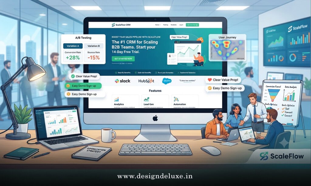
Headline and message match come first. The H1 should echo the ad or search query as closely as possible. Outcome-focused language with a specific number beats feature lists. “Cut reporting time by 40%” outperforms “Advanced analytics platform.”
Keep the primary CTA singular. Pages with one clear action consistently convert higher than those offering three competing options. Demo request or free trial—pick one primary path for that page.
Form friction kills volume. Cap fields at three to five for most demo or trial pages. Name, work email, company, and one qualifying question is usually enough. Enrich the rest later. Longer forms trade volume for early qualification signals that sales can gather in conversation.
Place trust early. Recognizable logos, G2 or Capterra badges, specific customer outcomes, and security certifications belong near the CTA—not in a distant carousel. Named results beat generic praise.
Show the product. A short looping demo or real UI screenshot above the fold reduces the leap of faith. Buyers want evidence the tool works the way you claim.
Speed is non-negotiable. Aim for Largest Contentful Paint under 2.5 seconds. Every extra second costs conversions, especially on paid traffic.
Remove navigation on pure campaign pages when possible. Extra links create exit paths. Keep the focus on the one action you want.
Step-by-Step Action Plan for B2B SaaS Landing Page Optimization
If I took over a set of underperforming landing pages tomorrow, this is the sequence I would run.
- Audit message match. Pull the top ad headlines or organic queries driving traffic. Rewrite the page H1 and subhead so they mirror the promise. This alone often delivers the largest early lift.
- Run the five-second clarity test. Show the page to three people outside the company for five seconds. Ask what the product does, who it is for, and what they should do next. Fix whatever fails.
- Cut the form to three–five fields maximum. Remove anything that is not essential for routing or basic qualification.
- Make the primary CTA the only dominant action above the fold. Demote secondary links.
- Add or reposition proof immediately next to the form and headline—logos, metrics, certifications.
- Add a short product demo or real interface visual if it is missing.
- Check Core Web Vitals and mobile experience. Fix load speed and responsiveness before running more traffic.
- Create dedicated pages for major intent clusters: brand, competitor, problem, and product. Stop sending everything to one URL.
- Instrument form starts, completions, and CTA clicks by source. Review weekly for the first 60–90 days.
Ship the high-leverage changes first. Message match and form length usually move numbers fastest without a full redesign.
Common Mistakes in B2B SaaS Landing Page Optimization and How to Fix Them
Sending all paid traffic to the homepage. Homepage messaging is broad by design. High-intent traffic needs specificity. Fix: build dedicated pages that match the query or ad.
Feature-first headlines. Buyers care about outcomes, not your architecture diagram. Fix: lead with the result and the timeframe.
Forms that feel like job applications. Every extra field drops completion rates. Fix: start short and enrich later.
Proof that arrives too late. A logo wall at the bottom does little when the decision happens above the fold. Fix: place specific signals next to the CTA.
Multiple competing CTAs. Decision fatigue is real. Fix: one primary action per page.
Ignoring mobile. A meaningful share of research happens on phones even when the purchase is desktop. Fix: design and test the critical path on real devices.
Treating the page as finished after launch. Buyer language and competitors shift. Fix: schedule quarterly reviews and continuous testing.
Comparison of High-Impact Levers
| Lever | Typical Relative Lift | Implementation Effort | Priority Order |
|---|---|---|---|
| Message match (ad/query to H1) | High | Low | 1 |
| Single CTA focus | High | Low | 1 |
| Form field reduction | High | Low | 1 |
| Proof placement near CTA | Medium-High | Low-Medium | 2 |
| Real product visual/demo | Medium-High | Medium | 2 |
| Page speed optimization | Medium | Medium | Ongoing |
| Dedicated intent pages | High (paid traffic) | Medium | 3 |
The sequence matters. Fix relevance and friction before you invest in heavier design work.
Think of a strong landing page as a focused sales conversation that never goes off-script. It confirms the visitor is in the right place, answers the immediate objection, and makes the next step obvious. When any of those pieces is missing, the conversation ends early—and the ad spend goes with it.
How many of your current pages would pass a strict five-second clarity test with a stranger? Most teams discover the answer is fewer than they expected.
Key Takeaways
- Message match between traffic source and page headline is the highest-leverage starting point.
- Single-CTA pages and short forms consistently outperform multi-option or long-form alternatives.
- Place specific trust signals and product evidence where the decision actually happens.
- Dedicated pages for different intent types beat generic destinations for paid and high-intent traffic.
- Speed and mobile experience are conversion factors, not technical afterthoughts.
- Test and iterate on a fixed cadence rather than waiting for a full redesign cycle.
- This work compounds the broader conversion architecture outlined in SaaS Website Design: B2B Conversion Strategies.
The teams that treat landing pages as precision instruments rather than afterthoughts lower CAC and improve lead quality at the same time. Start with the pages receiving the most paid or high-intent traffic. Apply the five-second test, tighten the message and form, and measure the change.
Open your highest-traffic landing page right now. Rewrite the headline for exact message match and cut the form. Then watch what happens to completion rates.
FAQs
What is a good conversion rate for B2B SaaS landing pages?
Average pages sit in the 2–5% range. Strong single-goal pages regularly reach 8–15% or higher depending on traffic source and offer type. Focus on relative improvement and downstream SQL quality rather than a single universal number.
Should every campaign have its own landing page?
Yes for major intent clusters—brand, competitor, problem, and product. Sending mismatched traffic to a generic page is one of the most common and expensive mistakes.
How does B2B SaaS landing page optimization connect to overall site strategy?
Landing pages are the sharp end of the conversion system. The broader principles in SaaS Website Design: B2B Conversion Strategies—clarity, proof placement, and friction reduction—apply directly here and scale across the rest of the site.