TECHNOLOGYDESIGN
Ad Campaign Design: Strategy + Creative for Results starts with one hard truth most beginners miss. Pretty ads don’t win. Relevant ones do. In my experience running and reviewing campaigns across Meta, Google, and YouTube for U.S. brands, the difference between “meh” performance and consistent ROAS almost always traces back to how tightly the strategy and creative lock together before a single dollar gets spent.
Here’s the quick overview you need:
- Ad campaign design combines audience insight, offer positioning, and platform-native creative into one system that actually moves people to act.
- Strategy decides who you talk to, what you say, and where. Creative decides how you stop the scroll and keep them.
- Weak creative kills strong targeting. Strong creative can salvage average targeting.
- In 2026 the platforms reward diversity of concepts, not minor variations of the same idea.
- Done right, this process turns ad spend from a cost center into a predictable growth engine.
Skip the shiny production values for a second. Focus on the bones.
Why Ad Campaign Design: Strategy + Creative for Results Matters More Than Ever
Platforms got smarter. Targeting got narrower. Attention got shorter. That means the creative carries heavier weight than it did five years ago. Nielsen’s long-running work still shows creative quality accounting for roughly half the sales lift from advertising. Targeting and media buying matter, but they can’t save a flat message.
What usually happens is a team builds a campaign around demographics and budgets first, then bolts on creative at the end. The result feels like a brochure with a media plan attached. The opposite approach works better: start with the buyer’s actual language and the single job the ad must do, then design everything around that.
Think of strategy as the map and creative as the vehicle. You can have the best map in the world, but if the car won’t start, you’re stuck on the side of the road.
The Core Framework for Ad Campaign Design: Strategy + Creative for Results
Every high-performing campaign I’ve seen follows roughly the same sequence. Skip a step and the rest gets wobbly.
1. Nail the one job of the ad
Before you open Canva or Ads Manager, write one sentence: “This ad exists to make [specific person] do [specific action] because [specific reason].” Everything else flows from that. Awareness ads educate. Consideration ads prove. Conversion ads remove friction. Mixing those jobs in one creative confuses both the viewer and the algorithm.
2. Steal the buyer’s language
Pull real phrases from reviews, sales calls, support tickets, and social comments. In my experience the best-performing headlines often come almost word-for-word from customers. “I was tired of wasting money on tools that never stuck” beats “Revolutionary productivity software” every time.
3. Match creative to platform physics
Vertical first. Most impressions in 2026 still land on mobile feeds that favor 9:16 or 4:5. Build for silent viewing—burn captions into the video. Hook in the first 1.5–3 seconds or you’re invisible. Meta’s own guidance and independent analyses keep pointing to the same thing: the opening frame decides whether the rest of the ad exists for that viewer.
4. Design for diversity, not decoration
Platform ranking systems in 2026 treat near-identical ads (same look, same opening hook) as essentially the same asset. Changing the headline color or swapping a background doesn’t count as new creative. Different problem angles, different formats (static + short video + UGC-style), and different emotional tones do.
Step-by-Step Action Plan for Beginners
If you’re just getting started or still in the intermediate range, follow this exact sequence. No fancy tools required.
- Write the single-sentence job of the campaign and the primary persona in plain language.
- Collect 10–15 real customer phrases that describe the pain or desired outcome.
- Choose three distinct angles (example: time savings, risk reduction, status/peer proof).
- For each angle, create one static image and one 15–30 second vertical video.
- Open with a pattern interrupt or direct question in the first three seconds of video. Put the benefit in the first line of text overlay.
- Keep the CTA identical to the primary headline on the landing page. Message match still matters.
- Launch the six assets in a single ad set with Advantage+ placements (or equivalent broad targeting) and let the system decide distribution for 5–7 days.
- Kill anything underperforming on cost-per-result. Scale the winners and immediately start producing the next three concepts based on what the data just taught you.
That’s the loop. Volume of distinct concepts beats perfection of any single ad.
Common Mistakes & How to Fix Them
Here’s where most campaigns quietly bleed money.
Mistake 1: Treating creative as the last step.
Strategy and creative get developed in parallel or creative comes first. Fix: lock the job of the ad and the buyer language before anyone opens design software.
Mistake 2: Testing cosmetics instead of concepts.
Five versions of the same photo with different button colors isn’t a test. Fix: change the angle, the format, or the primary benefit. One variable at a time if you want clean learning.
Mistake 3: Ignoring silent viewing and mobile vertical.
Horizontal video with no captions still gets uploaded every day. Fix: vertical first, captions burned in, text safe zones respected.
Mistake 4: Letting fatigue set in.
Even winning ads decay. In my experience the top 20% of creatives need weekly or bi-weekly refresh once spend scales. Fix: keep a rolling production calendar so new concepts enter before the old ones die.
Mistake 5: Copy-paste from big brands without context.
What works for a $50M brand with massive brand equity rarely works for a mid-market or local offer. Fix: borrow the structure, not the polish. UGC-style often outperforms high-production work for performance goals.
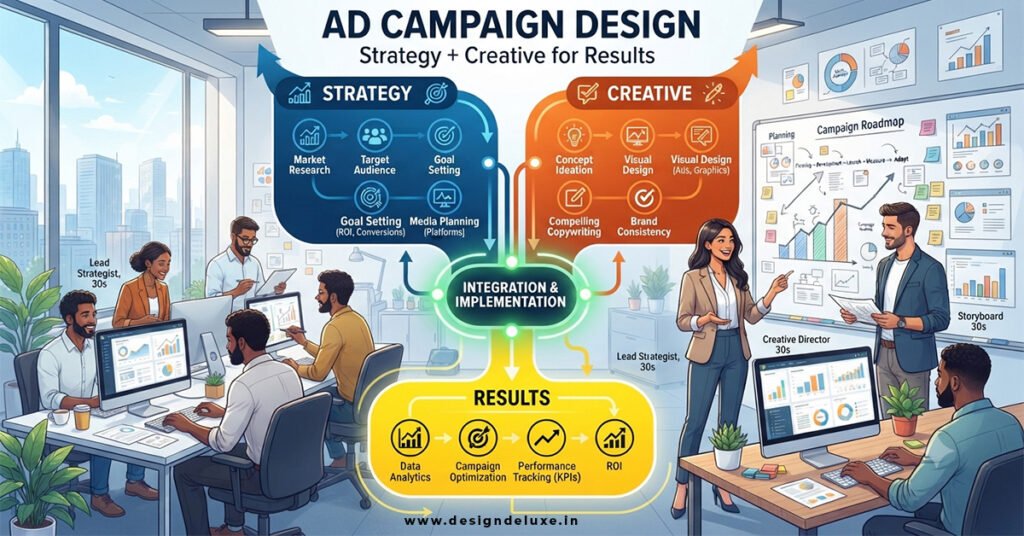
Strategy vs Creative: What Actually Drives Results
| Element | Primary Job | Common Failure Mode | High-Performance Move |
|---|---|---|---|
| Strategy | Decide who, what, where, and why | Vague objectives (“more awareness”) | One measurable action + clear persona language |
| Creative | Stop the scroll and deliver the message | Pretty but generic | Platform-native format + distinct concept + strong first 3 seconds |
| Testing | Generate learning | Cosmetic variations only | Concept-level diversity (angles + formats) |
| Refresh | Combat fatigue | Running the same winners for months | Systematic replacement of the bottom 50–70% of spend |
This table is the simplest way I know to keep teams honest. When results lag, check which column is weak.
For deeper platform-specific creative guidance, the resources at Think with Google’s performance creative materials and HubSpot’s advertising strategy library remain useful reference points. Meta also continues to publish outcome-focused diversification guidance through its official channels for advertisers.
Putting Ad Campaign Design: Strategy + Creative for Results Into Practice
One fresh way to think about the whole process: strategy is the recipe, creative is the cooking. You can have the perfect recipe and still burn the dish. Or you can be a gifted cook working from a bad recipe and still get something edible but never great. The teams that win do both well, then keep tasting and adjusting.
Rhetorical question worth asking every week: if this ad appeared in my own feed right now, would I stop scrolling—or would I keep going? Be honest. Most ads fail that test.
Another one: does this creative make a clear promise that the landing page immediately delivers on? Message mismatch still kills conversion rates faster than almost anything else.
Key Takeaways
- Creative quality remains one of the highest-leverage variables in paid media performance.
- Start with the single job of the ad and real buyer language before any design work.
- Build vertical, captioned, hook-first creative as the default in 2026.
- Diversify at the concept level (different angles and formats), not just visual variations.
- Run a continuous production and testing loop so winners get scaled and losers get replaced.
- Align the ad’s CTA and primary claim with the landing page headline.
- Treat strategy and creative as a single system, not sequential hand-offs.
- Refresh aggressively once an ad starts showing fatigue signals.
The real benefit of getting Ad Campaign Design: Strategy + Creative for Results right is predictability. You stop hoping the next campaign “works” and start knowing how to make the next one better than the last. Your next step is simple: take one existing campaign, write the single-sentence job of each ad currently running, and kill or rebuild anything that doesn’t pass that clarity test this week.
FAQs
How does Ad Campaign Design: Strategy + Creative for Results differ for Meta versus Google?
Meta leans harder on emotional hooks, native-feeling vertical video, and concept diversity because its ranking systems prioritize engagement signals in the feed. Google Search and Performance Max reward tighter message match between the ad claim and the landing page plus clear offer language. The strategic foundation (persona + job of the ad) stays the same; the creative surface changes.
What’s the minimum creative volume needed when starting Ad Campaign Design: Strategy + Creative for Results?
Three distinct concepts with two formats each (static + short video) is a practical starting point for most intermediate accounts. That gives the system enough variety to learn without spreading budget too thin. Scale production once you see which angles actually convert.
Can small U.S. businesses still compete on Ad Campaign Design: Strategy + Creative for Results without big production budgets?
Yes. Unpolished, authentic creative—phone footage, real customer stories, simple screen recordings—frequently outperforms expensive studio work for performance goals. Focus budget on testing more concepts rather than higher production value on fewer ones.