
Fitness Brand Design: Motivation Through Visuals is the practice of using color, type, imagery, and layout to make people feel ready to move before they read a single word. Done well, it does the first round of selling for you.
- What it is: A deliberate visual system (logo, palette, typography, photography, motion) built to trigger energy and action.
- Why it matters: People judge a gym, app, or coach in seconds, and visuals set that first impression.
- Who it’s for: Solo trainers, boutique studios, supplement startups, and fitness apps in the US market.
- What it fixes: Generic branding that blends into a feed of identical black-and-neon templates.
- What you get: A repeatable system you can apply to your site, socials, signage, and packaging.
Why Visuals Do the Heavy Lifting in Fitness
Here’s the thing about fitness buyers. They’re rarely buying a workout. They’re buying a version of themselves they haven’t met yet.
Your visuals are the preview. A beginner scrolling at 10 p.m., half-guilty about skipping the gym, isn’t reading your mission statement. They’re feeling something in about two seconds, and that feeling decides whether they tap or keep scrolling.
Think of your brand as a training partner who shows up before you do. It’s already warmed up and already confident. It makes the next step feel easy.
That’s why Fitness Brand Design: Motivation Through Visuals sits at the center of any serious marketing plan. Copy explains. Visuals convince.
The Building Blocks of Fitness Brand Design: Motivation Through Visuals
Every motivating brand runs on five levers. Pull them together and the whole thing hums. Pull them against each other and you get noise.
Color: The Fastest Mood Switch You Own
Color sets emotional temperature instantly. Warm tones like red, orange, and yellow read as energy and urgency. Cool blues and greens read as calm, trust, and recovery.
My professional opinion, not a hard rule: match the color to the promise. A HIIT studio selling intensity wants heat. A mobility or yoga brand selling restoration wants cooler, softer palettes.
Pick one dominant color, one supporting color, and one neutral. That’s it. Three is a system. Seven is a mess.
Typography: Your Brand’s Voice, Visible
Fonts talk. Heavy, condensed sans-serifs shout “work.” Rounded, open letterforms whisper “you belong here.” Beginners often find the first approach intimidating, which is worth remembering if your audience is people who’ve never set foot in a gym.
Limit yourself to two typefaces. One for headlines, one for body text. Then check legibility. The W3C’s WCAG contrast guidance recommends a contrast ratio of at least 4.5:1 for standard body text, which keeps your message readable for far more people.
Imagery: Show the Journey, Not Just the Peak
Ripped athletes mid-deadlift are everywhere. For beginner and intermediate audiences, they can backfire. The gap between “them” and “me” feels too wide.
What I’d do instead: show real progress. A first pull-up attempt. A sweaty, smiling face after a Tuesday-night class. Regular bodies in regular gym clothes doing hard things.
Layout and Motion: Give the Eye Somewhere to Go
Whitespace isn’t wasted space. It’s the rest day between sets. Cluttered layouts exhaust people before they’ve started.
Short looping video, subtle hover animations, and bold calls to action add momentum. Keep them purposeful.
Logo and Symbols: Small Mark, Big Job
Your logo needs to work at thumbnail size on a phone and at six feet wide on a studio wall. Simple shapes win. Test it in one color on a busy photo background before you commit.
Fitness Brand Design Styles Compared
Not every style fits every audience. Here’s a quick comparison to help you choose a direction. Here is your code converted into a properly formatted table:
| Visual Style | Best For | Motivation Signal | Watch Out For |
|---|---|---|---|
| Bold & High-Contrast (black, red, heavy type) | Strength gyms, HIIT, boxing | Intensity, discipline, grit | Can intimidate true beginners |
| Bright & Energetic (saturated color, dynamic photos) | Group classes, cycling, dance fitness | Fun, community, momentum | Looks cheap if photography is weak |
| Soft & Natural (earth tones, airy layouts) | Yoga, Pilates, recovery, wellness coaching | Calm, balance, self-care | May feel low-energy for performance buyers |
| Clean & Tech-Forward (minimal UI, gradients, data visuals) | Fitness apps, wearables, online coaching | Progress, precision, results | Risk of feeling cold or impersonal |
| Gritty & Raw (texture, grain, documentary photos) | CrossFit-style boxes, powerlifting clubs | Authenticity, effort, belonging | Can alienate newcomers if overdone |
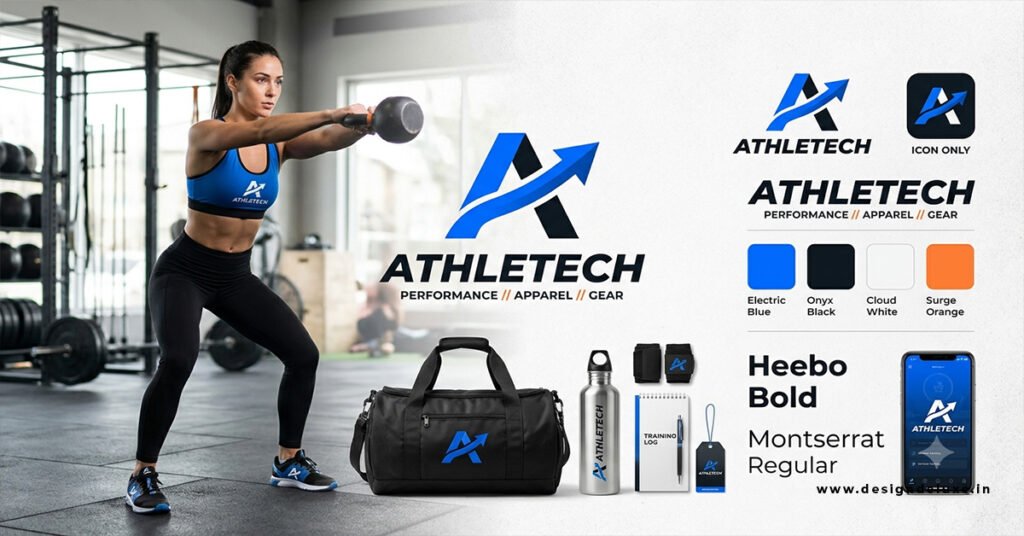
Step-by-Step Action Plan for Fitness Brand Design: Motivation Through Visuals
You don’t need an agency budget. You need a clear process and the discipline to follow it.
Step 1: Define the Feeling First
Before you touch a color picker, write down three emotions you want a visitor to feel. Confident. Welcome. Fired up. Whatever fits. Every design choice should serve those words.
Step 2: Know Who You’re Talking To
A 28-year-old returning to training after a long break wants something different from a 45-year-old marathoner chasing a PR. Pull up your last 20 customers or clients. What do they have in common? Design for them, not for yourself.
Step 3: Audit Your Competitors
Screenshot the websites and Instagram grids of five local or niche competitors. Lay them out side by side. If they all look alike, you’ve just found your opening. Zig where they zag.
Step 4: Build a Mini Style Guide
One page is enough. Include your three colors with hex codes, your two fonts, logo rules, photo style notes, and a short line on tone of voice. Save it somewhere your whole team can find it.
Step 5: Apply It Everywhere, Consistently
Site. Socials. Email templates. Class schedules. Merch. Consistency is what makes a brand feel established, and repetition builds recognition faster than any single clever design.
Step 6: Protect What You Built
Once your name and logo gain traction, look into trademark registration. The USPTO’s trademark resources walk you through the process, and it’s far cheaper to do this early than after a dispute.
Step 7: Test, Measure, Adjust
Run two versions of a landing page hero image for two weeks. Track click-through and sign-up rates. Keep the winner. Repeat quarterly.
Common Mistakes (and How to Fix Them)
I’ve seen the same errors on repeat. Most are cheap to correct.
Mistake 1: Copying the “gym bro” template. Black background, neon accent, shirtless stock photo. It’s everywhere, so it says nothing. Fix: Build your palette from your specific audience and promise, not from what’s trending.
Mistake 2: Using stock photos that don’t match your members. Visitors can smell stock imagery. Fix: Schedule one half-day photo shoot with real members (with signed releases). Those images will outperform stock for months.
Mistake 3: Ignoring accessibility. Light gray text on a white background looks sleek and reads terribly. Fix: Test every text and background pairing against the 4.5:1 contrast guideline mentioned earlier.
Mistake 4: Designing only for desktop. Most fitness discovery happens on phones. Fix: Design mobile-first, then scale up.
Mistake 5: Inconsistent visuals across channels. A polished website paired with a chaotic Instagram feed confuses people. Fix: Build reusable templates for posts, stories, and flyers.
Mistake 6: Selling perfection instead of progress. Unrealistic imagery can make beginners feel like outsiders. Fix: Feature before-and-during stories, not just before-and-after.
Making Fitness Brand Design: Motivation Through Visuals Work for Beginners vs. Intermediates
Your audience splits into two camps, and they respond to different cues.
Beginners need reassurance. Warm colors, approachable fonts, friendly faces, and simple layouts tell them “you won’t be judged here.” Show first-day moments, not finish lines.
Intermediates want challenge and proof. Data visuals, progress charts, performance-focused photography, and sharper contrast speak to people already invested in getting better.
Can one brand serve both? Absolutely. Anchor your identity in a shared core, then flex imagery and messaging by segment. A beginner-friendly landing page and an advanced-program page can wear the same colors while telling different stories.
Tie your visuals back to real-world standards when you can. The federal Physical Activity Guidelines for Americans recommend at least 150 minutes of moderate-intensity aerobic activity per week for adults. Visuals that make that target feel achievable (a simple weekly tracker graphic, say) turn a dry number into a motivating goal.
Key Takeaways
- Fitness Brand Design: Motivation Through Visuals is about triggering action through emotion, not decorating a logo.
- Choose color, type, and imagery to match the feeling your audience wants, not what’s trending.
- Limit your system: three colors, two fonts, one consistent photo style.
- Show real progress and real bodies to connect with beginner and intermediate audiences.
- Check text contrast against the WCAG 4.5:1 guideline so everyone can read your message.
- Build a one-page style guide and apply it across every channel.
- Test visuals on a schedule and keep what converts.
- Look into trademark protection once your brand starts gaining traction.
Your Next Move
Strong visuals don’t just make a fitness brand look good. They make people feel capable, and that feeling is what gets someone to book the first class or download the app.
Start small this week. Open your homepage and your Instagram profile side by side, then ask whether they feel like the same brand. If not, write your three emotion words and fix the biggest mismatch first.
FAQs
How much should a small fitness business spend on visual branding?
There’s no universal number, and anyone quoting one is guessing. A solo trainer can build a solid foundation with a freelance designer, a one-page style guide, and one professional photo session. Start there and reinvest as revenue grows.
What colors work best in Fitness Brand Design: Motivation Through Visuals?
It depends on your promise. Warm, saturated colors tend to signal energy and intensity, while cooler and earthier tones suggest calm and recovery. Pick the palette that matches how you want clients to feel, then test it with your actual audience.
How often should I refresh my fitness brand visuals?
Keep the core identity (logo, palette, typefaces) stable for years, since consistency builds recognition. Refresh photography, campaign graphics, and social templates every few months to keep things feeling current.

