2026 Design Trends are no longer just about looking pretty. They’re about whether your website, packaging, or social posts feel trustworthy, human, and worth a second look. If your visuals still scream “template from three years ago,” people notice—and they move on.
You’re busy running the business. Design can feel like one more thing you don’t have time for. Yet the brands that win attention right now are the ones that look intentional without trying too hard.
In this article, we’re going to be taking a look at 2026 Design Trends, and how you can use them to make your brand feel fresher and more trustworthy without a massive redesign budget. If you would like to find out more, feel free to read on.
Pic – CC0 License
Human-Centered Looks That Build Trust
Customers in the USA, UK, Australia, Singapore, and Dubai are tired of polished perfection that feels fake. The strongest 2026 Design Trends lean into warmth and honesty. Think slightly imperfect textures, soft earth tones, and photos of real people instead of stock-model smiles.
This shift shows up in packaging, websites, and even social graphics. Brands are using muted greens, warm browns, and soft blues that feel grounded. Pair that with clear, readable type and you’ve already done more for trust than a flashy animation ever could.
You don’t need a full rebrand. Start by swapping out one cold, corporate image on your homepage for something that looks like it belongs to a real team. Small changes compound fast.
AI Tools That Actually Help (Without Taking Over)
AI design tools have matured. In 2026 they’re less about generating random logos and more about speeding up the boring parts—resizing assets, testing color combinations, or cleaning up product photos. Tools from companies like Adobe now let small teams work faster while still keeping the final decisions human.
The smart move is to treat AI as an assistant, not the creative director. Use it to produce three layout options, then pick the one that feels most like your brand and refine it yourself. That balance keeps your work original while saving hours.
Many entrepreneurs we talk to are already doing this for social posts and simple packaging mock-ups. The ones who stay in control of the final look are the ones whose brands still feel distinct.
Bold Type and Motion That Catch the Eye
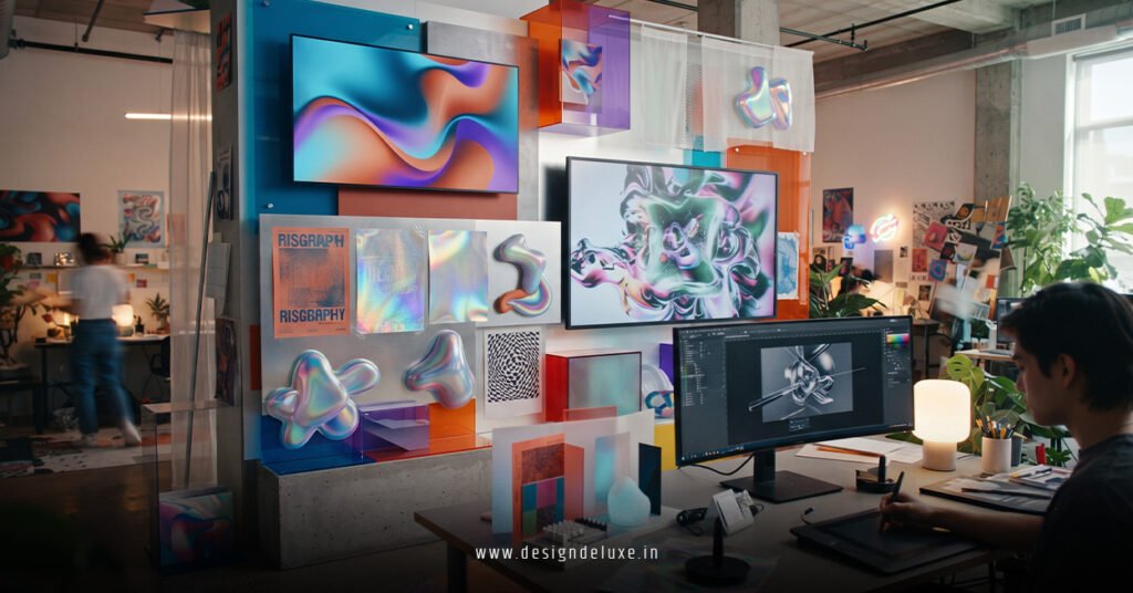
Typography is having a loud year. Oversized, slightly playful lettering and strong contrast between headlines and body text are everywhere. When done well, it makes your message impossible to ignore on a phone screen.
Motion is following the same path. Subtle movement—logos that gently shift, buttons that respond when you hover—adds energy without slowing the page down. According to recent guidance from Figma, these micro-interactions help users feel the brand is alive and responsive.
If your site still feels static, add one small animated element to the hero section. Keep it light. The goal is to guide the eye, not distract it.
Immersive Details Without the Overwhelm
3D elements and soft depth are showing up more in product pages and digital catalogs. Think gentle shadows, layered product shots, or simple spatial layouts that make items feel touchable. These 2026 Design Trends work especially well for e-commerce and service businesses that want to stand out in crowded markets.
The key is restraint. One well-placed 3D product render or a clean bento-style grid of features is enough. Overdoing it makes pages heavy and slow—something customers notice immediately on mobile.
For local businesses in places like Singapore or Dubai, this approach also pairs nicely with clear language and strong trust signals such as real customer photos and straightforward contact details.
Practical Ways to Apply These Trends Today
You don’t need a design agency to start. Here’s a simple sequence many small-business owners are using:
- Audit your homepage and main product images. Replace anything that feels generic or cold.
- Choose two or three warm, natural colors and stick to them across your site and socials.
- Test one bold headline style and one subtle motion element.
- Use AI tools only for the first draft of graphics, then edit for personality.
Sites that follow this path tend to feel more current while still matching the practical, no-nonsense expectations of customers across different regions. Resources from Behance regularly showcase real examples of these approaches in action if you want visual inspiration.
Keep accessibility in mind too. High contrast, readable fonts, and simple navigation still matter more than any trend. A beautiful site that people can’t use is just expensive decoration.
We hope that you have found this article enlightening in some way and that it gives you a clear starting point for updating your brand’s look this year. Design doesn’t have to be complicated or expensive. Focus on warmth, clarity, and a few well-chosen modern touches, and you’ll already be ahead of most competitors who are still stuck in last year’s defaults.