Logo DesignBanner DesigningBrandSocial Media AdvertisingTECHNOLOGY
YouTube channel logo and banner design for gaming creators is the visual handshake that tells viewers who you are before they hear a single word.
- Your logo is the tiny identity marker that shows up in search, comments, uploads, and subscriber lists.
- Your banner is prime brand real estate that can communicate your niche, upload schedule, and vibe in one shot.
- Good design helps a gaming channel look legit, even if the channel is brand new.
- Bad design makes a good creator look unfinished.
- The goal is simple: be recognizable on a phone, in a feed, and at a glance.
Here’s the thing. Most gaming creators don’t need “fancier.” They need clearer. The best YouTube channel logo and banner design for gaming creators acts like a clean esports jersey: instantly identifiable, easy to repeat, and built for chaos on small screens.
Why YouTube channel logo and banner design for gaming creators matters
On YouTube, your visuals do a lot of silent selling. Before someone clicks, they see your avatar, your banner, and your thumbnails. If those pieces feel random, viewers hesitate. If they feel tight, the channel looks trustworthy.
That matters even more for gaming creators. Gaming is crowded, fast-moving, and personality-driven. Your logo and banner don’t need to explain everything. They need to make the right promise.
A strong logo:
- reads clearly at tiny sizes
- works as a profile picture and watermark
- matches your content style without looking like a stock template
A strong banner:
- reinforces your niche
- sets expectations for uploads
- makes your channel feel active, not abandoned
What usually happens is this: a creator starts with a cool idea, then jams too much into the banner. Too many icons. Too many colors. Too many promises. The result looks noisy. On mobile, it collapses into mush.
The smarter move is to design for clarity first, flair second.
YouTube channel logo and banner design for gaming creators: what good branding actually looks like
Good gaming branding is not about copying the loudest channels in your niche. It’s about building a visual system you can repeat across your channel, social pages, Discord, and merch later if you grow that far.
Think of it like a loadout. You do not bring every weapon. You bring the tools that fit the map.
A useful YouTube channel logo and banner design for gaming creators usually includes:
- one primary color palette
- one or two typefaces
- a mascot, initials, icon, or character mark
- a banner headline that says what the channel covers
- consistent art style across thumbnails and overlays
If your channel covers FPS, battle royale, RPGs, or variety gaming, the look should match the content energy. Fast edits and competitive play usually pair well with sharper shapes, bold contrast, and minimal clutter. Story-driven or cozy gaming can lean softer, cleaner, and more atmospheric.
For official size and placement guidance, use the YouTube Help page for channel art and profile image dimensions. It’s the safest place to double-check what fits where.
What to put in the logo and banner
The logo should not try to be a full poster. Keep it simple.
For your logo
Use one of these:
- initials
- a mascot face
- a game-inspired symbol
- a stylized emblem
Avoid tiny text. Avoid busy scenes. Avoid squeezing your whole channel name into a circle that will be viewed at thumbnail size.
For your banner
Use the banner to answer three things fast:
- What kind of gaming content do you make?
- How often do you upload?
- What makes your channel different?
A banner can include:
- channel name
- tagline
- upload schedule
- platforms like Twitch, TikTok, or Discord
- a simple background that matches the logo
The trick is restraint. The best banner is not the one with the most graphics. It’s the one viewers understand in a second.
Answer-ready comparison table
| Element | Best use | What to include | What to avoid |
|---|---|---|---|
| Logo | Profile picture, comments, watermark | Initials, mascot, emblem, bold contrast | Small text, extra details, gradients that blur at tiny size |
| Banner | Channel homepage branding | Niche, upload schedule, social handles, clean background | Too much text, cluttered icons, random stock art |
| Color palette | Brand recognition | Two to four coordinated colors | Seven colors fighting for attention |
| Typography | Readability and personality | One bold headline font, one supporting font | Decorative fonts that look cool but read badly |
| Visual style | Channel identity | Consistent shapes, shadows, textures, or mascot style | Mixing five unrelated design styles in one place |
Step-by-step action plan for beginners
If you’re starting from zero, keep this process tight.
1) Lock the channel position
Decide what kind of gaming creator you are.
Ask:
- Do you post clips, full gameplay, tutorials, rankings, or commentary?
- Are you a casual personality channel or a high-skill competitive channel?
- Do you want your brand to feel funny, intense, sleek, retro, or cozy?
This decision drives everything else. A horror gaming channel should not look like a pastel co-op channel. That sounds obvious, but plenty of creators miss it.
2) Build a tiny brand kit
Pick:
- 2 main colors
- 1 accent color
- 1 headline font
- 1 supporting font
- 1 symbol or mascot direction
That’s enough. Really.
If you need a reference point for accessibility and contrast, the W3C contrast accessibility guidance is worth using before you finalize colors. Good contrast helps your channel look cleaner and makes text easier to read.
3) Design the logo for small-size survival
Make the logo work at 32 px and larger. That’s the real test.
What I’d do if I were designing for a new gaming channel:
- start with a simple icon or monogram
- use bold edges and clear shapes
- test it against light and dark backgrounds
- export a version with no tiny detail
If it fails when shrunk, cut it down further.
4) Design the banner around the one-line pitch
Your banner should answer: “Why should I care?”
Examples of banner angles:
- “Daily Valorant tips and ranked climbs”
- “Retro RPGs, boss fights, and late-night streams”
- “Funny Fortnite clips and challenge runs”
Keep the message short. The banner is not a résumé.
5) Check the safe zone
YouTube banners get cropped differently on TV, desktop, tablet, and phone. That means the edges can disappear. Keep important text and logos centered.
A good habit:
- place the channel name in the central safe area
- keep social icons off the far edges unless they’re decorative
- preview the banner on mobile before publishing
6) Use a consistent thumbnail style
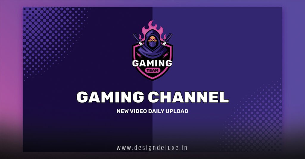
This is where the branding actually pays off. Your logo and banner should match your thumbnails, or the whole channel feels disconnected.
For example:
- same colors
- same type treatment
- same outline style
- similar character expressions or gaming imagery
If you want a practical publishing benchmark for what still performs on platform, the YouTube Creator Academy is a strong place to study channel presentation and content basics straight from the source.
Common mistakes and how to fix them
Too much detail in the logo
This is the classic mistake. Creators try to pack in a controller, headset, character face, flames, lightning, and their full channel name.
Fix it:
- keep one focal point
- remove all nonessential details
- test the logo at tiny size before you commit
Banner text overload
If a banner has a paragraph of text, it stops being branding and starts becoming a flyer.
Fix it:
- limit yourself to one short line and one support line
- use only the most useful info
- let the visuals do part of the job
Random style mixing
A neon logo with a soft pastel banner and a gothic thumbnail set? That mismatch confuses viewers.
Fix it:
- choose one visual lane
- keep the same color logic across assets
- build every design from the same mood board
Weak contrast
If the logo blends into the background, it disappears. Same with banner text.
Fix it:
- dark text on light backgrounds or the reverse
- add outlines when needed
- use contrast as a tool, not an afterthought
Overusing gaming clichés
Yes, controllers, skulls, flames, and glitch effects are popular. That’s also why they can feel generic fast.
Fix it:
- use one cliché at most
- combine it with a unique shape, mascot, or color system
- make sure the brand feels like yours, not a template
Forgetting channel behavior
A banner that looks great but doesn’t communicate upload cadence or niche can leave new viewers guessing.
Fix it:
- add a short schedule if you post consistently
- state your niche clearly
- keep the message obvious on first glance
Design choices that work well for gaming creators in 2026
The best YouTube channel logo and banner design for gaming creators in 2026 is still built on basic principles, but the execution has gotten cleaner.
What’s working now:
- bold, readable icons
- minimal text
- flatter shapes with selective depth
- strong contrast
- channel art that looks good on mobile first
What’s fading:
- overcomplicated gradients
- tiny decorative text
- cluttered esports-style banners for casual creators
- generic stock visuals that scream “template”
A fresh metaphor? Your channel branding is a lobby screen. If the lobby looks sharp and makes sense fast, people queue up. If it looks confusing, they back out.
That’s the game.
A simple workflow if you’re hiring a designer
Not every creator wants to make this from scratch. Fair.
If you’re paying a designer, give them a tight brief:
- channel name
- gaming niche
- target audience
- preferred color palette
- three example channels or moods
- logo idea, if you have one
- banner text
- where the art will be used
Don’t hand over vague notes like “make it look cool.” Cool to whom? Competitive shooter fans? Cozy Switch players? Horror shorts viewers? Be specific.
If you’re on a budget, ask for:
- logo
- banner
- social profile crop
- transparent version
- alternate dark and light versions
That gives you flexibility later without paying for a full redesign.
Key Takeaways
- YouTube channel logo and banner design for gaming creators should make the channel recognizable in seconds.
- The logo needs to survive tiny sizes. If it only looks good big, it fails.
- The banner should explain the channel’s niche and promise without clutter.
- Simple beats busy almost every time.
- Consistent colors and typography make a gaming channel feel established.
- Mobile first is the right mindset. Most viewers will see your branding small.
- Avoid generic gaming clichés unless you can twist them into something distinct.
- Strong branding does not replace good content, but it makes good content easier to notice.
If you want your channel to look serious fast, start with clarity, not decoration. Build a logo that reads instantly. Build a banner that says exactly what viewers get. That alone can lift the whole channel.
FAQs
What makes YouTube channel logo and banner design for gaming creators different from other niches?
Gaming branding usually needs more energy, stronger contrast, and a sharper identity because the space is crowded and visually loud. The logo and banner have to feel fast, memorable, and readable on small screens.
Should a gaming creator use a mascot or initials for the logo?
Either can work. Mascots are great if you want personality and long-term brand depth, while initials are cleaner and easier to recognize at tiny sizes. Pick the one that fits your channel style and can scale well.
How often should YouTube channel logo and banner design for gaming creators be updated?
Only update when the brand no longer matches the content, audience, or quality of the channel. If the current design still looks clean and fits your niche, don’t change it just to stay busy. Consistency builds recognition.