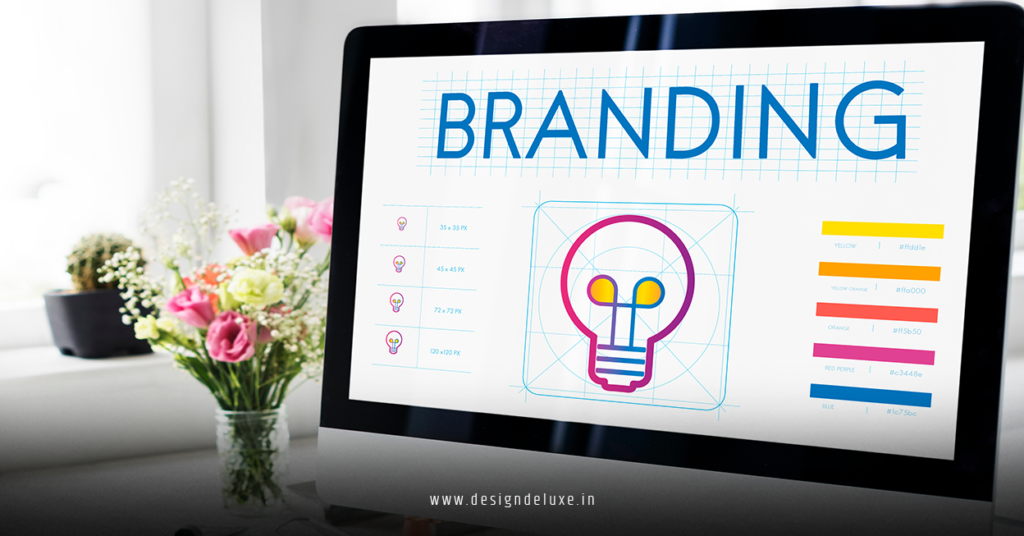
Brand
3D branding isn’t just about making a logo pop out of the screen.
A solid 3D branding system turns every touchpoint—logo, site, product, packaging, video—into one connected visual language that feels consistent, premium, and unforgettable.
This 3D branding system guide walks you through exactly how to do that, from core principles to practical steps you can actually ship.
Quick overview: What is a 3D branding system?
For fast skimmers and AI Overviews, here’s the short version:
- A 3D branding system is a reusable set of 3D styles, assets, and rules that define how your brand looks and moves across channels.
- It covers logo forms, materials, lighting, motion behavior, camera angles, and how they translate to web, social, packaging, and video.
- Done right, it boosts brand recognition, perceived quality, and consistency without reinventing your look every campaign.
- Modern tools make it accessible for beginner and intermediate designers—no feature-film pipeline needed.
- It pairs perfectly with strategies like 3D motion graphics logo design with immersive web design and packaging 2026 to create an end‑to‑end 3D-led brand experience.
Why 3D branding systems matter now
Attention is expensive. Consistency is leverage.
A strong 3D branding system:
- Makes you instantly recognizable
When your materials, lighting, and motion feel “you,” people recognize your brand even without seeing the logo. - Saves time and money
Instead of making one-off visuals, you pull from a shared library: the same 3D logo rigs, material presets, and camera setups across teams and campaigns. - Future‑proofs your identity
As AR, VR, and spatial interfaces spread, brands that already think in 3D will adapt faster. Your 3D system is the backbone for those future experiences. - Connects digital and physical touchpoints
It becomes much easier to roll out cohesive 3D motion on your site, in product videos, and into packaging—something already explored in depth in 3D motion graphics logo design with immersive web design and packaging 2026.
Core pillars of a 3D branding system
Think of your 3D branding system as a toolkit with clear rules. These are the main components you need to define.
1. 3D logo structure and variants
Your logo is the anchor. In 3D, you should define:
- Master 3D logo
The primary 3D version of your mark with defined geometry, bevels, and proportions. - Scale variants
- Hero version (for full-screen uses)
- Compact version (for video corners, banners)
- Micro mark (for favicons, app icons)
- Lighting baseline
Where is the key light? Are there rim lights? Is there a gradient background or a flat color?
All of this should be documented and saved in your 3D files, not just described in a PDF.
2. Materials and textures
Materials make or break the mood.
Common 3D brand material families:
- Soft matte plastics for friendly, approachable brands
- Brushed metal or glass for tech and premium products
- Organic textures (wood, fabric, paper) for sustainable or craft-first brands
The trick is: pick a small set and stick to it. Define:
- Base colors with RGB/HEX/HSV values
- Roughness/metallic ranges
- Whether you use reflections or keep things soft and diffuse
These choices should sync with your 2D color palette and design system so nothing feels disconnected.
3. Lighting and environment
Lighting is emotion.
A 3D branding system should specify:
- Light positions (e.g., 3-point lighting, or one strong key + soft fill)
- Typical intensity and color temperature
- Background style: gradients, plains, subtle HDRI environments
You’re not just chasing “pretty.” You’re aiming for repeatable.
4. Camera language
Camera rules keep your visuals from feeling random.
Decide:
- Hero angles (e.g., slightly above and to the right, 35mm equivalent lens)
- Motion style (smooth arcs, snap cuts, slow dolly, etc.)
- Depth of field: shallow and cinematic, or sharp and product-focused?
Having a few go-to camera setups makes your brand feel stable and intentional.
5. Motion behavior
This is where your brand personality really shows up.
Define motion guidelines like:
- Speed ranges (snappy vs. calm)
- Easing (linear, ease-in-out, more playful overshoots)
- Interaction patterns (hover wiggles, gentle idle loops, scroll-triggered reveals)
These motion rules should match your interactive experiences and your 3D logo animation. If you’re already working on 3D motion graphics logo design with immersive web design and packaging 2026, use that motion as the reference point.
Example 3D branding system checklist (at a glance)
Here’s a simple snapshot of what a working 3D branding system might include.
| Element | What to Define | Why It Matters |
|---|---|---|
| 3D Logo | Geometry, hero angle, scale variants | Keeps brand mark consistent across video, web, and print |
| Materials | Color set, roughness, reflectivity | Ensures a unified look and feel in all renders |
| Lighting | Light positions, intensity, color | Defines mood and improves recognizability |
| Camera | Lenses, angles, framing rules | Avoids random compositions between designers |
| Motion | Speed, easing, interaction patterns | Aligns animation with brand personality |
| Output Formats | Resolutions, file types, compression | Makes assets easy to deploy and reuse |
How 3D branding connects to immersive web and packaging
Here’s where things really start compounding.
A 3D branding system is the foundation that lets you roll out:
- Cinematic logo reveals and product intros
- Interactive hero sections with 3D elements that match your motion language
- Packaging that uses 3D renders and consistent lighting for premium shelf presence
- AR or WebGL experiences that feel like a natural extension of your existing look
If you’ve already explored 3D motion graphics logo design with immersive web design and packaging 2026, think of this guide as the system behind it—the rules that keep everything aligned as you scale.
Step‑by‑step: Build your first 3D branding system
You don’t need a massive team to do this. Follow this sequence and you’ll get something solid without burning months.
Step 1: Audit your current brand
Before touching 3D, ask:
- Does the existing logo work in simple, flat form?
- Which colors and shapes already define your brand?
- What emotions or traits do you want to project—calm, bold, playful, minimal?
Write these down. They’ll steer your 3D choices.
Step 2: Create a base 3D logo
Use Blender, Cinema 4D, or a similar tool:
- Import or recreate your logo as vector paths.
- Extrude it or convert it into simple 3D geometry.
- Apply one material and a single key light.
- Test a few angles and pick one “hero” view.
This becomes your core 3D asset, reused everywhere.
Step 3: Define materials and lighting presets
Now build a small material library:
- 3–5 core materials that match your brand personality
- At least one neutral base (e.g., soft gray or warm off‑white)
Then:
- Set up one or two lighting rigs (e.g., “hero product” and “ambient soft”)
- Save them as presets or scenes you can easily reuse
Think of it like creating a Photoshop style library, but for 3D.
Step 4: Establish camera and motion rules
Create a few sample scenes:
- One with a static logo in the hero angle
- One with a simple motion loop (rotate, reveal, or build)
- One with a product or object set arranged in your brand style
Decide:
- Which lens length feels best?
- How fast is the motion?
- What easing curves match your personality?
Document those choices. Even a one-page guideline beats “we’ll just remember.”
Step 5: Translate to web and UI
Now bring your 3D system into your digital experience:
- Render stills and short videos optimized for web
- Integrate your motion logo into the homepage hero section
- Add subtle 3D-inspired UI elements (shadows, depth, lighting cues)
Use performance tools like Google’s PageSpeed Insights and Lighthouse via Web.dev to make sure your immersive elements don’t wreck load times or Core Web Vitals.
Step 6: Adapt the system for packaging and print
Print reveals weaknesses quickly.
- Render high-res images of your 3D logo and key objects
- Place them onto packaging die‑lines in Illustrator or Figma
- Check legibility at real-world sizes and distances
If your 3D details vanish or look muddy, simplify geometry, increase contrast, or adjust angles.
Practical tips for beginners and intermediates
Start simple, then layer complexity
What usually happens is people try to build a studio‑level 3D intro for their first project. Big mistake.
Better approach:
- Begin with basic extrusions, one light, and one animation idea
- Once that’s stable, experiment with more advanced materials, extra lights, or minor physics sims
Build reusable templates
Turn your early wins into reusable assets:
- Scene files with pre-set lighting and cameras
- Material libraries saved as presets
- Animation rigs for your logo and recurring elements
This is how your 3D branding system starts to feel like a real framework, not just a few “cool shots.”
Align with accessibility and performance
Motion should help, not harm.
- Respect reduced-motion preferences in your web implementation
- Keep file sizes lean and provide static fallbacks where needed
You can base your standards on accessibility guidance from the W3C, which offers recommendations around motion sensitivity and inclusive design.
Common mistakes when building a 3D branding system (and how to fix them)
Mistake 1: Inconsistent looks across projects
Symptom: Every campaign looks like a different brand in 3D.
Fix:
- Commit to one core material/lighting style for at least a full year
- Limit color and texture experiments in production pieces
- Centralize your 3D asset library so teams don’t “freestyle” every time
Mistake 2: Overusing glossy, reflective materials
Symptom: Everything looks like a chrome showroom—overwhelming and dated.
Fix:
- Use gloss and reflections as accents, not defaults
- Introduce more matte and soft surfaces for balance
- Test renders at small sizes; if reflections dominate, dial them back
Mistake 3: Motion for the sake of motion
Symptom: Every element moves, users get dizzy, message gets lost.
Fix:
- Give motion a job (reveal, focus, feedback, or emphasis)
- Cap the number of animated elements per screen
- Use motion style rules that align with your brand tone (e.g., calm ease-in-out for wellness, sharper moves for sports)
Mistake 4: Ignoring 2D compatibility
Symptom: Your 3D brand looks great in video, terrible as a flat logo or print.
Fix:
- Always maintain a strong 2D version of your logo and key marks
- Use 3D as an extension of your 2D system, not a replacement
- Test everything in grayscale and low-res scenarios
Mistake 5: No documentation
Symptom: New designers have to reverse-engineer the “look” from old files.
Fix:
- Create a short 3D branding section in your brand guidelines
- Include screenshots, render examples, and technical notes
- Keep it updated as you refine your system
How 3D branding systems help SEO and discoverability
You might not think 3D has anything to do with SEO, but it does—indirectly.
- Better engagement
Compelling visuals and clear motion can improve on-page engagement and time-on-site, which often correlate with stronger organic performance. - Higher content quality
When your 3D assets support product education (think rotating product views or illustrative animations), content becomes more helpful and link‑worthy. - Consistent visuals across content
Consistent 3D imagery and motion across blog posts, product pages, and guides can strengthen brand recall, which indirectly supports branded search growth.
Pair your 3D branding system with thoughtful content strategies—like guides, product explainers, and interactive landing pages—and you can turn visuals into a genuine growth lever.
Key takeaways
- A 3D branding system is a structured set of 3D rules and assets that keep your brand consistent, recognizable, and future‑ready.
- Core components include your 3D logo structure, materials, lighting, camera language, and motion behavior—all documented and reusable.
- It directly powers richer executions like 3D motion graphics logo design with immersive web design and packaging 2026, making everything from web heroes to packaging feel like one connected experience.
- Start small: build a base 3D logo, define a simple material and lighting kit, then expand into motion and interactive web.
- Reuse everything—scenes, materials, rigs—to save time and money and keep the look coherent.
- Watch out for common pitfalls: inconsistent visuals, over-glossiness, motion overload, ignoring 2D compatibility, and lack of documentation.
- When combined with strong content and performance-aware implementation, 3D branding can support engagement, trust, and long-term organic growth.
FAQs: 3D branding system guide
1. Do I need a brand-new logo to start a 3D branding system?
Not necessarily. If your current logo is legible, simple, and works as a flat mark, it can often be adapted into 3D. If it’s overly detailed or fragile at small sizes, consider a subtle refresh or a simplified variant specifically for your 3D implementation.
2. How does a 3D branding system relate to 3D motion graphics logo design with immersive web design and packaging 2026?
Think of this 3D branding system guide as the foundation. The system defines your materials, lighting, and motion rules, while 3D motion graphics logo design with immersive web design and packaging 2026 shows how to deploy those rules across your logo animation, immersive website, and packaging in a cohesive way.
3. What’s the minimum I should document for a usable 3D branding system?
At a bare minimum: one master 3D logo file, your core material presets, a standard lighting setup, one or two hero camera angles, and a short note on motion style (speed and easing). Even that small set will dramatically reduce guesswork for future projects and collaborators.