Website Design Tips are not just for designers anymore. If you run a business, your website is often the first place people decide whether to trust you or move on. A slow, cluttered, or confusing site can quietly kill sales, even if your product is great. The good news is you don’t need a huge budget or a technical background to improve how your site looks and performs.
In this article, we’re going to be taking a look at Website Design Tips, and how you can use them to make your site more effective and user-friendly. If you would like to find out more, feel free to read on.
Pic – CC0 License
Start With Clear Goals
Before you tweak colours or layouts, you need to know what your website is meant to do. Is it there to generate leads, sell products, book calls, or build credibility? When you are clear about the main goal, design decisions become much easier.
Every page should have one primary action. That might be “request a quote,” “book a call,” or “add to cart.” If your visitors are seeing multiple competing actions, they will often do nothing. Good website design keeps their attention focused.
Take a look at your homepage and ask: “If someone landed here for the first time, would they know what we do and what to do next within five seconds?” If the answer is no, that’s your first problem to fix.
Keep Navigation Simple
One of the most important Website Design Tips is to make your navigation easy and predictable. People should be able to find what they need without thinking too hard. If your menu is crowded or uses vague labels, visitors may just give up.
Stick to clear, simple menu items like “Services,” “About,” “Pricing,” and “Contact.” Avoid clever wording that hides what people are actually looking for. Group related pages together instead of adding every minor page to the main menu.
A clean navigation bar also helps on mobile, where space is tight. Keep your menu short so your mobile visitors don’t have to scroll endlessly or tap multiple times just to find basic information.
Use Minimalist Design Trends 2026 For Clarity
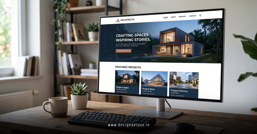
One of the easiest ways to upgrade your site is to apply the ideas from Minimalist Design Trends 2026. Minimalism in design is about focusing on what matters and removing what doesn’t. That means more white space, fewer colours, and clear visual hierarchy.
A minimalist layout makes your message, prices, and calls to action stand out. It also reduces mental friction for the visitor. They don’t have to “decode” your site; they can just read, understand, and decide.
If you want to explore how modern minimalism looks in detail, check out our guide on Minimalist Design Trends 2026 for practical examples and ideas you can borrow.
Make Content Easy To Scan
Most visitors will not read every word on your pages. They scan. So your website design should fully support that behaviour. Short paragraphs, clear headings, and bullet points help people find what they want quickly.
Here are simple layout moves that help:
- Use strong H2 and H3 headings that clearly say what each section covers
- Break long text into smaller blocks
- Highlight key phrases or benefits
- Use bullet lists for features or steps
- Avoid huge walls of text
Remember, good design and good writing work together. The goal is to guide the eye from headline, to main benefit, to call to action without confusion.
Focus On Mobile Experience
In markets like the USA, UK, AUS, Singapore, and Dubai, a huge portion of traffic comes from mobile devices. That means your site must feel comfortable and fast on a phone. This is now a basic Website Design Tip, not a nice-to-have.
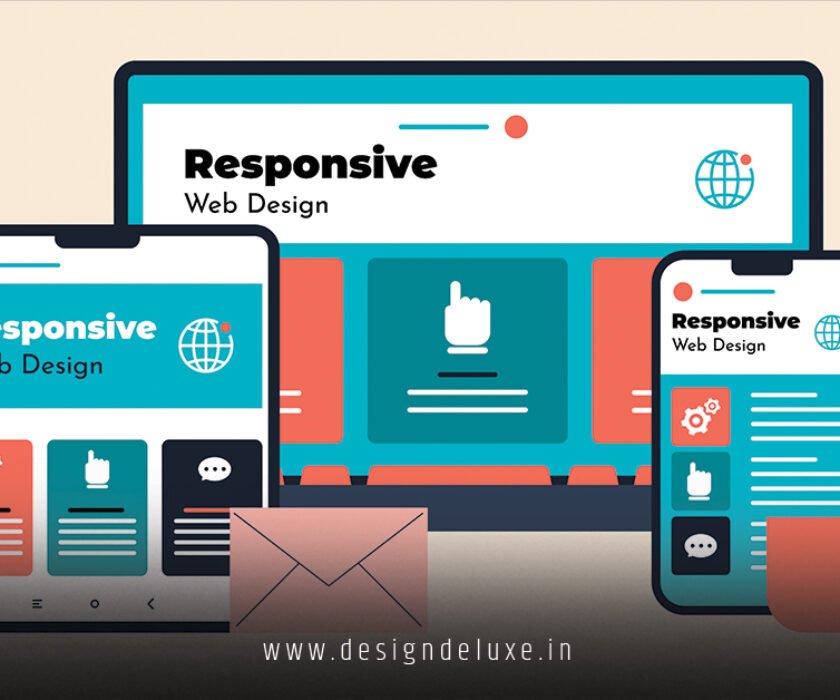
Check your site on different screens. Text should be readable without zooming, buttons should be easy to tap, and images should resize correctly. Avoid tiny fonts and small touch targets that frustrate users.
Also pay attention to load speed. Heavy images and complex scripts can slow your site down, especially on mobile. Faster pages usually lead to better engagement and better rankings in search.
Use Strong, Honest Calls To Action
Design is not just about how things look; it’s about what people do next. Every key page should have a clear, honest call to action. This can be a button, a form, or a link—but it must be obvious.
Use simple wording like “Book a free call,” “Get a quote,” or “Start your trial.” Place your main call to action above the fold, and repeat it where it feels natural further down the page. Don’t hide it at the very bottom.
Avoid vague buttons like “Learn more” unless there’s a good reason. People should know exactly what happens when they click.
Use Images That Support Your Message
Images can make your site feel more human and more professional, but they can also create noise if you choose them poorly. A key Website Design Tip is to use images that clearly support your message, not distract from it.
Show real people, real products, and real situations when you can. Stock photos are fine if they are relevant, diverse, and not overly staged. Always check how images look on mobile and how they affect load speed.
Balance visuals with text. Your pictures should guide attention toward your main points, not compete with them.
Test, Learn, And Adjust
Good website design is not a one-time project. It’s an ongoing process. Your visitors’ behaviour changes, your offers evolve, and technology moves forward. So you should be willing to test and adjust.
Watch simple metrics like time on page, bounce rate, and conversion rate. If people are leaving fast or not taking action, look closely at your layout, navigation, and calls to action. Small tweaks—like changing button placement or simplifying a page—can make a big difference.
We hope that you have found this article enlightening in some way, and that these Website Design Tips give you clear starting points to improve your site. When you pair simple navigation, clear content, and ideas from Minimalist Design Trends 2026, your website becomes a stronger sales tool for your business, not just an online brochure.