Brand PackagingDESIGN
Premium product packaging design for skincare and beauty brands is the difference between “nice bottle” and “I trust this brand with my skin, my money, and my shelf space.” It’s not just looks. It’s signal, function, and brand story working together.
- It tells shoppers what the product is, fast.
- It makes the brand feel premium before anyone opens the jar.
- It protects formulas, especially sensitive skincare actives.
- It can lift conversion, repeat purchase, and shelf appeal.
- It has to work in the real world: shipping, storage, compliance, and cost.
Here’s the thing: luxury packaging is not about piling on gold foil and hoping for the best. It’s about restraint, fit, and detail.
What premium packaging really means in beauty
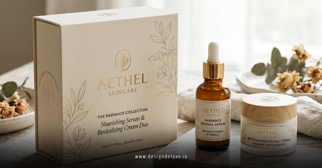
In beauty, “premium” is not a style. It’s a perception built from dozens of tiny choices.
A soft-touch carton. A closure that clicks cleanly. A label that sits dead straight. A pump that dispenses without drama. A color palette that feels intentional instead of loud. That’s the game.
The best premium product packaging design for skincare and beauty brands does three jobs at once:
- Protects the formula
- Signals brand value
- Makes buying feel easy and credible
If one of those is missing, the whole thing starts to wobble.
What usually happens is this: brands chase visual luxury first, then realize the packaging ships poorly, leaks, scuffs, or confuses the customer. Expensive-looking is not the same as premium-performing.
premium product packaging design for skincare and beauty brands: the parts that matter most
There are a few packaging elements that do the heavy lifting. Ignore them, and the rest is decoration.
Structure
Shape matters. So does proportion. A jar that feels too wide, a bottle that looks cheap because the wall thickness is off, or a carton that swallows the product all send the wrong message.
In my experience, premium packaging usually feels balanced, intentional, and slightly restrained. It doesn’t shout.
Materials
Material choice is where a lot of brands either level up or fall flat.
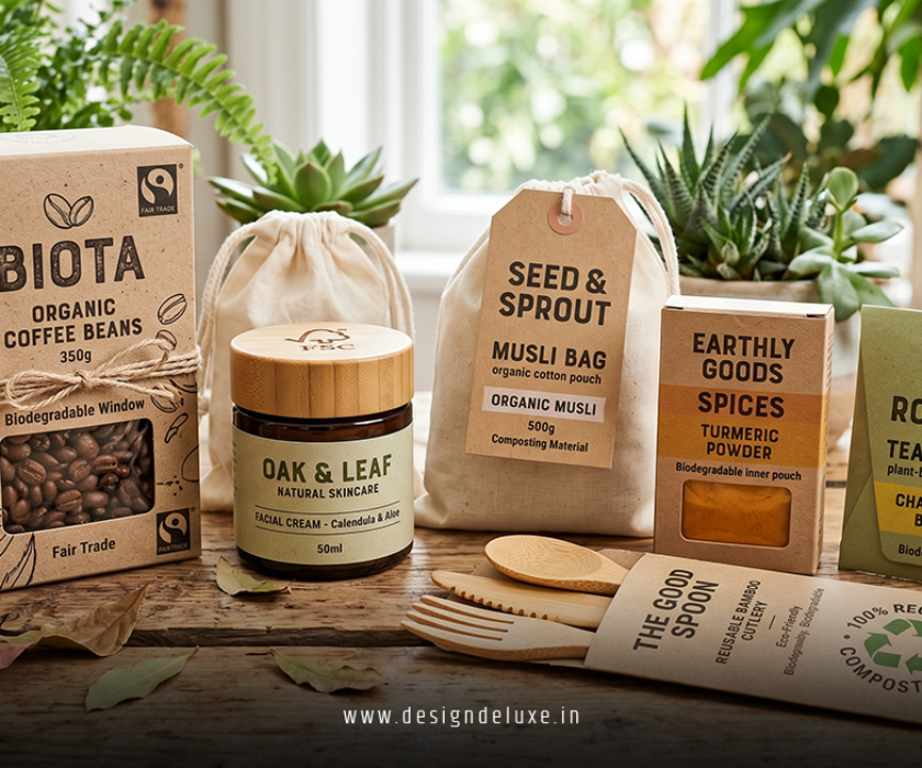
Common premium cues include:
- Thick glass for serums and creams
- High-quality PCR plastics where sustainability matters
- Heavy paperboard with clean folding and crisp edges
- Metal accents used sparingly
- Specialty coatings like matte, satin, or soft-touch finishes
The kicker is that the material has to match the formula and the channel. A prestige night cream sold through DTC has different needs than a vitamin C serum shipped nationwide in summer.
Graphics and typography
This is where beginner brands often overdo it. Premium design rarely needs more decoration. It needs better hierarchy.
- One strong font system
- Tight spacing
- Clear product name first
- Benefit second
- Compliance details where they belong
If a shopper has to squint to understand what the product is, the design has already failed.
Unboxing experience
For beauty, unboxing is not a gimmick. It’s part of the product experience.
Think of it like the handshake before the conversation. If the first interaction feels flimsy, what does that say about the formula inside?
Tissue wrap, insert cards, molded trays, nested boxes, and magnetic closures can all create a premium feel. But only if they’re used with discipline.
A quick comparison: what separates average packaging from premium packaging
| Packaging element | Average execution | Premium execution | Why it matters |
|---|---|---|---|
| Material | Thin plastic or low-grade board | Heavy glass, quality paperboard, refined PCR components | Signals value and improves durability |
| Typography | Too many fonts, weak hierarchy | Clean type system with sharp spacing and clear flow | Makes the product easier to trust and understand |
| Finish | Glossy or generic coating | Soft-touch, matte, foil used sparingly, or specialty texture | Changes how the package feels in hand |
| Closure | Loose cap, noisy pump, awkward twist | Precise fit, smooth action, satisfying tactile response | Creates a higher-end product interaction |
| Labeling | Crowded copy and cluttered claims | Clean legal hierarchy with smart spacing | Improves clarity and brand credibility |
What buyers notice first
Most shoppers do not inspect packaging like a designer does. They scan.
They notice:
- Color
- Shape
- Finish
- Readability
- Weight
- Cleanliness of layout
Then they make a snap judgment. Fast.
That’s why premium product packaging design for skincare and beauty brands has to work in under three seconds. Does it look credible? Does it feel elevated? Does it match the price?
If the answer is no, the rest of the brand story has to work twice as hard.
Step-by-step action plan for beginners
If you’re new to this, don’t start with inspiration boards. Start with constraints.
1. Define the product and the promise
Write down exactly what the product is, who it’s for, and why someone should care. Is it an acne treatment? A barrier cream? A fragrance-forward body oil?
Premium packaging should reflect the promise, not fight it.
2. Pick the channel first
DTC, retail, Amazon, spa, or professional-only. Each channel changes the packaging brief.
A retail shelf needs strong front-facing impact. DTC needs shipment durability. Amazon needs scuff resistance and clear labeling. Don’t force one format to do every job badly.
3. Choose the packaging architecture
Decide whether you need a jar, bottle, tube, airless pump, dropper, carton, or multi-piece system.
For actives and sensitive formulas, packaging compatibility matters as much as appearance. You want the formula protected, the product easy to use, and the design consistent.
4. Build the visual system
Lock in:
- Logo placement
- Typography
- Color palette
- Finish choices
- Label hierarchy
- Regulatory space
Keep it tight. Premium thrives on discipline.
5. Prototype early
Order physical samples. Screen mockups lie.
Hold the package. Open it. Twist it. Ship it. Drop-test it if needed. See where it scuffs, bends, leaks, or feels cheap.
6. Test the customer experience
Ask simple questions:
- Can someone identify the product in a glance?
- Does the closure feel precise?
- Does the packaging look like the price makes sense?
- Does the unboxing feel worth sharing?
7. Refine for production
The design that wins in a deck is not always the one that prints well. Build with manufacturing limits in mind from day one.
This is where good packaging teams earn their money.
premium product packaging design for skincare and beauty brands: cost, time, and trade-offs
| Decision area | Lower-cost route | Premium route | Main trade-off |
|---|---|---|---|
| Primary container | Standard plastic bottle or jar | Heavy glass, airless system, or refined custom mold | Cost versus perceived value |
| Secondary packaging | Simple carton or no carton | Rigid-feeling carton with better board and finish | More protection and shelf presence versus more unit cost |
| Decoration | Basic label or direct print | Specialty finishes, embossing, foil accents, soft-touch coating | Higher tactile appeal versus production complexity |
| Development speed | Off-the-shelf components | Custom components and closer QA | Faster launch versus stronger differentiation |
For many emerging brands, the smartest move is not “full luxury.” It’s premium where the customer can feel it. That might mean a better bottle, a cleaner label, and a stronger carton instead of a wildly expensive custom mold.
Common mistakes and how to fix them
1. Overdesigning the package
Too many patterns. Too much foil. Too many claims. Too much noise.
Fix: Strip it back. Keep one hero idea and let the material do some of the talking.
2. Ignoring formula compatibility
A beautiful package that lets the product oxidize or separate is a bad package.
Fix: Test the formula in the final intended component before scaling.
3. Making the brand hard to read
Fancy is not the same as clear.
Fix: Prioritize hierarchy. Product name first. Function second. Brand third if needed. Keep the legal copy organized.
4. Choosing finishes that scuff too easily
Some coatings look gorgeous on day one and tired by day three.
Fix: Ask for abrasion testing and handling samples. Real use matters more than studio lighting.
5. Forgetting the shipping environment
A package can look elite on a white table and still fail in transit.
Fix: Test the outer box, insert, and closure under real shipping conditions. Heat, vibration, and drop handling all count.
6. Chasing trends instead of fit
A trend-heavy package can age fast. Then the brand feels dated before the formula does.
Fix: Build a packaging system with room to evolve. Keep the core visual language stable.
What to know about sustainability without killing the luxury feel
Sustainability and premium are not enemies. They just need better planning.
In the U.S., shoppers are increasingly alert to recyclability, refillability, and packaging waste, but they still expect the product to feel special. That means brands need packaging that balances reduced material use with strong design cues.
A few practical moves:
- Use PCR where it makes sense
- Reduce unnecessary inserts
- Design for refill
- Keep component separation simple
- Avoid mixed materials that are hard to recycle
If you want the cleanest public-facing standards to reference, the U.S. Environmental Protection Agency’s packaging and waste guidance is a solid starting point, and the U.S. Food and Drug Administration’s cosmetics labeling resources matter for compliance. The Sustainable Packaging Coalition is also useful for broader packaging strategy and material thinking.
The point is simple. Sustainable packaging should feel considered, not compromised.
How premium packaging supports sales
Good packaging is not just a design expense. It can support the entire commercial engine.
It can:
- Increase perceived product value
- Help justify a higher price point
- Improve shelf and thumbnail conversion
- Strengthen repeat purchase through better usability
- Make the brand easier to remember
Ask yourself: if two serums have similar formulas, why would a customer choose yours? Often, packaging is the first answer.
And if the experience feels coherent from thumbnail to unboxing to daily use, that brand earns trust faster. That’s the real win.
For brands selling in the U.S. market, where consumers are flooded with options, premium packaging is often the shortest path from “interesting” to “worth buying.”
premium product packaging design for skincare and beauty brands: the real checklist
Before you approve a design, make sure it answers these questions:
- Does it clearly communicate what the product is?
- Does it feel right for the price?
- Will the formula stay protected?
- Does the package ship well?
- Can a customer use it easily?
- Does the brand look distinct without becoming hard to read?
- Does it work across digital, retail, and unboxing contexts?
If the answer is yes across most of those, you’re close.
If not, keep refining.
Key Takeaways
- premium product packaging design for skincare and beauty brands is about more than looks; it’s about trust, clarity, and function.
- Premium packaging starts with structure, materials, and usability, not just decoration.
- Clean typography and disciplined hierarchy do more for luxury perception than visual clutter.
- Physical samples matter. Screens hide problems.
- The best packaging feels premium in hand and performs well in transit.
- Sustainability can support premium positioning when it’s handled with intention.
- Beginners should start with channel, formula, and packaging architecture before touching aesthetics.
- The smartest premium move is often selective investment, not maximum spend.
Premium packaging is a business tool, not a vanity project. Get the right details in place, and the brand feels sharper, the product feels worth the price, and the whole thing sells with less friction. Start with the container, test it hard, and let every choice earn its place.
FAQs
What makes premium product packaging design for skincare and beauty brands feel expensive?
It usually comes down to material weight, clean typography, precise closures, restrained color use, and a finish that feels good in hand. The design should look intentional, not busy.
Can premium product packaging design for skincare and beauty brands still be sustainable?
Yes. Refillable systems, PCR materials, lighter-weight components, and reduced unnecessary packaging can still feel premium if the structure and finish are thoughtfully executed.
How do I choose packaging for skincare formulas with active ingredients?
Start with formula compatibility, then move to aesthetics. Some actives need protection from light, air, or contamination, so airless pumps, opaque containers, or barrier-focused materials may be the smarter choice.