DESIGN
Editorial Design: Tell Stories Through Visuals isn’t a fancy design school phrase — it’s the difference between a page nobody reads and a page nobody can put down. Good editorial design grabs a reader’s eye before they’ve read a single word, then guides them through the story like a friend pointing out the good parts. Bad editorial design just sits there, cluttered and confused, hoping someone cares enough to dig through it.
Here’s the quick version, because you’re busy:
- What it is: The craft of arranging text, images, typography, and white space to communicate a narrative — used in magazines, newsletters, blogs, and reports.
- Why it matters: Readers scan first, decide fast, and only commit if the layout earns their trust.
- Core tools: Grid systems, typographic hierarchy, photography, pull quotes, and color contrast.
- Where it shows up: Print magazines, digital publications, annual reports, even long-form blog posts.
- The payoff: Higher engagement, longer time-on-page, and content that actually gets remembered.
What Editorial Design Actually Means (Beyond the Buzzword)
Strip away the jargon and editorial design is just visual storytelling with rules. Every headline size, every margin, every photo crop is a decision that either helps the reader or gets in their way.
Think of a page like a stage. The layout is the lighting rig. Point it right, and the star of the show — your content — looks great. Point it wrong, and even brilliant writing gets lost in shadow.
In my experience, most beginners think editorial design means “make it pretty.” It doesn’t. It means make it clear, then make it feel intentional. Pretty is a bonus.
Editorial Design: How You Tell Stories Through Visuals on the Page
This is where the theory meets the page. Editorial design tells stories through visuals by using four connected tools: hierarchy, pacing, contrast, and rhythm.
Hierarchy tells the eye where to land first. Pacing controls how fast a reader moves through the piece. Contrast — big versus small, bold versus light — creates emphasis without a single word of explanation.
Rhythm is the subtle one. It’s the pattern of images and text blocks that keeps a long piece from feeling like a wall. A magazine spread with the same three-column grid on every page? That’s not rhythm — that’s a monotone drone.
Typography and Editorial Design: Tell Stories Through Visuals One Font Choice at a Time
Type is voice. A serif headline whispers “trustworthy” and “established.” A bold sans-serif shouts “modern” and “urgent.” Choose wrong, and your content fights itself before anyone reads a word.
What usually happens is beginners mix five typefaces because “more options equals more design.” Nope. Pick two — one for headlines, one for body — and let scale and weight do the heavy lifting.
Grid Systems: The Backbone of Editorial Design
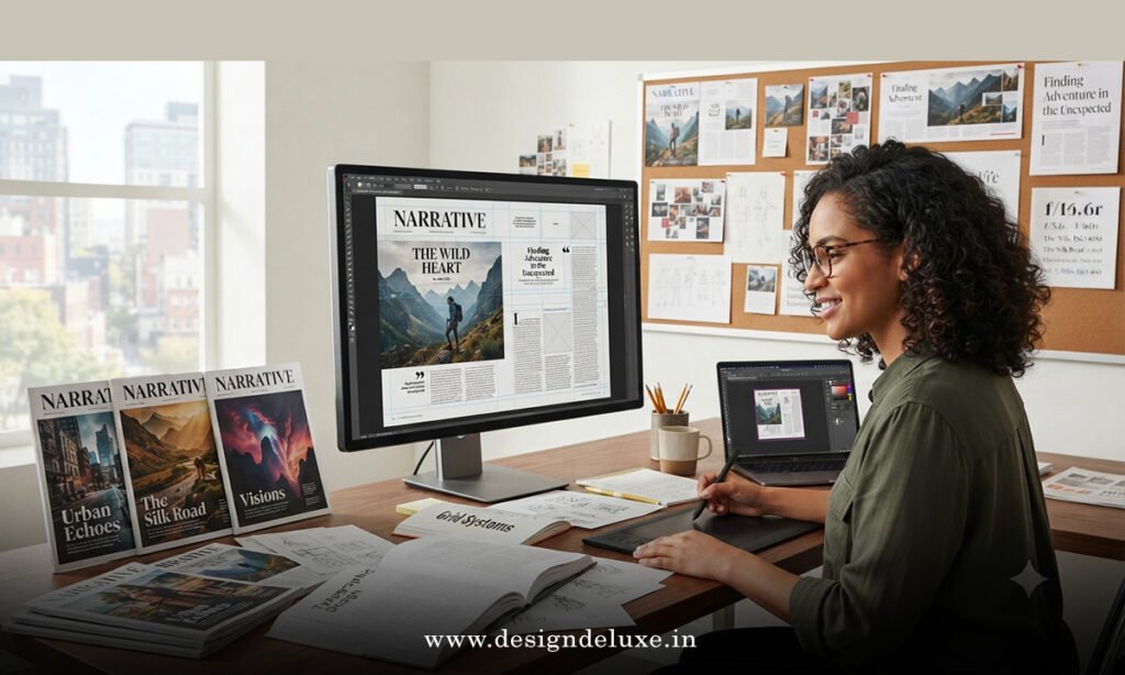
A grid is the invisible skeleton holding your layout together. Without one, images float randomly and text blocks feel arbitrary. With one, even a busy page reads as organized.
The Nielsen Norman Group’s research on visual hierarchy backs this up directly — readers process organized visual patterns faster than chaotic ones, whether that page is print or a scrolling web article. Structure isn’t restrictive. It’s what frees the reader to focus on the story instead of the layout.
Editorial Design: Tell Stories Through Visuals — Print vs. Digital Breakdown
Print and digital editorial design share DNA but behave differently in practice. Here’s a side-by-side so you’re not guessing.
| Aspect | Print Editorial Design | Digital Editorial Design |
|---|---|---|
| Reading Pattern | Linear, page-by-page, deliberate | Scanning, F-shaped or Z-shaped scroll behavior |
| Typography Constraints | Fixed size, physical print limits | Responsive, must scale across screens |
| Image Handling | Static, high-resolution, printed once | Optimized files, lazy-loaded, sometimes animated |
| Attention Span | Longer, tactile engagement | Shorter, competing with tabs and notifications |
| Cost to Produce | Higher (printing, distribution) | Lower (hosting, CMS tools) |
| Update Flexibility | None once printed | Fully editable post-publish |
Neither format is “better.” They just demand different disciplines from the designer.
Step-by-Step Action Plan for Beginners
If you’re staring at a blank layout and panicking, here’s the order I’d actually follow.
- Nail the headline hierarchy first. Decide what’s the biggest, boldest element before touching anything else.
- Pick your grid. Two columns for simplicity, three or four for magazine-style density.
- Choose two typefaces max. One for headers, one for body copy.
- Drop in placeholder images early. Text-only layouts lie to you about how the final piece will feel.
- Add one strong pull quote or callout per section. It breaks up gray text and re-hooks skimmers.
- Check contrast and white space. If everything feels cramped, something needs to go.
- Read it out loud, scrolling as you go. Awkward pacing reveals itself fast this way.
Do these seven things, and you’ll already be ahead of most beginner layouts floating around out there.
Common Mistakes & How to Fix Them
Everybody makes these. The trick is catching them before publish, not after.
- Mistake: Cramming too much text before the first image.
Fix: Break paragraphs with visuals every 150–250 words to maintain scroll momentum. - Mistake: Using stock photos that feel generic and disconnected from the story.
Fix: Choose images with genuine narrative relevance, even if that means simpler, more specific shots. - Mistake: Inconsistent heading sizes across sections.
Fix: Build a style guide early — H1, H2, H3 sizes locked before you write a single section. - Mistake: Ignoring mobile scaling until the end.
Fix: Design mobile-first, then scale up. It’s far easier than shrinking a desktop layout down. - Mistake: Treating white space as “wasted” space.
Fix: Remember — white space is a design element, not an empty gap you need to fill.
Tools of the Trade Worth Knowing in 2026
You don’t need a full design degree to get this right. Adobe InDesign still dominates print-heavy editorial work, while tools like Figma and Canva have made digital editorial layouts accessible to non-designers. The AIGA (American Institute of Graphic Arts) offers solid foundational resources if you want to go deeper into visual communication principles without the fluff.
For anyone studying how newsrooms and magazines actually execute this at scale, Poynter’s ongoing coverage of visual journalism is worth bookmarking — it’s written by people who’ve lived through decades of shifting reader habits.
Key Takeaways
- Editorial design tells stories through visuals by combining hierarchy, typography, grids, and pacing — not just “making it pretty.”
- Readers scan first and commit later, so first impressions carry real weight.
- Print and digital editorial design share principles but require different execution strategies.
- Two typefaces, one clear grid, and consistent heading sizes solve most beginner problems instantly.
- White space isn’t wasted — it’s a functioning design tool that guides attention.
- Common mistakes like text-heavy sections and generic stock photos are fixable with small structural habits.
- Tools like InDesign, Figma, and Canva have lowered the skill barrier without lowering the standard.
Here’s the thing — none of this requires talent you don’t have yet. It requires attention to a handful of repeatable decisions, made consistently, page after page. Nail the grid, respect the hierarchy, and let images breathe. That’s genuinely most of the battle.
Your next move? Pick one piece of content you’ve already published — a blog post, a newsletter, anything — and re-layout just the headline and first image using the hierarchy rules above. Small test, real feedback, fast improvement.
FAQs
Is editorial design only relevant for magazines, or does it apply to blogs too?
It applies everywhere text meets an audience. Blogs, newsletters, PDFs, even social carousels benefit from the same visual storytelling logic that print magazines have used for decades.
What’s the fastest way to improve at editorial design if I have zero design background?
Study layouts you already admire and reverse-engineer them — count the columns, note the typeface pairings, track where images sit relative to text. Editorial Design: Tell Stories Through Visuals is a learned pattern-recognition skill before it’s ever a creative one.
Do I need expensive software to practice editorial design?
No. Canva and free Figma plans cover most beginner and intermediate needs. The software matters far less than understanding hierarchy, contrast, and grid discipline first.