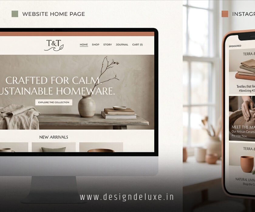
Portfolio Website Design: Showcase Your Best Work starts with one hard truth. Your site is not a digital scrapbook. It is a sales tool that either opens doors or quietly closes them.
Here is what strong portfolio website design actually delivers:
- A clear first impression of who you are and the problems you solve
- Curated proof that you can deliver results, not just pretty pictures
- Fast paths for the right clients or hiring managers to contact you
- Mobile-ready presentation that holds attention in under three seconds
- Ongoing signal that you take your craft seriously enough to present it well
Most people treat their portfolio like a personal gallery. The ones who land work treat it like a focused pitch.
Why Portfolio Website Design: Showcase Your Best Work Still Wins in 2026
Hiring managers and clients still open a dozen tabs and decide in seconds. They scan the hero section, glance at the first few projects, and either stay or bounce. Your job is to make staying the easy choice.
In my experience, the portfolios that convert share three traits. They lead with the work. They explain the thinking behind the work. And they make the next step obvious. Everything else is decoration.
A quiet palette, large images, and short text blocks let the projects carry the weight. Heavy animation or clever navigation usually backfires. Viewers came for proof, not a light show.
The Core Structure That Works
Most solid portfolios need only five page types. Home. Work index or project grid. Individual case studies. About. Contact.
The homepage does the heaviest lifting. One tight positioning line. Three to six project thumbnails. A single clear contact button. No long bio above the fold. No wall of text. Just enough to say “this person solves my kind of problem.”
Case studies are where you earn trust. Problem. Your role. Process. Final work. Result. Keep the text lean—roughly 30 percent words and 70 percent visuals works well. Show one or two process shots if they add clarity. Skip the novel-length write-up.
Your About page humanizes you. A real photo. A short bio that sounds like a person, not a brand. Mentions of tools or past clients if they help. Contact should take one click from anywhere.
Fewer, stronger pages beat a sprawling site every time.
Platform Comparison for Portfolio Website Design: Showcase Your Best Work
Choosing the builder matters less than most people think. What matters is how fast you can publish and keep it updated.
| Platform | Best For | Learning Curve | Starting Price (approx.) | Standout Strength |
|---|---|---|---|---|
| Framer | Designers who want motion control | Low-Medium | Free tier available | Visual design + interactions |
| Squarespace | Creatives who want polish fast | Low | ~$16/mo | Beautiful templates out of the box |
| Webflow | Those needing structured CMS | Medium-High | ~$15/mo | Scalable case-study systems |
| WordPress | Long-term SEO and ownership | Medium | Hosting only ~$5–30/mo | Full control and flexibility |
| Carrd | Simple one-page needs | Very Low | Under $2/mo | Speed and low cost |
Pick the one that matches how you work. If you design in Figma daily, Framer or Webflow feel natural. If you just want the site live this weekend, Squarespace or Carrd get you there faster.
Step-by-Step Action Plan for Beginners
Start here if you are building your first real portfolio or overhauling a dusty one.
- Decide who this is for. Write one sentence that names the client or role you want next. Everything else follows from that sentence.
- Select four to eight projects. Quality over quantity. Choose the ones that match the work you want more of. Cut the rest, even if you love them.
- Write the positioning line. “I design conversion-focused sites for B2B SaaS teams under 50 people” beats “Passionate designer.” Specificity filters the wrong people and attracts the right ones.
- Build the case studies first. For each project note the problem, your role, key decisions, and the outcome. Add metrics if you have them. No metrics? Ask the client or focus on the process instead.
- Choose the platform and template. Pick something clean. Resist the urge to customize everything on day one.
- Assemble the homepage. Positioning line. Best project thumbnails. Contact button. Test it on your phone.
- Add About and Contact. Keep both short. Make the contact form or email link impossible to miss.
- Optimize images and check speed. Compress every photo. Aim for under three-second loads on mobile. Run a quick Lighthouse check if you can.
- Publish and share. Send it to three people who will give honest feedback. Then put the link in your email signature, LinkedIn, and any proposals.
What I would do if I were starting from zero today: finish the case studies in a Notion page first, then move the content into the builder. Writing the stories before design decisions keeps the focus where it belongs.

Common Mistakes & How to Fix Them
These trip up even experienced people.
Showing every project you have ever touched. Dilutes the strong work. Fix: curate ruthlessly. Six excellent pieces beat fifteen mixed ones.
Putting the About section above the work. Viewers want proof first. Fix: lead with projects on the homepage. Save the personal story for later.
Walls of text in case studies. People skim. Fix: break text into short paragraphs, use subheads, and let images do most of the talking.
Slow load times from unoptimized images or heavy motion. Instant exit. Fix: compress assets and keep animations subtle.
No clear next step. Visitors finish looking and wonder what to do. Fix: put a contact button or form on every page.
Generic or missing positioning. “Designer” tells them nothing. Fix: state the specific value you deliver in one line.
One fresh analogy I use with clients: your portfolio is like a chef’s tasting menu, not an all-you-can-eat buffet. Serve the best dishes. Leave people wanting more, not overwhelmed.
Making the Work Itself Shine
Images need room to breathe. Large thumbnails on the grid. Full-width or near full-width shots on case study pages. Consistent lighting and crop if you control the photography.
For process-heavy work (UX, product, strategy), include a couple of artifacts—wireframes, early sketches, or decision notes. They prove how you think. For pure visual fields, the final work can stand more alone, but context still helps.
Mobile is non-negotiable. Most reviews happen on phones. Test every page on a real device. Touch targets need to be big enough. Text must stay readable without pinching.
Accessibility basics matter too. Strong contrast, clear headings, and alt text on images. These are not just good manners—they expand who can experience your work.
Keeping It Fresh Without Burning Out
A portfolio is never finished. Plan a light review every three to six months. Swap one project for a stronger recent one. Update the positioning line if your focus has shifted. Check that contact details still work.
The sites that stay effective are the ones their owners actually maintain. Fancy features that require constant upkeep usually get abandoned.
External resources worth bookmarking include the W3C accessibility guidelines for contrast standards, Webflow’s portfolio examples for layout inspiration, and Google’s PageSpeed Insights for performance checks.
Key Takeaways
- Lead with curated work, not a long bio
- Four to eight strong projects beat a long list
- Case studies need problem, role, process, and result
- One clear positioning statement at the top
- Mobile speed and simplicity matter more than clever effects
- Contact should be one click away from anywhere
- Update regularly or the site quietly dies
- The design of the site itself is part of the proof
Build the version that gets you in the room. Polish comes later. The real win is a site that makes the right people say, “I want to talk to this person.”
Open a blank page or a clean template this week. Write the positioning line. Pull the four strongest projects. Ship something usable. Then improve it. That sequence beats waiting for perfect every single time.
FAQs
How many projects should a portfolio website design: showcase your best work actually include?
Four to eight carefully chosen pieces is the practical range for most people. Enough to show range without forcing viewers to dig.
What is the fastest way to start portfolio website design: showcase your best work if I am not a designer?
Use a polished template on Squarespace or Framer, focus on writing clear case studies first, and keep the visual system simple. The content does more work than custom design at the beginning.
Does portfolio website design: showcase your best work still need SEO in 2026?
Basic on-page SEO helps. Unique title tags, descriptive headings, fast load times, and a custom domain improve discoverability. For most freelancers and job seekers, the bigger payoff still comes from sharing the link directly.