Website
SaaS website conversion optimization is the disciplined work of turning more of the visitors you already attract into trials, demos, or qualified leads. Most teams obsess over traffic. The smarter ones fix the leaks first. In my experience, a site converting at the median 3.8% for SaaS landing pages can often move meaningfully higher with clearer messaging, tighter proof placement, and fewer friction points—no extra ad spend required.
Here’s the quick overview:
- Median SaaS landing pages convert around 3.8%; site-wide visitor-to-lead rates often sit near 1.1%.
- The biggest gains usually come from the hero section, one clear CTA, and early social proof.
- Speed, mobile experience, and pricing transparency are non-negotiable trust signals.
- Interactive product demos and message-matched landing pages outperform generic pages.
- Brand consistency from Tech Startup Design: Modern Branding for Innovation underpins every high-converting surface.
Buyers arrive skeptical. They compare tabs, check pricing, and look for proof that the product solves their specific problem. Your site has seconds to earn the next click.
Why SaaS Website Conversion Optimization Delivers Faster Returns Than More Traffic
Traffic is expensive. Conversion rate compounds. A modest lift from 3% to 4.5% on the same volume of visitors can feel like a 50% increase in pipeline without raising acquisition costs. What usually happens is teams keep pouring money into ads while the homepage hero stays vague and the pricing page creates new objections.
I’ve seen product-led teams double trial starts simply by replacing abstract illustrations with real product screens and moving customer logos above the fold. Sales-led teams often gain more from shortening the path to a calendar booking and answering the hard questions—integrations, switching costs, security—right on the page.
The foundation matters. If the visual identity and messaging feel inconsistent across the site, product, and sales materials, trust erodes before the CTA is even noticed. That is why strong Tech Startup Design: Modern Branding for Innovation work pays off twice: once in recognition and again in conversion.
The Highest-Impact Levers in SaaS Website Conversion Optimization
Start with the five-second test. Show the page to someone outside the company. Can they say what you do, who it is for, and what to do next? If not, the rest of the page rarely gets a chance.
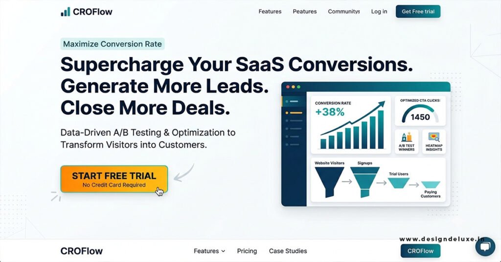
Hero clarity beats cleverness. Name the outcome and the audience. “Ship projects 40% faster without daily status meetings” outperforms “AI-powered project management for modern teams.” One primary CTA above the fold. Competing buttons create choice paralysis.
Proof belongs high. Named customers, specific numbers, or recognizable logos near the hero reduce the leap of faith. Real product UI or interactive demos beat abstract graphics almost every time. Buyers want to see the thing, not a metaphor for the thing.
Pricing pages lose high-intent visitors when limitations stay hidden or FAQs are buried. Transparent plan differences, clear inclusions, and answers to common objections keep people moving.
Speed is conversion infrastructure. Core Web Vitals targets still matter: LCP under 2.5 seconds, INP under 200 ms, CLS under 0.1. Slow pages lose the visitor before your positioning lands.
Aligning Brand and Conversion for SaaS Website Conversion Optimization
A fragmented brand creates quiet friction. Colors, type, voice, and proof styles that shift between homepage, pricing, and product screens signal inconsistency. Teams that treat branding and conversion as separate projects often discover the gap only after traffic spends money to arrive and then leaves. Integrating the two—clear positioning expressed consistently—removes one more reason to bounce.
Step-by-Step Action Plan for Beginners
- Establish baselines. Track visitor-to-trial, visitor-to-demo, and key page conversion rates for at least two weeks. Note mobile versus desktop differences.
- Run the five-second test on your homepage and top landing pages. Rewrite the hero until outsiders can repeat the core claim accurately.
- Reduce to one primary CTA above the fold. Secondary actions can live lower or as text links.
- Move social proof higher. Logos, a strong testimonial, or a concrete usage number should appear before the visitor has to scroll.
- Replace abstract hero visuals with product screens or a short interactive demo whenever possible.
- Audit page speed with real-user data. Fix the largest contentful paint and interaction delays first.
- Review the pricing page for hidden limits, missing FAQs, and unclear next steps. Add the answers people actually ask in sales calls.
- Check message match on paid and email traffic. The landing page should echo the promise that brought the click.
- Instrument heatmaps and session recordings on the highest-traffic pages. Watch where people rage-click or abandon forms.
- Ship one focused change at a time and measure. Continuous small improvements beat infrequent big redesigns.
If I were taking over a mid-stage SaaS site tomorrow, I would prioritize steps 2–5 in the first two weeks. Those changes usually surface the largest gains with the least engineering effort.
Common Mistakes & How to Fix Them
Vague hero copy. Fix: force specificity. Name the audience and the measurable outcome.
Too many competing CTAs. Fix: pick one primary action per page and make it visually dominant.
Proof placed too low. Fix: move logos, numbers, or short testimonials into the first screen.
Slow load times treated as a technical issue only. Fix: treat speed as a conversion metric and measure it against form completions or trial starts.
Pricing that creates new questions. Fix: surface the most common objections and limitations on the page itself.
Ignoring mobile. Many buyers research on phones even if the final decision happens on desktop. Fix: test the full flow on real devices.
Treating the website as a static brochure. Fix: adopt a continuous optimization rhythm—measure, diagnose, ship, repeat.
Generic messaging that tries to speak to every possible buyer. Fix: write for your strongest current segment first.
Conversion Benchmark Snapshot
| Metric | Typical Range / Median | Source Context |
|---|---|---|
| SaaS landing page conversion | ~3.8% median | Industry benchmarks across large page samples |
| B2B SaaS site-wide visitor-to-lead | ~1.1% | Aggregated client data across multiple years |
| Top-quartile SaaS pages | Often 5%+ to 11%+ | Higher-performing segments in the same datasets |
| Impact of 0.1s speed gain (lead gen) | Up to ~21% lift in form progress | Documented performance research |
These numbers are directional. Your actual baseline depends on offer complexity, traffic quality, and whether the ask is a free trial or a sales demo. Compare like with like.
For current Core Web Vitals targets and measurement guidance, consult Google’s official documentation on page experience. Unbounce’s conversion benchmark reports remain a widely referenced source for landing-page medians across industries. For broader research on how design and messaging affect buyer decisions, Harvard Business Review continues to publish relevant studies on trust and perception.
Key Takeaways
- Clarity in the hero section is the highest-leverage change most SaaS sites can make.
- One primary CTA and early, specific proof reduce friction more than visual polish alone.
- Speed and mobile experience are conversion features, not technical afterthoughts.
- Pricing and demo pages lose high-intent visitors when objections stay unanswered.
- Continuous measurement and small iterative changes outperform infrequent redesigns.
- Consistent branding from Tech Startup Design: Modern Branding for Innovation removes quiet trust leaks.
- Message match between ad/email and landing page prevents immediate bounce.
- Real product experience (screens or interactive demos) outperforms abstract visuals.
SaaS website conversion optimization turns the traffic you already own into more pipeline. Start with the five-second test on your homepage today. Rewrite the hero until a stranger can explain what you do. Then move proof higher and remove every competing button. Those three moves alone often reveal whether the rest of the site is ready to convert or still leaking value.
FAQs
What is a good conversion rate for SaaS website conversion optimization efforts?
Median SaaS landing pages sit near 3.8%. Many teams treat anything above 5% as solid and 8–11% as strong, depending on traffic quality and offer type. Always compare against your own baseline first.
How does branding connect to SaaS website conversion optimization?
Inconsistent visuals, voice, or proof styles create subconscious doubt. Aligning the site with a clear system—like the principles in Tech Startup Design: Modern Branding for Innovation—removes one more reason for a visitor to leave.
Should I prioritize speed or messaging first?
Messaging usually wins if the page is already loading within acceptable ranges. When load times exceed a few seconds, fix the largest delays first—visitors never see the improved copy if they bounce early.