DESIGN
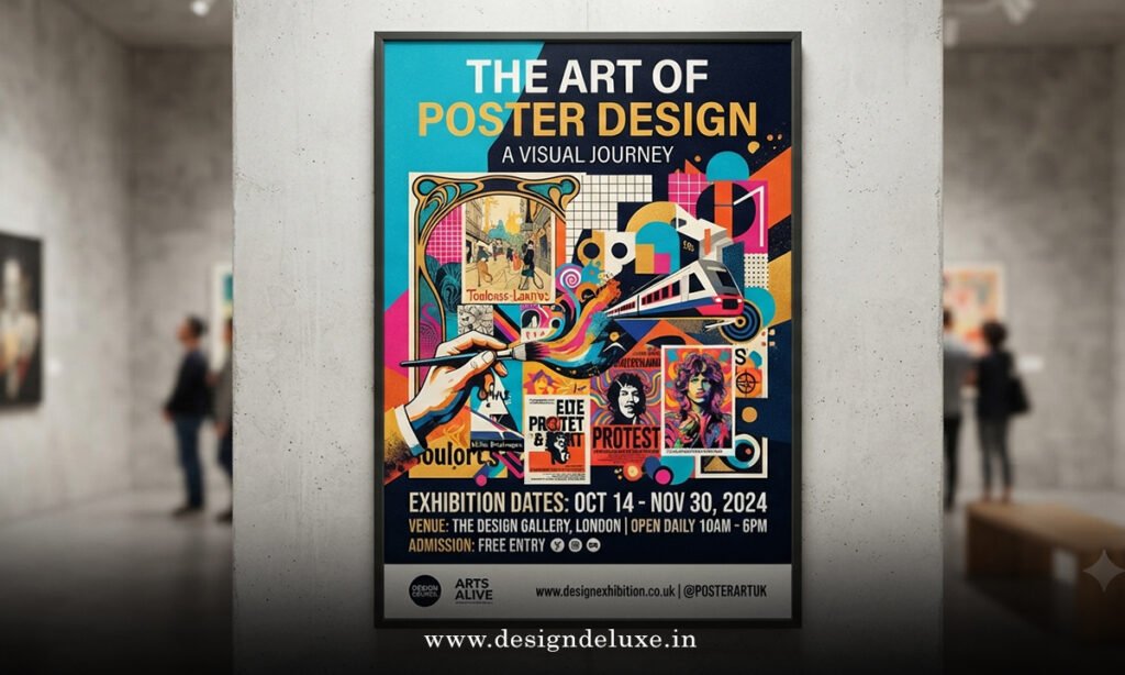
Poster Design 2026: Eye-Catching Visuals for Events demands more than pretty pictures and a date stamp. It is the difference between a flyer people walk past and one that stops them cold, pulls them in, and gets tickets sold or RSVPs locked. In the USA right now, event promoters face wall-to-wall visual noise—digital feeds, street poles, venue windows. A strong poster cuts through that chaos.
Here’s the quick overview of what matters:
- Bold, oversized typography that reads from across a room
- Tactile textures and imperfect human touches that fight the “AI-perfect” look
- Clear hierarchy so date, place, and call-to-action land in under three seconds
- Hybrid print-and-digital versions that work on Instagram and on a lamppost
- Simple workflows that let beginners produce pro-level results fast
Get these right and your event poster becomes a working marketing tool instead of decoration.
Why Poster Design 2026: Eye-Catching Visuals for Events Still Wins
Print is not dead. In many U.S. markets—college towns, music districts, community centers—physical posters still drive discovery. People scan a wall while waiting for coffee or walking to class. Digital versions of the same design then travel through Stories and group chats. The kicker is consistency: one strong concept that scales from 24×36 inches down to a phone screen.
What usually happens when the design falls flat? The event name gets lost. The date hides in a corner. Colors wash out under streetlights. Attendance suffers. I’ve watched solid lineups draw half the expected crowd simply because the poster never demanded attention.
Think of a great event poster like a skilled bartender. It doesn’t shout every special on the menu. It catches your eye, gives the one piece of information you need right now, and makes you want to order.
Core Visual Trends Shaping Poster Design 2026: Eye-Catching Visuals for Events
Typography has taken the driver’s seat. Oversized, playful letterforms—bubbly, wavy, slightly distorted—dominate. Hand-drawn edges and loopy scripts add the human fingerprint that pure digital work often lacks. Saturated color blocks and high-contrast pairings help posters pop under both daylight and neon signage.
Tactile rebellion is another strong current. Designers are layering grain, paper textures, and subtle imperfections so the piece feels made by a person, not generated. Surreal or absurdist details—unexpected scale shifts, visual jokes—give people a reason to look twice. Neon accents still work for nightlife and music events, especially against dark backgrounds, but the glow has to stay secondary to the message.
AI tools speed up the first draft. The human polish decides whether the final piece feels authentic or generic. What I’d do if I were starting a new festival poster today: generate three mood backgrounds with an image tool, then rebuild the layout by hand so the type hierarchy and spacing stay sharp.
For deeper reading on the year’s broader graphic shifts, the Adobe Express team has mapped the major creative themes that influence poster work this year.
Step-by-Step Action Plan for Beginners
- Lock the essentials first. Write the event name, exact date and time, venue, and one clear call-to-action (ticket link, QR, or “doors at 8”). Nothing else belongs on the poster until these are settled.
- Choose size and orientation early. Standard U.S. print sizes—11×17, 18×24, 24×36—still rule. Build a digital version at the same proportions so exports stay clean.
- Build hierarchy on a simple grid. Event name largest and highest contrast. Date and location next. Supporting details smallest. Leave breathing room—crowded posters lose viewers fast.
- Pick a limited palette and two typefaces max. High-contrast combinations (near-black on bright, or white on deep saturated tones) read from distance. Test the title at arm’s length on your screen, then from across the room on a printout.
- Create or source one strong hero visual. A single focused image or illustration beats a collage of five weak ones. Add texture or grain so it doesn’t feel sterile.
- Place a scannable QR code in a quiet corner. Link it to a mobile-friendly ticket page and test it on multiple phones before printing.
- Export for both print and digital. 300 DPI with bleed for physical copies. RGB versions sized for Instagram feed, Stories, and Facebook event covers.
- Run a quick reality check. Show the draft to someone who knows nothing about the event. Ask them to tell you the name, date, and location after five seconds. If they hesitate, fix the hierarchy.
This process works whether you use Canva, Adobe Express, Figma, or a full design suite. Speed comes from decisions, not from software.
Tools and Workflow Comparison for Event Posters
| Approach | Speed | Control Level | Best For | Typical Cost | Learning Curve |
|---|---|---|---|---|---|
| Template + manual edit (Canva / Adobe Express) | Fast | Medium | Beginners, local events, social variants | Free–low monthly | Very low |
| AI image gen + layout rebuild | Medium | High | Unique hero art, festivals, branding | Subscription or credits | Medium |
| Full custom in Illustrator / Figma | Slow | Highest | Large-scale campaigns, multi-city tours | Software license + time | Higher |
| Hybrid (AI draft + human type polish) | Fast–medium | High | Most 2026 event work | Mixed | Medium |
The hybrid path usually delivers the best balance for intermediate designers who want distinctive results without spending days on one poster.
Common Mistakes & How to Fix Them
Too much information. A poster is not a brochure. Cut every secondary detail that can live on the ticket page. Fix: force yourself to use only four text blocks total.
Weak hierarchy. Everything the same size means nothing stands out. Fix: make the event name at least twice the size of the next element and increase contrast.
Low-resolution images. They look fine on a phone and fall apart in print. Fix: start with files at least 300 DPI at final size. Never upscale a small JPEG.
Poor contrast under real lighting. Soft pastels vanish on a sunny sidewalk or under fluorescent lights. Fix: print a test strip and view it outdoors and indoors before the full run.
Ignoring the QR or call-to-action. People see the poster, like the vibe, then have no easy next step. Fix: give the QR its own quiet zone and make the surrounding text invite the scan.
Multiple competing focal points. The eye doesn’t know where to land. Fix: choose one dominant visual or type treatment and let everything else support it.
These fixes are simple. Most of them take minutes once you spot the problem.
Poster Design 2026: Eye-Catching Visuals for Events in Practice
Apply the trends with restraint. An oversized playful headline works for a music festival. The same treatment on a corporate conference poster can feel off. Match the energy of the event. A community fundraiser might lean into warm textures and approachable lettering. A late-night club night can push neon and high-energy saturation.
Distribution still matters. In denser U.S. cities, physical placement near the venue and complementary locations (coffee shops, campuses, record stores) continues to work. Pair every print drop with digital posts that use the same visual language so the campaign feels intentional.
For additional inspiration on experimental lettering and mixed-media approaches that appear in current poster work, the creative community coverage at It’s Nice That offers useful reference points.
Key Takeaways
- Hierarchy beats decoration—name, date, place first
- Oversized, slightly imperfect typography signals 2026 more than any filter
- One strong visual plus breathing room outperforms busy collages
- Hybrid AI-plus-human workflows give speed without the sterile look
- Always test readability from distance and under real lighting
- QR codes and clear next steps turn attention into action
- Print and digital versions must share the same core design
- Match the visual energy to the actual event, not the trend list
You now have a practical path from blank canvas to finished poster that works in both physical and digital spaces. Open your preferred tool, lock the four essential text elements, and build the hierarchy first. The rest follows. That single focused session will put you ahead of most event organizers still fighting with cluttered templates.
FAQs
How does Poster Design 2026: Eye-Catching Visuals for Events differ from older approaches?
The biggest shift is the push toward human texture and exaggerated type while keeping information hierarchy ruthless. Older posters often buried details in decorative frames. Current work puts the message up front and uses playfulness only where it supports clarity.
What free tools work best for beginners tackling Poster Design 2026: Eye-Catching Visuals for Events?
Canva and Adobe Express both deliver solid templates and export options for print and social. Pair either with a free font library and high-resolution images, and you can produce professional results without a paid design suite.
Should I prioritize print or digital versions when planning Poster Design 2026: Eye-Catching Visuals for Events?
Build for print first at the correct size and resolution, then adapt the same layout for digital formats. Print forces stronger hierarchy and contrast; those strengths carry over to every screen version.