Flyer / Broucher Design
Flyer Design Ideas: Templates That Generate Leads start with one hard truth—most printed pieces get tossed in under five seconds. The ones that stick follow a simple formula: bold benefit-driven headline, one clear offer, tight visual hierarchy, and a single next step that feels effortless. Whether you’re a local service business or testing a new product launch, the right template turns paper into measurable inquiries.
- A strong flyer leads with a benefit people can grasp instantly
- Templates cut design time while keeping brand consistency
- QR codes and trackable CTAs turn offline distribution into online leads
- Clean layouts with white space outperform cluttered ones every time
- Beginners can produce professional results using free tools like Canva
Why Flyer Design Ideas: Templates That Generate Leads Still Work in 2026
Print isn’t dead. It just got smarter. People still pick up a well-designed flyer when it speaks directly to a problem they have right now. In my experience, the campaigns that pull consistent calls or form fills treat the flyer like a landing page—not a brochure.
What usually happens is this: someone designs something pretty, packs it with every service they offer, and wonders why the phone stays quiet. The fix is restraint. One goal. One offer. One action.
Templates accelerate that discipline. Instead of staring at a blank page, you start with proven structure—headline zone, visual zone, offer zone, CTA zone—and customize from there.
Core Elements Every Lead-Generating Flyer Needs
Think of a flyer like a traffic light. Red light stops the eye. Yellow light gives the reason. Green light tells them where to go.
Start with a headline under ten words that names the benefit. “50% Off First Service This Weekend” beats “Welcome to Our New Location.” Pair it with one high-quality image that supports the claim. Keep body copy under 75 words. Add a deadline or limited quantity to create urgency. Place a QR code linked to a dedicated landing page so you can track scans.
Color choice matters. High contrast keeps text readable from arm’s length. Stick to your brand palette plus one accent that pops. Two fonts max—one for headlines, one for body.
Paper stock and size finish the job. Standard 8.5 × 11 works for handouts. Half-letter travels better in pockets. Always design with bleed and a safe margin so nothing important gets trimmed.
Flyer Design Ideas: Templates That Generate Leads for Different Goals
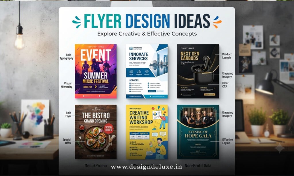
Different goals need different layouts. Here are the structures that consistently perform.
Single-hero layout
One large photo takes the top half. Headline sits in a dark band over the image. Offer and CTA live cleanly below. Works for real estate, restaurants, and retail.
List-and-offer layout
Three to five short benefit bullets beside a product shot. Big price or discount callout. Perfect for service businesses and local promotions.
Event-focused layout
Date, time, and location get equal visual weight with the headline. Space for a map snippet or venue photo. QR links straight to RSVP.
Authority layout
Headshot or before-after pair, short testimonial quote, credentials badge. Strong for contractors, coaches, and professionals who sell trust.
You can find solid starting points in Canva’s free marketing flyer templates. They already follow these hierarchies so you’re editing, not inventing.
Step-by-Step Action Plan for Beginners
If you’ve never designed a flyer before, follow this sequence.
- Write the one sentence that must stick. That’s your headline.
- Choose the single action you want: call, scan, visit, redeem.
- Open a template that matches your goal and industry.
- Swap in your brand colors and logo.
- Replace placeholder images with high-resolution photos (300 DPI minimum).
- Cut any text that doesn’t support the headline or CTA.
- Add a QR code that points to a simple landing page or form.
- Export as PDF with bleed, then order a small test print run.
- Hand out or post in the exact places your ideal customer already gathers.
- Track responses for two weeks and note what worked.
What I’d do if I were launching a new local service tomorrow: start with a single-hero template, write a headline that names the problem and the quick win, and put the phone number and QR code in the bottom third where eyes naturally land.
Common Mistakes & How to Fix Them
Clutter kills response. Too many fonts, too many offers, and low-contrast text all send the same message—this isn’t worth my time.
Low-quality images make the whole piece look cheap. Fix: only use photos shot or licensed at print resolution. Stretching a web image never works.
Missing or weak call to action leaves people unsure. Fix: make the next step impossible to miss and pair it with urgency.
Ignoring print specs (no bleed, text too close to edge) wastes an entire run. Fix: always design to the printer’s template and keep critical elements inside the safe zone.
Trying to speak to everyone dilutes the message. Fix: write for one specific person with one specific need.
Comparison of Template Approaches
| Template Type | Best For | Design Time | Tracking Strength | Typical Use Case |
|---|---|---|---|---|
| Single-Hero | Visual products & listings | 15–25 min | High with QR | Real estate, food, retail |
| List-and-Offer | Service businesses | 20–30 min | Medium–High | Cleaning, fitness, repairs |
| Event Layout | Time-sensitive gatherings | 15–20 min | High with RSVP link | Workshops, openings, classes |
| Authority | Trust-based sales | 25–35 min | Medium | Coaches, contractors, professionals |
Putting It All Together
The best Flyer Design Ideas: Templates That Generate Leads share the same DNA: clarity over cleverness, benefit over features, and one clear path forward. Once the design is locked, distribution decides results. Target the neighborhoods, bulletin boards, and events where your ideal customer already spends time.
Test small. Measure. Adjust the offer or headline based on what actually moves people. That’s how paper becomes pipeline.
Key Takeaways
- Lead with a benefit headline under ten words
- Limit body copy and stick to one primary offer
- Use high-contrast colors and generous white space
- Include a trackable QR code linked to a landing page
- Design to print specs from the start (bleed + safe margins)
- Choose a template that already has strong visual hierarchy
- Test a small batch before printing thousands
- Match distribution locations to the audience, not just convenience
You’ve got the structure and the tools. Open a template today, write one sharp headline, and get a test version in people’s hands this week. The leads follow the clarity.
FAQs
What makes Flyer Design Ideas: Templates That Generate Leads more effective than starting from scratch?
Templates already solve hierarchy and spacing problems so you spend time on the offer and CTA instead of reinventing layout basics.
How do I measure whether my Flyer Design Ideas: Templates That Generate Leads are working?
Use unique QR codes or promo codes tied to each design and distribution zone. Track scans, calls, and redemptions for two weeks.
Can beginners create professional Flyer Design Ideas: Templates That Generate Leads without design software experience?
Yes. Free tools like Canva give you drag-and-drop templates, brand kits, and print-ready exports that handle the technical side for you.