Social Media Advertising
Explainer Video Design: Simplify Complex Ideas begins with one hard truth: if your audience has to work to understand you, they leave. In my experience shipping dozens of these for SaaS teams and product launches, the videos that stick are the ones that strip complexity down to a single, visual story a busy viewer can grasp in under 90 seconds.
Here’s the quick overview of what Explainer Video Design: Simplify Complex Ideas actually delivers:
- Turns abstract features or processes into clear, visual narratives viewers can follow without rewinding
- Builds immediate understanding and trust by leading with the problem the audience already feels
- Drives higher engagement and conversion than text alone when length and focus stay tight
- Works across 2D animation, motion graphics, and live-action when the script comes first
- Cuts through the noise in 2026 by prioritizing one core message over feature dumps
According to Wyzowl’s 2025 State of Video Marketing report, 73% of video marketers have created explainer videos—the single most popular format—and 98% of people have watched one to learn about a product or service. That demand isn’t slowing. The teams that win treat design as the discipline of subtraction, not decoration.
Why Explainer Video Design: Simplify Complex Ideas Still Wins in 2026
Attention is expensive. HubSpot and industry data keep showing that video on landing pages lifts conversions, but only when the video itself doesn’t create friction. Complex ideas—API workflows, compliance processes, multi-step SaaS features—die in text. They thrive when motion, voice, and visuals carry the load together.
Think of a good explainer like a skilled tour guide in a crowded museum. The guide doesn’t stop at every painting. They point at three that matter, tell you why they matter in plain language, and move on. That’s the job. Everything else is noise.
Choosing the Right Style for Your Message
Not every complex idea needs the same visual treatment. Here’s a practical comparison I use when scoping projects:
| Style | Best For | Typical Length | Strengths | Watch-Outs |
|---|---|---|---|---|
| 2D Character Animation | Emotional stories, human problems, consumer apps | 60–90 sec | Warm, relatable, strong storytelling | Character rigging adds time and cost |
| Motion Graphics | Data, processes, technical or abstract concepts | 45–90 sec | Clean, precise, excellent for showing systems | Can feel cold if the script lacks story |
| Whiteboard / Kinetic Typography | Step-by-step teaching, educational content | 60–120 sec | Builds understanding in real time | Easily feels dated if overused |
| Live-Action or Mixed | Trust-building, physical products, founder stories | 60–90 sec | Human authenticity | Harder to revise; production heavier |
In practice, most B2B explainers lean toward motion graphics or 2D because they let you visualize what a camera can’t capture. The style should support the message, never compete with it.
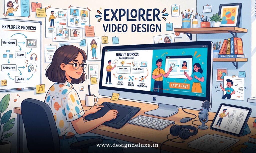
Explainer Video Design: Simplify Complex Ideas — A Step-by-Step Action Plan for Beginners
If you’re starting from zero, follow this sequence. I’ve seen teams skip steps and pay for it later in revisions.
- Lock the single core message first.
Ask yourself: if the viewer remembers only one thing, what is it? Write that sentence down. Everything in the video exists to deliver it. No exceptions. - Map the audience’s current belief.
What do they already think about this topic? Start there. A strong approach I’ve used successfully is briefly presenting the common (often incomplete) understanding, then correcting it with clear evidence. That moment of “wait, I was wrong” keeps people watching. - Write the script before any design work.
Target 130–150 spoken words per minute. Structure it as problem → agitation → solution → how it works in three simple steps → concrete benefit → one clear CTA. Read every line out loud. If it sounds stiff, rewrite until it feels like conversation. - Storyboard for clarity, not beauty.
One idea per scene. Visuals should either show the process, highlight relationships between elements, or reinforce a key term. If a shot doesn’t make the next idea easier to understand, cut it. - Choose voice and pacing deliberately.
Match the tone to the brand and the problem. Keep energy consistent. Leave breathing room so the viewer can absorb each point. - Build, test, and refine with real eyes.
Show the rough cut to someone who doesn’t know the product. If they can’t explain the core idea back to you in one sentence, the design still has work to do.
This process works whether you’re using traditional animation studios or modern AI-assisted tools. The tools change. The discipline doesn’t.
Design Principles That Actually Simplify
Visual hierarchy matters more than flashy transitions. Keep on-screen text large and limited. Use motion only when it carries information—arrows that show sequence, shapes that transform to reveal relationships, highlights that direct the eye.
Analogies help when used sparingly. Comparing a complex data pipeline to a city’s traffic system can land faster than three paragraphs of technical description, provided the comparison stays accurate.
Captions are non-negotiable. Many viewers watch with sound off, especially on mobile. Design the text as a second layer of clarity, not an afterthought.
Common Mistakes & How to Fix Them
I’ve reviewed enough underperforming explainers to recognize the patterns.
Mistake 1: Opening with the company or product.
Viewers don’t care yet. Fix: Hit the pain point or a sharp question in the first five seconds.
Mistake 2: Trying to explain everything.
Feature lists kill momentum. Fix: One core problem, one clear solution. Save the rest for follow-up content.
Mistake 3: Script that reads like a white paper.
Long sentences and jargon create cognitive drag. Fix: Write the way people talk. Short sentences. Everyday words. Second person (“you”).
Mistake 4: Style that fights the message.
Playful cartoon characters for enterprise security software erodes trust. Fix: Match visual tone to audience expectations and brand personality.
Mistake 5: Weak or missing CTA.
“Learn more” is lazy. Fix: Tell them the exact next step—“Start your free trial” or “Book a 15-minute demo.”
Mistake 6: Ignoring length for the platform.
A 2.5-minute video may work on a product page. It dies as a cold social ad. Fix: Match runtime to context. 60–90 seconds remains the sweet spot for most explainers.
Key Takeaways
- Start every project with one crystal-clear core message
- Script before design—always
- Lead with the viewer’s problem, not your product
- Keep most explainers between 60 and 90 seconds
- Use visuals to carry meaning, not just decorate
- One idea per scene keeps cognitive load low
- Match style, voice, and tone to the audience and brand
- End with a specific, low-friction next step
- Test with someone outside the project before finalizing
Mastering Explainer Video Design: Simplify Complex Ideas gives you a repeatable way to turn the hardest parts of your product into assets that actually move people. The next step is simple: pick one complex idea your team struggles to explain, write the single-sentence core message, and draft a 90-second script this week. Everything else follows from there.
FAQs
How long should an Explainer Video Design: Simplify Complex Ideas project take from script to final?
A focused 60–90 second animated explainer typically runs 2–5 weeks depending on complexity and revision rounds. AI-assisted tools can compress the production phase significantly, but the thinking and scripting stages still require real time.
What’s the biggest difference between a good and a great explainer when tackling complex ideas?
Great ones make the viewer feel smarter, not overwhelmed. They reduce the mental work required. That usually comes from ruthless prioritization of one message and visuals that actively teach rather than simply illustrate.
Can I use AI tools effectively for Explainer Video Design: Simplify Complex Ideas without losing quality?
Yes, when you treat AI as an execution layer, not a replacement for strategy. The teams getting strong results in 2026 still own the core message, script structure, and visual hierarchy. AI accelerates generation and iteration once those decisions are locked.Explainer Video Design: Simplify Complex Ideas with proven 2026 strategies. Learn step-by-step tactics that turn complexity into clarity and conversions. Start designing smarter today.