Logo Design
Minimalist logo design trends 2026 prove that less is still more — but only if that “less” feels human, sharp, and built for speed. Brands want instant recognition on a phone screen at 16 pixels and equal impact on a billboard. The cold, sterile flat designs of the 2010s are fading. In their place? Neo-minimalism that adds subtle warmth, personality, and smart adaptability without clutter.
The shift feels necessary. AI floods the market with generic marks. Smart designers counter with intention. They keep the core clean but inject one memorable twist that makes the logo stick.
Here’s the reality in 2026: Minimalism isn’t dying. It’s evolving into something warmer, more versatile, and deeply tied to full brand systems. Many teams now explore AI generated minimalist logo design with packaging and social media templates 2026 to accelerate concepts while keeping final execution distinctly human.
Why Neo-Minimalism Dominates 2026
Pure minimalism taught us clarity wins. But after a decade of identical sans-serif wordmarks, audiences crave distinction. Neo-minimalism delivers that — clean foundations with one or two deliberate choices that add soul.
Think softer edges instead of razor geometry. Subtle negative space tricks. Warm neutrals or single bold accent colors. These logos scale mercilessly yet feel crafted, not generated.
The kicker? They fight AI sameness. A logo that looks too perfect often gets ignored. One with a tiny human imperfection? That gets remembered.
Core Minimalist Logo Design Trends 2026
1. Minimalism with a Twist
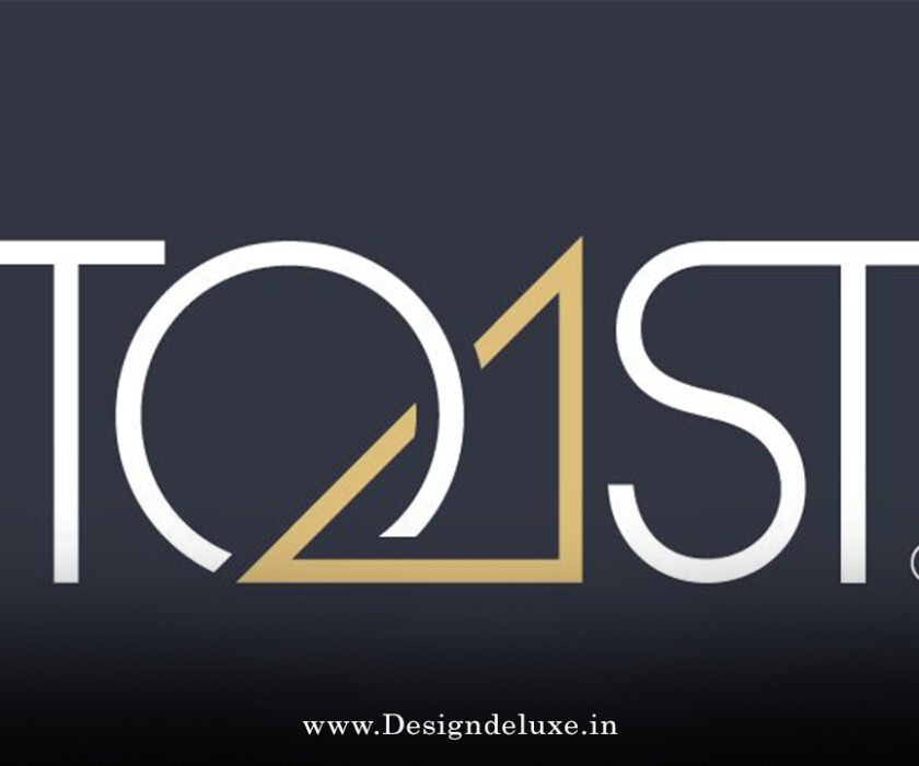
Clean shapes get one unexpected detail — an asymmetric cut, playful proportion, or clever negative space illusion. This keeps the design simple while adding personality that pure minimalism lacked.
2. Warm, Human Touches
Slight textures, micro-imperfections, or organic curves within geometric forms. Brands counter digital fatigue by making logos feel approachable and hand-considered.
3. Pixel-Perfect Sharpness
Hyper-crisp edges optimized for every screen size. These logos look razor-sharp as favicons and hold detail when enlarged. Precision matters more than ever.
4. Adaptive & Dynamic Marks
Logos that morph slightly for different contexts — simplified versions for tiny icons, expanded for packaging. Motion elements appear in digital versions without breaking the static core.
5. Negative Space Mastery
Empty areas work harder, hiding secondary meanings or creating optical interest that reveals itself on closer look.
6. Restrained but Expressive Typography
Bold yet refined letterforms. Custom ligatures or subtle weight shifts replace generic fonts. Legibility remains non-negotiable.
These trends blend timeless simplicity with 2026 relevance. They work across industries because they prioritize recognition over decoration.
How to Create a Standout Minimalist Logo in 2026
Start ruthless. Strip every element to its purpose. Ask: Does this serve recognition? Does it scale? Does it feel like our brand?
Practical steps I’d take:
- Define the single core idea your logo must communicate in one second.
- Sketch 20+ variations by hand first. AI comes later for speed, not soul.
- Test at every size — favicon, app icon, packaging, signage.
- Choose one accent: a color pop, a curve, a hidden symbol.
- Build full applications early. The logo must shine on packaging, social templates, and motion.
The strongest minimalist logos feel inevitable. Like they couldn’t exist any other way.
Minimalist Logo Applications: Packaging & Social Media
In 2026, a logo doesn’t live alone. It must perform on product packaging with clean breathing room and on social media where it competes in tiny profile pictures.
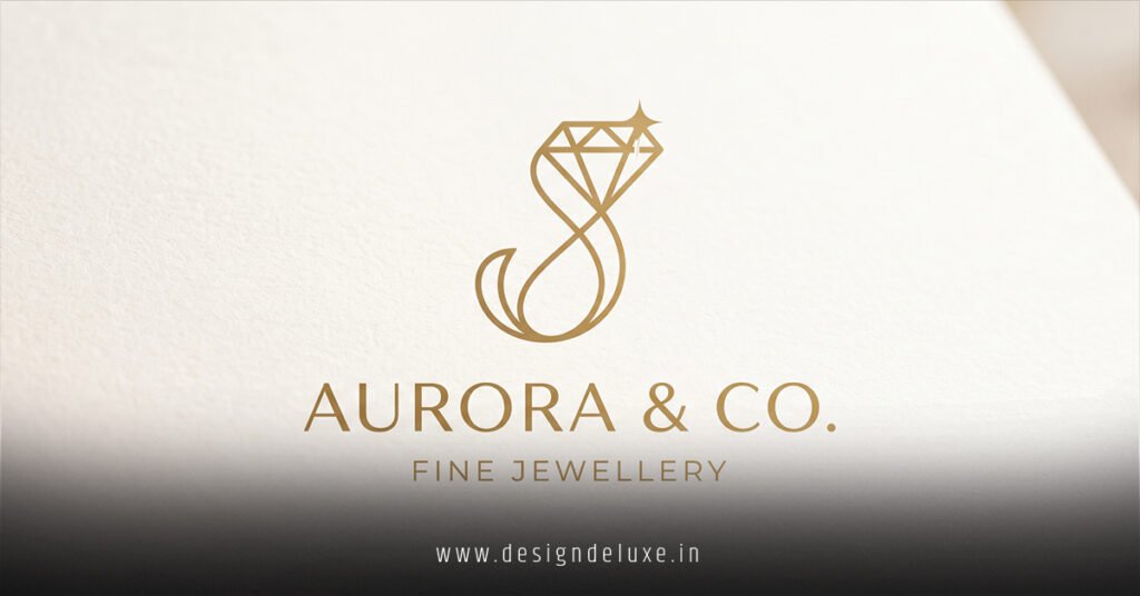
Packaging favors extreme simplicity — plenty of white space, one strong mark, and confident typography. Social demands versions that hold impact at thumbnail size.
This is exactly why forward-thinking teams turn to AI generated minimalist logo design with packaging and social media templates 2026. It lets you generate dozens of cohesive assets fast, then refine the winners with human judgment for that final polish.
Comparison of Minimalist Approaches in 2026
| Approach | Strengths | Weaknesses | Best For |
|---|---|---|---|
| Pure Classic Minimalism | Timeless, ultra-scalable | Can feel generic or cold | Established corporate brands |
| Neo-Minimalism with Twist | Memorable, warm, distinctive | Requires strong design restraint | Modern consumer brands |
| AI-Assisted Minimalism | Fast iteration, consistent assets | Risks soulless output | Startups needing speed |
| Warm Organic Minimalism | Human feel, emotional connection | Harder to maintain consistency | Lifestyle & wellness brands |
| Adaptive Dynamic | Perfect for digital-first | More complex to produce | Tech & app-based companies |
Neo-minimalism with a twist leads most categories right now. It balances clarity with character.
Common Mistakes to Avoid
Don’t chase trends blindly. A logo that follows every 2026 micro-detail risks dating itself by 2028. Focus on your brand first.
Over-simplifying kills meaning. Removing too much leaves nothing memorable. Under-simplifying adds noise that destroys versatility.
Ignoring testing is fatal. What looks perfect on your monitor may collapse on mobile or packaging.
Finally, treating the logo in isolation. In 2026 the mark must integrate seamlessly with packaging systems and social templates from day one.
Key Takeaways
- Neo-minimalism rules 2026 — clean but warmer and more human than past decades.
- One deliberate twist beats plain simplicity for memorability.
- Scalability and adaptability trump decorative details.
- Fight AI sameness with intentional human choices.
- Test relentlessly across sizes and applications.
- Build packaging and social assets alongside the core mark.
- Prioritize recognition speed over artistic flair.
- Update thoughtfully every few years while protecting core equity.
Minimalist logo design trends 2026 reward discipline. The brands winning do less, but do it with more intention.
Ready to refresh your mark? Start by auditing your current logo at thumbnail size. Strip one unnecessary element today. Then explore how AI generated minimalist logo design with packaging and social media templates 2026 can help you visualize the full system fast. The best work feels simple — because the hard thinking happened behind the scenes.
FAQs
What makes a minimalist logo effective in 2026?
It must be instantly recognizable at tiny sizes, scalable to large formats, and carry subtle personality that feels human rather than generic.
How do you balance minimalism with brand personality?
Add one strategic twist — a unique proportion, negative space story, or warm detail — while keeping the overall design ruthlessly simple.
Should startups use AI for minimalist logo design in 2026?
Yes, as a powerful starting tool. Generate concepts and full asset systems quickly, then refine with human strategy for authenticity and lasting impact.