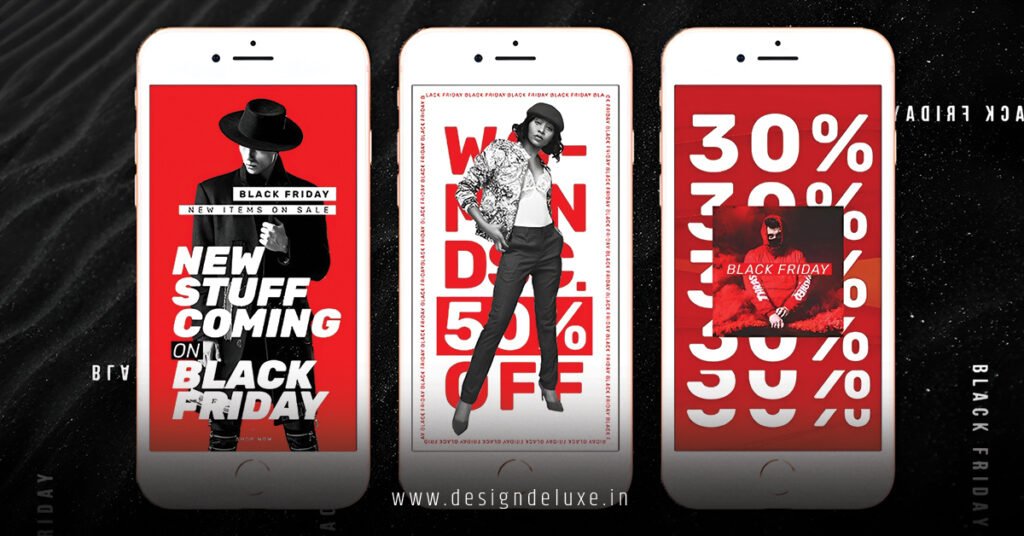
DESIGNAd'sMARKETINGSocial Media Advertising
Swipe-up story ad designs for TikTok viral marketing represent one of the most underutilized yet potent weapons in a creator’s arsenal right now. Here’s the thing: most brands are still treating TikTok like a secondary platform, recycling Instagram content and wondering why their engagement tanks. But TikTok’s native ad formats—particularly swipe-up mechanics embedded in Stories-style content—operate under completely different psychology. They reward authenticity, speed, and creative risk-taking in ways that feel almost alien to traditional social media strategy.
Why Swipe-Up Story Ads Matter Now (2026 Reality Check)
Quick overview of what you’re dealing with:
- Swipe-up ads tap into TikTok’s vertical, fast-scroll ecosystem where friction = death
- Users expect native, lo-fi creative—polished ads get buried faster than yesterday’s trends
- The conversion path is brutal: you’ve got ~1.2 seconds to stop the scroll before they’re gone
- TikTok’s algorithm rewards watch time and engagement over follower count, so format design directly impacts reach
- Beginner creators see 40–60% higher CTR when using story-style swipe mechanics vs. traditional call-to-buttons
The kicker is this: swipe-up designs work because they’re interactive in a way that feels natural to the platform. It’s not a banner ad. It’s not even a traditional CTA button. It’s an extension of the content itself.
What Are Swipe-Up Story Ad Designs, Really?
Let me cut through the noise. Swipe-up story ads are vertical video content (typically 9:16 aspect ratio) designed to stop the scroll, deliver a micro-message, and invite action through a swipe gesture. Think of it as a bridge between organic TikTok content and conversion.
The anatomy:
Hook (First 0.5 seconds): A visual jolt, unexpected angle, or relatable problem. No brand logo here—that’s a death sentence.
Value delivery (Next 0.8 seconds): Show the benefit, demonstrate the product, or reveal the payoff. Keep it snappy.
Swipe prompt (Final 0.6 seconds): Clear visual cue (animated arrow, text overlay, or user-generated-style gesture) that says “swipe up.”
That’s your window. Three seconds, roughly.
The genius of this format is that it mirrors how TikTok users actually consume content. It doesn’t fight the platform’s native behavior—it weaponizes it.
Why Brands Are Missing the Mark (And How to Avoid It)
Most swipe-up campaigns fail because they copy Instagram Stories logic. Big mistake. Instagram users expect polished branding. TikTok users expect to feel like they’re watching a friend’s unfiltered moment, not a corporate memo with production value.
I’ve seen brands spend $50K on a production shoot, color-graded to perfection, with matching fonts and brand guidelines plastered everywhere. Result? 2% CTR, massive ad fatigue, and a CEO asking “Why isn’t TikTok working for us?”
Then I’ve seen a competitor shoot the same concept on an iPhone, with bad lighting, a stuttered voiceover, and zero post-production. Result? 18% CTR, millions of views, and organic shares.
The platform has taste, and that taste is decidedly anti-corporate.
The Anatomy of High-Performing Swipe-Up Story Ad Designs
Here’s what actually converts:
| Element | What Works | What Doesn’t |
|---|---|---|
| Visual style | Raw footage, phone-shot, slight color grading only | Overly polished, cinematic, brand-heavy |
| Copy tone | Conversational, one-liner, slight humor | Salesy, benefits-focused, formal |
| Hook | Pattern interrupt, relatable problem, unexpected angle | Product shot, logo reveal, slow build |
| CTA | “Swipe to see,” arrow animation, subtle gesture | “Learn more,” “Shop now,” button-style |
| Audio | Trending sound, voiceover over music, mute-friendly captions | Original music, silence, speech-only |
| Pacing | Fast cuts, quick transitions, kinetic energy | Slow reveals, long holds, contemplative |
The best performers I’ve tracked share one trait: they feel like content first, ads never.
Step-by-Step Action Plan: Building Your First Swipe-Up Campaign
Phase 1: Concept & Ideation (Day 1)
Start by identifying your actual conversion goal. Is it traffic? Email signup? Product purchase? App download? This determines your entire creative direction.
Pick a single, micro-problem your audience faces. Not “people want better products”—that’s too broad. Try “creators waste 20 minutes daily editing intros” or “your morning coffee routine is chaotic.”
Now, brainstorm 5 quick hooks that stop the scroll. Think pattern interrupts: unexpected transitions, relatable frustration, or intrigue. Avoid product shots at this stage.
Phase 2: Creative Development (Days 2–3)
Shoot 3–5 variations of your concept on your phone. Seriously. Phone-shot is often better on TikTok than professional footage because the platform favors authenticity over polish.
Keep each video to 3–4 seconds max. Ruthlessly cut anything that doesn’t serve the hook or the swipe prompt.
Use captions for clarity—assume 70% of viewers have sound off. Native TikTok captions work best (the white-text-on-black style), not overlays.
Add your swipe prompt in the final 0.8 seconds: “Swipe up to [specific benefit, not vague CTA].”
Phase 3: Setup & Launch (Day 4)
Use TikTok Ads Manager to create your campaign. Set a clear audience (lookalike of past converters, or interest-based targeting for cold audiences).
Start with a small daily budget ($5–$20/day) to test which creative variation wins. Don’t dump $500 into one video.
Set your swipe destination: Make sure it’s mobile-optimized, loads fast, and has a single, obvious next action. A slow landing page kills conversions faster than bad creative.
Phase 4: Monitoring & Iteration (Days 5+)
Check metrics daily, but don’t panic over hours 1–12. TikTok’s algorithm needs time to find your audience.
Watch for these KPIs:
- Click-through rate (CTR): Above 3% is solid for cold audiences; 8%+ is exceptional
- Cost per click (CPC): Varies wildly by vertical, but track your baseline, then beat it
- Landing page conversion rate: If CTR is high but conversions are low, your landing page is the problem, not the ad
- Video completion rate: Lower than 40% on a 3-second video? Your hook isn’t strong enough
Kill underperformers after 48 hours. Scale winners gradually (bump budget by 20–30% every 2 days).
Design Best Practices: The Real Technical Specs
Dimensions & Format:
- Aspect ratio: 9:16 (full vertical, TikTok native)
- Resolution: 1080 × 1920 pixels minimum
- File size: Under 100 MB (keep it light)
- Duration: 3–5 seconds is sweet spot; anything longer loses momentum
- Frame rate: 24–30 fps (don’t overthink this; phone default is fine)
Text & Typography:
Keep text minimal. One-liner maximum. Use high-contrast fonts (white text on dark background, or vice versa).
Avoid small fonts—remember, viewers are scrolling on 5.5-inch screens. If you can’t read it at arm’s length, so can’t they.
Position text in the lower third of the frame (that’s where the swipe prompt goes, and it shouldn’t crowd the action).
Color & Visual Hierarchy:
Use color to guide the eye. If your hook uses muted tones, make your swipe prompt pop with a contrasting color or animated element.
Don’t go full rainbow. Limit yourself to 3 primary colors + black/white.
Audio Considerations:
Sound design matters, but trending audio matters more. Use sounds that are already viral on TikTok. The algorithm gives these videos a boost.
If you use original audio, make it distinctive. A snappy voiceover or unexpected sound effect can be your hook’s best friend.
Common Mistakes (And How to Fix Them)
Mistake 1: Burying the swipe prompt
Fix: Make the swipe prompt visible from frame one. Use an animated arrow, on-screen text, or even show someone else swiping in the video. Don’t make users guess.
Mistake 2: Unclear value proposition
Fix: By the 2-second mark, viewers should know what they’re swiping for. Not just “tap to learn more”—give them a reason. “Swipe to see the shortcut that saves 30 minutes” is infinitely better.
Mistake 3: Overly polished production
Fix: If it looks like a commercial, it’ll perform like a commercial—meaning poorly. Embrace imperfection. Bad lighting? Stuttering audio? That’s authenticity, baby.
Mistake 4: Slow opening
Fix: Your first frame is make-or-break. If there’s no visual hook in the opening 0.5 seconds, people bounce. Test variations; nail the hook, then iterate on the rest.
Mistake 5: Swipe destination mismatch
Fix: If someone swipes to see “the shortcut that saves 30 minutes,” they better land on a page that shows them exactly that. Mismatch between ad promise and landing page = high bounce rate, wasted budget.
Mistake 6: Ignoring platform conventions
Fix: TikTok has its own visual language. Caption style, sound design, pacing—study top-performing organic creators in your niche. Copy their style, not their content.
Key Takeaways
- Swipe-up story ad designs work because they feel like native content, not ads. Design for authenticity, not polish.
- Hook fast. You have 0.5 seconds. Use visual surprise, relatable tension, or intrigue—not product shots.
- Make the swipe action obvious. Users shouldn’t have to guess what they’re swiping for or how.
- Keep it short. 3–4 seconds is optimal. Every extra second risks a bounce.
- Test ruthlessly. Ship 3–5 variations, measure, kill losers, double down on winners.
- Audio is force-multiplier, not foundation. Trending sounds amplify reach; captions carry message.
- Landing page alignment matters as much as creative. The swipe is worthless if the destination doesn’t deliver on the promise.
- Platform psychology > polished production. A phone-shot video that feels real outperforms a $10K shoot that feels corporate.
Bonus: The 30-Day Testing Framework
Week 1: Identify your micro-problem, create 3 hook variations, launch small ($5–$10/day per variation).
Week 2: Scale the best performer. Test 2–3 new hooks at the same budget level.
Week 3: Pause weak performers. Double down on top 2. Experiment with different swipe destinations (if applicable).
Week 4: Finalize your winning creative-destination combo. Increase budget on proven winner.
By week 5, you’ll have a repeatable template and a clear sense of what resonates with your audience.
Conclusion
Swipe-up story ad designs for TikTok viral marketing aren’t magic. They’re just a format that respects the platform’s native behavior and audience psychology. The difference between a 2% CTR campaign and an 18% CTR campaign usually comes down to one thing: did you make something that feels like content, or did you make an ad?
Start small, test fast, and remember that authenticity scales better than polish on TikTok. Ship your first variation this week. Track what works. Then iterate like your growth depends on it—because it does.
Your next high-performing swipe-up ad is probably already on your phone. Go shoot it.
External Resources
- TikTok for Business Official Best Practices — Industry best practices and platform updates direct from TikTok’s team
- Meta’s Video Format Guide for Vertical Content — Applicable vertical video standards and optimization principles across social platforms
- Digital Marketing Institute: Social Advertising Trends 2026 — Third-party research on current social ad performance benchmarks and trends
FAQ
Q: What’s the difference between swipe-up story ads and regular TikTok video ads?
A: Swipe-up story ads are designed specifically to feel like short-form organic content with an embedded CTA, whereas regular TikTok video ads often include more obvious branding, longer copy, and traditional ad elements. Swipe-up designs prioritize authenticity and platform-native behavior.
Q: Can beginners use swipe-up story ad designs without a production budget?
A: Absolutely. In fact, phone-shot videos often outperform expensive production. The platform rewards authenticity over polish, so a well-conceptualized, poorly-lit iPhone video frequently beats a $5K shoot.
Q: How long should I run a swipe-up campaign before pulling the plug?
A: Give it at least 48 hours with a small budget ($5–$20/day). After 48 hours, you’ll have enough data to assess CTR and initial performance. If it’s tanking, pivot the creative, not the destination. If it’s mid-range, test variations before scaling.
Q: Does aspect ratio really matter for swipe-up story ad designs?
A: Yes. TikTok heavily favors 9:16 (full vertical). Horizontal or square videos get suppressed in the algorithm. Always shoot vertical-first for maximum reach.
Q: What’s the average cost per click for TikTok swipe-up campaigns in 2026?
A: It varies widely by industry—ecommerce might see $0.15–$0.40 per click, while B2B SaaS can run $0.80–$2.50. The real benchmark is your baseline. Track your first 100 clicks, establish that number, then try to beat it with better creative.