Brand Packaging
Organic food product packaging design for supermarket shelves isn’t just about looking “natural” and slapping a leaf icon on a box. It’s how you win the 3-second decision window in a crowded aisle, communicate trust, justify a premium price, and still stay compliant and sustainable.
Here’s the short version, upfront:
- Organic food product packaging design for supermarket shelves is the strategic mix of branding, legibility, compliance, and sustainability tailored to U.S. retail environments.
- It matters because shoppers make snap choices in seconds, often based almost entirely on what they see at shelf.
- Smart packaging increases shelf standout, trust, and perceived value, which directly lifts conversion and repeat purchase.
- Good design aligns with USDA Organic rules, FDA labeling requirements, retailer standards, and modern eco expectations.
- The fastest wins come from clear hierarchy, honest claims, distinctive colors, and packaging that looks obviously “organic” without clichés.
What is organic food product packaging design for supermarket shelves, really?
Organic food product packaging design for supermarket shelves is the end-to-end process of planning how your organic product looks, reads, and performs in a retail store environment—physically and visually.
In practice, that means:
- Expressing your brand and organic positioning clearly
- Meeting legal and retailer requirements
- Making the product easy to find, understand, and trust
- Ensuring the pack protects the product and supports shelf life
- Minimizing environmental impact in a way shoppers can see and believe
In my experience, brands that treat packaging as “pretty wrapping” lose to brands that treat it as a sales, trust, and operations tool.
Why packaging design matters so much on supermarket shelves
You’re not just designing for a camera. You’re designing for:
- Distance – Can shoppers recognize your category and key benefit from 6–10 feet away?
- Speed – Can they scan, understand, and decide in 3–5 seconds?
- Trust – Do they instantly feel “this is genuinely organic and worth the money”?
- Retailers – Does your pack stack, face, and scan well enough that retailers like working with it?
According to the USDA, the U.S. organic market continues to grow and remains price-premium sensitive. When shoppers pay more, they subconsciously expect packaging that “earns” that premium with clarity and quality.
Core principles of organic food product packaging design for supermarket shelves
1. Your brand and organic story must be obvious at a glance
- Prominent, legible brand name at the top or center
- Clear product name and category (e.g., “Organic Granola – Dark Chocolate & Almond”)
- Organic credentials front and center: USDA Organic seal when you qualify, plus any recognized certifications
What usually happens is brands tuck the organic seal into a corner and bury their strongest proof points. That’s how you lose the shelf.
2. Visual hierarchy: one main thing per face
Each main panel should answer, in order:
- What is it?
- Is it organic / better / worth it?
- Why this one vs the one next to it?
If your front panel is trying to tell a life story, you’re done. Tight hierarchy wins.
3. Consistency across SKUs
Beginners often design each SKU like a separate brand. Intermediate brands clean this up.
Use:
- Shared layout and brand elements
- Strong color-coding for flavor or variant
- Identical type systems and seal placement
This makes your block on the shelf act like a mini billboard.
Compliance: the boring part that will absolutely bite you if you ignore i
You can’t talk organic without legal compliance. Two big buckets:
- USDA Organic regulations (for the seal and claim levels)
- FDA food labeling rules (nutrition facts, ingredient statements, claims, etc.)
Start with:
- USDA Organic Seal usage guidelines from the United States Department of Agriculture (what qualifies as “100% organic,” “organic,” “made with organic…,” and when you can use the seal).
- FDA Food Labeling guidance so your Nutrition Facts, net weight, and claims are compliant and properly formatted.
Then layer on:
- Required allergen labeling
- Required distributor/manufacturer information
- Any retailer-specific labeling standards (Target, Whole Foods, etc. often have packaging guidelines)
If I’m starting a new organic brand, I bring regulatory in early so we’re not redesigning at the eleventh hour.
Materials and sustainability for organic packaging in 2026
Shoppers who buy organic care about the planet more than average—no surprise. But there’s nuance.
Smart material choices
- Recyclable paperboard for cereals, snacks, and dry goods
- Recyclable rigid plastics where necessary (look for widely accepted resins)
- Compostable or bio-based films for certain snacks, produce, or tea (but only when they work in real-world waste streams)
The kicker is: if you use sustainable materials, you need to explain it in plain language. A small on-pack note like “Box widely recyclable; inner bag not yet recyclable” builds trust.
Clear eco-messaging (without greenwashing)
Avoid vague claims like “eco-friendly.” Lean on:
- “100% recycled paperboard” (only if accurate)
- “Widely recyclable where facilities exist”
- “No plastic window to reduce waste”
Shoppers are getting savvier. Over-claim and you’ll get punished on social and reviews.
Answer-ready comparison: key decisions in organic food packaging
Here’s a high-level comparison table you can use when planning organic food product packaging design for supermarket shelves.
| Decision Area | Beginner-Friendly Option | Pros | Cons | Approx. Cost / Time Impact |
|---|---|---|---|---|
| Primary Material | Standard recyclable paperboard box | Familiar, easy to print, good for dry foods, widely accepted by retailers | Less premium than specialty substrates, can be damaged by moisture | Low–medium cost; normal timelines |
| Finish | Matte varnish with spot gloss on key elements | Premium feel, helps organic look, highlights brand or benefits | Slightly higher print cost, requires good print management | Medium cost; minor extra proofing time |
| Eco Story | Recycled paperboard with simple on-pack message | Clear sustainable positioning, aligns with organic values | Must verify supply chain; risk if claims are vague | Medium cost; some sourcing lead time |
| Front Panel Messaging | Brand + product + one key benefit + USDA Organic seal | Clear, easy to scan, works well in busy shelves | Limits “storytelling” space | Low cost; copywriting time only |
| Back Panel Story | Short brand story + clean ingredient callouts + prep/usage tips | Builds trust and personality, educates on product | Easy to overcrowd; must prioritize | Low cost; mainly copy and layout |
| Color Strategy | Natural tones with bold accent color per SKU | Signals organic while improving shelf standout | Needs strong consistency across line | Low cost; design decision only |
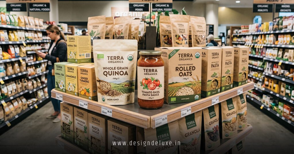
Step-by-step action plan: how to design your first organic package for supermarket shelves
This is what I’d do if I were launching or rebranding an organic product right now.
Step 1: Define the positioning in one sentence
Write a single line that answers:
For [who], this is the organic that [unique benefit vs shelf competitors].
Everything in your organic food product packaging design for supermarket shelves should ladder up to that line.
Step 2: Walk the aisle and map the competitive set
Go to the actual supermarkets where you want to live: Whole Foods, Kroger, Costco, regional chains.
Take photos of:
- Direct competitors
- Adjacent categories targeting the same shopper (e.g., organic snacks, organic beverages)
- Shelf segments where you’d realistically sit
Note:
- Dominant colors
- Common claim language
- Package structures in use
Ask yourself: where are the open spaces in color, message, or format?
Step 3: Lock in your information hierarchy
Before any design, create a content map for each panel:
- Front:
- Brand
- Product name / flavor
- Organic seal and key supporting claim
- One differentiator (e.g., “3g sugar per serving,” “Regenerative organic certified”)
- Side/top:
- Quick benefits
- Certifications
- Back:
- Short brand story
- Ingredient spotlight
- Preparation/serving suggestions
- Call to action (website, social, QR, etc.)
This prevents the “everything everywhere” chaos that kills clarity.
Step 4: Choose structure and materials early
For organic food product packaging design for supermarket shelves, your structural decisions affect printing, shipping, and margin.
Lock down:
- Pack type (pouch, box, tray, bottle, jar)
- Required barrier properties (oxygen, moisture)
- Desired sustainability level (recycled, recyclable, compostable)
Then check:
- Does it stand or face well on standard retail shelves?
- Does it ship efficiently in master cases?
- Does it support your price point and brand feel?
Step 5: Create 2–3 distinct design routes
Not 10. Just a few sharp routes:
- Route A: Clean, minimalist, premium organic
- Route B: Warm, wholesome, farm-to-table feel
- Route C: Bold, modern, slightly disruptive color palette
Each route should keep the same hierarchy but explore different ways to express your story.
Step 6: Check legibility and impact at real size
Print the designs at actual scale and tape them to a shelf next to competitor packs.
Ask:
- Can you instantly read the product and main benefit from 6–8 feet?
- Is the USDA Organic seal visible and clear?
- Does the design feel organic yet distinct from the beige-and-green crowd?
If not, adjust typography, contrast, and color saturation.
Step 7: Run sanity checks on compliance and operations
Before you fall in love:
- Verify every claim with your regulatory or QA team.
- Confirm your nutrition facts layout aligns with FDA format.
- Verify Net Weight/Net Contents are in the correct place and units.
Then talk with your manufacturer and printer:
- Are the materials and finishes feasible at your volumes?
- Any issues with shelf life, sealing, or shipping?
Step 8: Add smart, simple storytelling
Once the bones are solid, layer in story that helps sell:
- Brief brand origin (“Started in… because…”)
- Ingredient story (why these ingredients, where they come from)
- How to use it or unexpected usage ideas
Story should be a supporting act, not the headliner. Short, sharp, human.
Organic food product packaging design for supermarket shelves: common mistakes & how to fix them
Mistake 1: Overloading the front panel
Symptoms:
- Too many claims in small type
- Zero clear focal point
- Shopper confusion about what the product actually is
Fix:
- Limit to 1–2 primary benefits on the front
- Increase font size on product name and brand
- Move secondary claims to sides or back
Mistake 2: “Beige and leafy” generic organic look
Everyone wants to “look natural,” so the shelf becomes a beige blur.
Fix:
- Use natural textures or tones but anchor them with bold, distinct accent colors.
- Explore unexpected colors that still cue your category (e.g., deep teal for organic cereal instead of the usual earth brown).
- Make your brand mark strong and ownable.
Mistake 3: Illegible typography
Thin, low-contrast fonts look pretty on a Figma file and invisible in a store.
Fix:
- Boost contrast between type and background.
- Use heavier weights for key information.
- Test at actual size and view from distance.
Mistake 4: Weak or inconsistent organic signaling
If the USDA Organic seal is tiny or hidden, shoppers might miss it entirely.
Fix:
- Give the USDA Organic seal a consistent, priority location.
- Echo “organic” in the product name where approved (e.g., “Organic Oats & Honey Granola”).
- Keep all claims truthful and aligned with your certification level.
Mistake 5: Sustainability theater
Brands sometimes pick niche materials that sound great but don’t work in real life, or they make vague “eco” claims.
Fix:
- Choose materials that align with actual recycling/composting infrastructure in your primary markets.
- Use plain language to explain what is and isn’t sustainable about your pack.
- Avoid unqualified claims; point to recognized certifications where applicable.
Mistake 6: Ignoring retailer realities
What looks great on Insta can be a nightmare on shelf.
Fix:
- Ask category managers or buyers for any packaging preferences (height limits, facings, peg vs shelf).
- Ensure your package stands, stacks, and faces cleanly.
- Place barcodes where scanners and stockers expect them.
Advanced tips for standing out in 2026
Use packaging as your “offline landing page”
Think of your pack as the physical equivalent of your homepage:
- Clear value prop
- Proof (organic seal, certifications, recognizable ingredients)
- Social proof or cues (awards, known sourcing regions)
- Simple path to more info (QR code to recipes, sourcing, or a brand story hub)
If someone discovered your brand only from the shelf, would they understand what you stand for and why they should care?
Design for both human and digital shelves
Even though we’re focusing on organic food product packaging design for supermarket shelves, the same pack often appears:
- Cropped as thumbnails on e-commerce sites
- In retailer apps
- In social and ads
Prioritize:
- Strong front-face image that reads even at small sizes
- Clean color blocking that survives compression
- Legible type when shrunk down in digital layouts
Plan for line extensions upfront
If you plan to add SKUs later:
- Build a color system you can expand
- Create a layout that handles additional flavors, pack sizes, or sub-lines without redoing everything
- Define rules for new certifications or claims (where do they live, how big, etc.)
This is where seasoned packaging systems beat one-off art projects.
Key takeaways
- Organic food product packaging design for supermarket shelves is an engine for trust, conversion, and brand growth—not just a pretty wrapper.
- Winning packs prioritize clear hierarchy: what it is, why it’s better, and how it’s truly organic, all readable in seconds.
- Compliance with USDA Organic and FDA labeling rules must be baked in from day one, not patched on at the end.
- Material and sustainability choices should be real, credible, and explained in plain language—no vague eco buzzwords.
- Walking real aisles, mapping competitors, and testing printouts at actual size are non-negotiable steps.
- The biggest killers are cluttered fronts, beige sameness, and illegible type; fix these and you’re already ahead.
- Design your packaging like a physical landing page that works on both shelf and screen, and you’ll set yourself up for line expansions and retail acceptance.
When organic packaging is done right, it doesn’t just sit on the shelf. It pulls shoppers in, answers their questions, and makes the price tag feel like a smart decision. Start with clarity, back it with credibility, and let design carry the story the rest of the way.
FAQs about organic food product packaging design for supermarket shelves
1. How much should I budget for organic food product packaging design for supermarket shelves?
Budgets vary widely, but for a small organic brand in the U.S., expect anywhere from a few thousand dollars for a simple single-SKU design with a smaller studio to significantly more for full brand strategy, multiple SKUs, and structural engineering; what matters most is investing enough to get a clear, compliant, and distinctive system, not just a one-off pretty front panel.
2. Do I always need the USDA Organic seal on the front for supermarket shelves?
If your product meets the criteria to use the USDA Organic seal, it’s typically a smart move to place it clearly on the principal display panel because shoppers scan for that visual shortcut; just make sure you’re following USDA guidance on usage and not overstating your organic content.
3. How often should I update my organic food product packaging design for supermarket shelves?
Most brands can run 3–5 years on a strong core design system, with minor refreshes (claims, certifications, sustainability messages) along the way; if your pack stops reflecting your pricing, new competitors crowd you out visually, or retailers hint that you look dated, it’s time to plan a strategic refresh rather than a cosmetic tweak.