Brand PackagingDESIGN
National retail does not award shelf space for a prettier label. Buyers authorize items they can range, scan, explain, and reorder without creating problems for the store. That is why small brand packaging redesigns that unlocked national retail distribution tend to look, in hindsight, like operational projects as much as creative ones. The new pack made the product legible at a glance, practical to ship, and distinct from the private-label block beside it.
If you are preparing for a chain review, a distributor reset, or a broker meeting, treat the redesign as a response to specific objections. A regional brand can live for years with a pack that works at a farmers market and fails in a planogram. The job is to find which failures are blocking distribution, fix those, and keep the equity that already sells the product.
What “unlocked distribution” actually describes
The phrase is easy to overread. A redesign does not force a buyer to say yes. It removes reasons to say no, and it gives the sales story a physical proof point. In categories where products sit side by side—food, beverage, personal care, household, pet, and many general-merchandise lines—the package is the only salesperson on the shelf. It also has to survive a warehouse, a shelf edge, and a shopper who is not looking for you.
A refresh is not the same as a retail-ready redesign
A refresh updates color, type, or a seasonal icon while the structure, information hierarchy, and case pack stay the same. A retail-ready redesign may change any of those. It might shorten the brand lockup so it reads at an angle. It might move a buried claim into a position a buyer can photograph for an internal review. It might change a carton dimension so the item fits a standard shelf depth, or change a film structure so bags stop splitting in transit.
Founders often commission the first kind of project when they need the second. If the feedback is “I cannot tell what this is,” “the claim is too strong,” “it will not fit the set,” or “we had damage on the last shipment,” a new illustration style will not solve it.
The package has several audiences at once
You are designing for the shopper, but the path to the shopper runs through a category manager, sometimes a broker, a logistics partner, and your own co-packer. Each one reads the pack differently.
The shopper needs a fast answer: what it is, why it is different, and whether the price makes sense. The buyer needs a range story: how it fits the set, what it adds, and whether claims will create complaint risk. The store needs a scannable barcode, a stable footprint, and packaging that does not leak, fade, or open in the aisle. Your operation needs art a printer can hold to a tolerance, and a structure your co-packer can run without a new surprise on every order.
Name those audiences before anyone opens a design file. A pack that pleases only one of them will stall somewhere between the printer and the shelf.
Why packaging becomes the gate
Small brands often earn their first sales through explanation. A founder can talk through ingredients at a demo table. A website can use a video, reviews, and a long product story. National retail removes most of that. The item has to work as a silent object in a photograph, on a shelf, and in a data file.
That shift exposes weaknesses that were easy to miss in direct sales. The product name and the variant may be easy to confuse. The front panel may be a mood rather than an offer. Net contents or a required warning may be hard to find. The barcode may be too small, too close to an edge, or printed in a color that scanners struggle to read. The case count may not match how the store wants to replenish. Associates may struggle to open, face, or identify the item during a reset.
None of this means the brand is weak. It means the current pack was built for a different channel. National distribution is a channel change, and channel changes usually require packaging changes.
Buyer criteria a redesign has to meet
Before you brief a designer, write the buyer criteria in plain language. If you cannot list them, you will redesign toward taste instead of toward authorization.
Legibility in the way buyers actually review items
Many first reviews happen in a slide, a spreadsheet, or a photo of a shelf set, not in your hand. Front-panel hierarchy should survive a small image. That usually means a short brand mark, a clear product descriptor, one primary claim, and a variant cue that does not depend on a subtle color shift alone.
Color-only differentiation fails some shoppers and fails planogram photos that are cropped or poorly lit. Pair color with words or a structural cue. Print the front, hold it at arm’s length, then photograph it beside two competitors and a private-label item. If a stranger cannot tell your item apart quickly, the layout is not ready, however refined it looks on a calibrated monitor.
Claims a retailer can stand behind
National retailers inherit your claims. If the front of pack says the product is clinically proven, plastic-free, made with organic ingredients, or that it performs at a stated level, someone in the review may ask for the support. Overstated claims are a reason to decline the item, request a relabel, or pull it later.
For packaged foods, start with the U.S. Food and Drug Administration’s overview of food labeling and nutrition requirements. Rules differ by product type, and some businesses have specific exemptions, so that overview is a starting point rather than a complete checklist. Personal-care brands should also review the FDA’s cosmetics labeling resources, because cosmetic products follow a different set of labeling rules and claim limits.
Marketing claims on pack are still advertising. The Federal Trade Commission’s advertising and marketing guidance for businesses is the right frame for claims that go beyond required labeling, including environmental language. If you cannot substantiate a claim in a form a retailer could file, do not print it on the front. A narrow, true statement is easier to authorize than a lifestyle word no one on your team can defend.
Structure, shelf fit, and the case
Shelf fit rarely appears in a mood board. It appears in a line review. Before you commit to a shape, answer a few physical questions:
- What shelf depth, height, and facing width are typical in the target set?
- Does the item need to stack, hang, or stand?
- Will it ship in a shelf-ready tray, a master case, or both?
- What case weight is reasonable for the people who stock the aisle?
- Does the closure survive the temperatures and handling your lane actually involves?
A bottle that tips, a bag that will not stand, or a carton that wastes a facing can lose the item even when the brand story is strong. Bring a filled sample and a case, not only a rendering. If you use a shelf-ready tray, keep the brand and variant visible after the case is opened. Associates should not have to rebuild a display before the product can be shopped.
Identity in the data, not only on the art
A national item is a record as well as an object. Major retailers commonly expect a properly issued barcode and product data that match the physical unit: brand, variant, size, case count, and dimensions. GS1 US issues U.S. UPC barcodes through the GS1 system and is the place to start if your company still needs its own identification numbers. A borrowed or recycled code is not a shortcut. Mismatched data creates scan errors, invoice disputes, and onboarding delays that can erase the advantage of a strong design.
Confirm that the printed barcode matches the data you submit, that quiet zones are intact, and that contrast meets your printer’s barcode guidance. Moving a barcode onto a busy photograph can make a handsome redesign fail at the register.
A practical sequence for the redesign
Work in an order that keeps you from paying for plates, molds, or a large film run before the retail problems are understood.
Audit the current pack against a real shelf
Buy or photograph the set you want to enter. Line your item up with brands a buyer already knows. Note where your name sits relative to theirs, which claim each competitor leads with, how variants are coded, and whether your pack costs the store space because of its size or shape.
Talk to anyone who has already heard no. A regional buyer, a distributor, or a broker will often name the objection in one sentence. “We do not have room for that carton” is a design brief. “I cannot tell the flavor” is a design brief. “We cannot approve that claim” is a design brief. Collect those sentences before you collect visual references.
Decide the one job of the front panel
Small packs fail when they try to carry the entire website. Choose one primary job: identify the product form, state a functional benefit, show the ingredient story, or make the variant system obvious. Secondary messages belong on the side or back, or on a sell sheet where a paragraph is appropriate.
Write the front panel in words before you design it. If the sentence is longer than a walking shopper will read, it is not a front-panel sentence. “Sparkling water with a flavor name you can read from the aisle” is a strategy. The panel itself may only need the brand, “sparkling water,” the flavor, and the size.
Prototype with the constraints visible
Use rough physical prototypes early. A paper wrap on the current structure is enough to test hierarchy. If you are changing structure, a dummy filled to the real weight tells you more than a visualization. Mark legal zones, barcode zones, and the area a shelf tag may cover.
Show the prototype to people who do not work on the brand. Ask what the product is, who it is for, and how it differs from the item beside it. You are looking for hesitation, not praise. If a broker or a friendly buyer will look, ask what would stop the item in a line review. Do not ask whether they like it.
Lock technical artwork before you chase polish
Retail-ready art is a controlled file. Freeze these items before a trade-show deadline pushes you into a sloppy handoff:
- Final copy, including the labeling your category requires.
- Barcode size, placement, color, and quiet zone.
- A dieline from the printer or co-packer, not a generic template.
- Color targets the printer can hit on the substrate you chose.
- Varnish, foil, or texture only where it will not hurt readability or scuff in the case.
- A version habit so you can trace which art is in which production run.
Ask the printer what fails most often on jobs like yours. Hairline type reversed out of a photograph, and colors that shift on kraft or clear film, are ordinary and expensive problems. Approve on the real material, under light that resembles a store.
Plan the transition so you do not strand inventory
A redesign can create its own distribution problem if old and new packs collide. Decide how you will use up current components, whether accounts will accept mixed lots, and how you will update item data if the consumer-facing change is large. If the barcode must change because the product identity changed, coordinate that with every customer before the first shipment. A surprise at the distribution center is how a promising redesign misses its reset window.
A worked example, not a reported case
Consider a regional granola company with three flavors in kraft bags. At farmers markets, the founder explains that the difference is the seed mix, not the sweetness. In a photo for a distributor review, all three bags look like the same brown rectangle. The note that comes back is specific: flavors are unclear, the bag will not stand, and a grain banner is larger than the brand.
A retail-ready redesign does four things and stops. It places the brand in a high-contrast block. It gives each flavor a word plus a color bar, not a color alone. It leads with “granola” and the flavor, and moves the grain story to a smaller line the company can support. It switches to a gusseted bag that stands, puts the barcode on a flat quiet panel, and uses a case count the distributor already prefers.
Nothing in that list guarantees an authorization. It answers the objections that were ending the conversation. The company still needs margin, supply, and a buyer who has space. The pack’s job is to stop being the reason the conversation ends. The same logic travels: change the element the buyer named, and do not spend the redesign on decoration the review never mentioned.
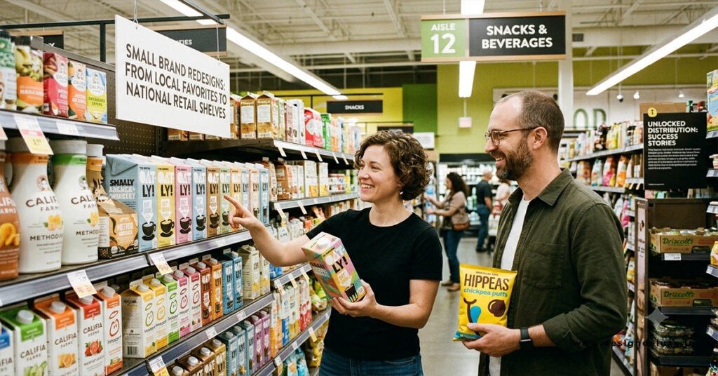
Lessons from small brand packaging redesigns that unlocked national retail distribution
Across food, beverage, and household categories, redesigns that coincide with wider distribution tend to share a few traits. These are patterns to test, not a promise that a new dieline will open a chain.
The brand becomes readable without an explanation. Packs that move from a hard-to-read script, a dense illustration, or an inside joke toward a name and descriptor a stranger can say out loud travel better into chain retail. Personality can stay. Ambiguity usually cannot.
The difference moves from a paragraph to a system. Clear flavor walls, ingredient-led fronts, and bottles with a recognizable silhouette do similar work. They make the reason to choose the item visible without a speech. One hero claim is easier to range than five claims of equal size.
Two public examples show that job without proving what your redesign will return. Method presented home-care products in unusually designed bottles, so the brand was easier to notice in a category long dominated by similar jugs. RXBAR put a short ingredient statement on the front of the wrapper, so the product argument did not depend on a paragraph. Both later sold through broad national retail. Packaging was a visible part of how each brand presented itself. It was not the only reason a buyer said yes, and neither pack is a template for a different category.
The structure respects the shelf. Teams that reach national sets often accept a less exotic form in exchange for a stable footprint, a facing the store can repeat, and a case the aisle can absorb. Distinctive does not have to mean fragile or oversized.
The claims get quieter and more precise. Moving from a broad lifestyle promise to a specific statement you can support reduces review friction. Precision is not less creative. It is easier to defend when a review team asks for the file behind the words.
Operations catch up with the story. National resets punish inconsistent print, late deliveries, and art a co-packer cannot run. The redesigns that stick are the ones production can repeat. A reorder is a response to availability and sell-through, not only to the first impression.
Packaging is one design decision among others. Product fit, margin, and the ability to support a region with inventory matter just as much. For a wider view of how small companies grow once the offer is clear, see design success stories: small brands that made it big.
Copy the job a successful pack performed—clarity, fit, defensibility, and repeatability—not the surface style of a brand you admire.
Mistakes that keep a redesign off the shelf
A few errors are worth catching before the budget is spent.
Designing for the unboxing photo. Direct-to-consumer brands sometimes lead with tissue, inserts, and a reveal. National retail needs the outside of the sellable unit to do the work. An insert the shopper never sees will not win a line review.
Changing everything at once. If you alter the name, the structure, the claim, and the variant system in one step, you cannot tell what helped. You may also discard recognition you already have in a home market. Change what blocks distribution. Keep the cues loyal customers use to find you.
Ignoring private label. In many sets, the competition includes the retailer’s own brand, which is often simple, high-contrast, and claim-led. If your redesign looks like a poster and the store brand looks like a clear offer, the store brand will be easier to shop.
Adding compliance at the end. Required text squeezed into an unreadable band is a quality problem as well as a regulatory risk. Put mandatory information into the hierarchy from the first round.
Trusting the screen. White ink on clear film, a coating that scuffs, or a label that wrinkles in a cooler can undo months of design. Approve on press, on the real material. And do not send only a rendering to the meeting. Buyers authorize physical goods. A finished sample, a case, and a one-page item sheet will outperform a mood board.
How to brief the work and judge it later
A short brief beats a poetic one. State the set you want to join, the objections you have already heard, what must not change, and what must change. Attach the printer’s and co-packer’s constraints. Name a decision owner and the date when art must freeze for a production slot.
Ask for two or three routes that solve the same brief, not three unrelated aesthetics. Judge them against the buyer criteria, in a shelf photo, with a sample in hand. Keep the sell sheet separate from the pack. The sheet can carry the set comparison and the operational details a buyer needs. Do not force that document onto the label.
After the first stores are live, judge the pack on evidence you can collect. Watch whether stores set the item as planned, whether scans match shipments, and whether people confuse variants. If the same question appears in several stores, the panel is not finished, even if the item was authorized.
Separate packaging effects from distribution effects. A new chain will change sales even if the art is ordinary. The packaging question is narrower: are people finding the right variant, are damage and confusion complaints down, and is the item earning its facing? If a claim or a size callout is creating returns, fix it. A smaller second revision is cheaper than defending a pack the shelf has already rejected.
Before the next line review
Put the sample, the case, the data sheet, and the claim support in one packet. Photograph the item in a real or simulated set. Write the range story in a few sentences: who it is for, which need it fills, and why the pack will not create extra work for the store. Then check that the object in the buyer’s hand matches every sentence.
That is the practical core of small brand packaging redesigns that unlocked national retail distribution. The packs that helped were not simply louder. They were easier to range, easier to trust, and easier to reorder. Design still matters. It matters most when it is aimed at the objection between you and the shelf.
FAQs:
Can a packaging redesign alone get a small brand into national retail?
No. A redesign can remove objections and make an item easier to range, scan, and explain. Authorization still depends on the product, price, margin, supply reliability, and whether the buyer has space in the set. Treat a retail-ready pack as necessary in many categories, not as sufficient on its own.
What should a small brand bring to a packaging review with a buyer?
Bring a filled sellable sample, the case or shelf-ready tray the store would actually receive, and a one-page sheet with dimensions, case count, barcode, and support for any front-panel claim. Photograph the sample in a simulated set. A rendering shows intent. The physical unit shows whether the item can live on the shelf.
Which packaging problems most often delay national onboarding?
The usual delays are unclear variant coding, claims the brand cannot substantiate, barcodes that do not match the submitted item data, and structures that do not fit the shelf or fail in transit. Art the co-packer cannot reproduce at scale creates a second delay after a buyer has already said yes. Fix those before you refine decoration.