Logo DesignBusiness & Finance
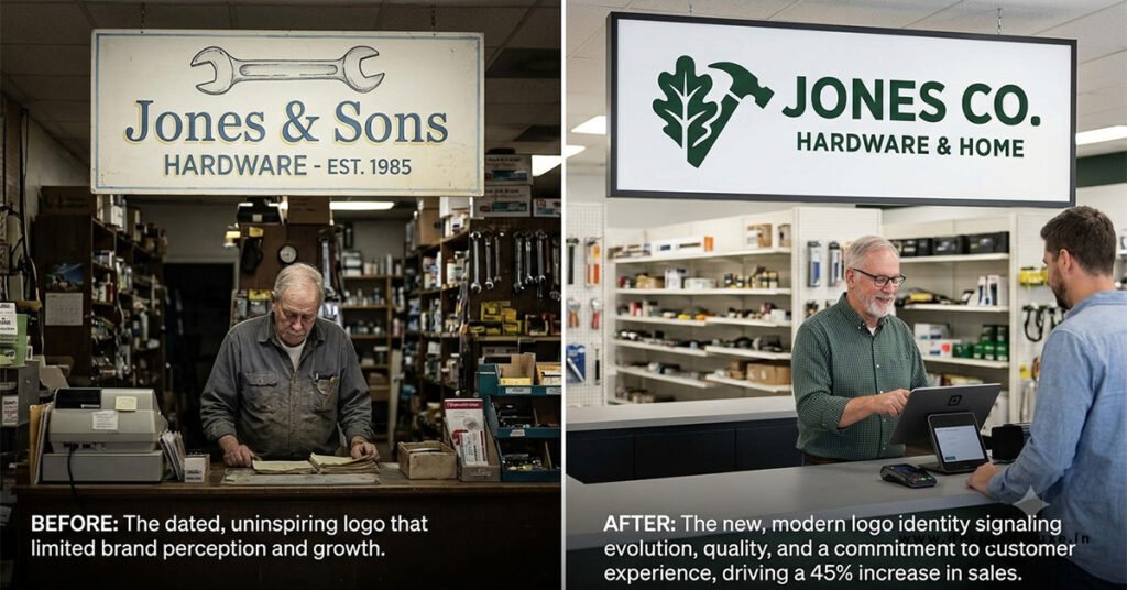
Before & After: Logo Redesign That Transformed Business is the exact story many owners chase when their mark feels stuck in another decade. A strong redesign does more than polish pixels. It can shift how customers trust you, how they find you online, and whether they choose you over the next guy.
Here’s the quick scan of what this actually means:
- A logo redesign updates or completely rebuilds the visual mark so it matches who the business is today, not who it was five years ago.
- The best ones protect existing recognition while fixing problems—outdated style, poor scalability, weak emotional pull, or mismatch with current customers.
- Done right, it boosts brand recall, consistency across digital and print, and perceived professionalism.
- Done wrong, it confuses loyal customers and wastes money.
- For most small and mid-size U.S. businesses in 2026, the real payoff shows up in clearer messaging and stronger first impressions rather than overnight revenue spikes.
Think of your current logo like a handshake. If it feels weak, dated, or awkward, people notice—even if they can’t explain why. A smart redesign firms that grip without breaking the relationship.
Real Before & After: Logo Redesign That Transformed Business Moments
Airbnb is the classic textbook case. Pre-2014 the mark was a friendly but forgettable blue script. After working with DesignStudio they launched the Bélo—a simple, continuous-line symbol that combined people, place, love, and the letter A. The internet roasted it for looking like certain body parts. Then the brand kept growing. Listings scaled hard, the “Belong Anywhere” idea stuck, and the mark became instantly recognizable worldwide. The redesign didn’t create the growth alone, but it gave the company a visual language that matched its ambition.
Slack’s 2019 refresh is another clean example. The old hashtag-style logo was a production nightmare—hard to reproduce consistently across sizes and media. The new version cleaned it up, improved recognition, and made the brand feel more polished as the product matured. Reports from the time pointed to measurable gains in brand recognition after the change.
Dunkin’ simply dropped “Donuts” and kept the pink-and-orange energy. Recognition stayed high because the color and typeface carried the equity. The move signaled a broader menu without alienating the base.
Pfizer’s 2021 update to a double-helix style mark happened at the height of vaccine attention and correlated with a large jump in web traffic. Timing and relevance mattered as much as the design itself.
These weren’t random pretty pictures. Each one fixed a real business problem—scalability, emotional connection, category perception, or digital performance.
Why Most Logo Redesigns Fail (and the Ones That Work)
In my experience the failures share the same pattern. The team falls in love with novelty and throws away the equity they’ve already paid for. Customers who recognized the old mark suddenly feel like strangers. Or the new mark looks great on a giant screen and turns into mush at favicon size.
The winners treat the logo like a tool, not a trophy. They start with the business goal, keep what still works, and only change what actively hurts. Simplicity almost always wins in 2026 because every logo has to survive social avatars, app icons, embroidered hats, and low-resolution email signatures.
Step-by-Step Action Plan for a Logo Redesign That Actually Moves the Needle
- Audit the current mark honestly. Print it tiny. Look at it on a phone. Ask five customers what they think it says about the business. Note what still works and what feels dated or confusing.
- Define the business problem, not the aesthetic preference. Are you expanding into new markets? Attracting a younger demographic? Looking more premium or more approachable? Write the one-sentence goal before anyone opens design software.
- Protect recognition equity. Identify the elements people already associate with you—color, shape language, typeface personality. Keep the strongest ones unless they actively conflict with the new direction.
- Brief the right partner. For most U.S. small businesses a skilled freelancer or small studio in the $1,500–$5,000 range is plenty. Bigger agencies make sense only when the project includes full strategy and guidelines. Always require vector files, full ownership, and a simple brand sheet.
- Test before full launch. Show the shortlist to customers and staff who weren’t involved in the process. Ask which version feels most like “you” and which they’d trust more. Watch for confusion, not just compliments.
- Roll out with intention. Update website, social profiles, email signatures, and packaging in a coordinated wave. Give loyal customers a short “why we updated” note so they feel included rather than blindsided.
- Measure the right things. Track brand search volume, unprompted recall in surveys, consistency of use across channels, and qualitative feedback. Revenue lift is secondary and usually delayed.
Cost and Timeline Reality Check for U.S. Businesses in 2026
| Approach | Typical Cost Range | Timeline | Best For | Risk Level |
|---|---|---|---|---|
| AI generator / marketplace | $50–$500 | 1–5 days | Very early stage or temporary | High |
| Mid-level freelancer | $500–$3,500 | 1–3 weeks | Most small businesses | Medium |
| Boutique studio | $3,500–$15,000 | 3–8 weeks | Growing companies needing guidelines | Lower |
| Full branding agency | $15,000–$50,000+ | 2–4 months | Complex rebrands or multi-location | Lowest (if brief is tight) |
Most solid small-business projects land between $800 and $4,500 when you include revisions and final files. Factor in trademark clearance as a separate step. You can search existing marks through the USPTO’s official trademark database before you fall in love with a design.
Common Mistakes & How to Fix Them
Mistake 1: Redesigning because you’re bored.
Fix: Only change when the mark is actively holding the business back. Boredom is not a strategy.
Mistake 2: Designing only for the desktop hero image.
Fix: Force every candidate to work at 16×16 pixels and on a black-and-white embroidery sample. If it fails there, kill it.
Mistake 3: Letting the committee vote.
Fix: Limit decision-makers to two or three people who understand the business goal. Committees produce safe, forgettable marks.
Mistake 4: Skipping trademark search.
Fix: Run design-code and word searches on the USPTO system early. Conflicts discovered late are expensive.
Mistake 5: Launching without a transition plan.
Fix: Keep the old mark visible somewhere (footer, archive page) for a short period and explain the shift in plain language.
Before & After: Logo Redesign That Transformed Business — What the Data and Experience Actually Show
Traffic studies have linked certain high-profile redesigns to measurable lifts in organic visits in the months after launch. Pfizer, various sports leagues, and others appear in those lists. The pattern is clear: when the new mark is simpler, more distinctive, and better matched to current positioning, search and social performance often improve because the brand becomes easier to remember and recognize.
Still, the logo is never the whole story. Product quality, customer experience, and consistent execution do the heavy lifting. The redesign just removes friction and adds clarity.
Key Takeaways
- A logo redesign succeeds when it solves a real business problem, not when it simply looks newer.
- Protect existing recognition equity whenever possible—evolution beats revolution for most established brands.
- Test for scalability early. Tiny sizes and real-world applications expose weak designs fast.
- Budget $800–$4,500 for a solid small-business result in 2026 and insist on vector files plus ownership.
- Always clear trademarks through the USPTO before finalizing.
- Measure recall, consistency, and qualitative feedback before you chase revenue attribution.
- Roll out deliberately and explain the change so customers feel continuity rather than disruption.
- The best marks feel inevitable after the fact—simple, distinctive, and true to the business.
A strong logo redesign is less about the pretty picture and more about removing the static between your business and the people who should care about it. If your current mark is creating friction, clarify the problem, protect what still works, and move with purpose. Start with an honest audit this week. The before-and-after that actually transforms a business begins there.
FAQs
What makes a Before & After: Logo Redesign That Transformed Business successful instead of just cosmetic?
It starts with a clear business problem—outdated perception, poor digital performance, or mismatch with new customers—and solves it while keeping the recognition equity that already exists.
How long does a typical Before & After: Logo Redesign That Transformed Business project take for a small U.S. company?
Most solid projects finish in three to eight weeks once the brief is locked, including concepts, revisions, and final files. Rushing usually produces weaker results.
Should every growing business pursue a Before & After: Logo Redesign That Transformed Business?
Only when the current mark is actively limiting trust, recognition, or consistency. If the logo still works and the business is healthy, leave it alone and invest the budget elsewhere.