DESIGN
Landing Page Design: Conversion-Optimized Templates separate the pages that quietly print money from the ones that burn ad spend. You land traffic. Visitors decide in seconds. A solid template gives you the structure that already accounts for attention ratios, mobile thumbs, and trust signals so you spend less time reinventing the wheel and more time testing the variables that move the needle.
Here’s the quick rundown:
- A conversion-optimized template is a pre-built page layout engineered around one clear goal, not a pretty homepage clone.
- It prioritizes single CTA focus, message match, above-the-fold proof, and speed under 2.5 seconds.
- Beginners get a proven skeleton; intermediate marketers get a faster testing cycle.
- Median dedicated landing pages sit around 6.6% conversion across industries, according to Unbounce’s analysis of tens of thousands of pages.
- Done right, these templates turn paid clicks into measurable actions instead of bounce rates.
Most people still treat templates like digital wallpaper. Pretty colors, stock photos, five competing buttons. Then they wonder why the numbers stay flat. In my experience, the difference shows up fast when you start with structure that already respects how humans scan and decide.
Why Landing Page Design: Conversion-Optimized Templates Beat Blank Canvases
Start with a template built for conversion and you inherit years of pattern recognition. Single-goal architecture. Visual hierarchy that points at the action. Mobile-first placement so the primary button sits in the thumb zone on first load.
What usually happens when teams build from scratch? They add navigation “just in case.” They cram three offers onto one page. They bury social proof below the fold. The page looks complete. Conversions do not.
Unbounce’s Conversion Benchmark Report, drawn from more than 41,000 landing pages and hundreds of millions of visits, puts the median conversion rate at 6.6% across industries. Top performers clear double digits. The gap is almost never about prettier graphics. It is about focus, speed, and clarity.
Think of a conversion-optimized template as the chassis of a race car. You still choose the engine and the driver, but the frame already handles the weight transfer and aerodynamics. Skip the chassis and you spend months welding while the other guy is already on the track.
Core Elements Every Conversion-Optimized Template Needs
Look for these pieces before you customize a single pixel:
- One dominant CTA repeated at natural decision points, never competing with secondary buttons of equal visual weight.
- Headline that names the audience and the specific outcome in one breath.
- Trust signals (logos, specific numbers, short testimonials) visible without scrolling.
- Form fields limited to the absolute minimum required to start the relationship.
- Load performance that keeps Largest Contentful Paint under 2.5 seconds on mobile.
Message match remains non-negotiable. The headline on the page must echo the ad or email that sent the visitor there. Break that contract and the click was wasted.
Landing Page Design: Conversion-Optimized Templates Comparison Table
| Template Approach | Best For | Time to First Publish | Built-in A/B Testing | Typical Mobile Speed Focus | Risk Level |
|---|---|---|---|---|---|
| Dedicated CRO builders (Unbounce-style) | Paid traffic campaigns | Hours | Native | High | Low |
| Theme-based page builders | Existing WordPress or Shopify sites | 1–2 days | Add-on | Medium | Medium |
| Code-first component libraries | Engineering-led teams | Days to weeks | Custom | Highest | Higher if team is small |
| AI-generated starters | Rapid experiments | Minutes | Limited | Variable | Medium |
Pick the row that matches your team size and traffic source. A solo marketer running Meta ads has different needs than a product team shipping inside a React stack.
Step-by-Step Action Plan for Beginners
- Define the single action. Write it on a sticky note and stick it to your monitor. Everything else is secondary.
- Choose a template built for that exact goal—lead gen, free trial, or purchase. Avoid “multi-purpose” kits.
- Rewrite the headline first. Specificity beats cleverness. “Cut reporting time by 4 hours a week” lands harder than “Streamline your workflow.”
- Strip the navigation. If the visitor can leave for the blog or the pricing page, many will.
- Place the primary CTA above the fold and again after the first proof section. Same button text, same color.
- Add one piece of concrete social proof above the fold—customer count, recognizable logo, or a short named quote.
- Compress every image. Test the page on a mid-range phone over a typical cellular connection.
- Launch with traffic that matches the offer. Measure for seven days before changing anything major.
- Run one controlled test at a time—headline, CTA copy, or form length. Record the result and move to the next.
What I’d do if I were starting a new campaign tomorrow: open the template, replace the headline and hero image within the first hour, then ship. Polish comes after data.
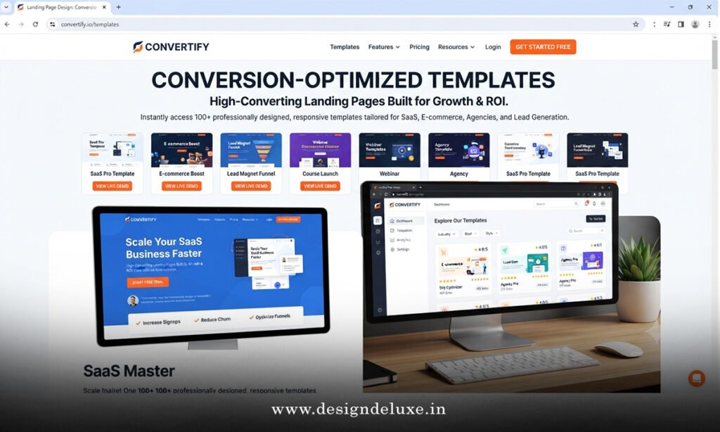
Landing Page Design: Conversion-Optimized Templates and Common Mistakes
Too many goals on one page. Visitors face decision paralysis and choose nothing. Fix: pick one primary action and demote everything else to secondary or remove it.
Headline that talks about the company instead of the visitor’s outcome. Fix: name the problem and the result in the first five words.
Form that asks for life history. Research consistently shows shorter forms convert higher. Keep only the fields you need to route the lead.
Slow mobile load. Google’s own research and multiple case studies show that even small delays raise bounce rates and lower conversions. Aim for LCP under 2.5 seconds. Compress assets, defer non-critical scripts, and host on a fast CDN.
Missing message match. The ad promised one thing; the page delivers another. Fix: copy the core phrase from the ad into the headline.
No trust above the fold. Cold traffic needs proof immediately. Add logos or a specific metric before the visitor scrolls.
These mistakes are fixable in an afternoon. Most teams just never run the audit.
How to Customize Without Breaking the Conversion Architecture
Templates are starting points, not sacred texts. Swap colors to match brand guidelines. Replace stock photos with real product shots or customer faces. Rewrite every line of body copy so it sounds like your voice, not the template author’s.
Leave the structure alone at first. Hierarchy, CTA placement, and section order exist because they work across thousands of tests. Change those only after you have a baseline conversion rate and a clear hypothesis.
For intermediate users: layer dynamic text replacement so the headline mirrors the exact keyword or ad variation that drove the click. Pair that with heatmaps and session recordings. The data will tell you which sections visitors ignore.
Key Takeaways
- Start with a single-goal template instead of a blank page or a multi-purpose homepage.
- Keep the median 6.6% conversion rate from Unbounce’s large-scale data as your reference point, then aim higher.
- Message match between ad and headline is the highest-leverage change most teams still skip.
- Mobile load speed under 2.5 seconds is table stakes in 2026.
- One clear CTA outperforms multiple competing actions.
- Social proof belongs above the fold for cold traffic.
- Test one variable at a time after you have a clean baseline.
- Customize copy and visuals freely; protect the proven structure until data says otherwise.
The real win is not a prettier page. It is a page that turns the traffic you already paid for into actions you can count. Grab a conversion-optimized template that matches your goal, rewrite the headline and proof for your audience, strip the distractions, and ship. Then watch the numbers and improve from there. That is how you stop guessing and start compounding.
FAQs
What makes Landing Page Design: Conversion-Optimized Templates different from regular website templates?
Regular templates often include full navigation and multiple competing goals. Conversion-optimized versions remove exits, enforce single-CTA focus, and place proof and action where scanners actually look.
How fast should a page using Landing Page Design: Conversion-Optimized Templates load?
Target Largest Contentful Paint under 2.5 seconds on mobile. Anything slower quietly raises bounce rates and lowers the conversion rate you worked to earn.
Can beginners use Landing Page Design: Conversion-Optimized Templates effectively without a designer?
Yes. Choose a reputable builder, lock the structural layout, and focus your energy on clear headlines, short forms, and relevant social proof. The template already handles the heavy design lifting.