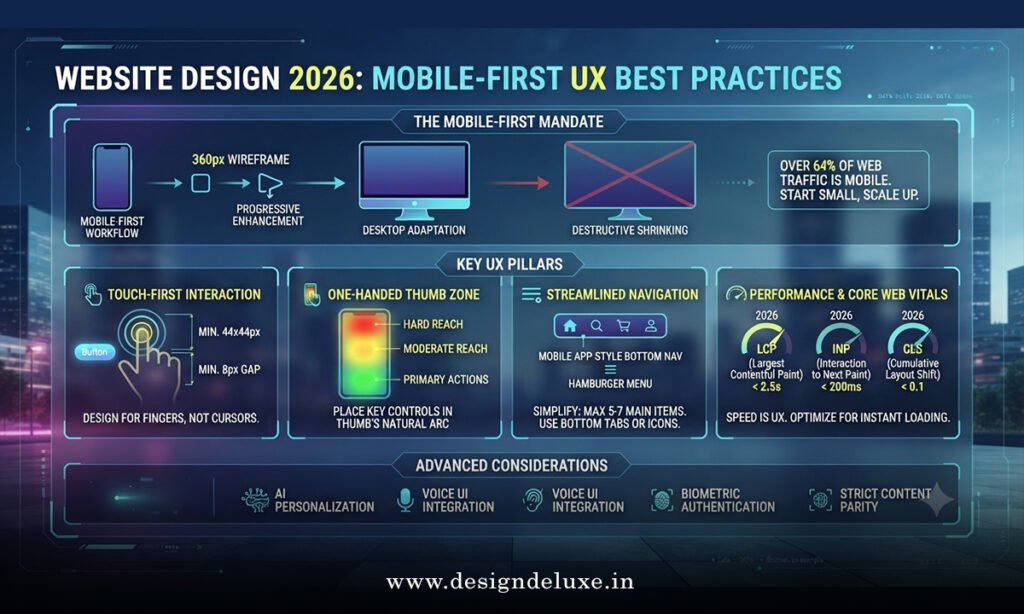
Website Design 2026: Mobile-First UX Best Practices starts with one hard truth—most of your traffic already lives on phones, and the bar for speed, clarity, and touch-friendly interaction keeps rising. Ignore that and you bleed conversions. Nail it and you pull ahead of slower competitors.
Here’s the quick snapshot:
- Mobile-first means designing the small screen first, then expanding upward—not shrinking a desktop layout.
- In 2026 the winners focus on sub-second load times, thumb-zone navigation, and adaptive components that feel native.
- Core wins: faster decision-making for users, higher engagement, and better rankings in search systems that favor mobile experience signals.
- The biggest risk? Treating mobile as an afterthought and watching bounce rates climb.
- Done right, it becomes the foundation for every other channel, not a separate “mobile version.”
Think of mobile-first design like packing a suitcase for a long trip. You start with the essentials that must fit in the smallest bag. Everything else is bonus. Start oversized and you’ll end up leaving the good stuff behind.
Why Mobile-First Still Rules Website Design 2026
Phones dominate. Tablets and desktops matter, but the primary interaction for most users happens in the hand. Search systems and AI overviews reward sites that load fast, stay readable, and let people complete tasks without pinching or hunting for buttons.
What usually happens when teams skip this step? They ship a polished desktop experience, then force it onto smaller screens. Result: tiny text, stacked menus that feel endless, and forms that fight the keyboard. Users leave. Fast.
In my experience, the sites that perform best treat the mobile viewport as the default canvas. They prioritize content hierarchy, reduce cognitive load, and make every tap count. That approach scales cleanly when the screen grows.
Core Principles of Website Design 2026: Mobile-First UX Best Practices
Four principles separate the average from the excellent.
1. Content hierarchy that works under pressure
Lead with the action or answer the user came for. Supporting details come later. On a phone, scrolling is cheap—but only if the path feels intentional.
2. Touch targets and spacing that respect real hands
Fingers are blunt instruments. Buttons and links need breathing room. Aim for generous hit areas and clear visual separation so accidental taps become rare.
3. Performance as a feature
Heavy images, unoptimized scripts, and render-blocking resources kill mobile sessions. Compress, lazy-load, and ship only what’s needed for the first interaction.
4. Adaptive, not just responsive
Responsive layouts reflow. Adaptive experiences also adjust density, interaction patterns, and even content priority based on device capabilities and context.
Ask yourself: if a user has one free hand and thirty seconds, can they finish the job? If the answer is no, the design still has work to do.
Practical Layout Patterns That Deliver
Vertical stacking remains the backbone. Single-column flows keep the eye moving downward without side-to-side scanning. Sticky headers or bottom navigation bars keep primary actions in reach without covering content.
Cards and modular sections help. They create natural stopping points and make progressive disclosure easy. Expand only what the user requests.
For forms, show one field at a time when possible. Use native mobile input types so the right keyboard appears. Autofill support is non-negotiable in 2026.
Step-by-Step Action Plan for Beginners and Intermediate Teams
Here’s what I’d do if I were rebuilding a site or launching a new one under Website Design 2026: Mobile-First UX Best Practices.
- Audit the current mobile experience
Open the live site on a real phone (not just browser tools). Time how long it takes to complete the main task. Note friction points: hard-to-tap buttons, slow sections, confusing menus. - Define the primary user job
Write one sentence: “A visitor on mobile needs to [specific outcome] in under X seconds.” Everything else supports that job. - Wireframe the mobile view first
Sketch or prototype only the small screen. Establish hierarchy, navigation, and key CTAs. Expand the layout to tablet and desktop only after the mobile version feels solid. - Set performance budgets
Decide maximum page weight and load time targets before design starts. Hold the team accountable. Tools from Google’s PageSpeed Insights and Lighthouse remain the practical baseline for measurement. - Build with progressive enhancement
Start with clean HTML and CSS that works offline or on slow connections. Layer JavaScript for richer interactions. Never make the core experience depend on heavy scripts. - Test on real devices and real networks
Emulators help, but nothing replaces a mid-range Android phone on 4G. Watch real users if you can. Fix the issues that appear repeatedly. - Iterate after launch
Track mobile-specific metrics: bounce rate, time to interactive, conversion by device. Small refinements compound.
Follow that sequence and you avoid the most common trap—designing for the ideal desktop user while the majority of traffic struggles on phones.
Common Mistakes & How to Fix Them
Most teams still make the same errors. Here’s the short list and the fix.
Mistake: Desktop-first wireframes that get “adapted” later
Fix: Ban desktop mockups until the mobile prototype is approved. Force the conversation to start small.
Mistake: Tiny text and cramped controls
Fix: Set a minimum base font size that remains readable without zooming. Increase touch target size and add consistent spacing. Test with actual thumbs, not a mouse cursor.
Mistake: Ignoring load performance
Fix: Compress images aggressively, serve modern formats, and defer non-critical scripts. Measure on real mobile networks, not just office Wi-Fi.
Mistake: Navigation that hides everything behind a hamburger
Fix: Surface the two or three most-used actions. Use bottom bars or progressive disclosure instead of forcing every visitor through a menu.
Mistake: Forms that feel like punishment
Fix: Minimize fields. Use smart defaults and native inputs. Validate inline so users know immediately when something is wrong.
One more that still shows up: treating accessibility as optional. High contrast, proper labels, and keyboard/focus support help everyone—especially on mobile where glare and one-handed use are common.
Comparison of Mobile-First Approaches
| Approach | Best For | Strengths | Weaknesses | Time to Implement |
|---|---|---|---|---|
| Pure Responsive (CSS media queries) | Simple sites, content-heavy pages | Single codebase, flexible | Can produce awkward intermediate sizes | Fast |
| Adaptive (device-specific layouts) | Complex product or e-commerce experiences | Tailored density and interactions | Higher maintenance | Medium |
| Progressive Web App + Mobile-First | Apps that need offline or install-like feel | Fast, installable, push-capable | Requires service worker expertise | Longer |
| Hybrid (responsive base + adaptive components) | Most 2026 business sites | Balance of speed and polish | Needs clear component rules | Medium-Fast |
The hybrid path works for the majority of teams. Start responsive, then upgrade high-traffic components to adaptive behavior where the payoff is clear.
External guidance worth bookmarking includes Google’s mobile-friendly documentation at developers.google.com, the research-backed patterns from the Nielsen Norman Group, and the accessibility baseline maintained by the W3C Web Accessibility Initiative.
Key Takeaways
- Design the smallest screen first and expand only after it works.
- Prioritize speed, clear hierarchy, and large enough touch targets.
- Measure real-device performance, not just lab scores.
- Keep navigation and primary actions within easy thumb reach.
- Treat forms and multi-step flows as high-stakes moments that demand simplification.
- Accessibility improvements benefit mobile users as much as desktop ones.
- Iterate with actual usage data after launch rather than assuming the first version is finished.
The payoff is straightforward. Sites built this way feel faster, clearer, and more trustworthy on the devices people actually use. That combination drives higher engagement and better results in search.
Start with one page—your highest-traffic or highest-value mobile path. Apply the principles above, test on real phones, and expand from there. The gap between average and excellent mobile experiences is still wide. Close it and you give users a reason to stay.
FAQs
What makes Website Design 2026: Mobile-First UX Best Practices different from older responsive design?
The shift is from “make it fit” to “make the primary experience excellent on the most-used device.” Layout flexibility remains, but hierarchy, performance, and interaction patterns now start on mobile by default.
How do I measure success with Website Design 2026: Mobile-First UX Best Practices?
Track mobile bounce rate, time to interactive, conversion rate by device, and task completion time. Pair quantitative data with occasional real-user observation on phones.
Is a full redesign required to adopt Website Design 2026: Mobile-First UX Best Practices?
No. Begin with the highest-impact pages, apply the core principles, and expand. Many teams see meaningful gains by fixing navigation, speed, and form friction first.