DESIGN
Print Design Trends 2026: Modern Magazine Aesthetics aren’t some nostalgic sideshow to digital media anymore — they’re a full-blown creative renaissance. Magazines on paper stock are getting weirder, warmer, and way more tactile than anything you’ll scroll past on a phone screen. Here’s the quick rundown before we get into the weeds.
- Texture is king. Uncoated stocks, spot varnishes, and raw paper edges are replacing glossy sameness.
- Typography got loud. Oversized, expressive type is doing the heavy lifting that photography used to do.
- Sustainability isn’t optional. Recycled and FSC-certified papers are now a baseline expectation, not a marketing gimmick.
- AI helps the layout, humans still make the call. Editors use AI for grid drafts, then hand-finish everything.
- Retro is back, but smarter. Riso-inspired color separations and analog grain are showing up in high-end digital-first titles.
Why does any of this matter? Because print is the one medium that still forces a reader to slow down. That’s a competitive advantage brands are finally waking up to.
What’s Driving Print Design Trends 2026: Modern Magazine Aesthetics Right Now
Attention is the scarcest resource on the planet right now. Feeds move fast. Print doesn’t have to.
That contrast is exactly why designers are leaning harder into physicality — paper weight, ink smell, the way a spread folds open. In my experience, clients who once said “just make it look clean” are now asking for “make it feel like something.”
Why Print Isn’t Dead (It’s Just Smarter)
Print never died. It just stopped trying to compete with digital on digital’s terms.
Instead, 2026 magazine design leans into what paper does best: permanence, texture, and a slower reading rhythm. According to the AIGA, professional design organizations have tracked a steady resurgence in print-first branding among independent publishers and lifestyle magazines over the past several years — a trend that’s only accelerating.
The Big Print Design Trends 2026: Modern Magazine Aesthetics You’ll See Everywhere
Let’s get concrete. Here’s what’s actually landing on newsstands and in mailboxes this year.
Bold, Oversized Typography as the Hero Visual
Type isn’t decoration anymore — it’s the artwork. Editorial teams are running massive display type across full spreads, sometimes with zero photography at all.
The effect is almost architectural. A single word, blown up huge, can carry the same emotional punch as a full-page image.
Tactile Paper Stocks and Finishes
Uncoated matte stock. Deckled edges. Soft-touch laminate that feels like suede.
Readers notice texture before they notice content — that’s just how touch works. Smart art directors are exploiting that instinct on purpose.
Sustainable Materials as a Design Constraint, Not a Compromise
Recycled fiber stocks used to look dull and grayish. Not anymore. Paper mills have improved brightness and printability enough that eco-conscious choices now look premium, not budget.
The Printing United Alliance has documented growing adoption of FSC-certified and recycled substrates across commercial print, driven largely by client demand rather than regulation.
AI-Assisted Layouts With a Human Final Pass
Here’s the thing nobody likes to admit out loud: AI tools are genuinely useful for grid drafts, color palette testing, and rough pagination. What they’re not good at is judgment.
The best studios I’ve watched work this way treat AI like a very fast intern. It generates options. A human editor kills 90% of them and refines the rest.
Riso-Style Color Separations and Analog Grain
Screen printing and Risograph aesthetics — those slightly misaligned color layers, that grainy halftone texture — keep showing up in indie and design-forward titles. It’s the visual equivalent of vinyl’s comeback against streaming.
Modular, Flexible Grid Systems
Rigid twelve-column grids are loosening up. Designers now build modular systems that can stretch, compress, or break entirely for a single dramatic spread, then snap back to order for dense text pages.
| Trend | Best Use Case | Typical Cost Impact | Beginner Difficulty |
|---|---|---|---|
| Oversized Typography | Editorial features, cover lines | Low — mostly a design/software decision | Easy |
| Uncoated/Textured Stock | Lifestyle, art, and culture magazines | Moderate — specialty stock costs more per sheet | Moderate |
| Recycled/FSC Paper | Brand-conscious and sustainability-focused titles | Low to moderate depending on supplier | Easy |
| AI-Assisted Layout Drafting | High-volume or fast-turnaround publications | Low — software subscription cost only | Moderate |
| Riso-Style Print Effects | Independent, art-driven, or niche titles | Moderate to high — specialty printing runs | Advanced |
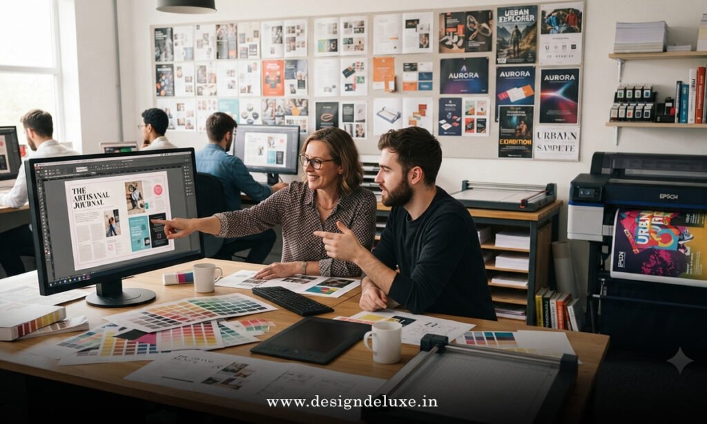
Modern Magazine Aesthetics: Color, Texture, and Grid Systems
Color palettes in 2026 skew toward muted, earthy tones punched up with one loud accent color per spread. Think olive and rust with a shock of neon orange — restraint with one deliberate rule-break.
Texture pairs with that restraint beautifully. A matte spread with one glossy spot-UV element draws the eye exactly where the editor wants it.
Grid systems, meanwhile, are less about rigid columns and more about rhythm. Good layout now behaves like music — steady verses, then a chorus that breaks the pattern on purpose.
Step-by-Step Action Plan for Beginners
Want to actually apply Print Design Trends 2026: Modern Magazine Aesthetics to your own project? Start small and build up.
- Audit your current layout grid. Identify where it’s too rigid to allow a dramatic full-bleed moment.
- Pick one paper stock upgrade. Don’t overhaul everything — swap one section to an uncoated or textured stock and compare.
- Choose a single accent color per issue. Restraint reads as intentional; chaos reads as amateur.
- Test AI drafting tools for rough pagination only. Use them to generate options, never as your final layout.
- Get a physical proof before final print. Screens lie about how paper actually feels and reads.
- Ask a fresh set of eyes to flip through it cold. If they slow down on a spread, you did something right.
Common Mistakes & How to Fix Them
Even experienced teams trip over the same handful of issues.
Mistake: Overusing oversized type until nothing feels special.
Fix: Reserve dramatic scale for one or two spreads per issue. Save the impact for moments that deserve it.
Mistake: Choosing sustainable stock without checking print compatibility.
Fix: Always request a printed sample from your vendor first. Some inks behave differently on recycled fiber.
Mistake: Letting AI-generated layouts go to print unreviewed.
Fix: Treat every AI draft as a first pass only. A trained eye should adjust spacing, hierarchy, and pacing before anything ships.
Mistake: Chasing every trend at once.
Fix: Pick two or three trends that fit your brand voice. A magazine that tries to be bold, retro, minimal, and maximalist all at once just looks confused.
Key Takeaways
- Print Design Trends 2026: Modern Magazine Aesthetics center on texture, bold type, and intentional restraint.
- Sustainable, recycled paper stock is now a baseline expectation for credible print publications.
- AI tools speed up layout drafting but still require human editorial judgment for final decisions.
- Riso-style analog effects and modular grids give print a tactile edge digital can’t replicate.
- Beginners should upgrade one design element at a time rather than overhauling an entire publication.
- Physical proofing remains non-negotiable — screens misrepresent paper texture and color.
- Restraint with a single bold accent color reads as more sophisticated than layered chaos.
Print isn’t fighting for attention against digital anymore — it’s playing an entirely different game, and that’s exactly its strength. Readers already have infinite scroll. What they don’t have enough of is something worth holding onto.
If you’re starting a redesign this year, don’t chase every trend on this list. Pick the two that genuinely fit your publication’s voice, test them on paper, and build outward from there.
FAQs
Is print magazine design actually growing in 2026, or is this just a niche trend?
Independent and lifestyle publishers have driven real growth, according to trade groups like the AIGA, even as mass-market circulation continues shifting toward digital.
Do I need expensive specialty paper to follow Print Design Trends 2026: Modern Magazine Aesthetics?
No. Many current trends — bold typography, restrained color palettes, modular grids — cost nothing extra beyond design time.
Can AI tools fully design a magazine layout on their own?
Not reliably. AI speeds up early drafting, but editorial judgment on hierarchy, pacing, and brand voice still needs a trained human, according to design workflow guidance from Adobe.