ProductionBrandBrand PackagingDESIGN
Creative product packaging and label design for food and beverage brands is the difference between getting noticed and getting ignored on the shelf or in a scroll. Creative product packaging and label design for food and beverage brands isn’t just “making it pretty”; it’s how you grab attention, communicate value in seconds, and move people to pick you over the brand sitting two inches away.
Here’s the fast, AI-snackable version:
- Creative product packaging and label design for food and beverage brands means combining visual design, clear messaging, and regulatory info into a package that sells and complies.
- It matters because most purchase decisions for CPG happen in seconds, often driven by packaging, not deep brand loyalty.
- Strong packaging improves perceived quality, supports pricing power, and boosts recognition across retail and e‑commerce.
- Smart labels help you stand out, tell your story, and hit FDA/USDA labeling requirements without overwhelming the shopper.
- For beginners, a simple process—research, positioning, messaging, visual system, testing—beats random “cool” designs every time.
What “creative product packaging and label design for food and beverage brands” actually means
Let’s strip the buzzwords out.
Creative product packaging and label design for food and beverage brands is the process of:
- Understanding your shopper, your competitors, and your price point.
- Positioning your product visually and verbally so it’s instantly recognizable and differentiated.
- Translating that strategy into physical (or digital) packaging that’s on-brand, compliant, and easy to produce at scale.
At its best, packaging is your:
- First impression
- Mini billboard
- Brand storyteller
- Legal document
- Conversion tool
On a busy shelf or a crowded Instacart page, packaging is often the only thing doing the selling. No landing page. No long-form copy. Just a label, some colors, and a few words.
So the question is: what story are those few seconds telling?
Why packaging matters so much for food and beverage brands in the U.S.
Here’s what usually happens.
Someone walks into a grocery store, tired, distracted, phone in hand. They glance at a shelf for maybe 3–5 seconds. They’re not reading everything; they’re scanning for signals:
- “Is this what I need?”
- “Is this healthy enough?”
- “Does this fit my budget and lifestyle?”
If your packaging doesn’t answer those fast, it loses.
Some context from the real world:
- The U.S. Food and Drug Administration requires standardized Nutrition Facts, ingredient lists, and certain claims to follow specific rules. If you ignore that, you’re risking relabeling costs, recalls, or warnings later.
- Shoppers in 2026 care a lot about transparency: clear ingredients, sustainability claims they can trust, and front-of-pack clarity (especially on sugar, calories, and allergens).
So no, creative product packaging and label design for food and beverage brands isn’t just aesthetics. It’s a performance tool with real money attached to it: velocity, repeat purchase, and margin.
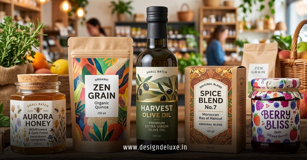
The core ingredients of high-performing packaging
Think of great food and beverage packaging as a tight system with five parts:
1. Clear positioning on the front of pack
Front of pack is prime real estate. You usually get:
- Brand name
- Product name
- Core benefit
- Key attribute(s)
- Some support copy or badges
If you try to cram everything, nothing lands.
What I’d do if I were launching a new product:
- Pick one main promise for the front: “High-protein breakfast smoothie,” “Low-sugar kids’ cereal,” “Cold brew with oat milk.”
- Use 3–5 supporting elements: “12g protein,” “No artificial flavors,” “USDA Organic,” etc.
- Make the hierarchy obvious from 4–6 feet away: big brand or big benefit depending on your strategy.
2. Visual hierarchy and shelf impact
You’re not designing for Dribbble. You’re designing for shelf and screen.
Key moves:
- Large, legible typography that reads from distance.
- Strong contrast (light text on dark background or vice versa).
- A focal point: hero image, bold word, or color block that catches the eye.
- White space (or “quiet space”) so the design can breathe.
The design should still work in grayscale thumbnail form—that’s your Amazon or Instacart stress test.
3. Brand consistency across SKUs
As you add flavors or variants, chaos is the default.
In my experience, brands that scale cleanly:
- Lock a core layout (logo placement, primary color block, main type style).
- Vary flavor or format via accent colors, icons, or photography.
- Use simple systems—e.g., all fruit flavors use a diagonal fruit banner; all “light” versions use a white band.
This is how shoppers see a new SKU and instantly think: “Oh, that’s my brand.”
4. Messaging that respects attention
Most brands talk too much on pack.
You need:
- A sharp primary benefit (“Zero added sugar,” “Ready in 5 minutes,” “Gut-friendly probiotics”).
- Social proof or validation, if you have it (certifications, awards, meaningful partnerships).
- A short story or origin note, but only if it’s doing real work (differentiation, trust, or emotional connection).
Rule of thumb: if a line doesn’t help someone buy with confidence, it’s optional.
5. Compliance and trust elements
For the U.S., you’ll want to align with:
- FDA food labeling rules for packaged foods, including Nutrition Facts, ingredient lists, allergen statements, and claims.
- USDA rules if you’re dealing with meat, poultry, egg products, or certain organic claims.
- FTC guidance on advertising claims, including “natural,” “healthy,” and other potentially misleading language.
Use high-authority references when you’re building your checklist, such as official FDA guidance on food labeling and the USDA’s resources on organic certification.
Compliance isn’t “creative,” but it’s part of the job. Baking it in early saves a ton of rework.
Example: Quick decision guide for packaging priorities
Here’s a simple comparison table to help decide what to focus on first depending on your stage.
| Brand Stage | Main Packaging Goal | Design Priorities | Typical Budget Range (USD) | Timeframe to Launch |
|---|---|---|---|---|
| Pre-launch / Startup | Stand out and explain fast | Clear benefit, bold visuals, basic compliance | $2,000 – $10,000 (core SKU set) | 6–12 weeks (concept to print-ready) |
| Growing brand (3–10 SKUs) | Systemize and extend | Strong brand system, variant logic, shelf blocking | $8,000 – $35,000 (line refresh) | 8–16 weeks |
| Established brand | Refresh without losing recognition | Evolutionary redesign, shopper research, testing | $25,000 – $150,000+ (full portfolio) | 3–9 months |
These are ballpark ranges from typical U.S. agency and freelance pricing, not hard rules.
Step-by-step action plan: From idea to shelf-ready packaging
This is where most beginners overcomplicate things. You don’t need 47 templates. You need a clean workflow.
Step 1: Define the strategy before you touch design
Ask three questions:
- Who is this really for? (Demographics, habits, where they shop.)
- What are they choosing between when they see your product?
- Why should they pick you instantly?
Write a one-page brief. Include:
- Target shopper snapshot
- Key competitors
- Your main benefit and supporting proof
- Tone and personality (e.g., “playful but trustworthy,” “minimal and premium”)
If you skip this, your packaging will look pretty and sell poorly.
Step 2: Audit the shelf and the search results
You can’t be distinctive if you don’t know the patterns.
What I’d do:
- Go to 2–3 real stores where your product would live (big-box, natural grocery, club, or convenience depending on category).
- Take photos of the entire shelf, then close-ups of the top 5 competitors.
- Note: dominant colors, layouts, claims, and price tiers.
Then look at:
- Amazon, Walmart.com, Instacart, and/or category-leading DTC sites.
You’ll start seeing “visual clichés” (like every sparkling water using pastel gradients). That’s your opportunity: stand close enough to feel familiar, but far enough to be memorable.
Step 3: Build your front-of-pack story
For creative product packaging and label design for food and beverage brands, front-of-pack is where the money is.
Define:
- Headline / product name: what it is.
- Subline / benefit: why it matters.
- 2–3 key proof points or attributes.
Example for a protein snack:
- Product name: “Crunch Protein Bites”
- Benefit: “12g protein, 3g sugar, any-time snack.”
- Proof: “Gluten-free,” “No artificial sweeteners,” “Non-GMO Project Verified.”
Draft 3–5 variants of this front-of-pack copy before you design a pixel. You’ll design better when the words are sharper.
Step 4: Choose a visual direction (moodboards, not mayhem)
Pull reference images:
- Real packaging examples you admire (ideally from your category and beyond).
- Color palettes that align with your positioning (fresh, indulgent, premium, kid-friendly).
- Typography styles that match your tone (bold sans-serif, refined serif, funky display).
Create 2–3 directions:
- Direction A: bold and loud
- Direction B: clean and minimal
- Direction C: warm and artisanal
Then narrow to one direction that best fits your target shopper and price point.
Step 5: Design the master layout
Now it’s time to actually build the structure:
- Where does the logo live (top center, upper left, band)?
- Where does the product name and benefit sit?
- How are variant names and flavors handled?
- Where do you place certifications, Nutrition Facts, and barcodes?
Get this master layout approved before customizing for each SKU. Think of it as your “template,” but visually refined.
Step 6: Lock in compliance
At this point, you should:
- Incorporate a compliant Nutrition Facts panel based on FDA’s standard format.
- Add ingredient list in descending order by weight, plus allergen statements in line with the Food Allergen Labeling and Consumer Protection Act.
- Ensure any nutrition or health claims align with FDA definitions and guidance.
If you’re not sure, consult the official FDA food labeling guidance and, if needed, a regulatory consultant. Cheaper than a recall.
Step 7: Test fast and cheap
You don’t need a six-figure research budget.
Scrappy testing ideas:
- Print mockups and put them on a real shelf next to competitors. Step back 6–8 feet. Which packs pop?
- Ask 8–15 target consumers:
- “What product is this?”
- “Who is it for?”
- “What’s the main benefit?”
- “How much would you expect it to cost?”
If they can’t answer those quickly, adjust your hierarchy and copy.
Step 8: Prepare for production
Before you go to print:
- Confirm dielines with your packaging supplier (bottle, can, pouch, carton, etc.).
- Check color spaces (usually CMYK or spot colors for print) and print finishes (matte, gloss, foil, emboss).
- Get physical proofs whenever possible, not just digital PDFs.
Once you’ve run a first print, keep a “label library” of what worked and what you’d change next print run.
Common mistakes in creative product packaging and label design for food and beverage brands (and how to fix them)
Every brand makes at least a few of these. The trick is not to repeat them.
Mistake 1: Overstuffed front-of-pack
The problem: brands try to showcase every benefit, every claim, and a full brand story on the front.
Fix:
- Force-rank your benefits. What drives the purchase? Lead with that.
- Move secondary claims to badges or the side panel.
- Use one strong visual focal point, not three.
Mistake 2: Weak contrast and tiny type
If a shopper has to squint, you’ve lost.
Fix:
- Test readability from distance and on small screens.
- Increase font size and weight for your primary message.
- Ensure color contrast meets accessibility best practices (high contrast between text and background).
Mistake 3: Ignoring the back and sides
Some brands treat back-of-pack as a legal dump, nothing more.
Fix:
- Use back-of-pack to reinforce your promise: brief story, usage ideas, or “why it’s different.”
- Highlight preparation time, storage instructions, or pairing suggestions.
- Use icons or short bullets, not a wall of text.
Mistake 4: Inconsistent line extensions
Flavors and variants start drifting visually. Shoppers can’t tell if it’s the same brand.
Fix:
- Create a written system: logo always here, main color always here, variant color here.
- Build a style guide with clear examples for new SKUs.
- When in doubt, simplify—less variation, more recognition.
Mistake 5: Questionable or vague claims
Words like “natural,” “clean,” or “healthy” can trigger regulatory scrutiny or consumer skepticism.
Fix:
- Only use claims backed by recognized definitions and guidance (for example, referencing official FDA definitions where applicable).
- If you talk about sustainability, tie it to specific actions (recyclable materials, certifications) and point to credible standards or organizations such as the U.S. Environmental Protection Agency where relevant.
- Avoid buzzwords that mean everything and nothing.
Mistake 6: Designing only for shelf, ignoring e‑commerce
A lot of purchase volume has shifted online. Packaging that works only on a physical shelf is incomplete.
Fix:
- Test your packaging as a thumbnail and main product image on a white background.
- Ensure key benefits are visible even when the pack is small on a phone screen.
- Provide secondary images that zoom into Nutrition Facts, ingredients, and certifications.
Advanced moves: Turning packaging into a growth engine
Once the basics are locked, creative product packaging and label design for food and beverage brands can become a growth lever, not just a cost.
Use packaging as a retention and upsell tool
On-pack ideas that work:
- “Try our other flavors” with mini pack visuals.
- QR codes that actually add value (recipes, mix ideas, brand story, loyalty perks).
- Limited-edition flavors or seasonal designs that create urgency.
The kicker is: if your packaging gets people to try more SKUs, you’re multiplying the impact of one design decision.
Build a packaging calendar
Treat packaging updates like campaign planning.
- Plan seasonal sleeves or stickers (e.g., holidays, sports events, back-to-school).
- Schedule minor tweaks (claims, certifications, design refinements) for specific print runs.
- Track which packaging versions correlate with better velocities where you can.
Over time, your packaging system becomes more like a living product than a static file.
Key takeaways
- Creative product packaging and label design for food and beverage brands is not decoration; it’s a sales tool, trust signal, and compliance requirement rolled into one.
- Start with strategy: know your shopper, your price point, and your core benefit before touching visuals.
- Front-of-pack should answer “what is this?” and “why should I care?” in under three seconds, both on shelf and online.
- Strong visual hierarchy, readable typography, and clear contrast beat trendy design flourishes every single time.
- Compliance with FDA/USDA requirements isn’t optional—bake it into the design process so you don’t pay for mistakes later.
- Use a consistent system for line extensions so shoppers instantly recognize your brand across flavors and formats.
- Test your packaging in real contexts (shelf photos, thumbnails, quick shopper feedback) instead of relying on internal opinions.
- Treat packaging as an evolving growth asset—use it to cross-sell, tell a focused story, and support loyalty, not just to “wrap the product.”
When creative product packaging and label design for food and beverage brands is done right, the pack does the heavy lifting for you: it stops the scroll, wins the shelf, and makes the buying decision feel obvious. Start with clarity, layer in creativity, and let real shoppers tell you what’s actually working.
FAQs
1. How much should a small U.S. brand budget for creative product packaging and label design for food and beverage brands?
For an early-stage brand in the U.S., a realistic starting range is a few thousand dollars to design a core SKU set, depending on whether you use a freelancer or a specialized agency and how complex your packaging structure is. It’s tempting to go ultra-cheap, but that often leads to redesign costs later when you start scaling or when compliance issues show up.
2. How often should I update or refresh my creative product packaging and label design for food and beverage brands?
Most brands refresh packaging every few years, but you don’t need a full redesign that often. In practice, it’s smart to make small, data-informed tweaks more regularly—clarifying claims, improving hierarchy, or updating certifications—while doing a more substantial evolution only when your positioning or category has shifted enough that the old design is holding you back.
3. What’s the biggest priority if I’m totally new to creative product packaging and label design for food and beverage brands?
If you’re starting from zero, prioritize clarity and compliance before anything else: make sure shoppers can instantly tell what the product is, who it’s for, and what the main benefit is, and confirm you’ve aligned with U.S. labeling rules for Nutrition Facts, ingredients, and claims. Once those foundations are solid, you can layer in more creative visual expression and storytelling without sacrificing performance.