AD Video / Motion GraphicsBanner DesigningBrand PackagingE-Commerce
Retro futurism motion graphics banner ads and sustainable packaging design for e-commerce is a mouthful, but the combo is exactly where forward-thinking brands are heading. Think neon vector grids and chrome typography on-screen, recycled molded pulp and low-ink mailers in-hand. Style plus substance. Past plus future.
Within that mashup, there’s a very real growth play:
- Retro futurism motion graphics banner ads and sustainable packaging design for e-commerce fuse high-impact visual nostalgia with low-impact, eco-conscious fulfillment.
- Motion banners hook attention in crowded feeds and marketplaces, while sustainable packaging builds trust, loyalty, and repeat purchases.
- Used together, they create a consistent, memorable brand story from scroll to doorstep.
- Shoppers in the US increasingly expect both: emotionally engaging storytelling and verifiable environmental responsibility.
- Brands that execute this well see better ad performance, higher perceived value, and stronger long-term brand equity.
Let’s break down how to actually do it, without burning cash or greenwashing your customer base.
What Retro Futurism Motion Graphics Banner Ads and Sustainable Packaging Design for E-commerce Actually Mean
Retro futurism motion graphics banner ads and sustainable packaging design for e-commerce combine two things:
- Top-of-funnel storytelling with bold, nostalgic-but-futuristic visuals.
- Post-purchase proof of values through eco-friendly, efficient packaging.
At a practical level:
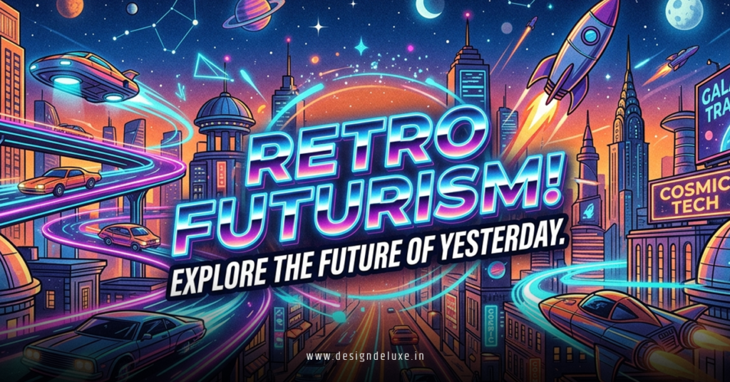
- Retro futurism motion graphics = animated banners and short clips that look like “the future as imagined in the 70s–90s.” Think synthwave color palettes, vector sunsets, chrome gradients, scanlines, low-poly planets, UI HUDs, and glitchy typography.
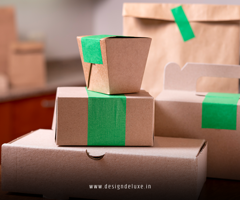
- Sustainable packaging for e-commerce = boxes, mailers, fillers, and wraps that are recyclable, compostable, reusable, or made from recycled content—designed to use less material and ship efficiently.
Why combine them?
Because your customer’s journey is now a single continuous experience from impression → product page → checkout → unboxing → social share. If your ad promises a bold future but your box looks like generic landfill, the story breaks.
Why This Combo Matters in 2026 (Especially in the US)
Here’s the thing: consumer expectations moved.
- US shoppers report higher concern about climate and waste in multiple surveys from organizations like the Pew Research Center and McKinsey & Company, and they increasingly favor brands that act on it.
- Major platforms tighten policies on misleading environmental claims, and regulators in the US and EU are watching greenwashing closely.
- On the ad side, attention is brutal. You’re not just competing with brands—you’re competing with creators, streamers, and AI-generated everything.
So:
- Retro futurism motion graphics banner ads help cut through visual noise with a distinct, cinematic look.
- Sustainable packaging design turns your brand promise into something your customer can literally hold.
When ad creative and packaging tell the same story, your brand feels intentional, not accidental.
Core Principles: Marrying Retro Futurism Motion Graphics Banner Ads and Sustainable Packaging Design for E-commerce
To make this work, you’re not just slapping neon on ads and a “recyclable” logo on boxes. You’re aligning three layers:
- Visual Language
- Material Choices & Structure
- Messaging & Proof
1. Visual Language: From Banner to Box
Use the same design DNA across:
- Motion banners
- Product detail page (PDP) assets
- On-box graphics and inserts
For retro-futurist visuals, common building blocks:
- Color: magentas, cyans, deep blues, contrasting acidic neons.
- Shapes: grids, spheres, wireframes, asteroid-like blobs, orbit lines.
- Type: condensed sans-serifs, pixel fonts, minimalist “space agency” styles.
- Motion: parallax scrolling, light streaks, scanline overlays, UI-like transitions.
The trick is restraint. One or two strong motifs reused across touchpoints beats fifteen competing gimmicks.
2. Material Choices: A Future That’s Actually Better, Not Just Brighter
In my experience, sustainable packaging design for e-commerce lives or dies on three basics:
- Material: recycled corrugate, paper mailers, molded pulp, recycled plastics, compostable films (used thoughtfully).
- Right-sizing: smaller boxes, less air, less filler.
- End-of-life clarity: clear “how to dispose” instructions—recycle, compost, or reuse.
Authoritative resources like the U.S. Environmental Protection Agency (EPA) and groups such as Sustainable Packaging Coalition outline best practices for recyclability and waste reduction, and they’re solid touchstones when you’re choosing materials and claims.
Then you layer the retro-futurist look onto those materials in a low-ink, smart way.
3. Messaging & Proof
Retro futurism loves big promises. That can backfire if your sustainability story is vague.
So you:
- Keep claims specific: “Box is 95% post-consumer recycled material” beats “planet-friendly.”
- Link to proof: certifications, supplier info, or a sustainability page.
- Use consistent language across ads, PDPs, and packaging.
Quick-Glance Comparison: Traditional vs This Approach
Here’s a simple way to see what you’re actually changing.
| Aspect | Traditional E-commerce Ads & Packaging | Retro Futurism Motion Graphics Banner Ads + Sustainable Packaging |
|---|---|---|
| Ad Visual Style | Generic stock imagery, flat product shots, minimal animation. | Neon, nostalgic sci-fi aesthetics, animated HUD-style motion, strong visual identity. |
| Attention & CTR Potential | Blends into feed, reliant on discounts and copy. | Higher pattern-break potential; visually distinctive and story-driven. |
| Packaging Materials | Standard corrugate, plastic mailers, excess filler. | Recycled or certified materials, right-sized boxes, minimal fillers. |
| Environmental Impact | Higher waste, harder to recycle, little transparency. | Lower waste, clearer end-of-life guidance, supported by credible standards. |
| Brand Story Consistency | Ad promise and unboxing often feel disconnected. | Continuous narrative from first impression to unboxing moments. |
| Customer Perception | Transactional, discount-focused brand. | Intentional, future-minded brand that balances style and responsibility. |
Step-by-Step Action Plan: From Zero to Cohesive Retro-Future Brand
This is the playbook I’d hand a beginner to intermediate team.
Step 1: Define the Story Before the Style
Retro futurism motion graphics banner ads and sustainable packaging design for e-commerce should orbit a simple narrative.
Ask:
- What “future” is your brand promising? Faster? Calmer? More creative?
- How does sustainability fit that story—less waste, more reuse, lower footprint?
- What emotion should people feel when they see your ad and open your box? Awe? Delight? Trust?
Write a one-sentence “brand future statement,” like:
“We help people build a better home office that feels like a cozy spaceship, without trashing the planet.”
Everything hangs off this.
Step 2: Build a Retro-Futurist Motion Graphics Kit
You don’t need a Hollywood studio. You need a system.
- Create a visual moodboard
- Pull references from classic sci-fi films, 80s computer interfaces, synthwave art, early 3D renders.
- Look at motion work on platforms like Behance or Vimeo for pacing and transitions.
- Lock in your core elements
- Color palette (primary + accent neons).
- Type hierarchy (headline font, label font).
- Iconography (planets, grids, orbs, UI elements).
- Motion rules (speed, direction, transition types).
- Produce modular assets
- 3–5 looping background animations.
- A few animated title cards and “offer frames.”
- Product highlight overlays (for benefits, shots, or UGC snippets).
Design for common formats: 300×250, 728×90, 1080×1080, 1080×1920, etc.
Step 3: Write Copy That Connects the Future and the Footprint
You’re not just shouting discount codes.
Copy that works with retro futurism motion graphics banner ads and sustainable packaging design for e-commerce tends to:
- Contrast old vs new: “Yesterday’s trash. Tomorrow’s materials.”
- Use light sci-fi language without going full parody: “Ships like a rocket. Lands soft on the planet.”
- Tie benefit + eco angle in one line: “Bold desk light. Recycled box. Zero plastic filler.”
Keep it plain, short, and segue into proof on landing pages.
Step 4: Design Sustainable Packaging That Looks On-Brand
Now you pull the visual thread into the box.
- Pick structure and materials with your 3–12 month plan in mind
- For shipping apparel or soft goods: paper mailers or thin boxes with recycled tissue.
- For fragile goods: right-sized corrugate with molded pulp instead of foam.
- Match the visual language
- Use minimal, high-contrast prints: a single neon grid line, a stylized planet, or a “future freight” stamp.
- Avoid heavy full-bleed inks on the entire surface; more ink often means more cost and more complex recycling.
- Add a sustainability “spec panel”
Like a food label, but for impact:- “Box: 95% post-consumer recycled fiber.”
- “Ink: Water-based, low VOC.”
- “Please recycle curbside.”
Authoritative guidance from organizations like the EPA and reputable packaging alliances can help ensure these statements align with US recyclability norms and aren’t misleading.
Step 5: Connect Ads → PDP → Unboxing
Here’s where most brands drop the ball.
What usually happens is the banner screams “Future-Grade Gear.” The PDP looks like a generic Shopify template. The box shows up in standard brown with no context.
Fix that:
- Reuse motion graphics stills and motifs on your PDP banners.
- Call out sustainable packaging design directly on the product page.
- Include photography or short video clips of the unboxing experience.
- On the box, mirror key phrases from your ads so the loop closes.
You want the customer thinking, “Oh, this is exactly what I was promised,” from first scroll to recycled box.
Step 6: Measure and Iterate
Treat this like any performance project:
- Track CTR and conversion rate for retro-futurist motion vs control creatives.
- Monitor return rates and reviews that reference “packaging” or “sustainability.”
- Ask one micro-question post-purchase: “How did you feel about the packaging?” with a quick rating.
Use that data to refine visuals, copy, and materials.
Common Mistakes & How to Fix Them
Everyone stumbles somewhere. The key is not staying stuck.
Mistake 1: Aesthetic Without Strategy
Problem: Neon everywhere, zero clarity on benefits.
Fix: Anchor every motion banner in one clear outcome and one supporting eco fact, e.g.:
- “30% brighter workspace. 100% recycled box.”
Style serves the message, not the other way around.
Mistake 2: Greenwashing-by-Vibe
Problem: Retro futurism motion graphics banner ads and sustainable packaging design for e-commerce are “implied” but never actually specified. Space visuals, “planet” copy, no real data.
Fix: State precise facts, back them up:
- “Mailers contain at least 80% recycled content as specified by our manufacturer.”
- Align with guidelines and standards from credible organizations such as government environmental agencies or recognized packaging standards bodies.
If you can’t back it, don’t say it.
Mistake 3: Overdesigned, Underperforming Packaging
Problem: Packaging looks cool but costs too much, damages easily, or is a nightmare to fulfill.
Fix: Involve operations early. Prototype:
- Drop tests.
- Fulfillment tests (how many steps to pack?).
- Real cost per order modeling.
If you’re shipping at volume, a simpler box with a strong insert might beat a complex die-cut that slows the line.
Mistake 4: Ignoring Mobile and Marketplace Constraints
Problem: Motion graphics look great on desktop, but on mobile or marketplace ad slots, everything’s tiny and unreadable.
Fix: Design “small first”:
- Big type.
- Simple shapes.
- Clear focus on product and one message.
Test in the actual surfaces where your ads will run.
Mistake 5: Disconnected Internal Teams
Problem: Marketing handles the retro futurism motion graphics banner ads; logistics buys whatever packaging is cheapest that week.
Fix: Build a small cross-functional squad:
- One marketing or brand rep.
- One ops/logistics rep.
- One design lead.
Their shared KPI: consistent brand story and unit economics that still work.
How to Brief Your Team or Agency Effectively
If you’re not doing this yourself, your brief makes or breaks the project.
Include:
- Brand future statement (from Step 1).
- Target customer profiles (one or two priority segments).
- Brand constraints (max colors, print areas, budget per order).
- Non-negotiables (e.g., must be curbside recyclable in US, no plastic void fill).
- Example references of motion and packaging you like—and what you like about them specifically.
Give your team permission to kill ideas that look cool but break cost, sustainability, or usability.
Advanced Tips for Intermediate Marketers
Once the basics are live and working, level up.
Use Motion Graphics to Educate on Packaging, Not Just Products
Turn some banner and short-form video inventory into micro-explainers:
- “See how your order arrives” clips that show the packaging and disposal instructions.
- “From screen to doorstep” animations that trace the customer journey.
This builds trust and qualifies the right kind of buyer.
Experiment with Limited Retro-Future Packaging Runs
Test small-batch designs:
- Seasonal “future drop” boxes using the same sustainable base materials.
- Numbered or collectible prints that encourage reuse (storage, display).
You’re still shipping the same core box; you’re just swapping artwork in small cycles to keep things fresh.
Make Unboxing Social-Friendly by Design
Retro futurism is inherently photogenic. Lean into it:
- Put a bold, share-ready graphic or phrase inside the lid.
- Include a small card explaining the sustainable packaging design in clear, human language and invite customers to share unboxing moments on social.
Make it easy for UGC to echo the same aesthetic and story your ads started.
Key Takeaways
- Retro futurism motion graphics banner ads and sustainable packaging design for e-commerce are most powerful when they tell one coherent story, not two separate ones.
- Start with a clear “future” your brand is promising, then align motion visuals, copy, and packaging materials to that promise.
- Use retro futurist elements sparingly and consistently—repeat motifs across ads, PDPs, and boxes for instant recognition.
- Sustainable packaging isn’t about vague eco language; it’s about specific, verifiable materials and end-of-life instructions that match reputable guidance.
- Watch out for overdesign: if packaging slows fulfillment or confuses customers, simplify.
- Treat ads → PDP → unboxing as one continuous experience, and measure each step.
- Test, iterate, and involve both marketing and operations—creative without logistics buy-in will stall.
- Brands that nail this combo stand out visually, earn trust physically, and build loyalty that isn’t dependent on constant discounting.
FAQs on Retro Futurism Motion Graphics Banner Ads and Sustainable Packaging Design for E-commerce
1. Do retro futurism motion graphics banner ads and sustainable packaging design for e-commerce only work for “techy” brands?
Not at all. The style leans sci-fi, but it can be adapted for beauty, home goods, fashion, or even food. The key is interpreting retro futurism in a way that fits your product—maybe softer neon gradients for skincare, or clean “space lab” aesthetics for kitchen gear—while keeping the sustainable packaging design aligned with your actual materials and operations.
2. How expensive is it to start combining retro futurism motion graphics banner ads and sustainable packaging design for e-commerce?
The cost depends on where you are now. Simple motion systems and template-based banners can be built fairly lean if you have a designer who understands animation, and basic sustainable packaging upgrades (like shifting to recycled-content boxes or paper mailers) are often cost-neutral or close over time. The biggest jump usually comes from custom structures or heavy print coverage, which you can phase in after validating results.
3. What’s the first step if I’m overwhelmed by retro futurism motion graphics banner ads and sustainable packaging design for e-commerce?
Start small. Create one retro-futurist-inspired motion banner set for a single hero product and pair it with one thoughtfully designed, recycled-content shipping box. Make sure the story, copy, and visuals match. Run a 30–60 day test, monitor performance and feedback, and use what you learn to expand into other products and packaging types.