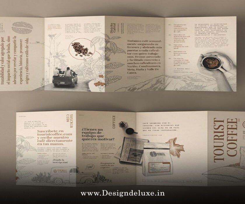
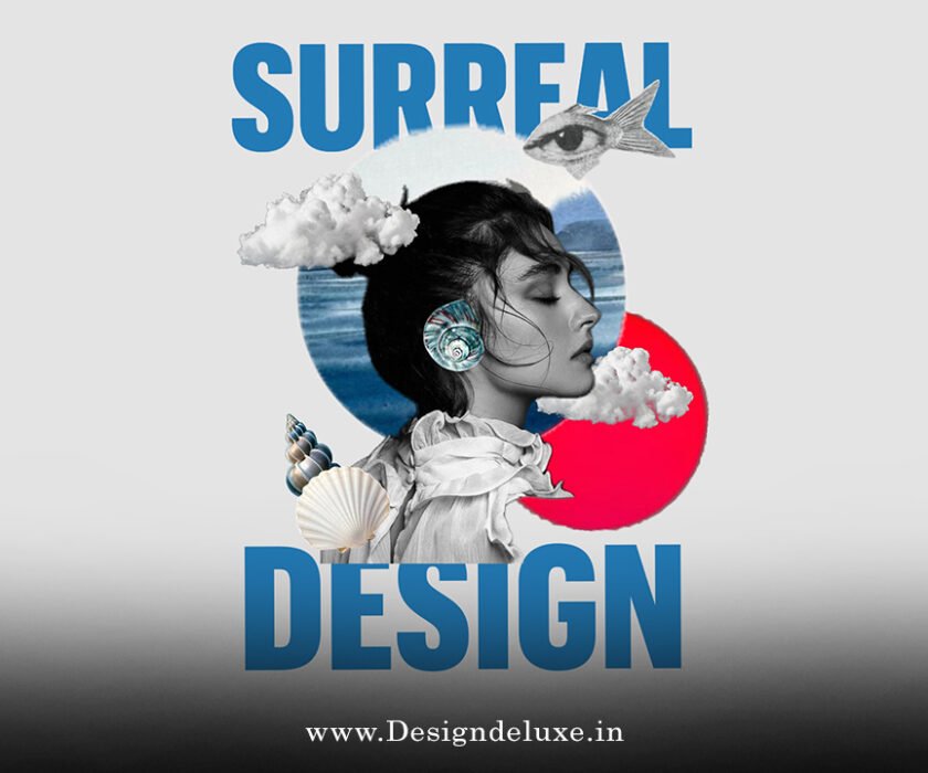
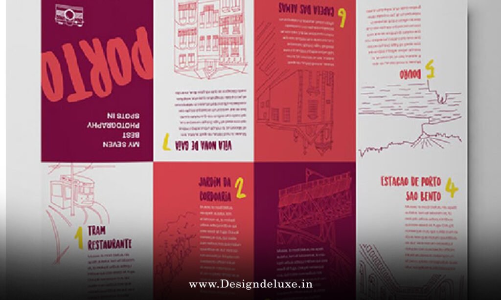
Flyer / Broucher Design
Playful exaggerated typography brochure and flyer combo 2026 is exploding onto the scene as one of the hottest trends in graphic design right now. Imagine your marketing materials jumping off the page like they’re having way too much fun—oversized, bubbly letters stretching wildly, puffy forms that look like they just puffed up from excitement, and wavy distortions that make everything feel alive and a little mischievous. If you’ve been stuck with boring, cookie-cutter designs, this combo is your ticket to injecting pure joy and personality into brochures and flyers.
Why does this matter in 2026? Because people are tired of sterile, minimalist everything. After years of clean sans-serifs dominating the scene, designers are rebelling with excess, absurdity, and that human touch that screams “we’re having fun here!” According to insights from major forecasts like Adobe’s 2026 Creative Trends, exaggerated, playful letters are leading the charge—think oversized sans-serifs, bubble-like shapes, and hand-drawn chaos that turns print into an experience rather than just information.
What Exactly Is a Playful Exaggerated Typography Brochure and Flyer Combo 2026?
Let’s break it down simply. A playful exaggerated typography brochure and flyer combo 2026 refers to a coordinated set of print materials where the typography steals the show. The brochure (usually multi-page, folded) and flyer (single-sheet, quick-hitting) share the same bold, over-the-top type treatment. Exaggerated means pushing letterforms to extremes: super-thick strokes, massive scale differences within words, distorted curves, or letters that look inflated, squished, or melting.
Playful adds the fun—whimsical elements like doodles integrated into letters, mismatched styles for emphasis, or colors that pop like candy. In 2026, this isn’t random; it’s strategic. Brands use it to stand out in a world flooded with digital noise, making physical print feel fresh and memorable.
Have you ever picked up a flyer that made you smile before you even read it? That’s the magic. It’s like giving your audience a visual hug mixed with a wink.
Why Playful Exaggerated Typography Is Dominating Design in 2026
Fast-forward to 2026, and the design world has flipped the script. Trends from sources like Adobe Express and various creative reports highlight a shift toward “imperfect by design,” where authenticity trumps perfection. Exaggerated typography fits perfectly—it’s rebellious against uniformity.
Think about it: in a sea of AI-generated sameness, hand-rendered or deliberately “misbehaving” type feels human. Oversized, bubbly forms evoke joy and approachability, ideal for brands wanting to connect emotionally. Playful elements like puffy letters or wavy distortions add energy, making static print feel dynamic.
This trend aligns with broader movements: immersive high-energy styles, surreal imagery, and a craving for sensory experiences. A playful exaggerated typography brochure and flyer combo 2026 taps into that by turning marketing into mini artworks that beg to be shared.
Key Characteristics of the Playful Exaggerated Typography Brochure and Flyer Combo 2026
What makes this combo tick? Here are the standout features:
Oversized and Bubbly Letterforms
Letters balloon out like they’re filled with helium. Huge headlines dwarf body text, creating instant drama. Pair this with soft, rounded edges for that cuddly vibe—perfect for events, kids’ products, or fun brands.
Distorted and Wavy Typography
Imagine letters stretching like taffy or waving like they’re dancing. This adds movement to still pages, guiding the eye playfully across the design.
Mixed Styles and Deliberate Chaos
One word in bubbly script, the next in chunky sans—intentionally mismatched for emphasis. It’s controlled anarchy that feels fresh and authentic.
Bright, Playful Color Palettes
Neon pops, pastels with punch, or gradients that shift like mood rings. These amplify the exaggeration, making the type feel even more alive.
Integration with Illustrations
Doodles, scribbles, or quirky icons weave into letters, turning type into storytelling elements.
In a playful exaggerated typography brochure and flyer combo 2026, these traits work together seamlessly, ensuring the brochure provides depth while the flyer delivers punchy impact.
How to Create Your Own Playful Exaggerated Typography Brochure and Flyer Combo 2026
Ready to dive in? Here’s a step-by-step guide that’s beginner-friendly but packed with pro tips.
Step 1: Choose the Right Fonts
Hunt for display fonts with personality—think bubbly, puffy, or distorted styles. Look for variable fonts that let you stretch or squash letters dynamically. Free resources abound, but premium ones give that polished-yet-playful edge.
Step 2: Plan Your Hierarchy
Exaggeration works best when guided. Make headlines massive and wild, subheads slightly tamed, and body text clean (a simple sans-serif) for readability. Contrast is key—don’t let fun overwhelm function.
Step 3: Coordinate the Combo
Use the same type treatments across both pieces. The brochure might expand on themes with more pages, while the flyer distills the boldest elements for quick grabs.
Step 4: Add Texture and Effects
Layer subtle textures (paper grain, glows) or shadows to make type pop. In print, spot UV or foil stamping elevates the exaggeration.
Step 5: Test for Print
Always proof on actual paper. Exaggerated sizes can shift in production—check bleed, margins, and how colors render.
Experiment! Start small, like redesigning an event flyer, and scale up to a full brochure series.
Benefits of Using a Playful Exaggerated Typography Brochure and Flyer Combo 2026
Why bother? Because it delivers results:
- Grabs Attention Instantly: In crowded spaces, bold type stops scrollers (or walkers) in their tracks.
- Builds Brand Personality: Shows your brand has fun, is approachable, and isn’t afraid to stand out.
- Boosts Memorability: People remember what makes them feel something—joy counts big.
- Versatile Across Industries: Events, food, fashion, education, nonprofits—anywhere energy matters.
- High Shareability: Eye-catching designs get photographed and shared on social.
Brands embracing this see higher engagement because the materials feel less like ads and more like invitations.
Real-World Inspiration for Playful Exaggerated Typography Brochure and Flyer Combo 2026
Picture a music festival flyer with letters ballooning like speakers blasting sound waves. Or a kids’ workshop brochure where words doodle across pages like living creatures. These aren’t hypotheticals—2026 trends show designers pushing boundaries with exactly this.
For high-authority inspiration:
- Check out Adobe’s 2026 Creative Trends Forecast for official insights on exaggerated playful letters.
- Explore Creative Boom’s typography trends for community-driven examples.
- See Envato Elements font trends for practical typeface recommendations.
These sources confirm the shift toward playful excess.
Common Mistakes to Avoid in Your Playful Exaggerated Typography Brochure and Flyer Combo 2026
Even fun designs can flop. Watch out for:
- Overdoing it: Too much exaggeration kills readability.
- Poor contrast: Wild type needs strong color/backing.
- Ignoring audience: Playful works for fun brands, not corporate law
- Forgetting print specs: Exaggerated sizes demand careful layout.
Balance is everything—let the type play, but keep the message clear.
Conclusion: Embrace the Fun with Playful Exaggerated Typography Brochure and Flyer Combo 2026
So, there you have it—the playful exaggerated typography brochure and flyer combo 2026 is more than a trend; it’s a mindset shift toward joyful, human-centered design. By embracing oversized, bubbly, distorted, and whimsical type, you’re creating print materials that don’t just inform—they delight, engage, and stick in minds long after the event ends. Whether you’re a small business owner, event planner, or designer, this combo offers endless creative freedom. Grab those bold fonts, crank up the exaggeration, and watch your audience light up. Your next brochure and flyer set could be the one that finally makes people say, “Wow, that’s fun!”
Now go make some mischief on paper.
FAQs
What makes the playful exaggerated typography brochure and flyer combo 2026 different from regular designs?
It pushes boundaries with oversized, bubbly, and distorted letters that add personality and energy, making print feel dynamic and joyful instead of flat.
Which fonts work best for a playful exaggerated typography brochure and flyer combo 2026?
Look for bubbly sans-serifs, puffy display fonts, wavy scripts, or variable fonts that allow stretching—anything that feels hand-drawn and mischievous.
Is the playful exaggerated typography brochure and flyer combo 2026 suitable for all industries?
It’s ideal for creative, youth-oriented, event-based, or fun brands like food, entertainment, and lifestyle, but tone it down for formal sectors.
How can I ensure readability in a playful exaggerated typography brochure and flyer combo 2026?
Use exaggeration mainly for headlines, pair with clean body text, maintain high contrast, and test prints to avoid overwhelming the reader.
Where can I find templates for playful exaggerated typography brochure and flyer combo 2026?
Platforms like Canva, Adobe Express, or Envato offer customizable starters—search for “playful bold” or “exaggerated type” kits and tweak to fit 2026 vibes.